Web Design & Business Tips
O N T H E B L O G
CHEATSHEET & TEMPLATES
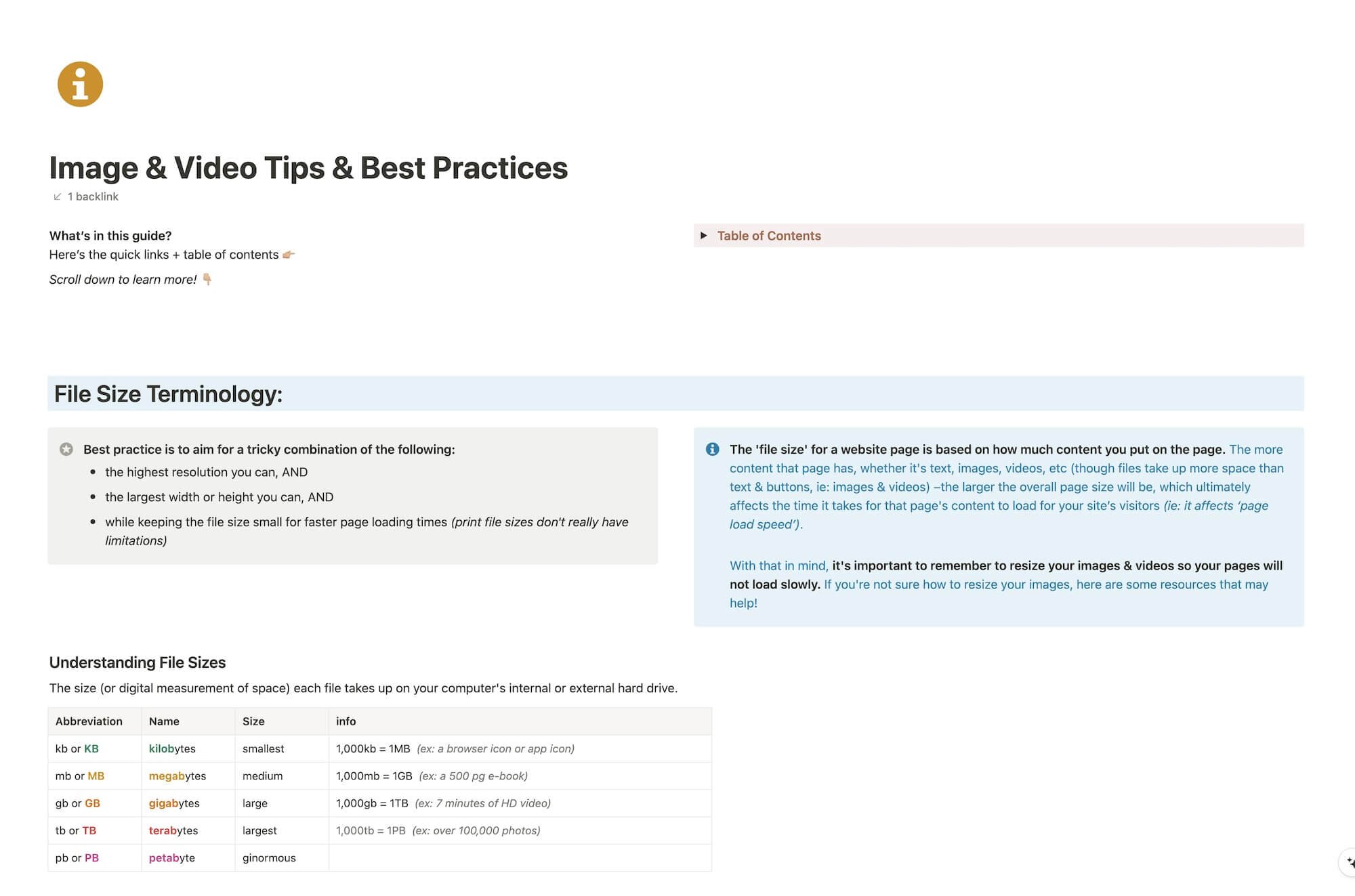
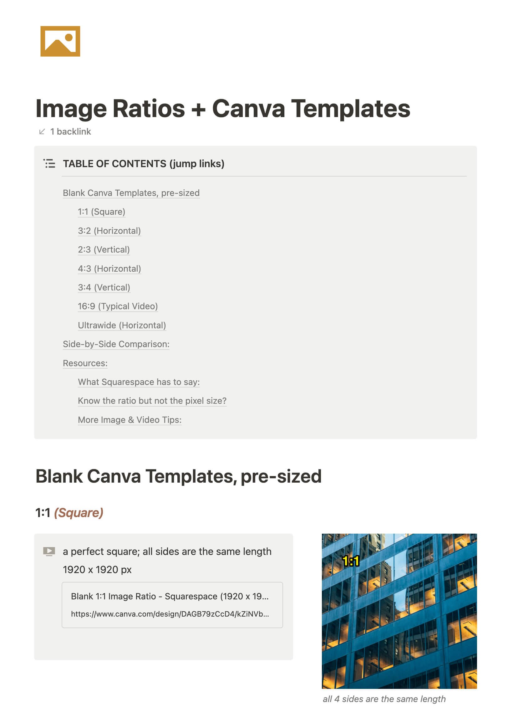
File & format terminologies & size ranges, resource lists, and pre-sized blank Canva templates for various image ratios.
Squarespace 7.0 vs 7.1: What's the difference?
With all the fuss over Squarespace introducing a new version of their service (that’d be 7.1 in case you’re living under a rock), Squarespace website designers like myself are getting tons of questions like:
Which is better, 7.0 or 7.1?
Does 7.0/7.1 have X feature?
Can I move my site from 7.0 to 7.1?
Should I start my clients on 7.0 or 7.1?
On and on and on. Most of the answers aren’t straightforward either, I’m afraid. So let’s dive in & see what we can tackle today.
How to organize your blog posts in Squarespace
If you’re new to blogging or want to start, but you’re not suuuper tech savvy & computers sometimes make you want to wring somebody’s neck, –then blogging on Squarespace will probably be a good fit for you.
If you’re already blogging on Squarespace, but you feel like the posts are disorganized, or you can’t figure out what should be tags or categories, then read on, ma’ friend!
I’ve had several questions about this lately, so it’s time to address it for you all! And it’s not super complicated, so don’t freak out –just jump right in!
Understanding Squarespace Analytics (for beginners)
When you first launch the website, you’re likely wondering how things are going right?
How many people are seeing it? Which pages are people going to? How are they finding me?
These are all good questions to ask!
You’ll want to link your site up to Google Analytics for the most accurate & detailed information, but until you do Squarespace has built-in analytics that will still be helpful for you to collect this kind of info.
Maybe you’ve seen it in the home menu in your account, and maybe you’ve even clicked on it before to see what’s there, but got overwhelmed or don’t understand the terminology.
I totally understand! So let’s walk through it together; it’s not as scary as it sounds, I promise!
How to create drop-down navigation menus on Squarespace
My older sister’s gym website was one of my first client sites that I built on Squarespace. Actually, I set up the basics for her and she took it over from there, transforming it into whatever she needed it to be.
So, imagine my stupid moment, when a couple years later, I realize she doesn’t like the long string of navigation links across the top. It was like that because she didn’t realize Squarespace has the ability to create drop-down menus, or how to do it obviously.
I dropped the ball on that for her, not that she was pissed about it, but I felt a bit bad about missing that detail. We’re actually in the middle of a total site redo anyway, so it’ll be fixed going forward. 🤦🏼♀️
That situation made me realize that I had taken my own knowledge for granted & assumed she knew, but it’s actually not an obvious thing.
Since it’s not obvious, even to the technically savvy like my sister, I’m sharing this quick tutorial with you! Let’s get to it.
The Brine family are still the best 7.0 Squarespace templates
People always want to know how to pick a Squarespace template, or which is the best template.
While it does depend on what features you actually want to have on your website (whether you want a side bar, pre-footer, full-width banners, buttons & content on your banner images, etc.), my go-to is still the 7.0 Brine family of templates.
Want my thoughts on the new 7.1? Keep reading.
4 ways to use the Summary Block in Squarespace
The Summary Block is one of the most versatile blocks Squarespace has to offer.
Want to display a list of new posts, events, or shop items that automatically include new additions when added? Meaning, you don’t have to go back and add the new post/event/shop listing everywhere, every time.
What about those nice rotating reviews with the arrow navigation? Yep, that too.
Let’s walk you through how to set these up (or check out the video at the end of the post)!
7 ways to use the Image Block in Squarespace
People love the idea of Squarespace, because it's so easy to edit. No developers are necessary; therefore, longterm, you save time & money in investing in Squarespace, whether you hire out the original design or DIY.
The one thing that people worry about is whether their site will look too much like the template, or too much like everyone else's Squarespace site, because of this template-based system.
The way around that? Get creative! With the right creative mind and the right tools, your site doesn't have to look like anyone else's –and I'm not even talking about using some code to customize it.
Let's investigate some other ways we can use the Image Block in Squarespace to make your site stand out!
4 things you can do with the Spacer Block in Squarespace
‘I added an image to the page, but it’s HUGE! How can I make it smaller without cropping it?’
Questions like those pop up in my inbox a lot, and for good reason. There’s not an obvious answer!
If you’re new to Squarespace, or even just new-ish, you probably don’t know some of the multifunctional qualities of their most useful block elements. So over the next few posts, I’ll go through them one by one and spill the beans for each of them.
Now, let’s dive into the 4 other ways you can use a Spacer Block on your website (besides, of course, just adding space to the page between elements)!
Where to edit your Squarespace website’s SEO Settings
Not an expert in SEO? That’s okay! You don’t need to be an expert to make these quick & easy changes.
I’ve walked you through the bare-bones basics in a couple other posts about Squarespace SEO basics, and now I’ll show you where to update your individual page SEO settings with the new UI/UX changes, because it’s gotten EVEN EASIER!
Edit your Squarespace site on the go with their new mobile app!
Betcha didn’t know they finally released a mobile site-editor app, did ya?
It happened in early 2019 with a beta release I got to be part of. I got to submit feedback & help them work out some bugs and now it’s available for the public.
FINALLY.
Now, let’s talk about what you can/can’t do with it.
6 game-changing CSS tweaks for your Squarespace website
Let me preface this post by saying, I’m not a web-developer and I can’t custom code your site from the ground up. In fact, I’d really prefer not to ever learn that exact skillset, myself. My interest is in the design & visuals of the site, not the backend.
I use Squarespace for myself & for my clients because it allows me to focus on the design & leave the backend coding, site security and more to the Squarespace gurus.
My clients love being able to edit their site themselves as needed; a fabulous bonus for small businesses who don’t want to have a whole team dedicated to building & maintaining their online company-home.
That being said, I still use some coding to tweak the sites I build and today I’m sharing with you how to get these 6 game-changing CSS tweaks for your site.
Why I chose Squarespace
It’s a hard thing to decide on, right? Especially if you’re not in this design/website world & don’t know the terminology or what any of it actually means.
Maybe Squarespace is a platform that you’ve never even heard of.
Maybe you have heard of it but know it’s a website thing and just blew it off because you don’t know anything about websites & assumed those ads aren’t meant for people like you.
Maybe you’ve talked to designers before about about building a website & they’re using terminology you don’t know or understand. Do you find yourself nodding along, but thinking something like ‘I don’t know what any of this really means; how does this apply to me?’
Or ‘What is hosting & a domain?’
Or ‘What do you mean I’ll be able to edit my own website when you’re done with the design stuff? That sounds scary & overwhelming!’
In the beginning of a website project I always list the wonderful reasons why I use Squarespace for my own website & for my clients as well, especially to the folks who aren’t up to date & don’t know what a “Square Space” is. 😉
The key here is, I try to explain all of this in layman’s terms of how it applies to YOU and what the value is for YOU or YOUR BUSINESS.
Squarespace SEO Best Practices: Blogging
I totally get it. Most people don’t want to blog, don’t know how to “write” posts or don’t have a friggin’ clue what to write about.
Well, I’m afraid if you want to have any kind of online presence, you need to get over it. #sorrynotsorry
Keep reading, because I’m about to tell you everything I know about why blogging helps with your website SEO, from my own personal experience.
(HINT: blogging is a “thing” for a reason, and more than just so everyone has a place on the internet to voice their innermost thoughts. 😉)
Squarespace SEO: Optimizing Images
Are you frustrated with uploading large images to your website (but didn’t know there was another way)?
‘I’m pulling out my hair over here!’ 🤬
Don’t know what to name your image files?
‘Is IMG_0321-edit1.jpg is wrong?’ 😨
Think it doesn’t matter what you name your files, or how large they are?
‘Yes, no one can see the file name anyway!’ 😏
(You’re wrong about that, BTdubbs.)
Optimizing images for Squarespace SEO purposes (and the web in general) isn’t actually hard or time consuming, so this’ll be quick, with lots of screenshots!
Squarespace SEO Best Practices: Using Keywords
Have you’ve been wondering whether Squarespace is SEO friendly? I'm sharing best practices for how & where to use keywords for your Squarespace website's SEO.
Search Engine Optimization is an incredibly expansive topic, so I'm breaking this up into more bite-sized pieces!
Stay tuned, because I'm also covering these topics in later posts & additional content:
A tutorial for optimizing images for websites
(smaller file sizes = faster load times)
Which types of pages have big SEO opportunities
Why Blogging is great for SEO
Social Media & SEO (focusing on Pinterest)
Helpful Tools & Resources
Truth? I'm not an SEO expert and don't claim to be one. That being said, when I first started my website back in 2015 (first of all I had no idea what SEO was or that I needed it in order to have a successful website), I couldn't afford to hire an SEO expert, so I learned everything I could about how to do it myself.
My efforts are paying off; Google has ranked me on the top of page 1 for several of my keywords. Now I'm sharing what I've learned with you!
Katelyn, here!
I’m the Founder, Owner, CEO, Designer & Educator at Launch the Damn Thing® and I love coffee, cursing & carefully laid plans. 😂 (Also reading, blaring loud music, and teaching, –but those didn’t fit into my nice alliteration!)
Did I just totally make your day? #goals


