5 MarkUp Alternatives for Web Designers: The Good, Bad & Buggy
What's inside this post: Hide
MarkUp.io decided to throw us all under the bus by killing their free plan and replacing it with a single ridiculous $79/month option. 🙄
As a Squarespace designer who's been in the graphic design industry for nearly 20 years, I want affordable solutions that actually make financial sense for solopreneurs like me.
So, I've been testing three alternative website annotation tools, and I'm about to spill all the tea on which one might actually be worth your time, if you’re looking to switch.
If you want the full backstory on the MarkUp.io situation, check out my previous blog post where I ranted about their price hike.
But for now, let's dive into these 3 alternatives to see if any of them can fill the MarkUp-shaped hole in our hearts (and workflows). 😬
Why Do Designers Even Need Website Feedback Tools
Let's be real—client feedback can be a total nightmare without the right tools, because there are so many variables & details. Before I discovered MarkUp.io, I was drowning in vague emails like “can you make that blue more blue-ish?” or “I don't like how that thing looks on the page with the stuff.” 🤦🏻♀️😂
If you've offered web design services any time in the last decade or two, you'll understand why tools like this are such game-changers for the revision process. Since 2020, MarkUp has been my go-to for client feedback because it solved so many problems at once, without costing me a fortune.
What made MarkUp magical (and why I'm annoyed AF they've priced us out)
Clients could click directly on elements to leave comments for those specific details
Comments were automatically grouped by page (a HUGE time-saver for me)
It’s intuitive—even my most tech-challenged clients could figure it out
It works easily with password-protected website drafts on Squarespace
It captured screenshots of the exact element being commented on (even hidden ones like links in navigation dropdowns, copy in slide 3 of a slideshow, or content in an FAQ accordion dropdown)
Clients could experience animations and interactive elements like button hover effects, scroll animations, and use anchor links
When MarkUp announced their changes in early 2025, it felt like a gut-punch. $79/month is genuinely absurd—that's more than I pay for tools like Squarespace that are actually essential to running my entire business. That price feels like going to buy a bike 🚲 and being told you can only get a luxury car. No thanks!
The Contenders: Five MarkUp Replacements
I’m testing: Pastel, Ruttl, Workflow, Webvizio, and Simple Commenter. I've been putting these three tools through their paces & in this post’s accompanying video you can see my real-time reactions to some of those tests!
I'm focusing on those 5 because they all have free or affordable pricing plans, their core features include website feedback, and I wanted to know whether they'll actually work as a suitable alternative to MarkUp. Let's break them down one by one.
NOTE: In the video I only covered Pastel, Ruttl and Workflow. Since that recorded video, I’ve added 2 more to this article that are worth checking ––since it turned out that Ruttl is NOT.
Tool #1:
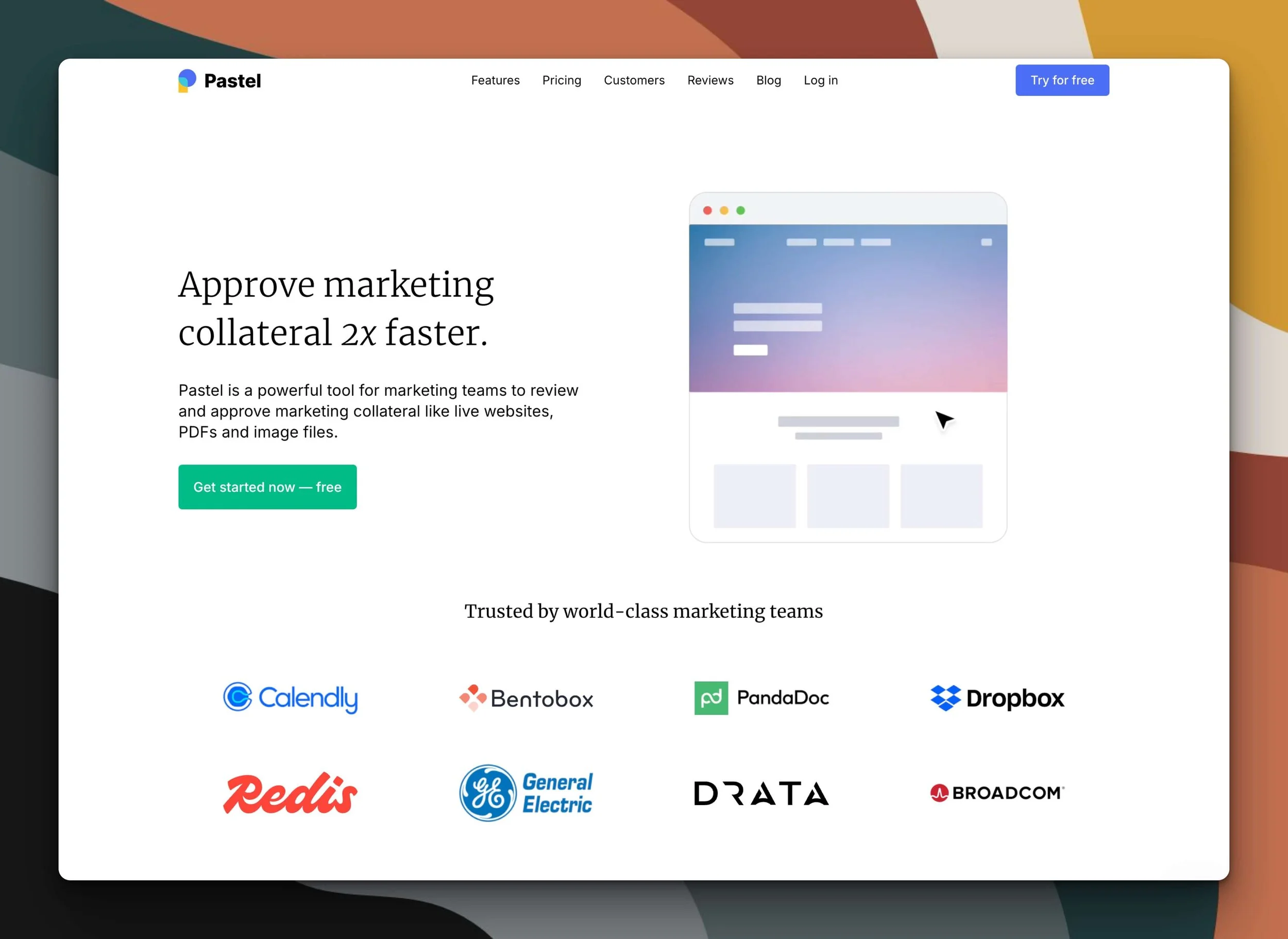
Pastel – A solo designer's best option?
This was definitely my first pick going into testing based on their flexible free plan, so let's see if it holds up in practice.
The Free Plan
Pastel immediately caught my attention with what might be the most generous free plan of the bunch (as of posting):
Unlimited canvases (meaning unlimited projects/websites)
Unlimited clients and guest reviewers
Unlimited versions for each canvas
For a solopreneur trying to keep costs down, this is pretty damn appealing. You can try it yourself at usepastel.com.
The 3-day/72-Hour Commenting Window
Here's the catch—and there's always a catch, isn't there? Pastel has a 72-hour commenting window. After that, comments automatically close.
This could actually be a positive thing for those clients who like to take foreverrrrr to provide feedback, because it creates a sense of urgency and prevents projects from hanging out in revision purgatory for months & helping us automatically reinforce that deadline.
The 72-hour window creates a hard boundary. You can send it on a Monday and it'll close on a Wednesday without you having to do a damn thing. The client has a hard deadline whether you're awake and at your desk or not. I kind of like that, honestly! Especially for designers using the 2-week website build process from Paige Brunton’s course, Square Secrets Business™️, because 3-ish days is about the most that will fit into that schedule anyway.
But if you need more flexibility, there's a workaround: just create a new Canvas for each revision round, with each round taking up to 3 days. Since you have unlimited canvases, this isn't a big deal. It's a little extra step, but not the end of the world. Again, this could help you define each revision round clearly & keep/hold a hard deadline for each one without enforcing it yourself (ie: closing comments in whatever way the tool will let you).
Want to know what that message looks like for both the account owner & the guest? Me too, so here ya go:
Account owner’s expiration message
Guest user’s expiration message
Pricing for Premium Solo Accounts
If you want a longer commenting window, you’ll need a premium plan, and those (as of posting) start at $29/mo, paid annually. They come with some upgrades though:
premium canvases (ie: no commenting limits)
file attachments in comments
export comments to CSV
Whether those upgrades are worth the price or not, will be up to you!
Testing Pastel In Real Life
The setup process is refreshingly simple. You hit "Create a canvas," click on "website," and paste in your URL. It takes a few seconds to load the site’s Canvas in the tool. Sometimes I needed to refresh the page, but that was the only minor hiccup.
What really impressed me is the simple client experience. When a client opens their shared Canvas link, there's an automatic tutorial that shows them exactly how to use it. YASSS! I don't have to spend 5-10 minutes on a Loom making a tutorial video for how to leave feedback comments. 🙌🏻 There's a popup with clear instructions: "Click anywhere to start leaving feedback. If you need help getting started, click here." And that button triggers a short video tutorial showing them how to use it. So convenient for everyone!
Pastel offers generic desktop and mobile views of the website in each Canvas, which is fine for Squarespace sites. I'd love more viewport/screen-size options, but I can live with just these two.
The comments are automatically grouped by page—a must-have feature for me—and there are status options per comment for tracking progress. There's also a "new version" button that could make managing revision rounds pretty straightforward.
Pastel Pros & Cons
✅ Pros:
Most usable free plan by far
Super simple interface that doesn't require a degree in rocket science to figure out
No bugs or weird glitches in my testing (so far)
Easy client onboarding with automatic tutorial built into the platform
Comments are grouped by page (a basically non-negotiable feature)
Takes screenshots of elements for each comment (though not for hidden elements, –more on that later)
Each comment includes an editable status, & details about how that area was being viewed when the comment was created (operating system, desktop or mobile, etc)
❌ Cons:
That 72-hour commenting window could be too short for some (though there's a workaround)
Only desktop & mobile viewport options (no option to see it for tablets or other specific devices)
No video commenting (that I noticed, but do I really need that? Not really.)
Canvas navigation bar is at the bottom of the window, which could be easily missed by clients
Canvas expired message says to contact the owner to upgrade, which is weird for guests to see
DO NOT TRY RUTTL
⚠️ Reportedly, customers are saying:
Ruttl would NOT accept (ignored) customer cancelations
Ruttl has kept charging customers even after managing to cancel, regardless of proof of cancelation
Ruttl removed customer’s access to their own account to make further changes
This is forcing Ruttl customers to do a chargeback via their bank or credit card to stop the charges.
Tool #2:
DO NOT TRY Ruttl – ❗️ This is your WARNING! (Seriously.)
BE ADVISED:
I’ve only tried using their no credit card required free plan myself, and it was unusably buggy.
At least 2 people have told me about their separate experiences on the paid plan and it was horrible. From refusal to stop charging, even after cancellation of their plan, and even Ruttl’s removal of their customer’s account access to update/change anything… both people had to go through their bank or credit card company to finally stop the charges.
So here’s your warning – do NOT try this option.
Their website looks legit, but their business practices are apparently questionable at best, illegal at worst.
Ruttl Pros & Cons
✅ Pros:
nothing / nada / zip –– DO NOT TRY IT
❌ Cons:
Does not work with Squarespace trial sites
Unusably buggy
Tool #3:
Workflow – Pretty, but new & basic on purpose
I didn't talk about this one in my previous post’s video because I didn't know it existed yet! Shoutout to the lovely people on my email list who suggested it after my first blog post on this topic.
The Free Trial
Workflow's free trial offers unlimited access to features for 14 days, and whatever projects you start (including guests you invite, I believe) during that window are free forever if you need to keep collaborating after that trial is over. To add new work (collect feedback on new assets) after the trial is over, you’ll need a paid plan at about $16/mo USD.
Specifically, they say,
“Your first projects are free
Create unlimited projects and invite reviewers for free. After 14 days, keep collaborating risk free. Upgrade only to start something new.”
Check the updated pricing details for yourself at workflow.design.
First Impressions: ...Damn, Ain’t She Pretty?!
I'll give Workflow this—it has a beautiful, clean and simple interface. It's very minimalist and that allows us to focus on the design itself rather than the software we’re using to evaluate & revise it. Aesthetically, it's a winner!
I actually sat down with Will Taylor, a Founder of Workflow, to discuss the platform, ask some of my questions & provide some brief feedback on my experience of the tool so far. He acknowledged that the terminology on the pricing page was confusing & that they’d planned to update it, which they have since that call.
What’s the ‘Workflow’ like?
See what I did there? 😂 Pun intended!
Two of my previous dealbreaker issues have been solved since originally posting, and the other is being solved & should be fixed soon too.
Adding assets (websites) for feedback has been slightly confusing, though not really a dealbreaker –it’s just unexpected behavior compared to similar tools like Pastel & Markup. When you need to add a new project to get feedback on, you have a task board to add any assets in various stages of progress –which is SMART! But at first glance, if you’re used to the way competitor tools work, you might not realize that after adding a project, you also need to add your assets in those statuses, which is where you’ll put the website link, or exported design file you’d like your client to provide feedback on. They’re working on a way to make this process a bit better, but for now (June 2025) that’s how it works.
Added/Updated in July 2025:
Workflow now takes automatic screenshots of the comments added to each asset, which is massively helpful in locating feedback on hidden elements, such as dropdown menu folders in navigation which only appear on hover, or the answers in dropdown/accordion style Frequently Asked Questions, etc. This is a welcome update!
Workflow also added the ability to filter the list of comments and group by page or screen-size, which is super helpful to organize a longer list of feedback on large projects –ultimately helping us work smarter and feel less overwhelmed as we move through them. For example, if there are 100 comments on the asset, it doesn’t make sense to bounce around fixing things on page 1, then page 9, then page 3, then page 25 ––eek! Now you can use these filters to see all the comments on page 1 & do those in a group, then move on to the next. Phew! 😮💨 Much better!
Workflow Pros & Cons
✅ Pros:
Beautifully simple interface
Generally reliable (not as buggy as Ruttl)
100GB storage limit with ability to delete projects & assets yourself to maintain that storage capacity
takes screenshots of comments, helpful for finding feedback on hidden elements
groups comments by page using filters
first projects are free forever (whatever is created in the first 14 days, ie: during your free trial)
❌ Cons:
No limited forever-free plan (example: can’t have 1 active project at a time for free, etc)
Slightly confusing project setup: add ‘project’ first, then add a ‘task’ with a creative asset in it (not a dealbreaker)
Possibly slower loading times compared to Pastel & MarkUp
Tool #4: bonus!
Webvizio – Almost a perfect replacement!
I found this one AFTER posting & making this video review, so check out the full review I did in this blog post & video for more details.
Suffice it to say that it may be the closest option to MarkUp in full-featured, non-buggy functionality –and it actually has more features than Markup ever had, including responsive browsing so we can test the site at different screen sizes. It also definitely works with password protected Squarespace websites.
Like Workflow, there’s no free plan for Webvizio which is unfortunate for sure.
BUT they were offering a 40% OFF forever plan making it at least the same price as Workflow, at around $17/mo USD. To grab the discount, you must have used my unique code: DAMN40 before April 15, 2025.
Tool #5: bonus!
Simple Commenter – A wildly different option!
This one is COMPLETELY different than ANY other feedback tool I’ve ever seen. As always, use their free trial first to see if you like it before making a commitment to a paid plan.
What’s different about this one?
Simple Commenter is primarily an overlay widget, but it also has a web application. 🤯
But that’s using web designer terms, so what do I mean by that?
Simple Commenter’s functionality is actually INSTALLED on the website itself, which means users aren’t leaving feedback on a separate application that’s loading in your website to another company’s web app ––it’s actually loading Simple Commenter’s app ONTO your website.
For Squarespace users/designers like myself,
While the website is still unpublished, you can install the widget to get feedback, and just send the normal draft link to your client. Simple Commenter lives on the website itself, so they don’t need a third party account or guest access to pin comments/feedback onto the draft site –even if it’s not published yet.
If the website is already live when using Simple Commenter for feedback, in settings, turn on the "Conditional Script Loading" setting so the tool will only load when visiting the page with the following parameter appended to the end of the link: "?simple-commenter=true"
As the account owner, you can log into their web app to see & review all comments, delete the info from a project, start another one & get the installation code, etc. ––but you can also manage the comments, leave your own, and more from the widget on the website draft. We have the option to use either (the web app or widget on the site itself).
For clients/guests, no registration is required for them to leave comments. Specifically, they say, “Is registration required for commenters, or can they leave feedback without signing up? No registration is required. Commenters can leave feedback as easily as annotating a PDF, without needing to sign up. However, with the upcoming associated comments feature, linking comments to users might require some additional considerations.”
Downsides/Disadvantages
When you’re done collecting feedback, you WILL have to uninstall the widget from the website before it launches.
It only works on websites, so you can’t use Simple Commenter on files like exported PDFs, etc.
What about pricing?
Simple Commenter has several options for different budgets! Here are those details as of April 2026. (please check for current updates on their website, they won’t be reflected here)
Agency:
10 users
Integrations
Webhook
Custom themes
Automatic screenshots
50 GB storage
500 MB per file
Business:
Everything in Agency +
25 users
500 GB storage
5 GB per file
Priority support and onboarding
SSO
Custom domain
Custom email domain
Whitelisting
Enterprise:
Everything in Business +
Unlimited users and projects
SSO / SAML
Advanced permissions + admin controls
Dedicated onboarding + training
Priority support with SLA
Custom contracts + invoicing
API access + custom integrations
Logs storage
API user provisioning
API comments endpoint
The Verdict:
After putting all three of these tools (reviewed in this post’s video) through their paces, here's where I landed ––but 4 of these 5 are great options!
🥇Pastel: Best free plan, simple, reliable, groups comments by page. Winner!🏆
🥈 Simple Commenter: the simplest to use, and my client really liked using it with me!
🥉 Workflow: Beautiful and affordable, but not great for anyone needing a free option.
🏅 Webvizio: Robust & feature-rich; no free plan available & may actually have too many features.
❌ Ruttl: NOT an option; questionable business practices with user-reported inability to cancel subscriptions & other bad/negative reviews.
For now, I'm going with Pastel &/or Simple Commenter, because they feel the easiest to use and had the least bugs/issues while testing. For Pastel, the 72-hour window isn't completely ideal for me personally, but the workaround is simple enough that it’s not a dealbreaker. For Simple Commenter, it seems as though I can only use it on draft sites since the widget would also display on the live site for the general public (unless I’m wrong about that).
Of course, your needs are likely different than my own. If you have different requirements or workflow priorities, you might prefer one of the others. It's all about finding what works for YOU. Please do your own testing & see which one you like best!
Other Feedback Options Worth Mentioning
Before wrapping up, here are a few other options I've considered or used in the past:
Google Docs: Simple, But Limited
Yes, you can use Google Docs for feedback, but it's clunky as hell and not very time efficient. Clients tend to struggle with explaining WHERE on WHICH page they want changes, leading to endless back-and-forth messages like:
Me: “Where exactly is this button you're talking about?”
Client: “The blue one.”
Me: “There are three blue buttons...”
Client: “The one on the right.”
Me: “The page has four sections with buttons on the right.”
🤦🏻♀️
I got really tired of that kind of endless clarification cycle, as you can imagine. If Google Docs is working for you, great! But for me, this approach was a total productivity killer, so I haven’t used this method in 6+ years.
Loom: Video Feedback Has Potential
A designer friend of mine swears by Loom for this purpose. You could ‘present’ the website in a video recording, walking through each page, and clients can pause and leave timestamped comments.
The comments are automatically timestamped in Loom videos, which tells you exactly where they were in the video when they left the comment. But it's not a foolproof system, because they might not stop the video fast enough, might forget to clarify which button they're talking about when there are similar ones on different pages, or think of something later in the video & not be able to find it so they don’t bother & leave the comment in a random place near the end.
It's not as precise as pinning comments directly to elements, but it's still way better than vague email exchanges. Plus, seeing and hearing your client if they opt to leave video feedback can eliminate some miscommunication.
Kitchen: For files only, but included inside a portal
Kitchen.co* doesn’t yet offer pinned feedback on website links, but they do work on files really well, and also include a literal “Approval” button per file that the client can use to let you know when that page is good to go!
To use this system instead of a third-party option, you can always use a free Chrome extension like GoFullPage, or a paid tool like CleanShot for Mac, to capture a full-page screenshot image of each website page, then upload those files into your Kitchen client portal to collect pinned comments on those images.
Downsides to be aware of (with video/image-based feedback methods)
The main downside of using either video (Loom, etc) or screenshot images of the website’s individual pages, is that the client doesn’t get to USE the website draft.
Specifically, they’re not clicking around in the draft, so it’s not interactive for them & they can’t:
see broken links because they can’t click on any links at all
see animations
test load times for images
test accessibility apps, if they use them for themself (to see if it works well with their screen reader)
test responsiveness of the pages on different devices to help you find issue that need to be fixed/addressed
Share your pick!
The design world never stands still, and neither should we. New tools pop up constantly, and existing ones evolve (or devolve, in MarkUp's case).
I'll keep testing and exploring new options for website feedback as I find them. Maybe I'll even do some tutorials on using these tools with clients once I've fully integrated it/them into my workflow.
If you've found another alternative worth checking out, drop it in the comments! And if you want to keep up with my client process adventures, make sure you're subscribed to my newsletters (people literally rave about them 🤩).
For now, pour one out for MarkUp.io's free plan—it was good while it lasted! But like every tool that pivots away from solopreneurs to chase agency money, we'll adapt and find something else. We always do! 😉