What's inside this post: Hide
If you’re wondering how to manage web design clients without wanting to scream into the void every time a file is misplaced or a conversation is lost in email purgatory—keep reading. After years of navigating through clunky softwares & processes, and experimenting with different tools, I’ve finally found the client portal system that just works.
But before we dive into why I've ditched my Notion Client Portal for this new option & why it's taken over my life (in the very best ways possible), let’s rewind a bit!
I’ve been through the wringer finding the right tools to manage my web design clients, and I’ve got stories—oh, do I have stories. HOURS and HOURS of trying & moving between softwares, researching which ones to test, and trying very hard NOT to give into shiny object syndrome...
From the highs of Notion’s customization to the lows of overwhelming interfaces (looking at you, Freedcamp), it’s been a wild ride, and one that's taken years. Quite literally.
So this is where things stand in 2025: I’ve officially left my Notion portal behind (*gasp!* I know 😱) for a different client portal tool and I’m here to tell you why it's my new favorite, plus how it might just save your sanity, too. 😏

⚠️ IMPORTANT NOTE:
CRMs and Client Portals are NOT interchangeable terms!
Check out the previous post & video to learn the differences between them & when to use what, otherwise you may be confused about the software roundup in this post.
You’ll need to know the difference BEFORE reading any further into this post & to make the best informed decision for yourself.
Finding the ‘Perfect’ Client Portal(for me)
Anyone who knows me knows I geek out over systems. I can’t help it—I’m a Squarespace designer and educator, which means I’m always chasing efficiency for both myself and my clients. I spent years using Notion as my all-in-one solution, helping me manage projects without a hefty recurring subscription cost. Notion is highly customizable and flexible, intuitive (compared to competitor apps like ClickUp), and generally helped me get my shit together.
But here’s the thing: as my workload (project size) and client expectations grew, Notion started to unravel in a few key areas. The lack of built-in features like native feedback tools, bulk file sharing & management, and real task management eventually forced me to duct tape together multiple solutions across several different apps, –which worked just fine... until it didn’t.
After enough frustration with my own systems, and an increasing desire to simplify & cut down on tedious details, I finally set out to find a system that would be just as easy for clients as it is for me.
Don't get me wrong –my Notion Client Portal system is STILL beloved by many, –not just by myself! As of posting, I've sold my Notion portal template to 110 happy customers and made over $15,000 from sharing this one templated system with other creatives who are constantly sharing their positive feedback with me. While they may not choose to implement all of it, they always walk away learning a LOT just from the tutorials & insights that come with the template.
So I'm NOT dissing Notion itself, either. I still love it and I still use it for OTHER things! I wasn't looking for perfection. Ironically, I was craving simplicity & a bit more rigid structure, –the very opposite of what I'd wanted when I created the portal in Notion to begin with. 😆
Curious how I build custom websites in 2 weeks? Check out this post where I walk through my 2-week website process day by day, milestone by milestone.
The Portal Alternatives I Considered
There’s no shortage of software tools promising to magically fix all your problems. I found and tested or researched 22 platforms (yes, I said twenty-two 🙃). Some were promising, others had me closing tabs faster than a victim runs from the killer in the movies.
Here’s the shitlist– er, I mean shortlist. 😉🤭
Basecamp:
Affordable Portal, but Limited Task Management
Basecamp actually surprised me! I had written it off as absurdly expensive because that's always been the rumor, but they now offer a free plan and a more reasonable $15/month plan, which is a total steal compared to their next plan up at around $299/MONTH.
The messaging and office hours feature? A solopreneur’s dream. But the task management—ughhhh. It offers task management in two separate areas for List &/or Kanban –as in, you can put info in either type, but they are totally separate from each other, and neither has the task detail I’d be looking for.
While the task Lists (To-Dos) are like a super simplified Asana list, the Boards area is closest to Trello...and yet neither of them will feel all that familiar to Trello/Asana users. Task lists can use a templated system so new projects wouldn't require you to recreate all of the tasks for each project, but the Kanban style doesn't have access to that same template system for new tasks, and neither had much room for task details like custom fields or subtasks with date, status & assignee details.
Verdict: For a web designer managing intricate project timelines, possibly multiple projects happening or being booked at the same time, and managing revisions, file sharing, communication –etc between them all, Basecamp's task management limitations felt glaring. Like, the creators just skimmed a task management 101 book... but didn’t read the advanced chapters. For $15/mo, it's not a bad solution if you WANT simplicity in your task management & like their other features, but I'd never pay more than that for it.
-
Focus & notification management: There’s two separate ares for you to decide how you want to be notified about activity happening in the platform:
– Focus Mode ON/OFF (like Do Not Disturb, but just for your Basecamp account), and
– Office Hours for notification settings (tell Basecamp when you want to be notified and when you just want to be caught up on everything that happened since you last logged in before the weekend.My Stuff, home views & top nav make it easy to find or get an overview of anything that’s YOURS, from assignments to bookmarks, schedules, activity, etc.
Messaging AND Message Boards. There’s both a message board/announcement-style area, and a chat area. You can use both or either in any project for different reasons.
File Sharing is pretty easy and you can link to a lot of external stuff like Figma files, Google Docs, and more, –seamlessly connecting the dots between your varied toolsets. Learn more about how those work from their help doc here.
Event Calendar features make it easy to add project milestones, events, out of office dates, and see tasks with assigned due dates all in one calendar space that’s sharable with the client. Learn more about this feature update here.
Automatic check-ins: great for managing clients & making them feel very supported. (ie: send ‘how’s the homework coming along?’ 1 week before project starts, or send ‘how’s the website launch going?’ one week after launch)
Client-facing help documentation: they know we’ll be using this tool with clients so they’ve already written help docs we can give our clients. Read through them here.
-
Task management, in my opinion, is so basic it’s abysmal. Splitting the views of tasks between EITHER list or kanban view and separating them like that is terrible in itself, but to also give each version of task management different feature access? 🤦🏻♀️ Don’t expect either to give you what you expect, if you’re coming from actual project management tools.
Pricing: it’s a recurring subscription and even though it’s an affordable rate, —aren’t we all sick to death of needing another damn bill to pay? 😬
Bad historical reputation: I invited a friend to demo the account with me while I was testing it and she was HORRIFIED that I was thinking about using it. Not because she’s used it recently, but because she had past horror stories using it 5 or 10+ years ago in her past business life. 😂 I suspect a lot has changed since then, but the fact remains that clients could have a sour pre-existing opinion of it.
It’s not also a CRM, so you’d still need something to send invoices & send/sign contracts, take payments, make & send forms, etc.
Bonsai*:
CRM + Portal Duo That Almost Won Me
Bonsai comes so close to being a one-stop shop for freelancers. It seamlessly combines a solid CRM and pretty great client portal, making it easy to manage contracts, invoices, tasks, and even time tracking, among other things. For between $9 - $49/mo, you can get it all in the same tool, which is an award-winning combo. Most new designers would be fine with one of the $30/mo (or under) plans.
Their internal task management was solid with nested subtasks (rare!), file attachment options, great time tracking, and magic-link login for clients entering/using the portal features with us. (Read: no password required!)
But here’s why I couldn't commit: Bonsai’s automations and CRM tools still just can’t compare to Dubsado (my CRM of choice) and switching to Bonsai from Dubsado —when Dubs’ locked me into legacy pricing— would actually cost me more than Bonsai, but for fewer features.
For someone like me who's knee-deep in systems that require higher-level features like customized contracts, the ability to use public proposals like order forms, use custom code styling &/or embedded videos in forms, and a litany of automation options, –Bonsai just gets a Silver medal. So for me, it's not the solution, because I can't just use the portal in Bonsai and the CRM stuff from Dubsado; with them both being full-fledged CRMs, it's a “no” for me specifically, but may be worth a look for you!
Verdict: If you don’t already use a different CRM like Dubsado or Honeybook that you love, Bonsai’s all-in-one options are a serious contender, especially for freelancers building service-based businesses from scratch.
For more on how CRMs compare to Client Portals, check out my detailed breakdown of the two.
-
Task Management is actually great!
I used a free trial to setup & test the Client Portal features. The task management features alone are very good for a CRM and blow Dubsado’s ‘tasks & boards’ out of the water. Though not still not quite on par with apps like ClickUp, etc., it’s still pretty good & tasks have about 3 levels of nested detail (subtasks). Task details open in a ‘side peek’ like Asana’s do or Notion’s can, and subtasks can have their own details (description, comments, dates, assignees, etc.) including their own subtasks. Viewing the project’s tasks, or All Tasks across all projects, is also a great must-have feature to see the progress of all your active projects. The All-Tasks views don’t quite hit the mark for me, leaving a little to be desired in customizability, but still function very well for the purpose.Client Collaboration seems easy.
Clients can log into the portal area to collaborate with you, using just their email & a magic link sent to that address (no password necessary!). They can also comment, message us, add files, and engage in other ways too. The dashboard design when they log in seems clean, modern, & simple. More on their client collaboration details here.A full CRM:
Bonsai is already a full CRM. So, along with all of their task management options within their project management features, you can also track & report billable time in tasks, send forms (proposals, invoices, contracts), allow ‘live chat’ or Slack style messaging with clients per project, and more within their system alone. You can also use their Bonsai Tax add-on plan to get help with filing taxes for your business, it seems; though I’ve never tried it & have no idea how that part works, the tax management option seems like a really nice-to-have bonus!Really fun to use! I really liked the user experience, both for myself & for my test clients (also me 😂)! The design and user-interface of this platform is very modern, clean, and easy to navigate if you’re at all familiar with how platforms like this work. It’s customizable enough, I picked it up quickly without needing to contact support for help along the way.
-
Feature crossover:
While Bonsai is a very robust CRM option that I genuinely enjoy using & also recommend, it’s still lacking some features Dubsado has that I’m actively using in my current stage of business & don’t wish to have that crossover. I can’t imagine how to easily use Client Portal features in Bonsai (which Dubsado doesn’t do well at all) and more advanced CRM features in Dubsado that Bonsai lacks altogether.Doubled cost if not exclusively using Bonsai:
If I can’t leave Dubsado yet for Bonsai, then in order to use both I’d have to pay for both. With as much feature crossover as there is, this just seems both incredibly overwhelming & inefficient from a budget standpoint. It seems silly to pay for 2 softwares that do exactly the same basic things (invoicing, forms, contracts, task & project management, scheduling, time tracking, etc) when you’re only using some of both platforms. It’d be tedious to set up x2, and hard to manage longterm, not knowing which software to do what in, because you can do a lot in either. 🥴
CoordinateHQ:
It Did the Job but Didn't Love It
CoordinateHQ’s portal features were just okay. —It felt more like that hole-in-the-wall café with good/decent coffee, but has a seriously outdated exterior/interior that makes you think twice about coming in to place an order. The functionality was there. I could manage project task lists, update timelines, and organize client feedback, message clients & collect files, but... it felt old. Like, Netscape-old. 😬 (IYKYK)
I could’ve looked past its lack of aesthetic appeal, but even the straightforward task management came with some hiccups. The interface often felt a little unintuitive because it was so dated.
And the price? Honestly, at $25/mo-ish, it cost way more than it should for what it offered vs what it looked like on the inside. At that cost, I’d expect more visual polish. 🤷🏻♀️
Verdict: For all of its good intentions, CoordinateHQ just didn’t spark joy when I was in there and I didn’t see enough value in the tool to justify its recurring cost. Functionality matters, but so does usability and design—two things our clients tend to specifically notice when dealing with new & unfamiliar ‘software’. It left me hoping for a tool that matched the joy my web design brand is known for.
-
Task Management is good enough, but not great.
The task management functionality is good enough if you get creative with how you organize project tasks using groups & subtasks, and maybe forms from apps like Tally or Dubsado to collect more in-depth information. Tasks also have unique features in Coordinate, like setting a task-specific CTA that will make knowing the main goal for each task VERY easy for our clients, on each task.Very little feature crossover!
Coordinate does have basic ‘forms’ functionality, but not on the lower tier plan ––so there’s very little that Coordinate does which your CRM also does, meaning you can just have your portal here & just have your CRM elsewhere, or not need a CRM at all I guess?Collaboration & Communication:
It has client messaging per project, and apparently that area also brings in comment threads from tasks so you can see all ‘messages’ in the same area for each project. Clients can also easily login to access all of this content. More on this here: https://coordinatehqhelp.zendesk.com/hc/en-us/articles/30268047701395-How-can-I-view-the-project-plan-as-a-collaborator-clientInvite clients & contractors for free.
Only pay for however many of our internal team members to use it with us, meaning clients & contractors (not employees) can use this portal for free along with us!Decent free trial time for set up & testing.
You can set up your account completely on the 30-day free trial and even invite your clients to use it with you, without paying or putting in your credit card information. Once that trial is up though, you’ll have to pay to keep using it.
-
Outdated UI:
The user-interface is a bit ugly & outdated looking –not gonna lie– but because it looks ‘old’ it’s also somewhat familiar, simple, and easy to figure out/learn how to use fairly quickly. Comparing the design style of using the platform, it feels 10 years older than Bonsai’s & so it’s much less fun to use & requires a few too many clicks when adding/editing tasks.Subtasks are too basic.
Tasks have subtasks in the form of checklists like Trello’s, which means subtasks can’t have their own details (due dates, assignees, descriptions, etc), so there’s also no nested task → sub task system.Cost is too high.
I only tested features on the lowest paid plan, and while they would work well enough for my use-case, I felt like the cost is a bit too high for what each plan includes, especially considering its outdated UI design, in my opinion.
Assembly*:
Really intriguing, an almost-there option
(previously called CoPilot, renamed in 2025 to Assembly)
Starts comparably priced with Dubsado or Honeybook but actually has a good client portal built-in, so using something like Kitchen.co* alongside it isn’t necessary. Its CRM features are somewhat basic on some levels and more robust than their competitors’ in others, so whether it addresses your pain points or not will depend on which ones are most painful for you.
If you don’t like Dubsado/Honeybook/Bonsai, have a healthy budget, and want something that feels simpler, Assembly might be worth exploring.
-
Client vs Company distinction
Clients can be individuals, or multiple clients can be tied to an overall company, and companies list all the clients in them.Internal & Client Messaging
There are several chat options. You can send a message to a single client, a team member, a group of clients, or even all clients or groups of clients at once.Services Storefront
An optional shop-style list of available services & pricing for your service packages, and it can be added to the portal for a self-checkout-style interaction from your clients.Task Management
Basic task management is baked in with views for my tasks, team tasks, client tasks, and an all-tasks view. Tasks can have unique client visibility set per task and include subtasks, task details, due date and status, attachments, and comments, and show an activity log.Customizable Portal Access
Sharing portal access with inquirers before they become a client is an option. This could be helpful to invite a potential lead into a portion of the portal with limited access before they’ve booked anything, which could include access to the storefront, a scheduler, a custom welcome page, etc.AI Assistant
The built-in AI is available to help with questions and summaries and drafting invoices, forms, contracts, messages, and more.Active Development
The team is actively working on improvements & is open to our feedback, which is always great!
-
Steep Pricing
Their pricing starts affordably, but becomes very steep in the mid-tier option & higher at well over $100/mo, practically pricing out newer/smaller businesses. Their plans are also largely based on how many clients you work with in the tool, which potentially means careful regulation internally for removing bad-fit leads that you don’t want to become clients (so you don’t ‘pay’ to manage bad leads).Contract Editor
Editing & updating contract terms in Assembly is not as smooth as competitors’ methods, as the terms themselves are edited externally (such as in a Google Doc) & uploaded as a file, with variable & input fields manually placed in the blanks you created while editing the document. This means editing an existing contract in Assembly isn’t an option, forcing you to go back to the original for edits, re-downloading, re-uploading, and replacing those variables & input fields.Payment Plans & Schedules
While invoices have a subscription option, one-time invoices lack flexible payment plan options, meaning large invoices must be split into multiples with 1 per payment in the plan if a payment schedule is offeredForm editor
The internal form editor is really basic, so for anyone coming from Dubsado or Honeybook, you’ll likely feel a bit disappointed with the available options.
Other Options That Didn’t Make the Cut (for me)
And, the others—a mix of promising contenders, overlooked gems, and outright “NOs”.
Let’s rapid-fire through some of the other tools I considered while I researched my options:
-
Pretty interface, but the pricing had me running away screaming. Apparently it thinks it's a CRM, Client Portal, Email Marketing, –and more...? I guess they’re trying to be like a version of Keap/Infusionsoft. 😒🤷🏻♀️
-
This only works on WordPress sites, so as a Squarespace-enthusiast, that's immediately out.
-
If you're earlier than the portal stage and still trying to actually get content out of clients, that's a different category.
Content Snare is a client onboarding platform used by web designers, accounting firms, and marketing agencies to gather website content, brand assets, sitemaps, and intake info from clients.
It's a monthly subscription (not a one-time payment), so it doesn't compete with Kitchen there. It sits a bit upstream of the portal stage in the content-collection phase, and I have heard good things about it from their users, though I’ve not tested it myself.
-
🔗 Copper
This is just a basic CRM overlayed in your Google Workspace email inbox. It doesn't seem to have any client portal functionalities like I'd be looking for, and I have no idea how it manages other features a CRM typically has.
Read this review if you don’t understand what I mean by overlayed in Gmail, and want to learn more.
-
The UI sent me into a panic —clunky, dated, and overwhelming are not vibes I want to share with clients— but hey, it's free! 😂
-
🔗 Bloom
🔗 Moxie
🔗 Indy
While these 3 are all reputable up-and-coming CRMs with great modern user interface designs, decent & affordable pricing mostly well-under $40/mo, & all have modern & relevant feature sets, –they can’t integrate well with the tools I'm already using (or had too much crossover features with Dubsado specifically, and I'm not changing CRMs).
I didn't set up/create free accounts in any of them because I'd already done that in Bonsai & decided I can't use a client portal that's part of another CRM if I’m not also switching CRMs, which means all 3 of these are out for the same reason Bonsai was, –all 4 are also CRMs.
That said, if YOU don’t already love your CRM, or don’t have one yet & want one, then these 3 are very popular choices and modern competitors with Bonsai, Honeybook, and Dubsado.
-
🔗 Dubsado*
Great CRM, but its built-in portal, scheduling & project tasks features suck ass & totally feels like a “meh” afterthought compared to its other features. Those features are fine to use for brand new businesses, but once you begin to scale you'll need the proverbial “more”. The rest of their features are the best in the industry, even if the UI is a bit dated by comparison.
-
🔗 Elotree
It’s an interesting, brand new option that I actually did not cover in the accompanying video for this post, because I just found it the day before posting; I created a free account because at Free Forever or $8/mo why not test it out IF it looks like the graphics displayed on its website?
Turns out the inside looks absolutely nothing like the UI graphics on their website... which left me feeling disappointed, and I quickly found that it lacks a lot of the customizability that I'm used to in Dubsado’s forms, –but it does appear to offer a LOT of features & reporting which is really nice to see & that’s something Dubsado doesn’t offer much of (reports)!
-
Has a limited-use free plan, but everything I'd wanted was locked on a paid plan that cost nearly $500/year. I did create a free account, but quickly abandoned the effort of trialing it when I realized how limited it was & how completely unwilling I was to pay that rate.
-
It's totally free –in that they don't even offer any paid plans anymore, but it's also not exactly the kind of portal I'm looking for, though it has some portal-like features. It seems more about creating a project brief and collecting the info for that, vs collaboration during an active project.
-
Also a great CRM, but they're almost doubling their prices* –and again, I'm not looking to downgrade my CRM. Honeybook is great and all, but it still can't top Dubsado's customization & automation options. 🤷🏻♀️ (Honeybook wins on being the more attractive UI though, for sure!)
*Check the screenshots in the comparison table below to see the pricing changes announced in 2025.
-
🔗 Hubflo
Good intentions, –but their price tag nearly made me spit out my coffee. –No joke. Clearly made for enterprise solutions or larger agencies with more feature needs than I would ever need as a solopreneur.
-
It seemed solid, but was definitely on the most-expensive side at the time of this original posting (Feb. 2025). At the time of my original review, they were too expensive to consider recommending for smaller, newer business owners.
Since then, it appears that they’ve changed a lot of things about their pricing & more, along with their brand name, and may be worth another look if you’re interested.
-
🔗 Moxo
At this point, I began to check the pricing pages FIRST, and Moxo didn't bother to list any prices at all... so I moved right along...
-
Really modern and clean UI design, with task management and client collab features, but it's mostly task-focused and seemed to lack some of the features I was looking for like messaging & file sharing. I don’t think it’s actually a client portal, but instead is more of a collaborative task-management system with an added focus on money-management for budgets & time-tracking, etc. Still interesting, but not solving the problem I’m looking for right now (client portal).
-
Seems new to the game, but not yet mature enough to meet all my needs, –and again, it seems a bit too expensive for what it offers.
-
Tezzera was created by web designers, for web designers, but I think it may work well for anyone who wants a CRM that offers a Flodesk like interface.
It’s simplistic yet powerful in what it offers, even in this earlier Beta stage, and should launch with reasonable & competitive pricing. It does include a portal and decent internal task management, which means that it’s so far looking like it could be a serious competitor for its competition!
Their trial is a month long & cost $5, so it’s not free, but that does give you a lot of time to decide if it’s the right fit for you, before you need to make a financial commitment to it.
The laundry list of tools I tried felt a bit like speed-dating. Some apps wowed me at first glance, but after a deep dive, they lacked the essentials to have a fun &/or meaningful conversation on that date. 🤭
If you’ve ever been in that “too many choices” spiral, –you’re not alone. It’s overwhelming to digest that much information, but once you find the right fit, the mega-absorption is usually worth the search! That's why I made you this handy little comparison chart of my research in its simplest form. 👇🏻
You came here for the comparison chart, ...right?
KEY:
💲 = a range of roughly $20/mo (+/–), per $ icon
–– = in Price (Min.) means there’s a useable free plan
❓ = in Price (Min.) means there’s no prices listed
* = after the name means the Link will be an affiliate link
Pricing, Crossover, and Free Plans
PRICES
Many of those apps listed have high subscription costs, but either
they don’t do as much as Dubsado does (or what most CRMs commonly do),
or it doesn’t do enough of what Dubsado does (or what most CRMs commonly do) ––for their price point
That made it easy to rule out a bunch of them, because you hopefully don’t need/want to pay for multiple apps that do the same types of things as part of their main set of features. For example, I already have Dubsado and Quickbooks Online so I don’t need another software that can send invoices & take payments.
CROSSOVER
Commonalities in comparable feature sets is something I call “crossover” and my definition of that is:
DEFINITION:
a feature or set of features between one or more softwares that are nearly the same, to the point that you could use either software for that purpose.
Obviously, the goal would be to have/pay for as few tools as possible that have crossover (can do the same types of things). Otherwise, not only are you losing money paying multiple times for the same types of features/tools, but eventually it will become confusing for you to decide where to do what in each tool if more than 1 of them can do the same set of things.
FREE PLANS
🤔 Some of the options listed do have free plans available with no time limit (ie: not the same as a free trial). However, not all of those free plans actually seemed useable in real life scenarios.
🫤 Several of those free plans did not include the kinds of features most business owners would want/need access to, gating access to them via their paid plans, which means you’d be more likely to upgrade to a possibly hard-to-swallow subscription cost in order to get the most out of it.
😬 Apps (like Freedcamp, specifically) just felt totally confusing & overwhelming to be in there, despite it being actually free and having the cheapest price range on all of their subscription plans (including their Enterprise plans).
COMPROMISES
As with all things, you win & lose some things so there’s almost always a compromise made somewhere, when you research tools like this.
Ultimately, I think I’ve found an option worth actually using (despite its cons), because the pros seem to far outweigh any compromises.
To get my opinion on whether it’s smarter to choose a best-in-class or all-in-one app/software, read this post next:
Each option I checked into made me MORE confident about the one I kept falling back on and —most importantly, deciding what I actually needed vs wanted in a client portal.
Funny how trial and error can sometimes teach you exactly what you want by showing you what doesn’t or isn’t working. 🤭
Why I picked Kitchen*
This tool wasn’t initially on my radar. I stumbled upon it after what felt like infinite late-night searches & reading other people's blogs, software reviews, etc.
Kitchen was originally made by a web design agency for their own clients, so it’s been battle-tested in real-world scenarios for over a decade. When they finally released it to the public in 2021, they knew it was something the creative world desperately needed: a refreshingly useful collaboration tool for creatives.
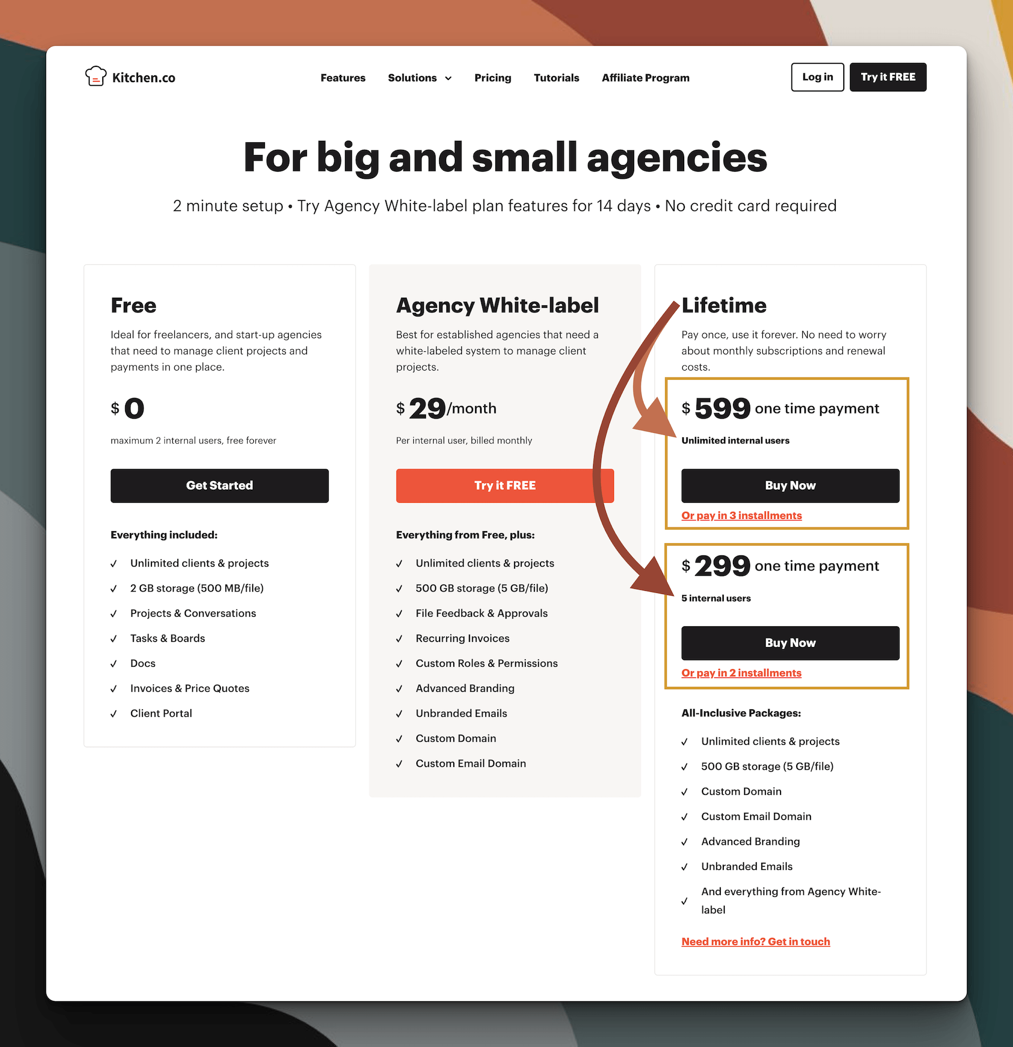
2026 Pricing Options
1. Pricing Without the “Subscription Burn”
Kitchen’s pricing sealed the deal. First, the fact that they have a no-credit-card-required free trial is really helpful, but what makes them the real winner? A lifetime plan for a one-time payment of either $300 or $600 (split into two installments if needed!). That’s it. No recurring fees, no forgetting about auto-renewals that drain your bank account, no eye-roll at yet another subscription cost. It’s hands-down the most budget-friendly portal I’ve seen for what it offers, and the ONLY option out of the 22 I researched that doesn't have recurring fees.
To clarify: there are 2 prices listed in the Lifetime plan for different size teams. Guests are not considered “internal users” so we pay for the size of OUR team, not how many clients will use it with us.
It's a $599 one time payment for "Unlimited internal users" which means you can use it with a growing team of employees, contractors, assistants, etc, beyond 5 people, –that’s people YOU employ or pay to work with you (guests are not internal uses).
It's only a $299 one time payment for up to “5 internal users” or people on our internal team (again, guests are not internal uses).
2. Fully White-Labeled Everything
My clients don’t hire me to learn new software. And nothing irritates me more than clunky software that looks like, well, clunky software because it doesn't feel fun or easy to learn how to use —for my clients.
Kitchen makes white-labeling effortless, though. From a custom URL where our clients log in, to branding customizations all the way down to the logo, colors, and button shapes, the portal feels like part of my own website. Clients log in and get to use a simple, no-frills interface that reinforces my brand, —not some third-party tool's.
So, when I realized how far Kitchen lets me re-brand the entire portal—I was sold. It's seamless, and my web design clients probably assume the portal is just part of my website magic.
3. Essential Features That Just Work
Here’s a taste of what Kitchen does and why it clicks:
Messages: Slack/Voxer-style messaging where clients can even leave audio notes. I mean... need I say more?
File Uploads: Drag-and-drop simplicity, customizable visual cues to organize the content (folders, names, privacy levels, colors & icons, cover images & more), along with the ability to lock files until invoices are paid and larger file size limits, make this an easy yes!
Feedback & Approvals: Clients can pin comments directly onto uploaded files. Approvals are visible at a glance.
Task Management: Includes both list, calendar, and Kanban views with optional customizations for status changes & even backgrounds. Simple, yet effective. Their lite task management helps us cut out the clutter by only giving us the features we need to satisfactorily manage the tasks without getting buried in 'neat features' we don't need.
Embedded Tools: From adding our online schedulers (Cal, Acuity, or Calendly, etc) to Google Docs or Figma files & Tally or Dubsado forms, you can bring many of your external tools right into your project in Kitchen.
These aren’t just features—they’re solutions that make daily work on big/detailed projects feel much smoother for both me and my clients. It’s robust enough for web design projects without being "too much" for smaller setups, —or our clients.
4. Designed for Client Simplicity
If I had to pick the ultimate win of Kitchen, it’s this: my clients love using it with me!
When my clients log in, all they see are their projects—and nothing else. Notifications are customizable for each of us without being overwhelming (–I'm talking to you, ClickUp!), so I can guide them into turning off any duplicate or unnecessary notification updates while just focusing on what’s important.
They log in however they want (with or without a password—up to them!), see their projects neatly laid out, and can pretty much just figure it out themselves because it's that easy. Especially if you send a tutorial video when you invite them to use the portal with you, that gives them the lay of the land before they actually log in.
My clients feel confident using the portal and I can focus on the actual design work instead of playing tech support while helping them get me the content I need just to do the work.
Kitchen has ALREADY been a game-changer in the services side of my business! It’s weirdly funny & slightly satisfying to say that my client's success now starts in my "Kitchen." 😂
The Client-View Experience
Easily seeing the Kitchen portal from my clients’ perspective just reinforced my love for it, because I was confident in knowing how they'd experience everything. Instead of feeling bombarded with cluttered interfaces or decisions to make, they get an intuitive space. Tasks are clear, files are neatly organized, and messages flow naturally.
I know this, because you can 'impersonate' any client added to your Kitchen account, in order to see their access points, assets & tasks, etc the way that person (not you) actually would, —without logging out & logging in as them, and without opening an Incognito window to log in as them in a different/private browser. It makes testing your new setup A LOT easier/faster/simpler.
Onboarding clients is a breeze, too. I’ve made how-to guides within Kitchen, and embedded tutorial videos via Loom, directly into their portal so clients don't have to open another app or link if they need to reference those things.
Recreating Key Workflows in Kitchen*
Here’s the thing about switching tools though: it’s not just about moving all of your stuff over—you also have to reimagine how things will work in the new space. It’s like moving houses. You don’t just plunk the couch in the exact same spot; you rethink the layout for maximum comfort (and plugin access –let's be real).
With Kitchen, I didn’t just replicate my Notion workflows—I adjusted and improved them, getting rid of anything that wasn't used as much to declutter things that weren't 100% necessary.
Here's how I tackled it:
Identify the Essentials: First, I listed out my must-have parts of the process. For me, this included:
Tracking project timelines (tasks)
Managing client communication (messages)
Gathering file uploads (files)
Organizing design feedback (files, or 3rd-party software)
Test One Feature/Process at a Time: Before committing everything, I created a free trial & created a sample project in Kitchen. I tested task creation, file sharing, and tasks to make sure everything worked like I needed. This test phase cut down on hiccups before fully migrating & deciding to pay for the software.
Adjust for Simplicity: In Notion, some of my portal details had grown to “Frankenstein” status—layer upon layer of overly complex databases and templates. I used the switch to simplify.
Templates: There are several areas in Kitchen that can use templates, including saved replies & templatizing folder systems. I needed to set up what I could & test the duplication process to find any bugs. For example, if I make a Project folder a template, does it just duplicate the structure or does it also duplicate the tasks & files inside it as a starting point? I also wanted to type up and save a message that can be pasted into the Invitation message that comes from the portal so I don't have to type it every time.
Test everything: After I had what I needed set up, I created a "client" profile with one of my email addresses and testing EVERYTHING with the impersonation ability. Uploading files, adding or editing (changing statuses) tasks, sending messages, what did those notifications look like, what could I see in the various menus, what happens if I add a new page to their project folder, will they have automatic access or will I need to invite them, etc.
Setting this up & making some changes where I needed to, wasn’t just about working smarter—it actually made me feel lighter about the process itself. Now, not only is it easier for my client, it's also easier FOR ME.
Sometimes we don’t realize how cluttered our old tools are until we take a step back and start fresh somewhere else. If you’re toying with the idea of improving your client workflows, you might enjoy my tips in this blog on setting up client-first systems in Dubsado.
Should You Try Kitchen* too?
If you're like me, you’ve probably spent way too much time wrestling with tools that just don’t do the job. Setting up a client portal for creative work feels simple in theory: one place for communication, files, and timelines. But that “one place” often turns into a patchwork of apps—each one fixing a gap the others left behind. (Trust me, I've been there.)
After kicking my Notion portal to the curb, I’ve settled happily into using Kitchen both quickly & easily, —and it just works. But should you make the switch? Let’s break it down.
Who Kitchen* Is Perfect For
Kitchen was absolutely made for web designers, branding experts, and creatives who run service-based businesses. It cuts through the noise and lets you focus on what matters. If any of these sound like your current situation, this tool might be what you’ve been hunting for:
You’re drowning in tools. If your workflow looks like Trello for task management, Slack for messaging, Google Drive for file sharing, and… you get the gist—it might be time to simplify.
Your clients get overwhelmed. Maybe they’re not “tech people.” Explaining how to navigate your portal feels like teaching rocket science to an artist (—not gonna happen!). With Kitchen, the setup is so intuitive, even your least savvy clients can figure it out.
You’re scaling your business. Managing two clients with a DIY system is fine. But if you’re stepping into the arena of juggling five, ten, or twenty creative projects at once, you need a tool that grows with you and maybe Kitchen could be a Robin to your Batman.
You want a professional edge. Kitchen lets you brand the portal as your own (like putting your logo on the software & making sure emailed notifications come from your address), making you look polished and put-together without paying developers to build a truly custom app for you —but your clients won't know you didn't shell out thousands to make their client-life easier. 😉💁🏻♀️
Whether you’re working solo or with a small team, Kitchen delivers exactly what a web designer’s client portal should: simplicity, clarity, and efficiency. And the best part? It doesn’t break the budget doing it.
Free Trial & Paid Plans
This is one area where Kitchen really stands out, especially if you feel like you’re drowning in subscriptions (can relate!).
Free Trial: You get access to all the features on paid plans, like task boards and messaging, set it up & see if you like before you’re required to pay for continued access. No credit-card required!
Lifetime Paid Plan ($300, 1x): For a one-time or two-time payment, you unlock everything Kitchen has to offer. No monthly charges creeping up on you, no surprise renewal fees— and you can customize everything too.
If you’re curious about other budget-friendly options for freelancers, check out my roundup of affordable tools for designers.
Pros vs Cons:What’s the catch?
REMINDER: Kitchen is technically not a CRM, IMHO.
If you truly want JUST the basics, you've tried traditional CRMs before (like Bonsai, Dubsado, Honeybook, etc), and hated using them for some reason, —then yes, using Kitchen as a very basic CRM will still be lightyears better than using Squarespace’s Projects features (invoicing, etc), for example.
Not sure what I mean by that? Here’s my opinion of Squarespace’s attempt at adding CRM-adjacent features.
If you’re still undecided, read the pros & cons list below.
-
OVERVIEW: Kitchen does everything I’d wanted a client portal to do, and only a few things I didn’t really need (because Dubsado can do them too). The UI is simple and surprisingly customizable, and the layout is flexible enough to use on a range of projects. Best of all, it does NOT have a subscription; they offer free basic plans or lifetime payments instead, and you get access to future updates. And support has responded to my questions within 1 business day!
Nested folder system
The organizational system of projects feels, looks, and works exactly like a computer’s file system with nested folders to organize however many levels of tools you need for each project. Alongside that, you also have separate views for ‘All Tasks,’ notifications, Clients, etc.Basic task management
It’s simple but effective, and you should feel fairly familiar with Kanban, list & calendar views per task board page. Tasks have basic subtasks, commenting, file/attachments, dependencies & blockers, very basic milestones & time tracking, assignees, start & due dates, and custom fields.File Uploads & Sharing
Create as many file folders as you need, and allow clients to upload files if you want. The file size limit on paid plans is 1GB per file, giving us lots of flexibility to accept larger files for content. On the free plan it’s just 10MB per file. We can create folders to organize the folders, and each folder can have its own permissions. Not only that, but comments work like Markup, allowing either party to pin the comment to a particular spot in the image AND allow either party to approve the image. Approved images are also clearly marked in the files list!Granular Access Permissions
You can invite clients to the space AND control what they can edit within it, getting pretty granular if you need to. For example, clients may be able to see & comment on tasks but not edit them (change statuses) while still being able to upload files to the tasks, which means you control when the task status is ready to be changed. Or, you can allow clients to create & edit or just edit & manage tasks, giving them more control & allowing them to change task details like the status as they complete their assigned work.Messaging
The messenger, or ‘Conversation’ area, within Kitchen can be added to any project as needed, and messages can send email notifications to clients that they can respond to via email—and that response will still show up in the portal! So they don’t actually have to be logged in to reply. 🤯😍 Not only that, but if the message contains a request, we can easily turn that message into a task for that project. Files sent via messaging can be viewed in a collective attachments area. ––You also have a few seconds to “Undo” a sent message, can control message signatures (that show up in the emailed message notification), and can even set a message to send later, &/or record audio messages rather than typing one. See how it works here.Client Profiles & Logins
Each client granted access to our portal in Kitchen will be able to access it WITHOUT a password if they wish, or with a password if they prefer, and even turn on their own two-factor authentication for their own access. They can also change/update their own basic information (name, email, avatar color, or add a photo). When we invite them via the portal, they get an emailed invitation with a button (‘magic link’) to access if they don’t set a password for themselves.Completely white-labelled & customizable design
The paid version of Kitchen allows you to completely white-label (or cover/hide) all Kitchen branding from the client view, including the email address that sends notifications, the domain they go to login, and the login screen itself. You can also customize all of the colors from icons to sidebars & navigational areas to card & list colors in tasks and upload covers to some pages. You can even set the buttons & other elements to have sharp or rounded corners!Lockable files
You can also upload files that will be locked until the client has paid to essentially unlock them. A great & easy way to share deliverables with clients when deliverables are tied to payment milestones, because you don’t have to manually send anything after payment; it’ll automatically update & allow them to download after they’ve paid.Actually usable free plans
The free tier is actually usable if customization isn’t as important & you don’t need to share larger files. You still get access to unlimited clients & projects, unlimited storage (10MB/file), Projects, Conversations, Docs, Tasks & Boards, Invoices, Price Quotes, and the Client Portal features.Affordable lifetime payment
Their unlimited plan for 5 internal users or less (clients or contractors don’t count toward this, just our own team) is just $299 USD, ONE TIME, or two payments of $149 (so there’s no penalty to split the lifetime cost into 2 equal payments). That means you can get ALL of the above features and more for basically $300 and never pay again for the life of your account while still getting updates and support. I haven’t found ANY other client portal tool with this pricing model, and I’ve tested, found, and researched A LOT of software over the last 4 years!Invoices, Quotes, Reminders & Affiliates
I haven’t used any of the payment-related features yet, but there’s still a lot more to dive into there! I’ve looked at their reminders features but not tried them yet either. All looks interesting & easy to set up, though! Their affiliate program acceptance is through FirstPromoter, and applications seem to be automatically accepted, so it’s easy to join!(Very) Basic CRM features
Would work great as a stripped-down CRM if you don’t already use one, OR with anyone that already has a CRM (like Dubsado or Honeybook) if you aren’t willing to switch from it. The flexibility here & lack of significant feature crossover is fabulous!
-
OVERVIEW: The simple UI does mean some things are possibly too basic, and the lifetime plan means new features may be slower to be added/released. Honestly, even though this is a long list, I’m just being nitpicky here; none of these cons are deal-breakers for me!
Subtasks are just basic checklists
Tasks have subtasks in the form of checklists like Trello’s, which means subtasks can’t have their own details (due dates, assignees, descriptions, etc.), so there’s also no nested task → subtask system.Pinned feedback/comments doesn’t apply to websites; it only works on uploaded files for now.
Forms are very basic
Form fields only have about 5 different types, none of which are file uploads, and reordering lists in dropdown fields isn’t possible, so you do a lot of copying/pasting to get it right. I’ve also read somewhere that the forms create new projects, but I haven’t tested this. They really feel too simple to use, except for basic lead captures (inquiry forms), so you’ll need to use something like Tally’s free forms for anything more robust. Luckily, you can probably embed Tally forms and definitely link them inside the portal in several areas!Message Replies via Email are slow to arrive
It can take 1-5 minutes for an emailed reply to a message to show up in the portal’s ‘Conversation’ area, but that’s an insignificant issue considering it can show up there from email at all! lolTime tracking on tasks is very basic
Right now, all you can do is tell the task how long it should take & manually type in how much of that time has already been worked, but it does display this in a progress bar automatically & looks really nice. More features are coming to fix this soon!No native contract management
You have to use something else for sending & signing contracts or service agreements.No internal automations
Automating processes like ‘when client signs the agreement, send this form’ isn’t possible yet. Having access to ‘reminders’ could be helpful though, because at least we’ll be able to set up reminders for ourselves. –– For anyone already using a CRM like Dubsado/Honeybook/Bonsai, you probably won’t ‘need’ Kitchen to have automations anyway.Embed options are tool dependent
You can embed anything that’s supposed to be embeddable with the right link, but whether it will work or not mostly depends on the platform you’re embedding & whether or not they allow it. (Notion is a great example: Prior to Q1 in 2025, they did not allow any pages to be embedded, not even their new forms—but that has changed & you can now!)
What’s next for me & my clients?
Whether you’re attached to your CRM or starting fresh, consider what will actually serve you and your clients best. At the end of the day, our tools should reduce friction—not add to it.
For me, Kitchen is finally delivering on that promise, and my hope is that it could for you too!
Switching tools isn’t quick or easy, but Kitchen has already made a tangible difference in how I run my web design services.
For those of you who have already purchased my Notion client portal, you’ll soon get tutorials for recreating this setup in Kitchen—free of charge— IF you want to try it too. You’ve already invested in the system, and I’m committed to making this transition as smooth as possible for you!
Curious about Kitchen? Give their free trial a try*. Who knows—it might just become your new favorite, too. And when you’re ready to upgrade your workflows for good... well, I’ll see you in the Kitchen. 😉😂🤭 (Sorry, but I had to!)