

Web Design & Business Tips
O N T H E B L O G
CHEATSHEET & TEMPLATES
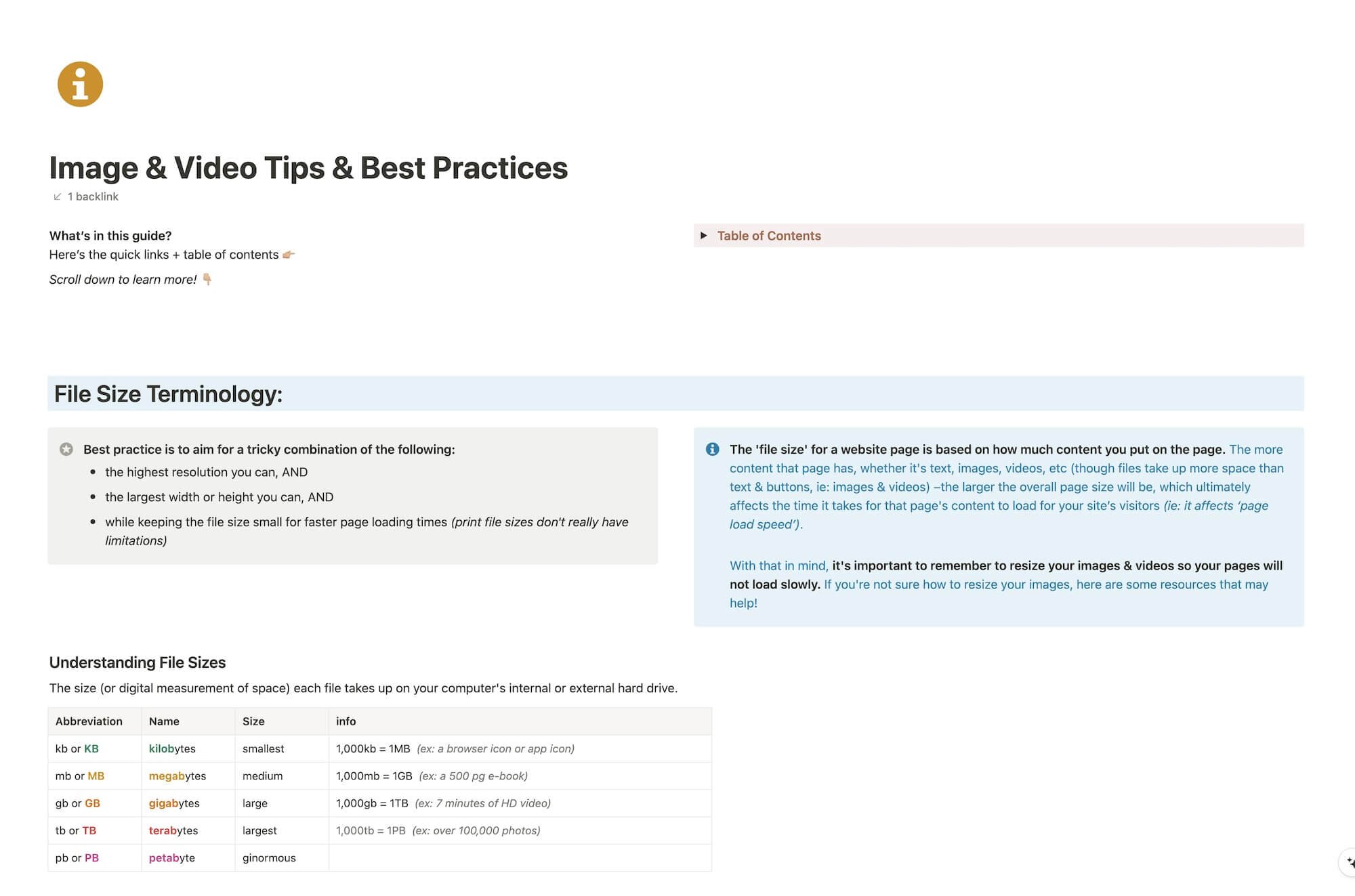
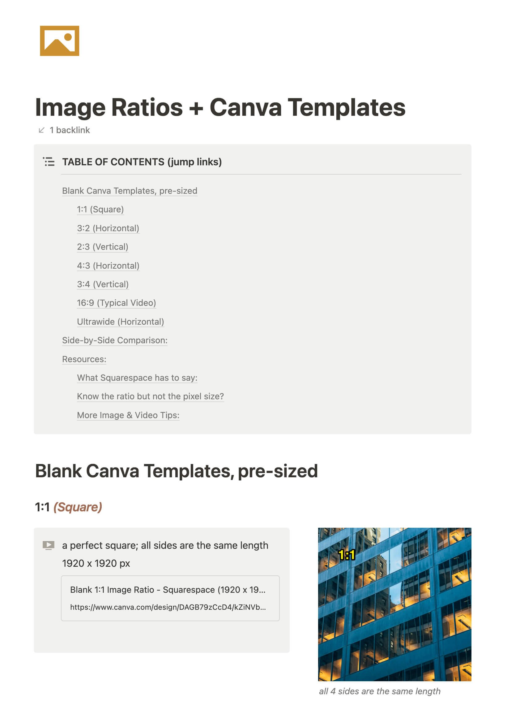
File & format terminologies & size ranges, resource lists, and pre-sized blank Canva templates for various image ratios.


How to optimize your Squarespace website for mobile screens
Unlike Showit and Wix, Squarespace doesn’t let you separately alter your design for mobile size screens. That’s both a great thing and an irritation, tbh.
Great because: you’re not designing anything twice; it’s all automatic.
Not great because: it’s all automatic & you have no specific control how the design reacts on mobile without custom code.
So how do Squarespace designers deal with this problem?
Katelyn, here!
I’m the Founder, Owner, CEO, Designer & Educator at Launch the Damn Thing® and I love coffee, cursing & carefully laid plans. 😂 (Also reading, blaring loud music, and teaching, –but those didn’t fit into my nice alliteration!)

Did I just totally make your day? #goals
