

5 Tips to Master Responsive Design on Fluid Engine
What's inside this post: Hide
Today, I'm tackling a common complaint I hear a lot - that Squarespace doesn't work on/for tablet size screens.
But guess what? That's not entirely true.
Squarespace is actually pretty flexible. It's designed to help you create layouts that can keep their structure from tablet size & up, and rearrange things for smaller phones. This means your design can work on everything from tablets to large computer monitors and even massive TV screens.
So it's not that Squarespace didn’t consider tablet view in Fluid Engine’s editor, it's more about understanding how it works underneath the hood to get the most out of it.
It’s often the little tips and tricks that can make the design process more efficient and predictable. When you're laying out your sections, it's important to know how things are going to fluctuate on smaller screens as you use the editor.
So, are you ready to dive in? We're going to explore how I design and edit websites on Squarespace to ensure the content remains readable, functional, and appealing on all sizes, and when it’s time to find a compromise somewhere in between.
Isn't that true for everything that's worthwhile? It's not all pros, and it's not all cons. So, keep an open mind and as we go through the details feel free to follow along because if you’re anything like me, I retain best when I’m practicing the work myself, rather than just watching!
⚡️ TIP: You’ll get the most out of this tutorial if you watch the video too, so you can see how the elements react in real time as I actively resize the browser & show you examples along the way.
How Fluid Engine Works, Responsively
Fluid Engine’s editor is a grid made up of columns and rows. On desktop, the grid is 24 cells across and however many rows high in each section of the page. On mobile, the grid is only 8 cells across & its row count is also flexible like the desktop’s.
The important thing to note here is that every time you place a block on that grid & lock it into that grouping of cells, it stays in that percentage of space, until the grid changes to mobile view.
I’m not a math person but to understand this better, we gotta break out the fractions & percentages! So let’s get out the calculator & do this with some easy math real quick.
24 cells across = 100% of the layout width & 50% of the screen’s viewable area
18 cells across = 75% or 3/4 of the section width & the viewable area
12 cells across = 50% or 1/2 of the section width & the viewable area
8 cells across = 33% or 1/3 of the section width & the viewable area
6 cells across = 25% or 1/4 of the section width & the viewable area
4 cells across = 16% …and so on.


So the biggest takeaway from this post, that we’ll keep coming back to in each tip, is that for your layouts to easily work on various screen sizes, you have to be cognizant of how much horizontal space the block takes up in the grid because it will keep that percentage of screen real estate as the design compresses & the browser resizes for smaller screens, –until the grid switches to mobile, when you can uniquely adjust the layout for that size.
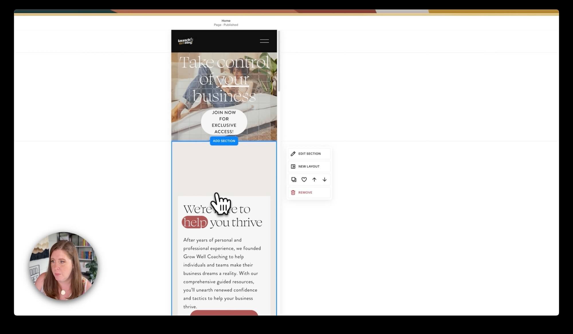
Tip ❶: Keep Titles & Paragraphs Together

Example: placing two text boxes next to each other may create unnecessary spacing issues
One of my top tips for designing a responsive layout: keep nearby text together in the same block. It might sound simple, but it can save you a lot of headaches!
Now, you might be wondering, "What exactly do you mean by 'keeping text together'?" If you've got a heading and a paragraph that need to sit next to each other, the last thing you want to do is to place them in separate text boxes & overlap them to get each line as visually close together as possible. Why?
On smaller screens, your layout compresses, but each piece on the grid stays locked into that percentage of space UNTIL mobile view. That means that your layout blocks are also in the same layout on your tablet but your tablet is a much narrower screen.
And those separate boxes? They could easily end up overlapping, creating a real mess of unreadable letters (see the example below).
So, here's my advice: when you've got text elements that need to sit next to each other, put them in the same text box. I know that even Squarespace’s own layouts & templates don’t do this; ignore that. Don’t do as they do! 😂
If you do it my way, there’s no need to understand the inner workings of the Fluid Engine’s code (ie: how it works), and your text will behave exactly as you want it to without the title overlapping the paragraph unexpectedly on smaller screens.
Let’s look at an example.
If we've got text in one block and a paragraph in another, and they're too far apart from each other but aligning the title text vertically within the block doesn’t fix it, you might be tempted to move the paragraph text’s block up closer to the title text’s block, into that empty space.
To help visualize this, turn on the grid (just press G on your keyboard), so you can see that the header’s text block occupies two rows in the grid, while the paragraph’s text block only takes up one row. You might assume that dragging the paragraph’s block upward would fill the space & solve the problem, ––but doing that will wreak havoc on smaller screens.
Here's the catch: each box (block) only takes up a certain percentage of the grid –overall.

Example: unexpected issue of text overlapping when the title & paragraph underneath it are both in different text blocks
When we scale the layout down by resizing our browser window, the layout fluctuates a bit & compresses, right?
Here’s what happens when they’re in separate blocks:
The title text at the top now has less space inside its block so it wraps into multiple lines to fit the title inside the smaller container, making the title taller (take up more vertical height) in the section layout, and the block still sits on two rows; the bottom row flexes in height as needed to make sure that it can still sit on two rows.
However, the paragraph doesn't need to do that, because its letters are much smaller. Even though the container for them is getting smaller too, it doesn’t need as much space to start with. The paragraph keeps its single row in the grid.
––The result? A jumbled, overlapping mess that's impossible to read.
😳
It’s an easy fix. Just place both the heading and the paragraph in the same text box so they BOTH live in the same container together, making it impossible for one to overlap the other even if it needs to resize on smaller screens.
Tip ❷: Understanding Container Sizes
The next tip is all about your container size. You know what they say, "Size matters!" 🤣
But it couldn't be more true in the world of Fluid Engine on Squarespace.
With a responsive, fluid, and adaptive layout engine like Fluid Engine’s, it's adapting and changing our design based on the size of the device's screen that's displaying it. For context, in the video I'm using a 4K (pixel) computer monitor that doubles as a TV screen and it’s about 32 inches wide. Because of that larger screen size (compared to tablet, for example), the cells in my grid in the video will look pretty big.
So if I add a block to the section and it's only filling up 9 of the 24 columns on my screen, it's actually taking up less than half of the available screen real estate (space). The math nerds among us will tell you that's about 37.5% out of 100%.
But if I stretch that box to take up half the screen, it's now occupying 12 out of those 24 columns, or 50% of the available width.
And if I shrink it down to half of that again, it's only taking up 6 columns, a mere 25% of the screen width.
Of course, this doesn't seem like a problem when you're viewing it on a big screen like mine but what happens when we start looking at those percentages on smaller screen sizes? Think iPad Pro size, MacBook Air size, Surface Pro size.
As I resize my window to resemble these smaller screens, you'll notice that box is still taking up 25% of the screen (or 6 columns), causing your layout to change undesirably because it's trying to maintain that same percentage you initially set & the cells in the grid will fluctuate in size to help accommodate this. But sometimes, that doesn't translate in the way you'd expect. 😬
The takeaway here, is that the size (width) of your container block matters. It needs to be wide enough to allow the content inside to adapt and look good on smaller screen sizes too. It doesn't matter if it's a button, an image, or a text block, it needs to be a large enough percentage of the grid's total width, so that when viewed on smaller screens, it doesn't end up looking, …well, ridiculous. 🤷♀️
Let’s look at an example.
Imagine we've got a simple button + text layout and we want it to fill up most of the screen, so we turn on the Scale Text feature for the title so it will be as large as possible & fill up the whole width of the block. If we leave it as is, it might look good on a desktop layout, but when we switch to a smaller, tablet-sized screen, it's too small.
If we don’t use the Scale Text feature, Fluid Engine will scale not just the container (block) sizes but will also scale the font sizes as the screen size changes, as long as you’ve kept responsive font values in your Site Styles (like rem and em vs px).
LEARN MORE!
If you want to learn more about what rem and em does & how it works, & why Squarespace started using it (so you should too), check out this post next & skip down to the challenges of wire-framing in Squarespace section.
So, the rule of thumb is to be super mindful of the rough percentage width your content is taking up across the screen & remember it will maintain that percentage as the layout adjusts.
Now, you understand why (the container) size matters. 😉


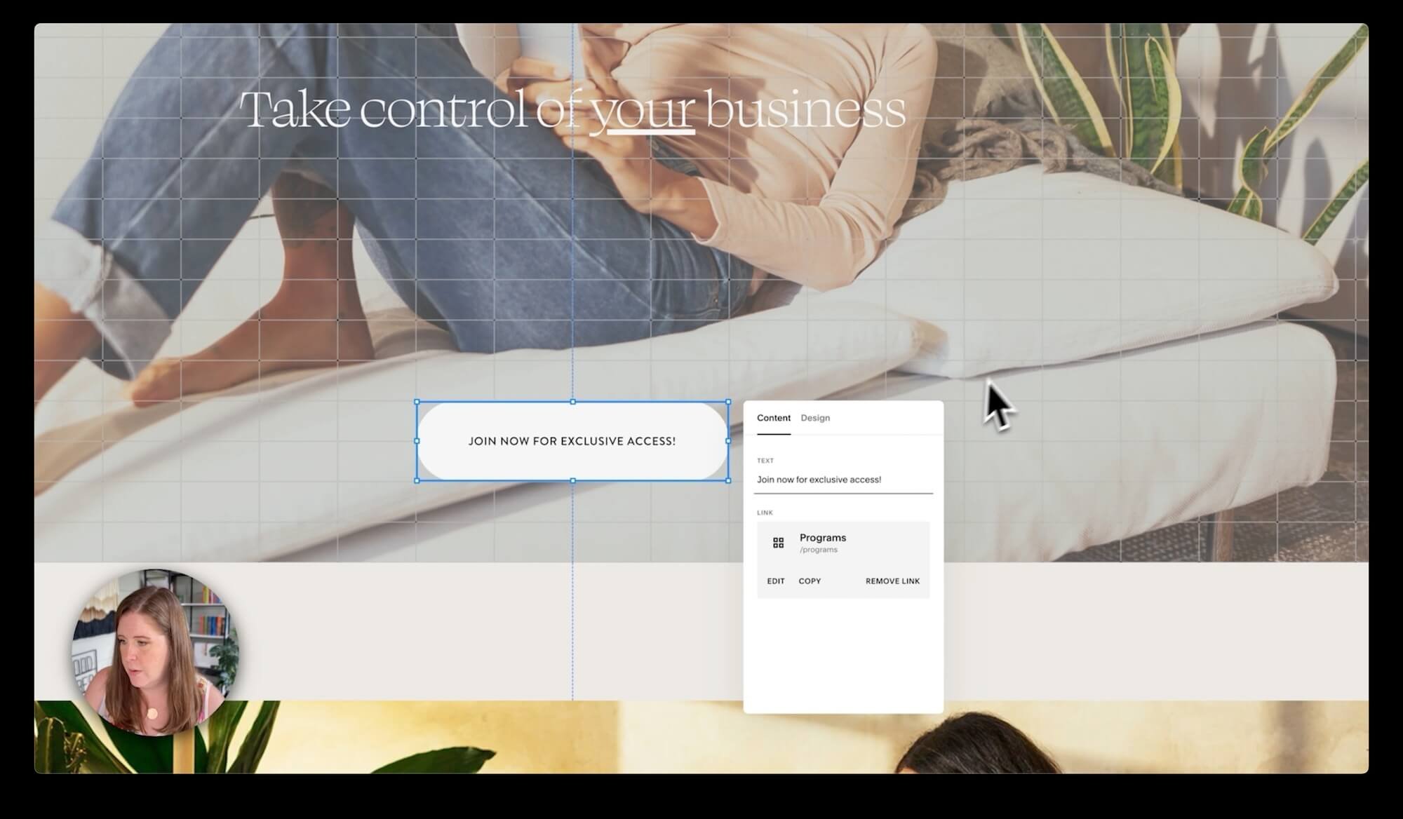
Tip ❸: Button Behavior & Sizes
Next, let's talk about buttons, and specifically, how they behave in our layouts.
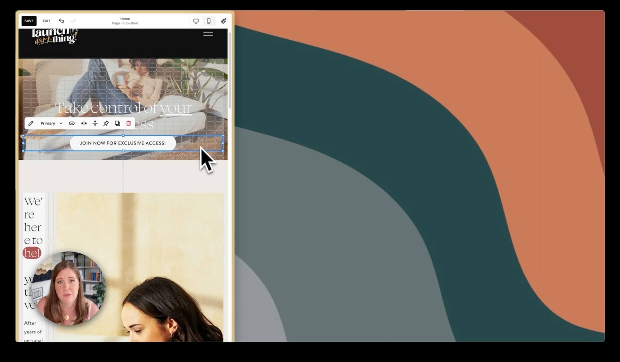
For instance, let’s say you need your button to read "Join now for exclusive access." It's a bit on the long side, but it’s great for this example. If this button block is only taking up 4 of the 24 columns, it's only filling a fraction of the available space (just 16% of it). When viewed on smaller screens, the button will still only fill up 16% of the screen and on tablet sizes that 16% width will make the button unnecessarily enormous & possibly even hard to read.
In mobile view, you can make the button block a totally different size than on Desktop, and that size will be unique to the mobile website. But the text is still going to wrap into two lines on mobile –with a name that long– because the text (letters) isn't getting smaller, but the container size is and there's a lot of letters to fit into a tiny space.
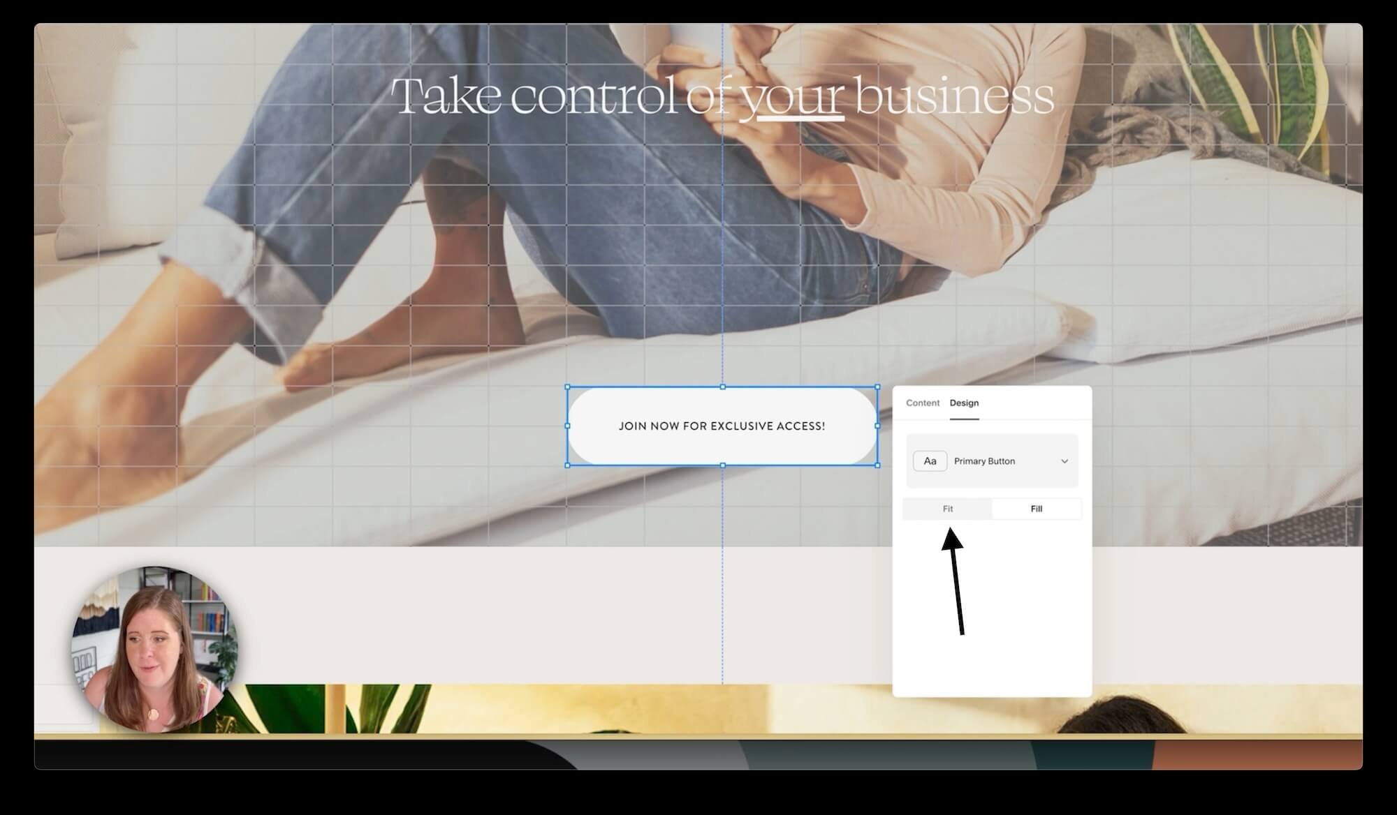
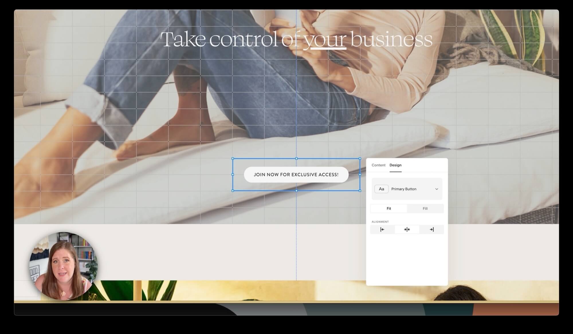
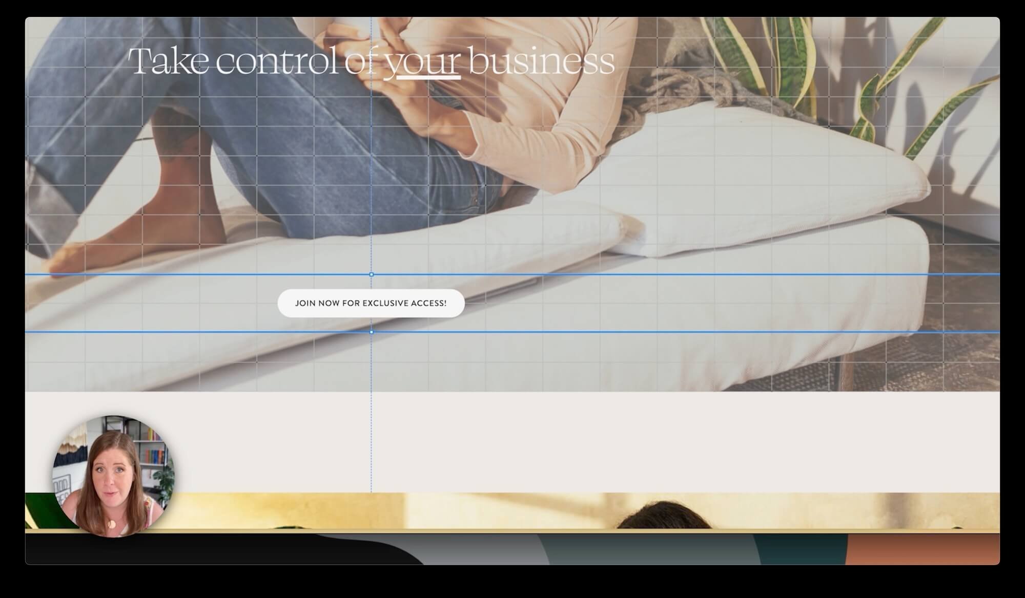
So, how do we work around this? If you want a button with a lengthy call to action and you want it to take up a smaller amount of space on desktop or tablet sizes, go to the button block’s settings, click on the Design tab and switch the button to Fit from Fill.
This will make the button shape fit within or inside the container (rather than filling it completely), but the button shape will only be as big as it needs to be to fit the text inside in one line, wherever possible.
The important part of this secret is to also make the container larger than you need it to be. By doing this, the button isn't going to fill the entire container when it’s set to Fit, but the longer text has lots of room to spread out in one line, meaning it’s much less likely to need so much height to fit all of the text on smaller screens.
If I try resizing the screen now, you'll see (in the examples below) that it can retain it’s shape the way we set it on Desktop for a lot longer (more screen sizes) before the text on that button begins to wrap into multiple lines.
Even if we make the browser window as small as the grid can be before it switches over to mobile, that button text isn't as likely to wrap because we've given the container plenty of extra space on the right and left. The button shape can take up as much of the width as it needs so that the text doesn't need multiple lines.
The takeaway here is to make sure your button containers are as big as they possibly can be to prevent excessive text wrapping, and switch the button from Fit to Fill if you need to.
If you can make the container bigger than you actually need it to be, when it resizes on smaller screens, you'll be more confident in how it will adapt and adjust.
Tip ❹: Customizable Heading Sizes
The next tip is a reminder that the Scale Text feature can help give you more customizable heading sizes.
If you want a really big heading that's super-sized, rather than adding custom code or changing the (global) font size in Site Styles for that heading type (Heading 1, Heading 2, Heading 3, or Heading 4), just turn on the Scale Text feature.
Basically, it automatically adjusts the text to fit the full width of the container, and then you can just resize the container to adjust the font-size of your text. This means you can stretch your text from one edge of the screen to the other, making it as large as possible for any screen size, and the font-size change is specific to this block (not affecting the headings on the rest of your site).
There’s a caveat to this, of course, when you look at that heading on a mobile view, the text probably won’t be as big as you thought it would, because mobile view only has 8 columns of width to work with, which means it really can’t be super-sized if the full heading phrase is longer & all on one line. When Scale Text is triggered (on), even on mobile, it's still fitting the text within the container, just like before, but on ALL screen sizes.
Luckily, there's a way around this.
Option 1 is to shorten your heading text. Fewer words will mean bigger letters in those words, when Scale Text is on. But if you don’t want to rewrite your heading, then Option 2 will work better.
Option 2 is to put your cursor where you want to force a line break, then press shift + enter on your keyboard, to move the second part onto another line with a single space between the lines. This won’t create a new paragraph with double space between them (which separates the styling of Scale Text). Once the single space line break exists, then highlight the whole heading & turn on the Scale Text feature. If you do it in that order, the new formatting will scale the font size of both lines of text at the same rate (size).
This way, you can still have your heading nice and large and it can be a lot larger on mobile too, because you're not trying to fit it all on one line across just 8 columns. Both lines in the heading are the same size, its more legible on mobile, and you can control the size on mobile with the width of the block a bit better!
Again, keep in mind, if you've got your text block taking up 12 columns (50%) of the grid, even when it scales down, it's still only going to take up 50% which leaves about 25% of the screen space on either side, when centered. Even though the text itself is getting a little smaller to maintain the calculated font size, it's still taking up 100% of the box, but that box may only be taking up 50% of the screen width.
This makes it a fantastic way to get customizable font sizes for your headings without messing with Site Styles.
To learn more about how to use the Scale Text feature, check out this post next!
To learn more about what sizes to make your headings & why, check out this post next!
Tip ❺: Desktop vs. Mobile Changes
Now that we understand how our layouts fluctuate between desktop & tablet, it’s finally time to clarify the difference between changes in the desktop editor versus the mobile editor.
SO MANY of you have voiced your frustrations with Squarespace's 7.1 Fluid Engine editor and how it removed our tablet view. Believe me, I feel you! I'm not a fan either.
But the truth is, if you design your layouts with these tips in mind you really can get by without having the tablet view.
Essentially, we have two main breakpoints.
In the code, a breakpoint is basically just a size range that dictates the behavior & flexibility of the elements within that range only. The desktop breakpoint which spans all the way down to about 767 pixels or 749 (whatever it currently is), which covers desktop and tablet sizes. Everything smaller than that breakpoint is considered mobile view.
You might wonder why we don't have control over tablets, specifically. The truth is, only about 2% of people globally use tablets to surf the internet.
I know! It shocked me to learn that too, but the research and statistics back it up.
That means the lack of design control on tablets doesn't really affect that many people. That said, in my view (& likely yours too if you’re reading this) even a small percentage is still a percentage, so I really do feel the frustration there. But ultimately it’s just not enough of the market to justify adding that additional breakpoint (and extra development work) so it's important to know how to tweak your design layouts in Fluid Engine, without it.

Example: Horizontal vs Vertical alignment within the block
What types of changes are specific (unique) to each view?
Desktop layout changes are separate from mobile layout changes, as we know. But which types of changes are specific to either view?
Let's say you decide to customize the color of some text in a text block, change the content alignment vertically & horizontally in the block (different from paragraph alignment), or add a Text Highlight. These kinds of modifications are affecting the content styles inside the block, and they will show up in both desktop and mobile views.
But if you just change the layout or position, –where a button block is placed on the grid, for instance– that change doesn't carry over in both views; it can be unique to either one.
The takeaway here is that changes to the content inside a block, like text color or alignment, will show up in both views, but changes to the layout or position of the block –where it sits on the page– are unique to each view.
The one caveat to this is that changing the horizontal alignment within a block (see example screenshot) often shows up in BOTH, while vertical alignment within a block is often unique to either version of the site.
When you’re designing, always check the mobile view when you see a blue dot on the mobile icon in the editor. That dot is a friendly reminder that something you've done in the desktop view is also possibly affecting the mobile layout.
Remember, the key is planning your design with these 5 principles in mind the whole time!
Using Plugins for More Control
Let's wrap things up with a quick discussion about using third-party plugins for more tablet-specific control in your design, because I know you want to ask!
SquareKicker*
SquareKicker is a design tool that works on a subscription plan where you can use it for free until you’re ready for your changes to display on the published website, at which point you can pay for a month, then cancel your subscription & keep the changes until you need to make further published changes.
SquareKicker’s design tool offers four different views in its design tool: desktop, laptop, tablet, and mobile. Sounds promising, right? Well… it’s not exactly what you’d expect. Although this tool allows you to make design tweaks in each of these views, it doesn't offer complete control over position and layout in the same way Fluid Engine does, so while it can definitely help, it’s NOT a failsafe answer to all your responsive design problems.
Sure, in specific views you can use SquareKicker to nudge blocks left or right, tweak block styles, font sizes, and even animate scrolling actions per device size (depending on your plan). But it won't give you the full control you might be craving or expecting.
Plus, let's not forget the wide variety of screen sizes and brands of internet-connected devices out there. Even with SquareKicker's four different views, it can't cover ALL the bases and there’s bound to be a brand or device that shows your design layout in a way that does not work perfectly in those breakpoint ranges.
Please note that there really isn’t a “failsafe” way to fix the responsive design ‘problem’ on the web.
So, …want my advice? Stick with Fluid Engine's built-in options for as much as possible & only use it for truly unique adjustments that can’t be done without it. Trust me, you really don't need anything like SquareKicker for basic responsive adjustments if you use the tips you’ve learned so far in this post!
Get to know Fluid Engine inside and out, forward and backward. Once you're comfortable and know and understand how it works (the pros & cons), you could then consider adding some extra tweaks with a plugin.
For me? What will I be doing? I've been using Fluid Engine solidly for a couple of years, relying on Classic Editor (the old editor) less and less, preferring to use Fluid Engine in most cases now. I’ve also been using SquareKicker since 2020. I know both of these tools inside & out at this point and how they both work.
But if you're new(er) to this, and not as comfortable with the tools yet, again, I'd say stick with Fluid Engine only, for a while. Once you've got the hang of it, feel free to add some extra bells and whistles, –but not before you understand how those bells & whistles will work together with Squarespace.
Tablet Spacing Fixer
Next, let's talk about a free plugin that I think is often misunderstood. I know I didn't get it at first either.
It's a free Chrome extension designed by Chris Schwartz-Edmisten and it's available in the Chrome store. It also works in the newer Arc web browser, which I've been happily using this year & in many of my tutorial videos this year too, so it should also work in any other Chrome-based browser.
Once you've installed it, just click on the extension icon while you’re in edit mode in Squarespace. A little pop-up will appear and ask if you want to fix those in-between sizes. You'll see an option to Enable or Disable the tool.
After clicking Enable, you'll notice a change in your editor’s device icons. It adds a Mobile Preview, which is just for viewing ––not editing.
And, it also changes the device width for the mobile editor to now use a tablet size pixel width, which will be visibly wider than the standard Squarespace mobile preview had been before you enabled the plugin tool.
What's happening here is that it's expanding the mobile editor’s pixel width, which is why it appears bigger (wider). You've still only got eight columns, but the screen width is bigger to include smaller tablet size screens, so you can see where those weird spacing issues crop up on tablets, that you can’t otherwise fix in Fluid Engine. If you adjust the block heights in this view, with the plugin enabled, you can adjust the layout to remove the extra spaces you can’t otherwise see in normal desktop or mobile view.
Remember, plugins like these are not always necessary. As long as you're designing with different device widths in mind as you create your layouts, you should be fine most of the time & not need it, but at least you’ll know where to get it if you do! So if you do come across a project where the spacing issues are really bothering you & you can’t fix it no matter what you try, then this plugin could be your solution. Download it for free & just keep it disabled until you need it.
And keep in mind, that even when you're using a plugin like this, and it allows you to remove some of the weird spacing issues, you still want to be aware of the widths & font sizes in all of your blocks because the sizes of your containers still matters. (It always will; that’s part of responsive or mobile-friendly website design.)
Pro tip:
If you ever want to hide something on mobile or desktop that you don't want to see in the other version of the site, you can make it as small as possible (1 cell is the smallest) and then use the layering options to place it behind something else.
If the item you’re hiding has a link or a clickable element (for example, a duplicate button or hyperlinked image), as long as that block is covered by another, the link or click-action is disabled or inaccessible while it’s covered.
Ta da! Now you can’t see it, even though it’s still there. 😜
What does it mean to be a “responsive website”?
“Responsive” in the website design world basically just means the website design responds to the size screen being used to view it.
Designing websites on ANY website builder will always require some level of compromise. Every builder handles this a bit differently but all of them have limits, and none of them can adapt the content to every possible/conceivable device size. It’s just not possible.
Also, pixel density is VERY important to the perceived size of on-screen elements on ANY device, because a pixel does NOT have a standardized height.
A 32” screen that is cheap will have fewer pixels in it making up the design you see on screen, than a more expensive screen with 4,000+ pixels (ie: 4k) , ––even if both screens physically have the same width & height measurements.

Moving boxes, set next to each other, all open & ready to fill!
First, let’s think about the pixel density concept, represented in a physical space.
Pretend you have a room full of small-sized moving boxes. Let’s say you could fit 100 boxes in that room, filling it up from wall-to-wall and floor-to-ceiling.
Now let’s pretend you have the same sized room, but you have large moving boxes instead of smaller ones. Now you may only be able to fit 25-50 boxes in that room, even if you fill it up wall-to-wall and floor-to-ceiling, because each box takes up more space in the room.
That’s because the ROOM (screen) size isn’t changing, but the BOX (pixel) size is.
A font set to 72px on the screen is going to take up 72 pixels in height to make that font-size.
If the pixels are larger (less definition, less pixel-dense) there are fewer of them in the screen, which means a less crisp image in general and the font set to 72px will be fairly large but not crisp.
If the pixels are smaller (more definition, or HD, and more pixel-dense) there are a lot more of them fitting into the same space, which will also mean a font set to 72px will NOT take up the same visual height on-screen as it did on the low-def screen with fewer pixels in it.
In the same way, a stack of 72 large boxes will be a different height than 72 small boxes.
The "p" in “720p” and “1080p” stands for “progressive scan,” and the number refers to the height dimensions of the image in pixels.
© Interaction Design Foundation, CC BY-SA 4.0 –
Image Source: https://www.interaction-design.org/literature/article/responsive-design-let-the-device-do-the-work
Platform Comparison: Showit’s Mobile-Responsiveness
In this image, you can see that the fixed version of the content has the same width regardless of the device, whereas in the fluid version, the content fills the available screen space of the device.
© Interaction Design Foundation, CC BY-SA 4.0
Image Source: https://www.interaction-design.org/literature/article/responsive-design-let-the-device-do-the-work
Squarespace, unlike Showit, is not designed to give you pixel-perfect control. But trust me, you don’t really want that level of control or the design will take a lot longer. In fact, Showit websites don’t offer device-specific adjustments between desktop and tablet at all, and the content doesn’t automatically adjust (like Squarespace) to compensate either.
Why is Showit like that? Showit websites have specific pixel widths & heights in both desktop view and mobile view, and pixel-based web design is NOT responsive to a range of devices, in any way.
If your content is all based on a flat, unresponsive pixel-width or pixel-height, it means every element is the pixel-size the designer made it, no matter what screen it’s viewed on, how big that screen is, or how many more/less pixels are inside that size screen (pixel density), with mobile being the only exception.
On more pixel dense (high-res or extreme HD) screens, everything in the Showit website will appear smaller: smaller font sizes, smaller buttons, smaller overall design width, etc.
On less pixel dense (low resolution, or HD on the lower end), everything in the Showit website will appear larger: larger font sizes, larger buttons, larger overall design width, etc.
That fluctuation is not a form of responsiveness, but is dependent solely on the users screen size & density, while not allowing the content to recalculate in order to appear the same across both screen types, and/or rearrange if necessary to maintain the original intended layout.
So, even if you can lock elements into that exact spot (ie: a button is 150px wide by 50px tall), whether floating or reliant on spacing between it & the edge of the page (ie: the button is 500px from the edge of the page), that’s not always a helpful solution if the content itself is locked into pixel-specific values, because nothing recalculates for visual consistency. It just tends to create weird spaces between that locked element & the content around it as the space between elements grows or shrinks between different device screens, and font sizes especially can become hard to read on HD screens with smaller pixels.
In Showit’s mobile view, the elements must be not only rearranged, but completely restyled including colors, sizes, animations to the button shape & the text on it, and sometimes even the font styles, which takes a lot of extra time, effort & attention. If you don’t remember to style the mobile view, your site will be UTTERLY unusable on mobile.
I can usually spot a ShowIt website a mile off. I can tell that certain design elements were locked into that place, because when the content gets wider or smaller, it's often gets out of alignment and doesn't sit where it’s supposed to anymore, distracting me with weird things floating in places they shouldn’t or covering things I wanted to see or interact with.
Platform Comparison: Squarespace’s Mobile-Responsiveness
© Interaction Design Foundation, CC BY-SA 4.0
Graphic Source: https://www.interaction-design.org/literature/article/responsive-design-let-the-device-do-the-work
Don’t get me wrong, Squarespace has its own pros and cons too, but one thing it does really well is to allow your content blocks to grow and shrink together with the size & density of the screen’s pixels, while also NOT being strictly sized based on pixel counts. This makes your content generally more adaptive, responsive, and fluid(thus the name, Fluid Engine), which is exactly what you want for web design in 2024 and beyond.
As more and more devices come onto the market, the harder it's going to be to predict which one our users will be using to view our websites.
Compromise is key
So, despite what you may think, more control is not always a good thing for user-friendly designs. A pixel-perfect design on your screen is likely to look drastically different on someone else’s and this is the crossroad where web designers must accept COMPROMISE.
Because what matters most is the user's experience, and it needs to be high quality and tailored to whatever device they're using, which is a difficult thing to do.
In my opinion, for now, Squarespace does a MUCH better job of this than ShowIt.
Did any lightbulbs go off while reading/watching this tutorial? I'd love to hear about your 'a–ha!' moments or learn how this video made a difference for you. 😃
Don't be shy, drop a comment down below with your thoughts and feedback!


