Tensioning Solutions
PROJECT CASE STUDY
WEBSITE REDESIGN + REBRAND ✦ v7.1 FLUID ENGINE
Website & Branding Refresh
Owners Ron & Kathy purchased Tensioning Solutions from the original owner who had recently retired.
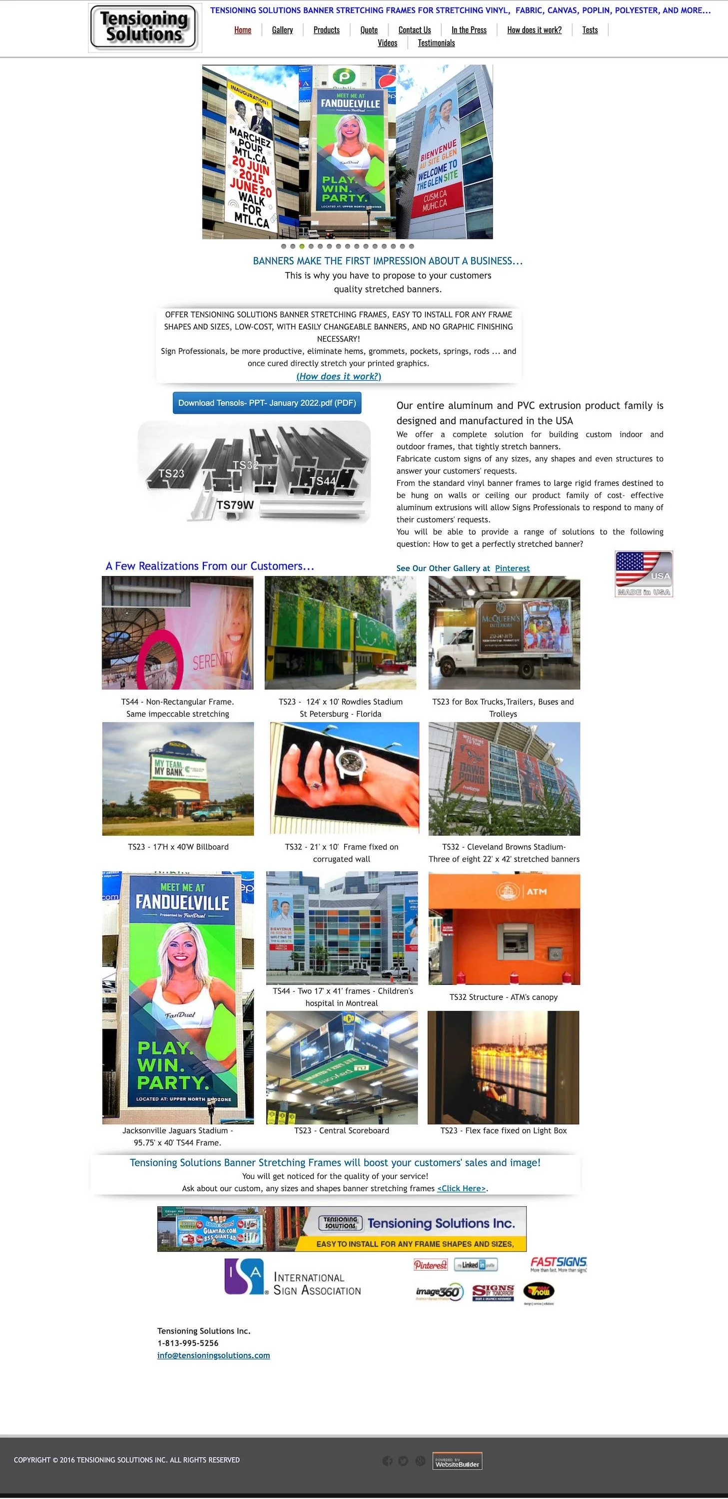
The company’s website hadn’t been updated in a decade (or two), aside from project photos and minimal maintenance, so they were ecstatic about bringing it into the 21st century!
In just two weeks their old website was GONE!
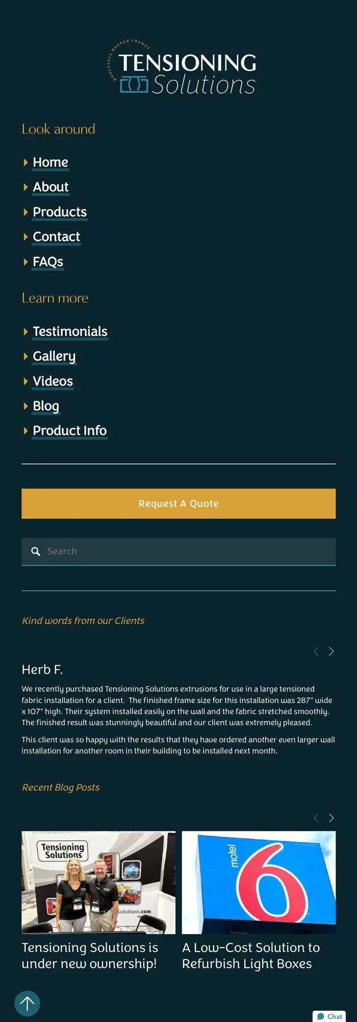
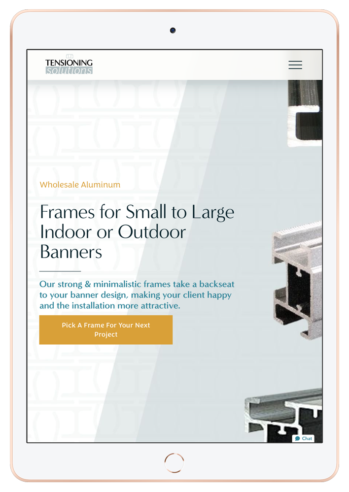
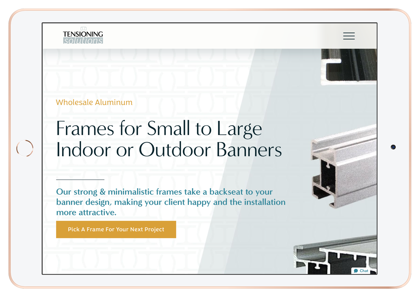
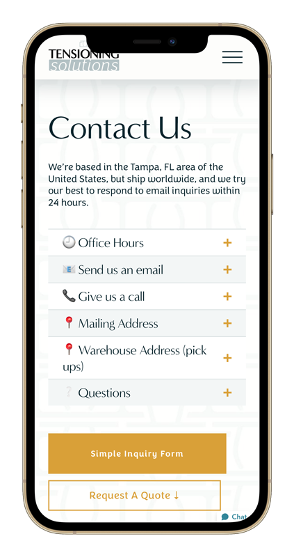
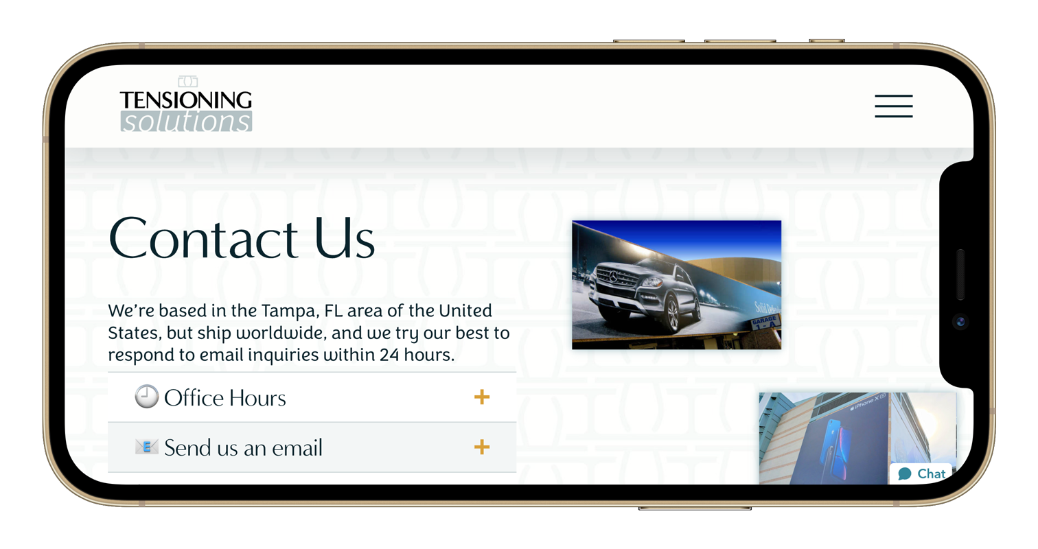
From very basic, early-internet design styling to a modern, image-focused, and fun layout loaded with strategy and a little of their personality, the migrated & redesigned website launched without a hitch!
experience
Sales Strategy & Modern Design +
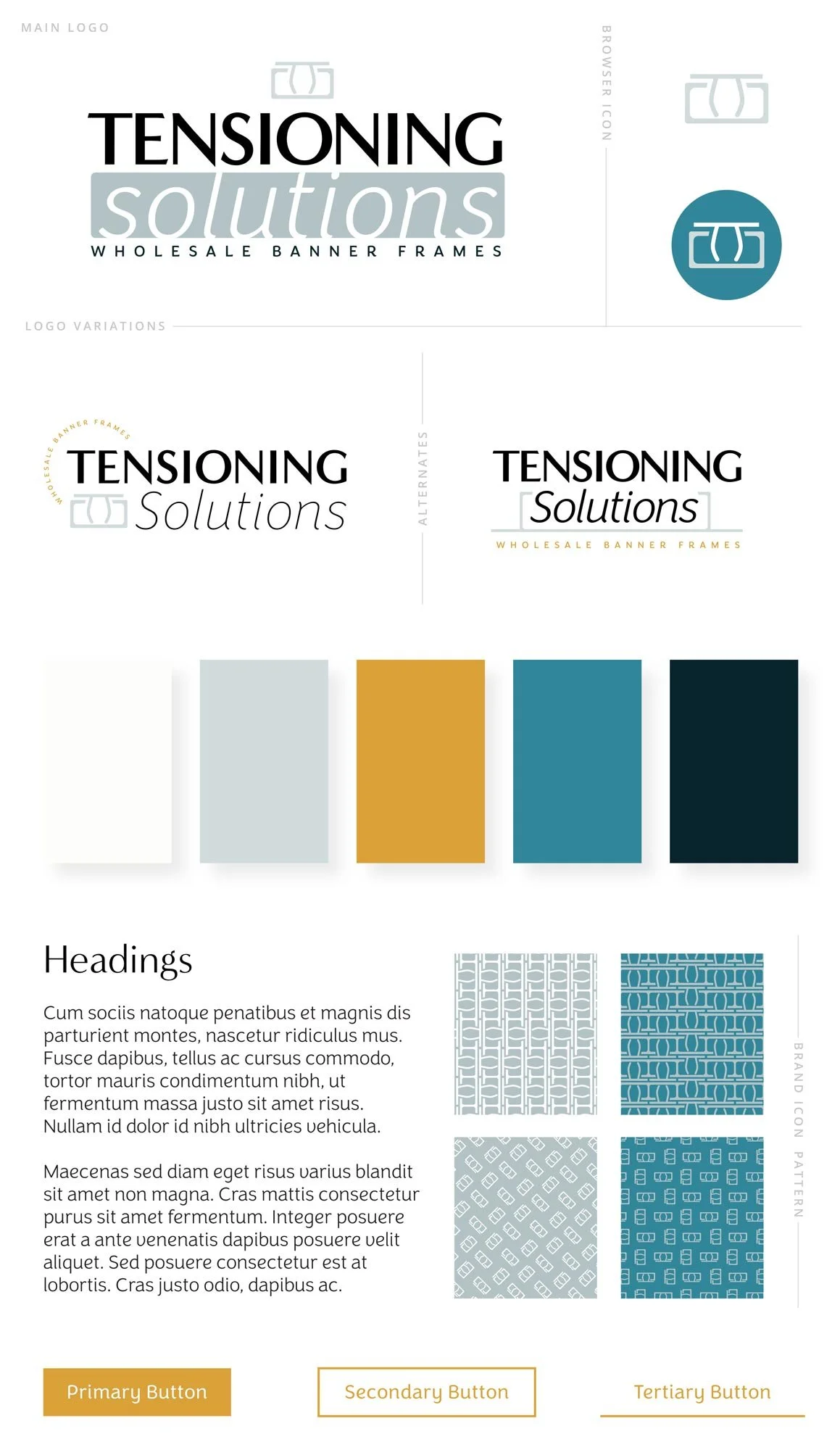
descriptive & modern branding,
1 main logo + alternate logos & browser icon (favicon)
customize brand patterns made with the new logo icon
scrolling animations,
basic SEO applied to all images, pages, blogs, & alt text,
URL redirects to prevent broken links from old website,
multiple galleries,
video library,
organized resources with categories, sorting & search
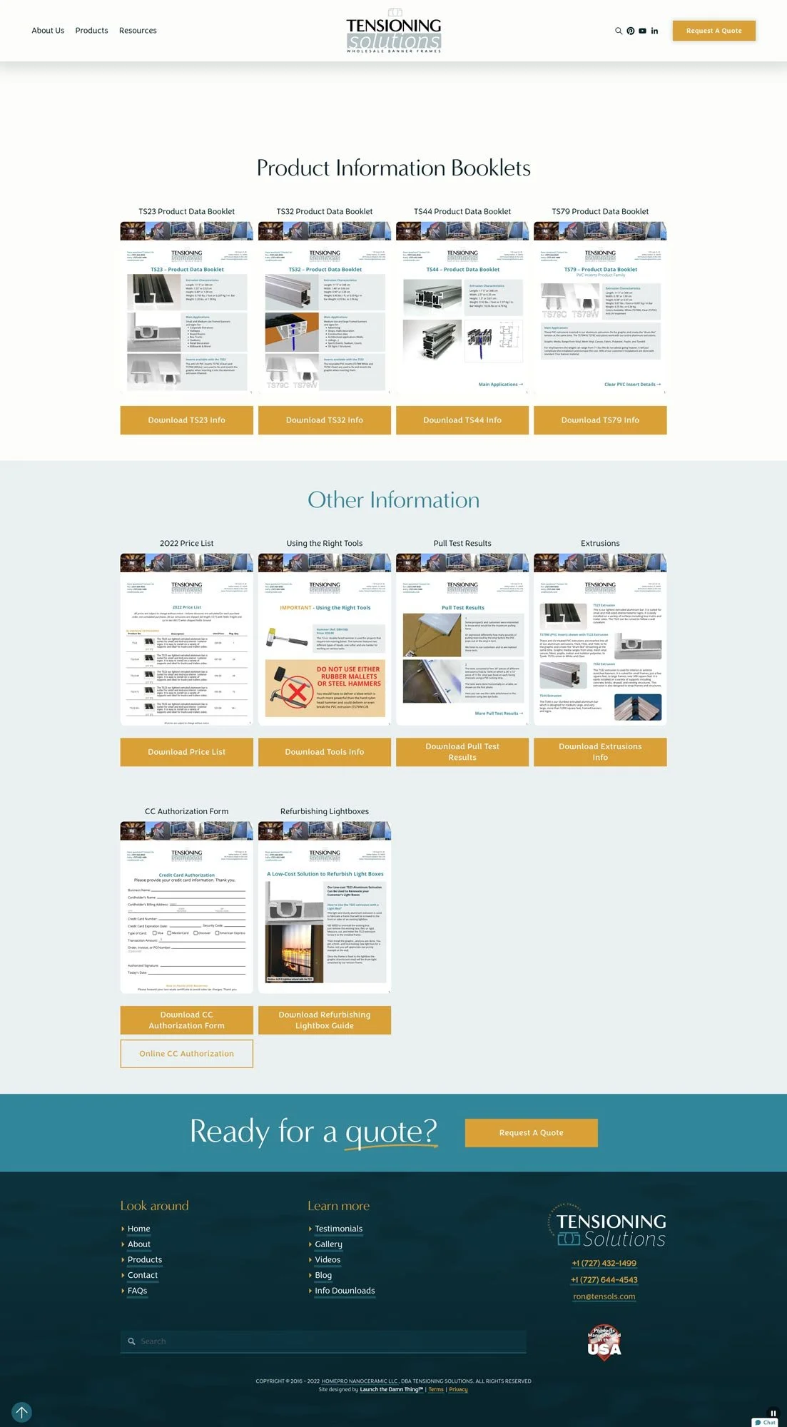
document downloads page,
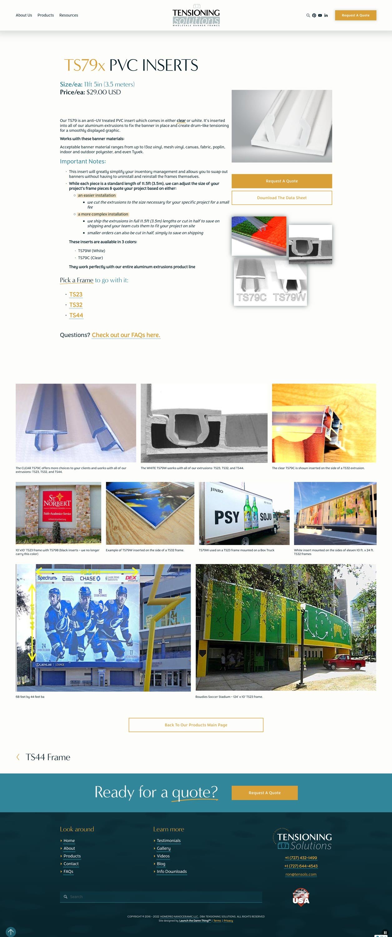
sales pages for each product,
online forms,
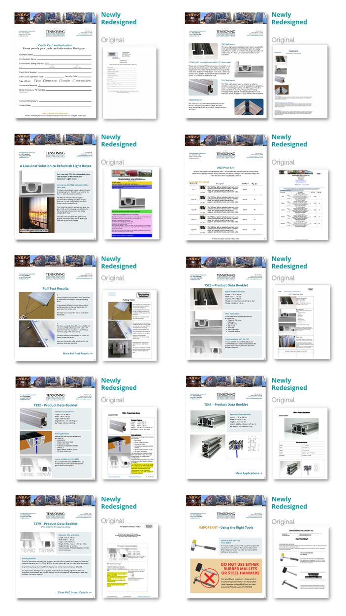
redesigned 10+ company documents
and Canva templates for all new or redesigned graphics for future edits
❶ What are your favorite parts of the new website & branding?
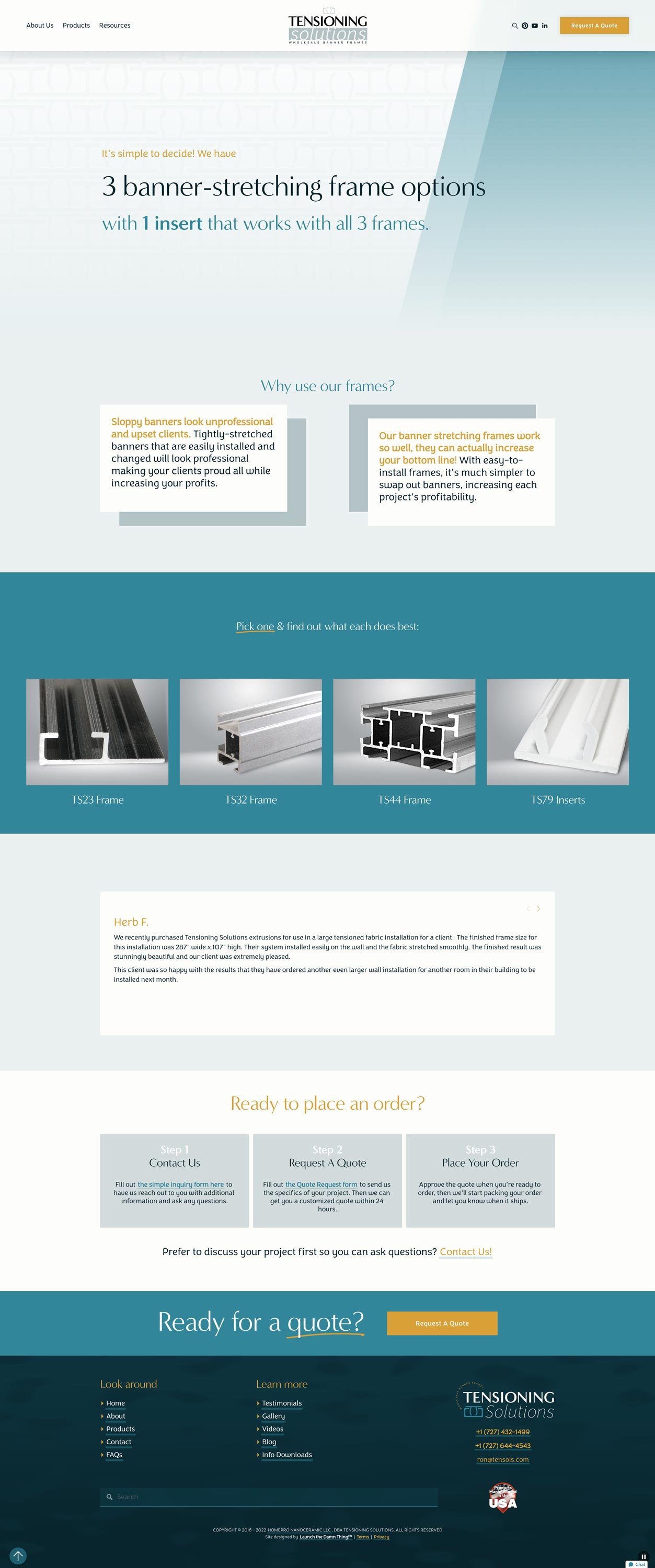
Our products can be perceived as “industrial” and our goal was to soften our approach and guide visitors to our solutions for their clients while educating them about the details in a way that wasn’t too bogged down with technical jargon. Katelyn absolutely accomplished that with our new, rebranded website! We love everything from the colors that she chose to the way the elements move and capture people’s attention. When compared to our competitors, we are confident that our website holds visitors’ attention longer and helps them educate and prequalify themselves.
❷ Did we successfully accomplish your design goals?
We cannot say enough about how pleased we are with the design of our website and branding. Even the technical information is presented in a way that encourages prospects to stay engaged and explore further.
❸ Has the updated website had any impact on your business thus far?
Literally, everyone who we guide to our website has positive feedback, and it shows in our sales as well! Our sales so far this year are up 25%, and we attribute a lot of that to people being engaged with our website. The business efficiencies and third-party tools that Katelyn provided have been invaluable!
❹ In general, how is the website treating you? Any feedback you have or that visitors, business contacts, or clients have mentioned?
As mentioned above, we have received nothing but positive feedback about our website. Prospective clients seem to like the fact that it is easy to navigate and that there are lots of examples of work done by customers who have purchased our products and put them to use.
Designs
New Branding
Home
About
Products
TS23 - Product Page
TS32 - Product Page
TS44 - Product Page
TS79 - Product Page
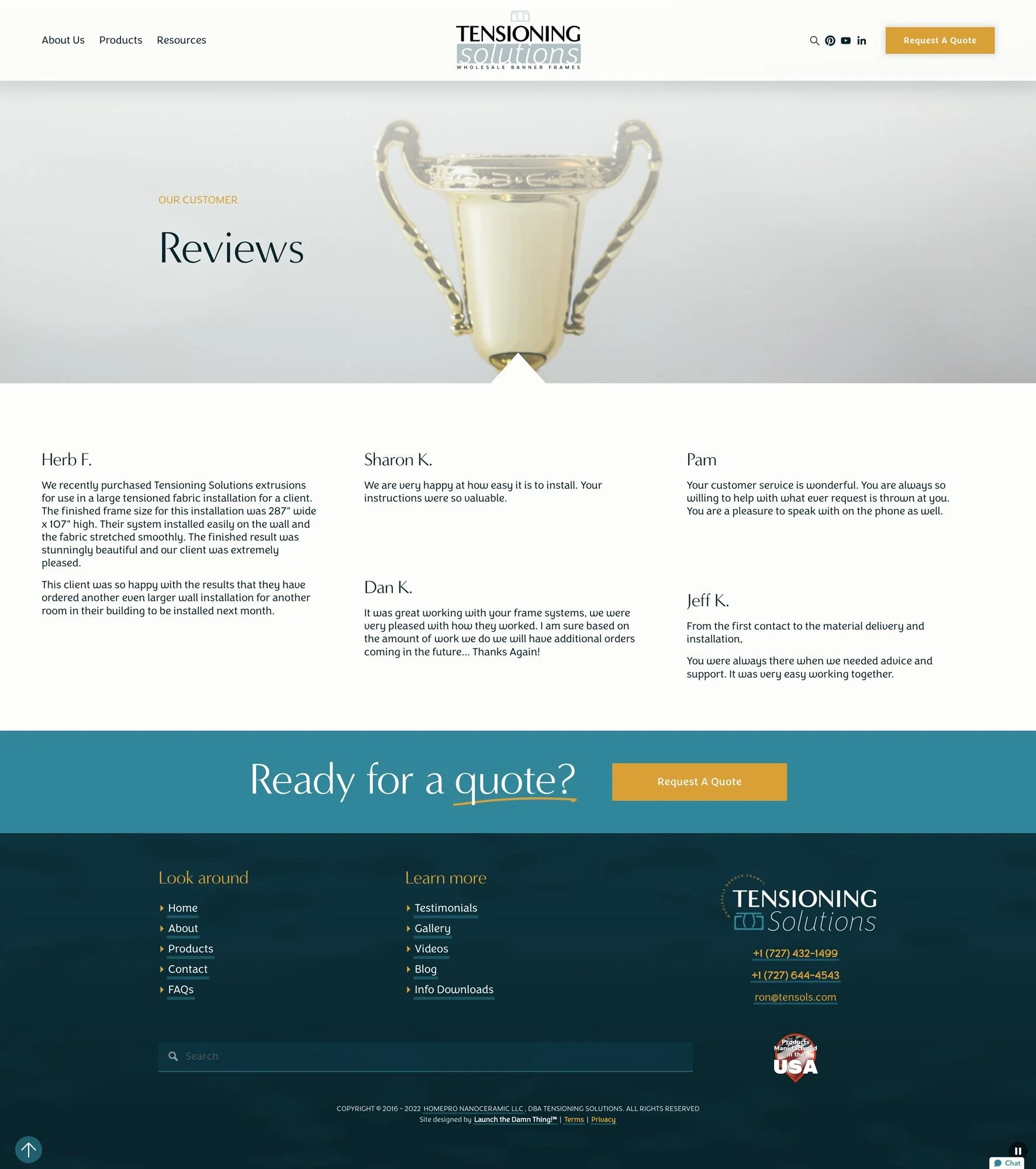
Testimonials
Document Downloads
Client Gallery
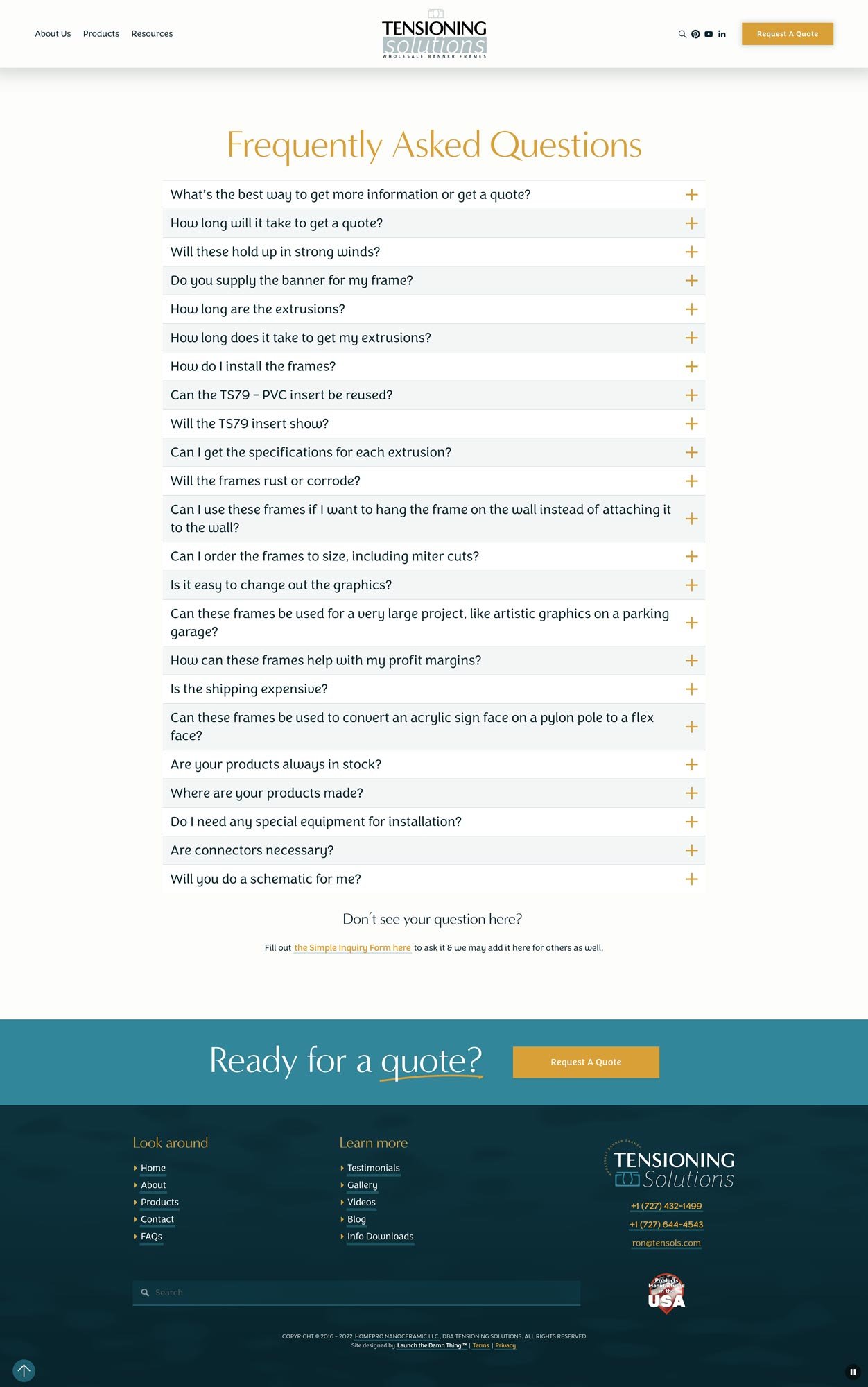
FAQs
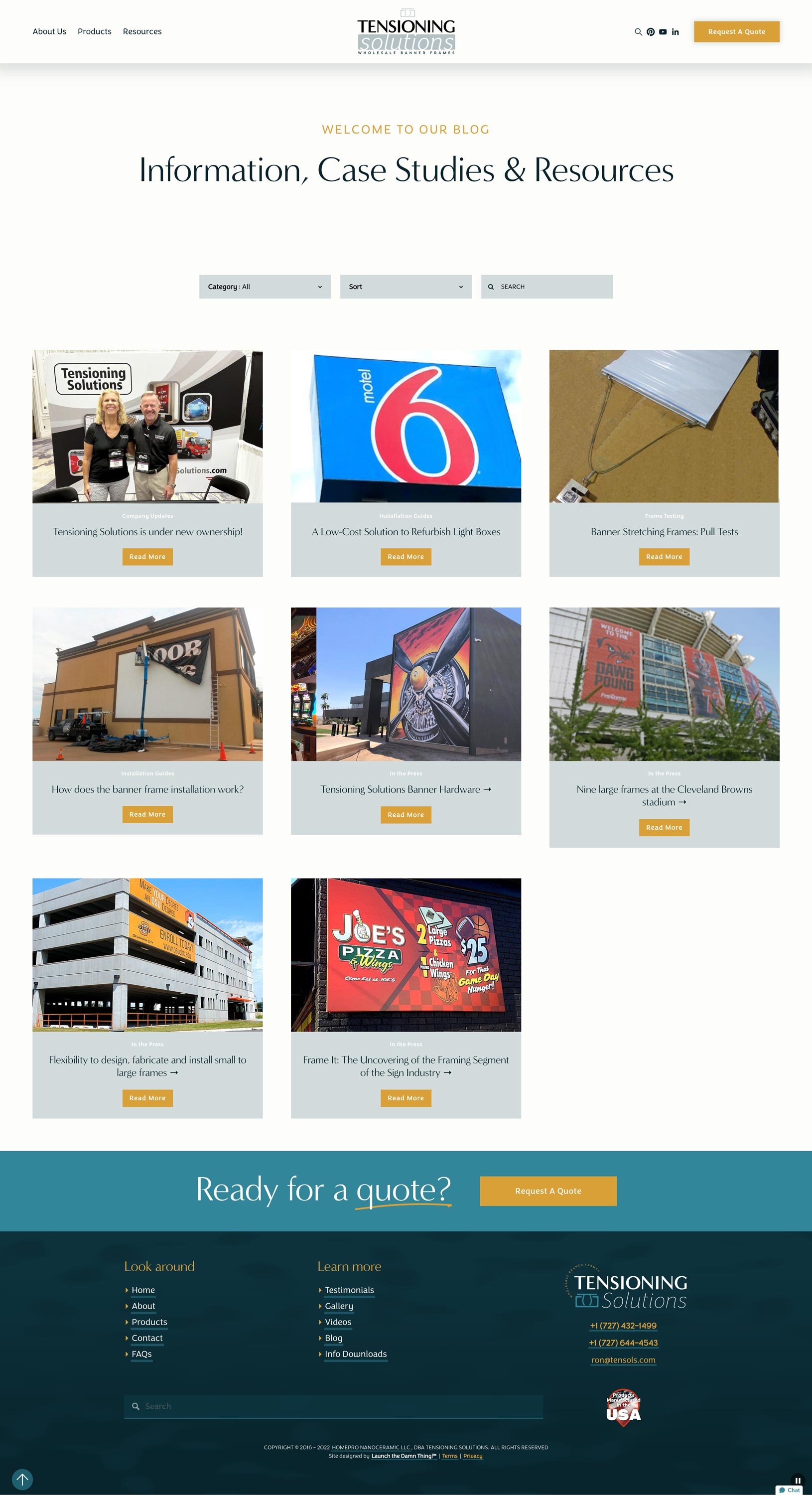
Blog & Resources
Contact
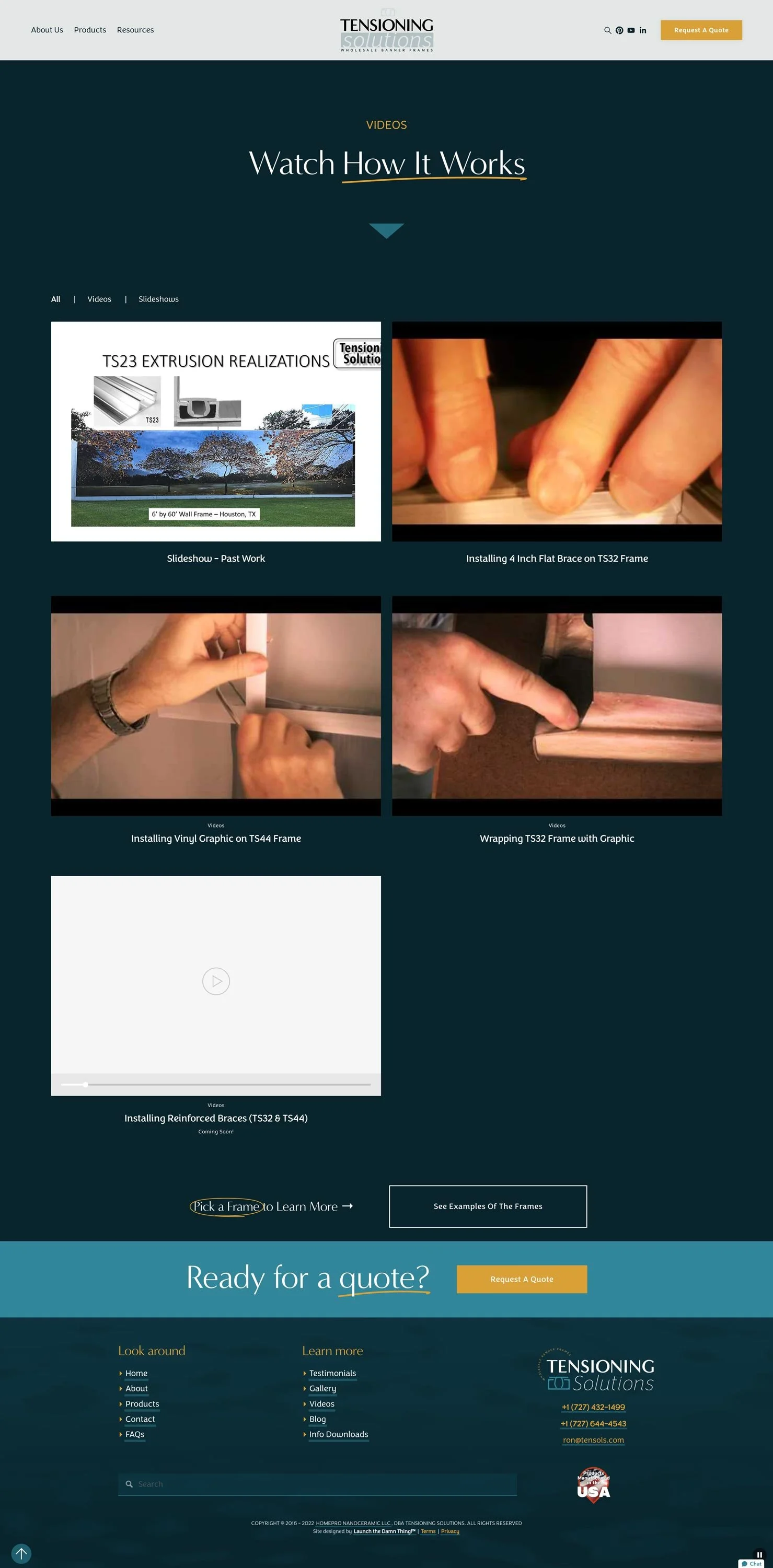
Videos
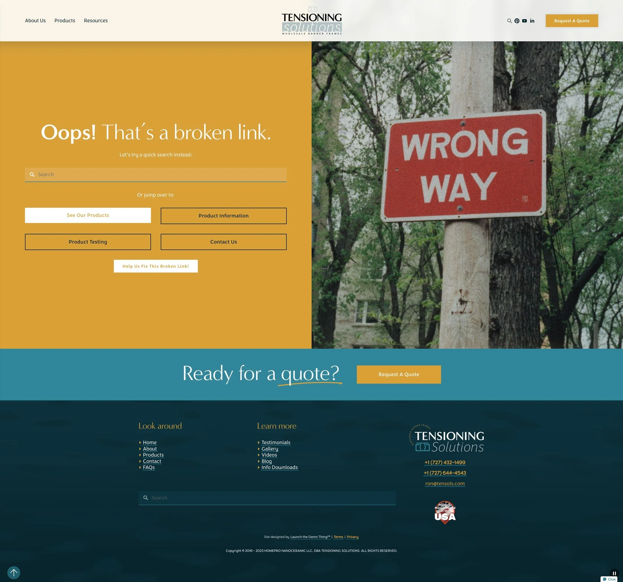
Custom Error 404
Custom linktree for social media
Redesigned 10 Company Documents
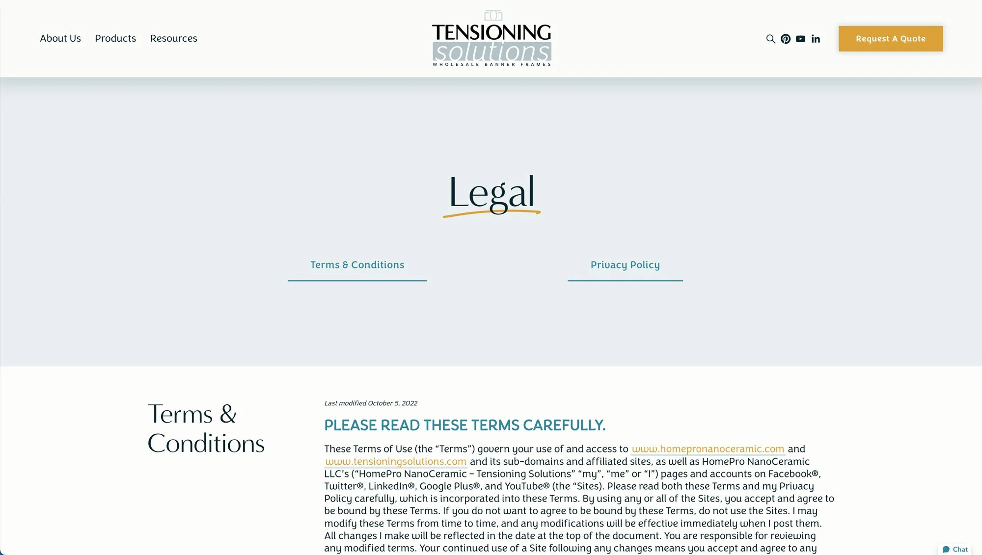
Legal Terms Layout

The proof is in the digital pudding...
You’re unique. Your website should be one-of-a-kind too!









★★★★★
This is our second website venture with Katelyn and, just like the first, we enjoyed the process from start to finish! Katelyn is extremely talented, very skilled, and professional, yet she is warm, kind, and funny. She is so good that we would have waited a year to work with her! The end result really speaks to our clients in a way that tells them, not only about our products but also who we are and how we run our business.
Literally, everyone we guide to our website has positive feedback, and it shows in our sales as well! Our sales so far this year are up 25%, and we attribute a lot of that to people being engaged with our website. The business efficiencies and third-party tools that Katelyn provided have been invaluable! Even the technical information is presented in a way that encourages prospects to stay engaged and explore further.