Stay Wiggly
PROJECT CASE STUDY
WEBSITE REDESIGN ✦ v7.1 FLUID ENGINE
Website & Branding Refresh
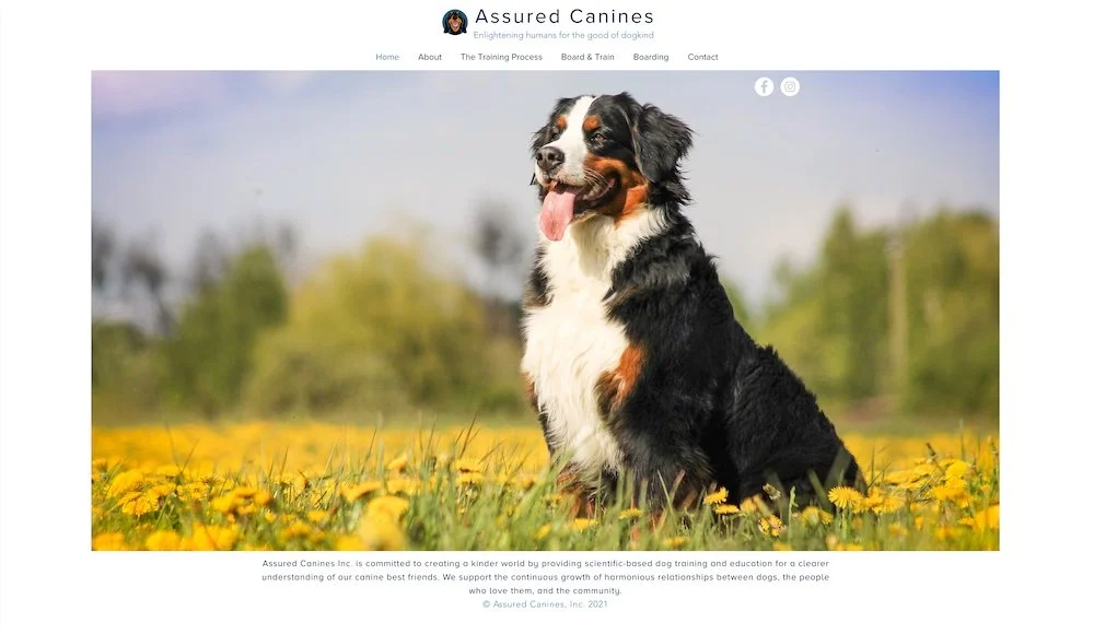
Brittany rebranded and hired a copywriter before realizing she also wanted to hire a web designer, feeling as though she was in over her head with so many projects & couldn’t figure out how to design a wiggly new website worthy of her new brand & words.
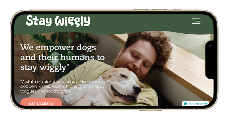
In just two weeks her new website was DONE!
But Brittany doesn’t shy from a big project and had decided to hire help to sort her client processes and finesse the Private Members area, too!
Her hard work has paid off! Stay Wiggly’s unique processes are clearly set, her private members area is ready to invite new clients, and I couldn’t be happier for her!
Sales Strategy & Modern Design +
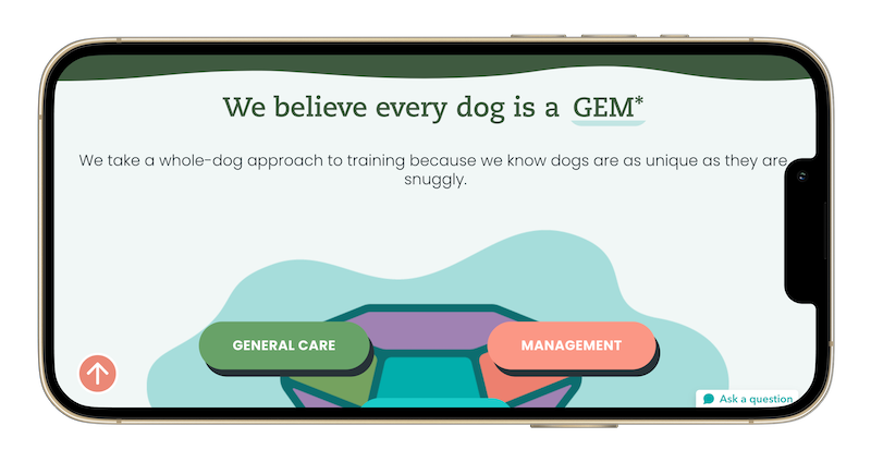
customize brand shapes (wiggles, waves & blobs)
custom popups for hidden content,
basic SEO applied to all images, pages, blogs, & alt text,
URL redirects to prevent broken links from old website,
multiple galleries,
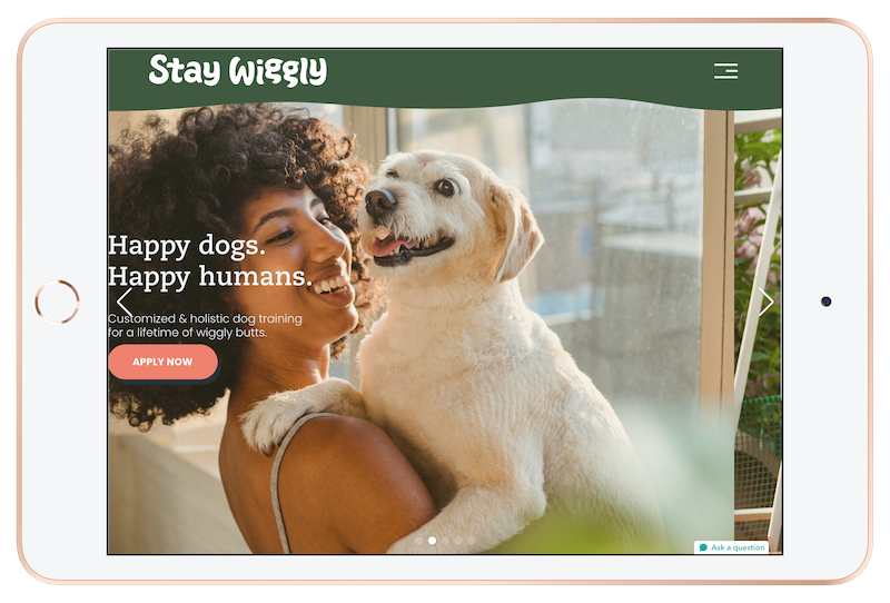
custom banner slideshows,
custom button shapes & hover effects,
custom header & footer borders (wiggly edges),
video library,
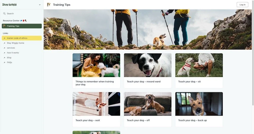
organized resources with categories, sorting & search
basic membership setup,
customized CRM inquiry forms,
basic CRM setup,
sales pages for each product,
online forms,
and Canva templates for all new or redesigned graphics for future edits
❶ What are your favorite parts of the new website & branding?
Our products can be perceived as “industrial” and our goal was to soften our approach and guide visitors to our solutions for their clients while educating them about the details in a way that wasn’t too bogged down with technical jargon. Katelyn absolutely accomplished that with our new, rebranded website! We love everything from the colors that she chose to the way the elements move and capture people’s attention. When compared to our competitors, we are confident that our website holds visitors’ attention longer and helps them educate and prequalify themselves.
❷ Did we successfully accomplish your design goals?
We cannot say enough about how pleased we are with the design of our website and branding. Even the technical information is presented in a way that encourages prospects to stay engaged and explore further.
❸ Has the updated website had any impact on your business thus far?
Literally, everyone who we guide to our website has positive feedback, and it shows in our sales as well! Our sales so far this year are up 25%, and we attribute a lot of that to people being engaged with our website. The business efficiencies and third-party tools that Katelyn provided have been invaluable!
❹ In general, how is the website treating you? Any feedback you have or that visitors, business contacts, or clients have mentioned?
As mentioned above, we have received nothing but positive feedback about our website. Prospective clients seem to like the fact that it is easy to navigate and that there are lots of examples of work done by customers who have purchased our products and put them to use.
Designs
Home page
About page
Training Approach page
Training Services page
Board & Train page
Reviews page
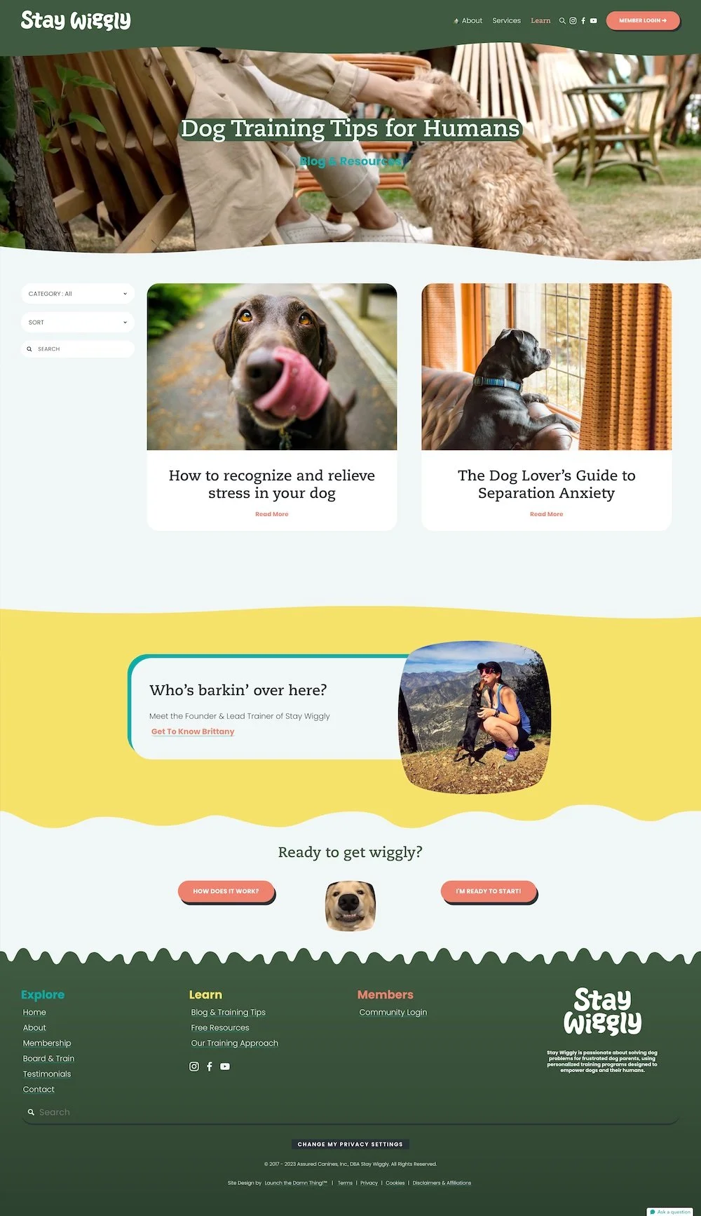
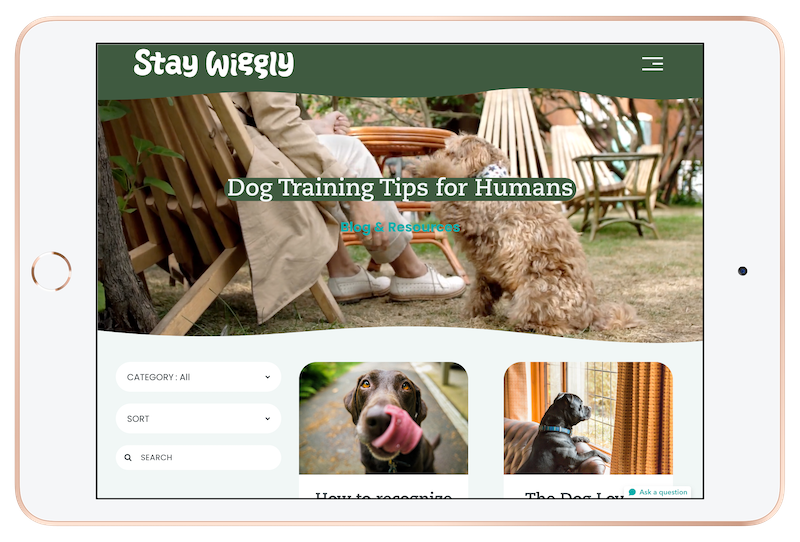
Blog page
Blog Post page
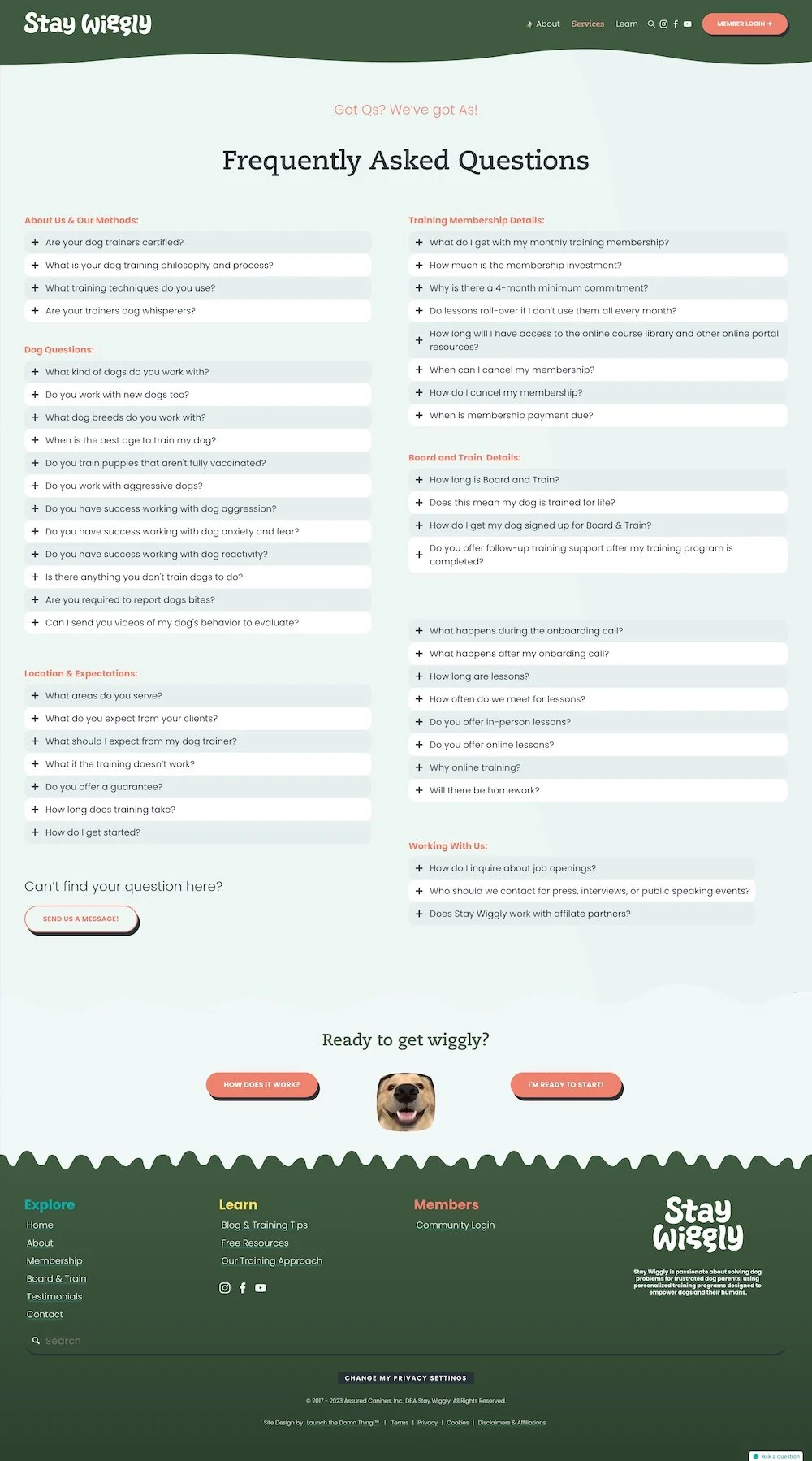
FAQs page
Contact page
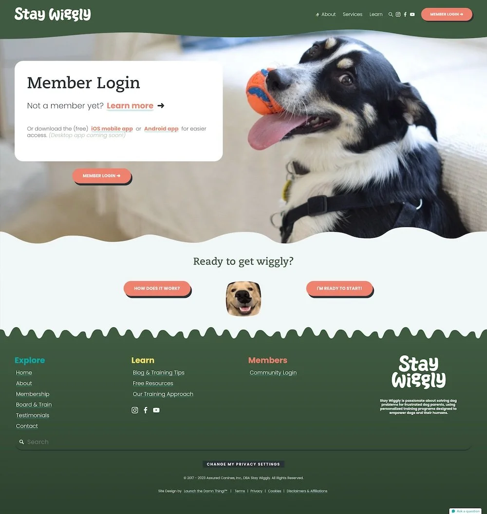
Member Login page
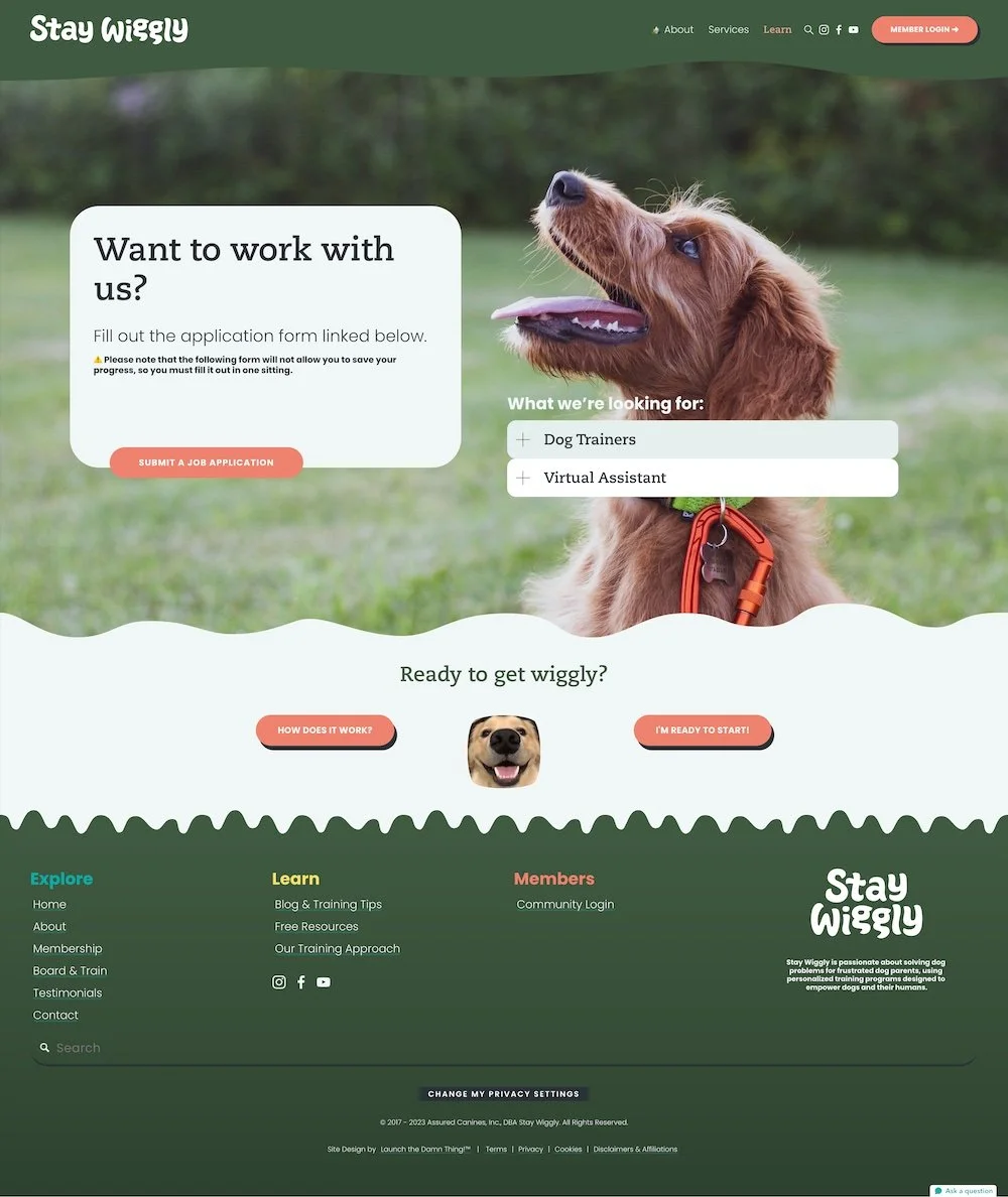
Jobs page
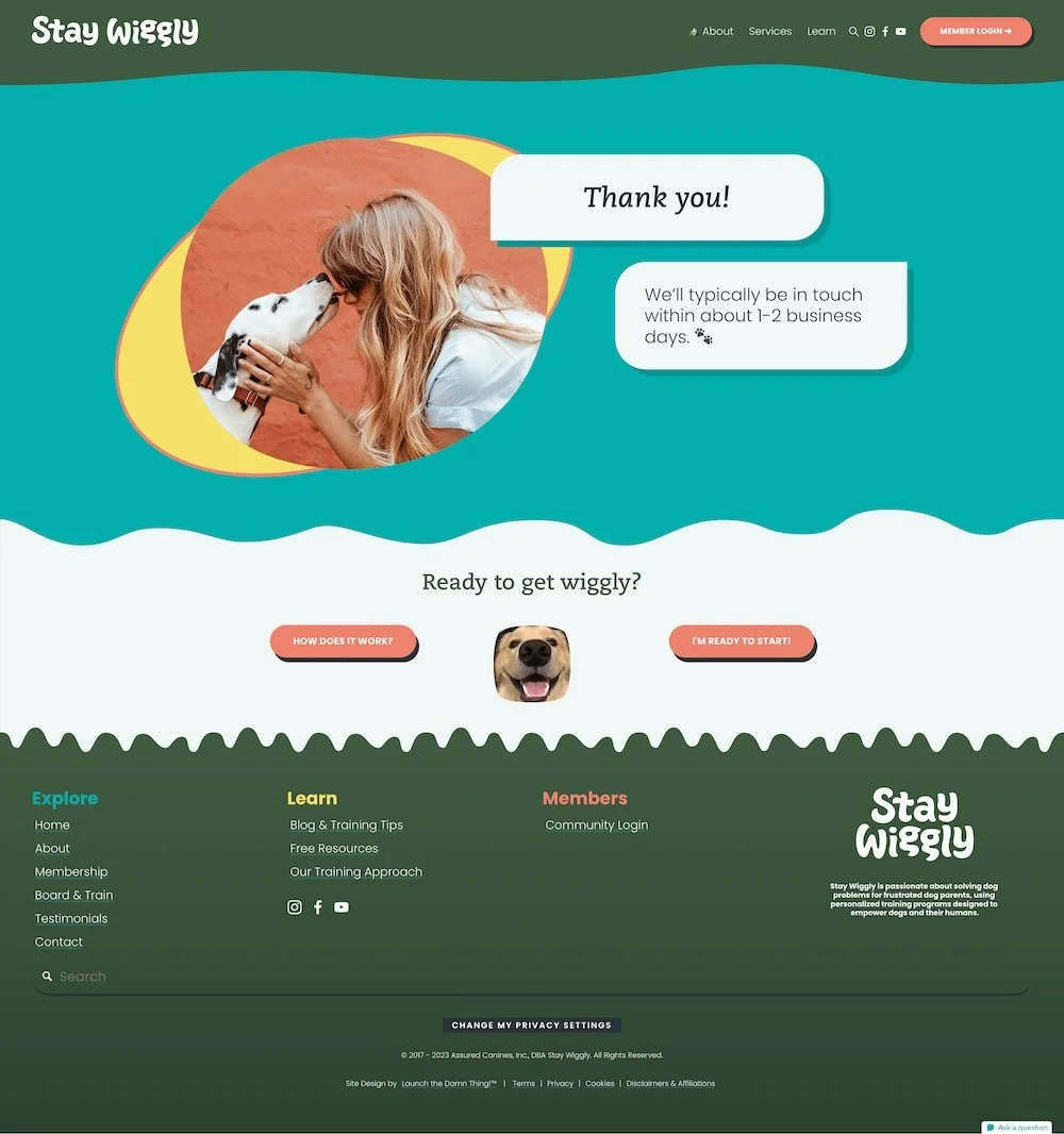
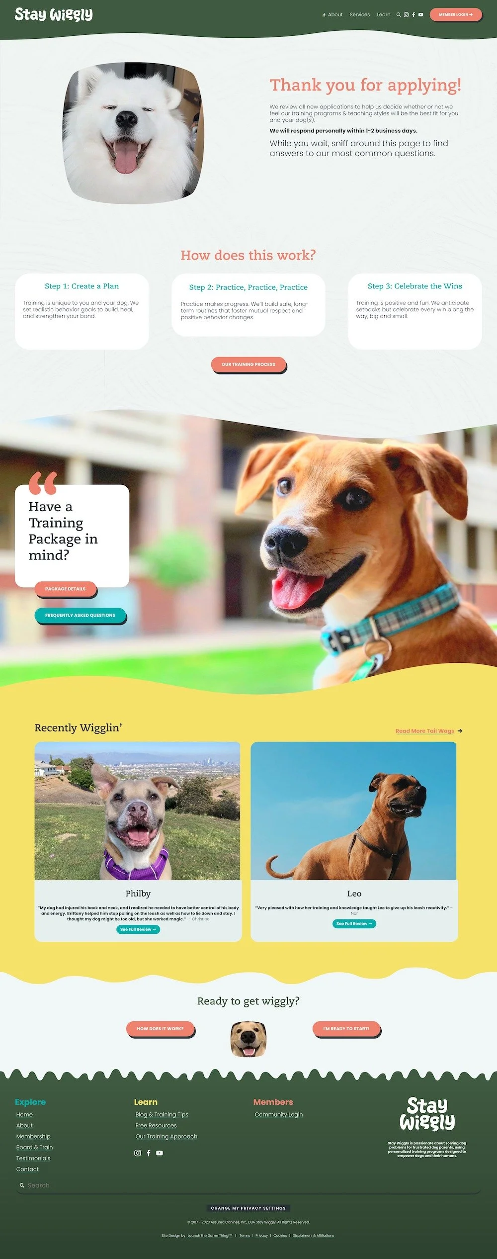
Thank You page
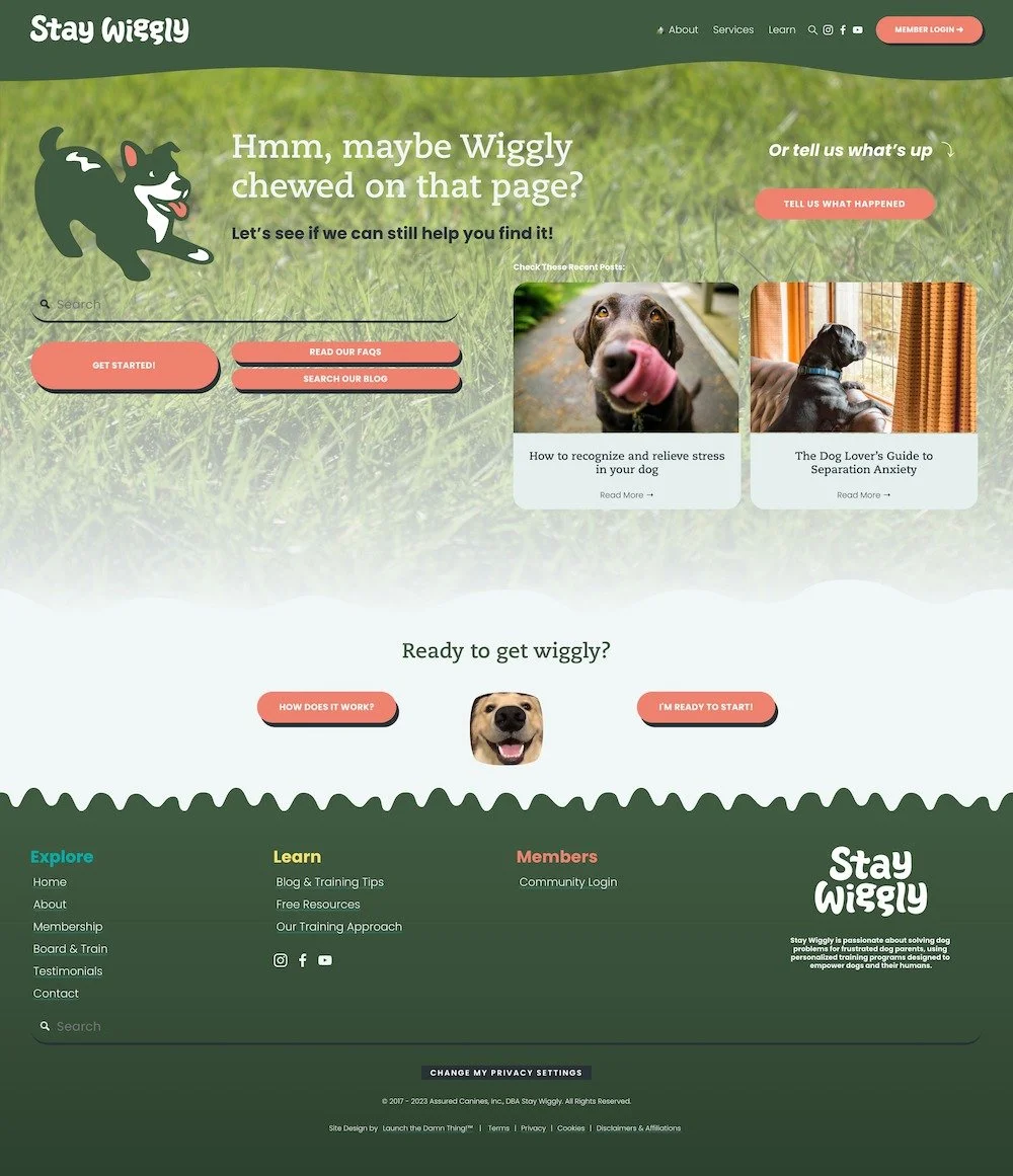
Error 404 page
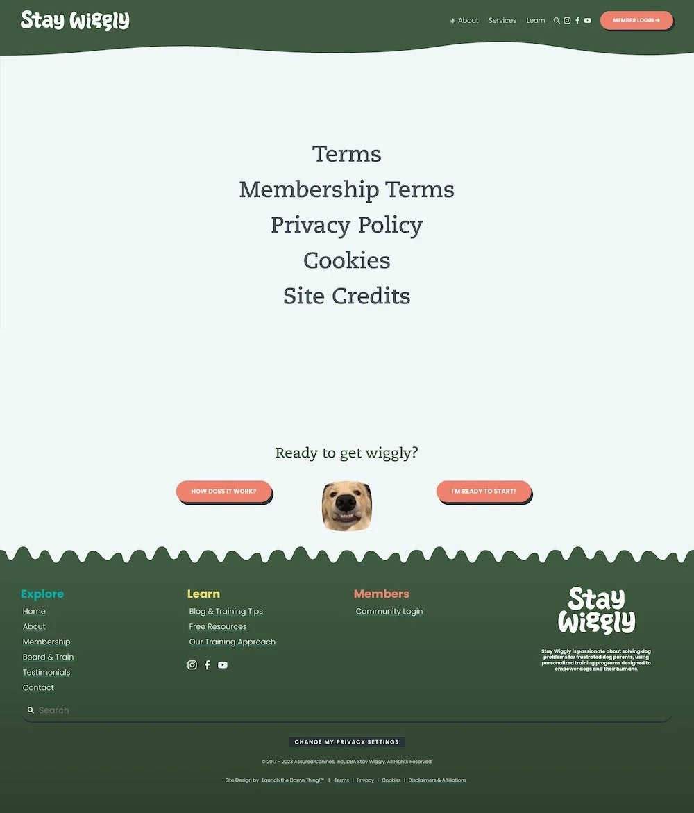
Legal policies page
Social links page
Inquiry Thank You page
Private Members area (public page)
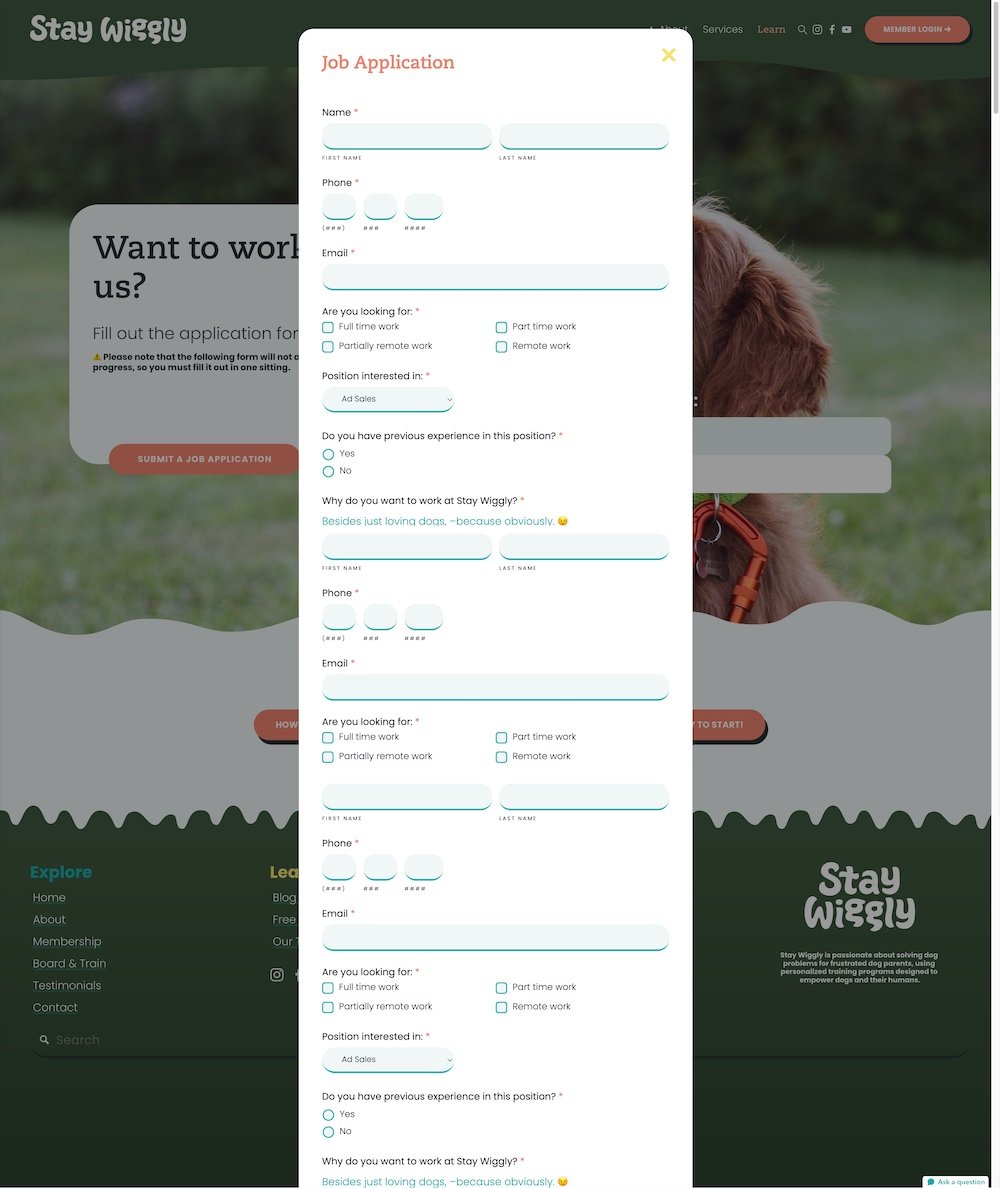
Jobs page (form)

The proof is in the digital pudding...
You’re unique. Your website should be one-of-a-kind too!


