Squarespace Web Design & Business Tips
O N T H E B L O G
Images & Videos for Websites
CHEATSHEET & TEMPLATES
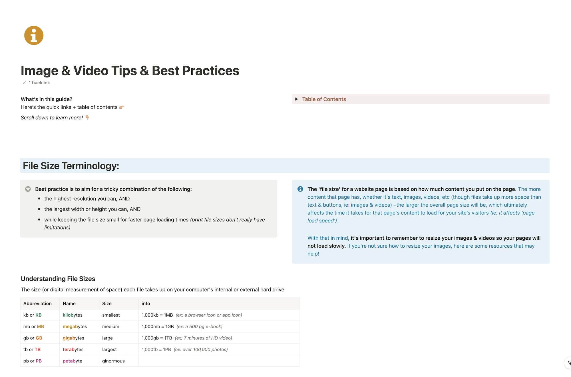
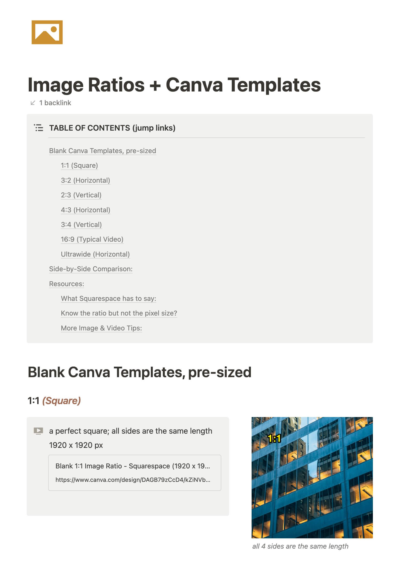
File & format terminologies & size ranges, resource lists, and pre-sized blank Canva templates for various image ratios.
4 ways to use the Summary Block in Squarespace
The Summary Block is one of the most versatile blocks Squarespace has to offer.
Want to display a list of new posts, events, or shop items that automatically include new additions when added? Meaning, you don’t have to go back and add the new post/event/shop listing everywhere, every time.
What about those nice rotating reviews with the arrow navigation? Yep, that too.
Let’s walk you through how to set these up (or check out the video at the end of the post)!
Why you’ll never get what you want & how to fix that
Truth Bomb: I’ve been feeling stuck for a long time.
I’m sure you can relate if you’re reading this.
There’s so much out there saying blog X times a week, start a podcast, start a YouTube channel, send X emails to your list every week, create a course, start a membership, post to Pinterest X times a week, post to Instagram at least 1x day, create a Facebook group, stay active on social media, show up in the DMs, do Insta Stories ––on and on and on.
Well as you can see, perhaps, that’s a lot of shit to be keeping up with. #amIright?
Frankly, I don’t want to do most of those things. They just don’t resonate with me and the things I have fun doing are just hard for me to do consistently with my current schedule.
So, I’ve been listening to #allthepodcasts and I just picked up Marie Forleo’s new book Everything is Figureoutable (love it, btw!) and I’ve been punched in the gut a few times with some realizations.
Ya know, stuff “we already know” but aren’t doing anything to fix/adapt/change? Yeah, that stuff.
Because those “Ah-ha!” moments hit me in the face with a truth bomb I needed to pay attention to (yes we’re all still learning!), I wanted to make sure I could share those Ah-has with you!
7 ways to use the Image Block in Squarespace
People love the idea of Squarespace, because it's so easy to edit. No developers are necessary; therefore, longterm, you save time & money in investing in Squarespace, whether you hire out the original design or DIY.
The one thing that people worry about is whether their site will look too much like the template, or too much like everyone else's Squarespace site, because of this template-based system.
The way around that? Get creative! With the right creative mind and the right tools, your site doesn't have to look like anyone else's –and I'm not even talking about using some code to customize it.
Let's investigate some other ways we can use the Image Block in Squarespace to make your site stand out!
4 things you can do with the Spacer Block in Squarespace
‘I added an image to the page, but it’s HUGE! How can I make it smaller without cropping it?’
Questions like those pop up in my inbox a lot, and for good reason. There’s not an obvious answer!
If you’re new to Squarespace, or even just new-ish, you probably don’t know some of the multifunctional qualities of their most useful block elements. So over the next few posts, I’ll go through them one by one and spill the beans for each of them.
Now, let’s dive into the 4 other ways you can use a Spacer Block on your website (besides, of course, just adding space to the page between elements)!
15 reasons I'm obsessed with this email app!
We all hate that little number icon on our email. Whether you stress about getting to inbox 0 or ignore that growing number as you only check the emails that feel relevant to you, there’s a better way!
Imagine having control over your inbox again and removing that pesky number badge on your email app that may be causing you stress.
Wouldn’t it be nice if you could be reminded of emails you CANNOT forget about, schedule emails to send later, delegate emails to team members, setup canned emails, manage multiple email accounts and more, all in one place? For FREE!
Then PLEASE keep reading, because I cannot wait to share this with you!
*There are NO affiliate links in this post!
Comparing: ClickUp, Asana, Trello, Zenkit, Airtable, Milanote & Quire
There are SO many Project Management tools out there that are worth a look, but which one is the right fit for YOU?
I’ve taken the time to break down the ones I’ve used & organize them into feature lists so you can search for what you need and see which apps offer those things.
Now, let’s see which app is the right fit for your productivity needs!
Client Relationship Management vs. Project Management tools
As a business newb (or even a business pro), you’ve probably heard other entrepreneurs tossing around phrases like “client management” or acronyms like “CRM” or “PM” and you might not have any idea what they mean.
Maybe you bought something like Dubsado or Honeybook and now you’re confused because you don’t understand why people are also using a PM/Project Management tool –and how do they integrate? Why do you need both?
Where to edit your Squarespace website’s SEO Settings
Not an expert in SEO? That’s okay! You don’t need to be an expert to make these quick & easy changes.
I’ve walked you through the bare-bones basics in a couple other posts about Squarespace SEO basics, and now I’ll show you where to update your individual page SEO settings with the new UI/UX changes, because it’s gotten EVEN EASIER!
Edit your Squarespace site on the go with their new mobile app!
Betcha didn’t know they finally released a mobile site-editor app, did ya?
It happened in early 2019 with a beta release I got to be part of. I got to submit feedback & help them work out some bugs and now it’s available for the public.
FINALLY.
Now, let’s talk about what you can/can’t do with it.
6 game-changing CSS tweaks for your Squarespace website
Let me preface this post by saying, I’m not a web-developer and I can’t custom code your site from the ground up. In fact, I’d really prefer not to ever learn that exact skillset, myself. My interest is in the design & visuals of the site, not the backend.
I use Squarespace for myself & for my clients because it allows me to focus on the design & leave the backend coding, site security and more to the Squarespace gurus.
My clients love being able to edit their site themselves as needed; a fabulous bonus for small businesses who don’t want to have a whole team dedicated to building & maintaining their online company-home.
That being said, I still use some coding to tweak the sites I build and today I’m sharing with you how to get these 6 game-changing CSS tweaks for your site.
4 Tips For A More Professional Design
I'll start by saying I swear I'm not a "design snob!" Haha!
That being said though, there are a few important things I tend to notice most frequently in other people's designs that will either give me better faith in their knowledge of design, ...or not.
A lack of attention to these 4 details in any given design will help me decide what caliber of designer I'm looking at. Are they self-taught with good instincts? Are they a trained or college educated designer? Are they a trained designer or a self-taught with bad design instincts? These can be important factors in deciding:
from a client's perspective: who to hire
from a designer's perspective: who to get advice from
Here's that list! It's super short! These are the top 4 things to check as you design or before you wrap up your design, because it will leave a better impression on other designer's and your client, and help create better consistency.
What's wrong with using logo templates?
First things first, I realize that it seems hypocritical for me to say this when I design sites in Squarespace, which is a template-based system. I’m not referring to websites here, at all.
Templates for websites are entirely different because a website template means the coded structure is already done for you, but (typically) you still edit it. A LOT. You change the fonts or color scheme, put in your own content & images, etc. and truly make it your own, hopefully to the point it no longer obviously resembles the initial template style. You can choose where to put your content & end up making something that may or may not resemble the original you started with and THAT’s why it’s different.
Also, web developers are not always designers & designers are not always web developers; having the two separate sets of skills are vital in creating a good site, but it's not necessary to have both skill sets in the same person. A developer sets up the template, then a designer can come in & use that structure to design a site for someone using what the developer created. It's a great system!
So what's really wrong with using a logo or business card template, for example? I totally get why people do it. They're usually free, or very cheap and people who use them typically don't have a designer on staff or they assume they can’t afford one to set up these things. A lot of these templates even look really good, depending on where you get the template from, of course.
So, if they're free, cheap, easy to use, and are built into whatever company you're ordering the product from (like VistaPrint), then why shouldn't you be using them?
How to pair different fonts
Using one font throughout a document can be visually monotonous, right?
But how do you know which ones go together and which ones don't?
Do you see gorgeous font combinations other people have done, but when you make an attempt yourself, it never looks right?
Today I'm going to give you a few tips on how to pair different fonts and what not to do! Whether it's in your Powerpoint, your resume or images for social media, you can choose like a pro too.
The 'how' is simple if you understand the the basic rules of thumb used.
+ download the FREE Guide to help you Choose & Pair Fonts Like A Pro!
How to choose the right font style
Ever noticed there are certain fonts designers don't use? Have you ever wondered why that is? Keep reading for the answer, and grab your FREE How-To Guide so you can Choose Fonts Like A Pro!
7 tips for new designers
Are you a new designer entering the workforce or starting your own freelance business?
Maybe you’re a new designer and you've already landed your first design job (Congrats!!).
If so, here are 7 tips I've learned through my own experiences over the years while in college, working in the professional world as a student, freelancer and landing my own design job as an in-house designer.
Make sure you grab your FREE Ai Key Command Cheatsheet too! 😉
9 tips for giving designers better feedback
I think when people hear the word "designer" they sometimes think of one (or several) of these descriptors: nerd, techie, IT person, hard to communicate with, quiet, introvert, not personable, weird, unorthodox, etc.
While some of those things may be true, the main purpose of today's blog is to provide tips on how to communicate effectively with your designer, despite the personality differences that may exist.
7 apps to boost your business productivity
If you’re new to the entrepreneurial world, then you might be kiiiiinda sorta flyin’ by the seat of your pants. Yeah?
You never went to business or marketing or even design school, so you’re probably a little overwhelmed with your business.
I totally get it. When I first started, I had about 10 years of print design experience and some light freelancing experience under my belt, plus my college design education, which in no way prepared me to run a business of any magnitude. Back then freelancing just meant we agreed (verbally or written in an email) on a price, I did the work and they sent me a check. No written invoice, no contract. YIKES.
Don’t be that person! Let’s get you started with a few apps I wish I’d been using right out of the gate.
How to organize fonts like a Pro
Designers end up having sooooo many fonts. It really gets ridiculous!
If you have 500-1000+ fonts and you’re scrolling through them constantly searching for certain styles or that one you JUST CAN’T REMEMBER the name of… then you need my help!
It’ll take some time to get this system started, but if you do this now it will save you so much of it later on as you continue to collect them.
17 must-have Chrome Extensions for designers
I’m a Mac user and will likely be one for the foreseeable future. Their interface makes more sense to my creative brain; the clean lines & simplicity just mesh better with me all around. Plus I “grew up” with it being the standard machine used for the design industry, which is also what my formal education is based on.
That being said, I have the choice of using Safari, Firefox, Opera or Chrome, and I’m sure there are some others I don’t know exist, but I choose to use Chrome because of all the available extensions! Let’s dive into that list now!
Katelyn, here!
I’m the Founder, Owner, CEO, Designer & Educator at Launch the Damn Thing® and I love coffee, cursing & carefully laid plans. 😂 (Also reading, blaring loud music, and teaching, –but those didn’t fit into my nice alliteration!)
Did I just totally make your day? #goals
