Grouping Blocks in Squarespace: A Stacks Tutorial
What's inside this post: Hide
⏯️ QUICK DISCLAIMER:
Because this is a very visual tutorial today, make sure you watch the included video! It will be much easier to grasp what's happening if you can see it as I talk through everything with you.
I really hated Stacks when it was first released.
Not in a "mildly annoyed" way—in a "closed the tab and complained about it out loud" way. 😂
I couldn't figure out what it was supposed to do, or why my layouts kept rearranging themselves the second I stacked (grouped?) some blocks together, or why Squarespace decided to name a grouping feature something that sounds like a pancake order. 🤭
It wasn't until I started watching other designers who picked it up faster than I did that the whole thing finally clicked. 🤦🏻♀️
That confusion is what made me want to make this tutorial: because I know I'm not the only one. A bunch of my students in the Club have told me the exact same thing. They open the Stacks panel, poke around for a few minutes feeling COMPLETELY confused, and quickly close it again, convinced this is a dumb feature.
It's not dumb, and it IS useful, but Stacks just doesn't work the way you'd expect it to, especially if you've never seen someone actually use it, which is probably exactly why you've been avoiding it like the plague.
So that's what this post is for. I'm walking through what Stacks actually solves, then how to use it without wrecking your layouts, and where it still trips people up even once you know what you're doing.
What is "Stacks" on Squarespace?
It's not GROUPING, technically, but it does behave similarly.
Stacks quite literally STACKS blocks on top of each other, or next to each other, which adds those blocks into an organized group. So when you 'Stack' a set of blocks together, they are realigned as a group, either vertically or horizontally.
Within the Stack's settings, you can make customized adjustments, not only to the Stacked group itself, but also to the elements inside, which can be different between desktop and mobile. And when you want to rearrange the whole group within the section, you don't have to select every block in the group, you only need to select the Stack, to move all the inside pieces around together as if it were all one block.
Stacks also gives you the option to set spacing granularly between the blocks within each Stack, AND you can also stack together multiple Stacks. 😂 There may be a limit of 6 or so layered Stacks that can be grouped together—but I'll get into that later in today's tutorial.
Where can I use Stacks?
The new Stacks grouping feature in Squarespace only works in version 7.1 and only in Fluid Engine sections.
It does NOT work in Classic Editor (the older editor in Squarespace). Classic Editor is only the current default editor inside Event collection items, and Blog collection items (posts). Stacks also doesn’t work in the older versions of Squarespace, including version 7.0 and older.
How to use Classic Editor to edit blog posts
Squarespace's Stacks Feature Fixes Those Weird Spacing Issues
Before you can appreciate what Stacks does, you really need to understand one of the major problems it exists to fix, and that problem lives inside Fluid Engine sections only.
Here's the situation we've all been complaining about: you design your site on your laptop, and it looks great. Then you open it on a bigger screen—an iMac, an external display, whatever—and suddenly there's this weird gap of dead space between blocks where your content used to sit snugly.
example of spacing issues in Fluid Engine
highlighting the extra spaces in Fluid Engine
The editor isn't malfunctioning though, it's actually doing exactly what you told it to do. You just didn't realize what that was. ☺️
If you turn on the grid in Fluid Engine (press G on your keyboard, as in "grid"), you'll see what's happening.
Squarespace lays your content into a grouping of cells on the grid. When you place a text block with a heading inside, it locks that text block into a certain number of cells wide and tall. Same with your paragraph text, same with your button.
In this example, the heading block is covering 4 rows of cells and 10 columns of cells on the grid.
heading (text block) container size in Fluid Engine
paragraph (text block) container size in Fluid Engine
Squarespace holds onto that exact cell-grouping shape no matter what screen size someone's viewing your site on.
That's fine when the browser window is close to the size you designed it on.
But because Squarespace's font sizes are responsive to browser width, that locked-in cell-grouping shape stretches as the screen gets bigger and the content inside adjusts to fit the resized area for different size screens. The text can be scaled proportionally larger to fill the space inside the block if needed, based on how you’ve set the font size in Site Styles.
However, the text may also adjust itself to wrap (or not wrap) into multiple lines within the container you told it to fit into, whether that box around it balloons or shrinks based on the size of the screen the viewer is using.
Either way, that's where your dead space tends to come from, especially on larger screens. This will make more sense if you watch today’s tutorial so you can SEE it happening.
The old workaround, before the Stacks feature was released, was to design your site on the biggest screen you had access to. If you noticed a gap, you could manually collapse it and shift your remaining blocks up to fill the space. When the design got smaller for smaller screens, the spacing issue wasn't nearly as bad, as the design scaling up for larger screens.
In this example with the browser taking up the full width of my 32” screen, the heading block is still covering 4 rows of cells and 10 columns of cells on the grid. The extra visual space is because the content inside these blocks (containers) no longer needs that full space on larger screens, because it’s not wrapping into so many lines anymore, yet the block itself is still the same size on the grid.
What’s changing and adapting, is the content inside the container––not the container itself.
container sizes in Fluid Engine on larger screens - same group of cells, but more space is visible
It worked, technically, but it meant you needed a larger 30+ inch external monitor just to catch problems that most of your visitors might never even see, because most people aren't browsing on a screen that big.
Stacks is the way Squarespace decided to help us fix this, it's not just another workaround. It lets you group blocks together so they behave as a unit, with spacing and sizing that flexes intelligently for each visitor, versus holding onto a rigid cell count that creates spacing issues on larger screen sizes.
You don't need the giant monitor anymore, though it can certainly help in a lot of other situations (right now, I have two browser windows open side-by-side while I write this post, LOL). You do need to understand how Stacks' grouping features work though, which is what we're covering in the next sections.
How to Use Squarespace Stacks: The Basics
Stacks works by grouping blocks either vertically or horizontally, depending on how they're laid out on your page.
If you've got three elements sitting in a column, it'll stack them vertically by default because it generally guesses the direction correctly for us.
If they're sitting side by side, it'll stack them horizontally instead.
Stacks settings in Fluid Engine
Some layouts may end up needing multiple stacked groupings that work together with each other, not just one. Meaning, some stacked groups will be vertical, some horizontal, and those stacked together for the final grouped layout, if needed.
To create a stack, select the blocks you want to stack together (click one, then Shift+Click the others, or just drag a selection box around everything you want to select), then click the "stack blocks" icon in the toolbar, or hit Shift+S on your keyboard. Squarespace groups them into a Stack—and it will almost certainly change your layout in a way that makes you want to immediately undo it. 😆 Don't undo it!
That rearrangement is part of the process, so don't panic. It's fixable!
Controlling Spacing Between Grouped Items
controlling the space between blocks in a Stack, in Fluid Engine
Once blocks are in the same stack, they share consistent spacing between them automatically. That's genuinely useful when you want uniform spacing, and kinda annoying when you don't.
Let's say you've got a heading, a paragraph, and a button, and you want the button to have different spacing above it, than the space between the heading and paragraph. If they're all in one stack, you can't do that—they'll all inherit the same gap/space.
Only if you want different gap spaces between the elements, the workaround is to unstack and rebuild the Stack with more intention or strategy.
First, group just the heading and paragraph blocks together, so they get their own spacing between those two blocks, if separate (note: this only works if the heading's text block is separate from the paragraph's text block).
Then, because Stacks can be stacked in multiple layers of Stacked groups, group that heading-and-paragraph stack with the button separately in a new Stack.
Now the button can have its own independent spacing that's different from the spacing between the heading and paragraph, because the heading and paragraph are in a Stack together, and the button is grouped with that first Stack; each layered Stack gets its own spacing preferences.
This is basically "stacking Stacks on Stacks" which is the part that trips people up most, so it's worth watching the video tutorial until it makes sense.
You can think of 'Stacks' like a stack of pancakes (vertical) or 'stacked' side-by-side (horizontal) on a griddle while they're cooking. The stack groups the elements (blocks) together visually. 👇🏼
Fill vs. Fit, + Using Percentages Instead of Pixel Sizes
Fit vs Fill buttons in Fluid Engine, and using width percentage values vs. pixel values
When you Stack a button with some other blocks, Squarespace flips its sizing setting from "Fill" to "Fit" automatically, for reasons that remain a mystery to me. So if your button suddenly looks too small or it's in the wrong place after stacking it, check that button block's settings and switch it back to Fill.
From there, you'll want to decide how wide that button actually stays. You can set a hard pixel value (such as 320px wide or 70px high), but I'd steer you away from pixel values for widths.
Why? Because a fixed width of a specific pixel value (number) means that on a screen too narrow to comfortably fit a button that width, things are going to look weird or broken, and too compact.
Percentage values are more responsive because they scale relative to whatever container they're in, not to a fixed number of pixels.
For example, setting a button block to 50% width means it's always half the width of the Stack (group) it lives in, whether that stack is taking up the full section width or only half of it, or being viewed from a mobile phone or a 32-inch monitor. It will behave the same on everything, because it's a calculated percentage value, not a fixed size.
Accessing & Editing Blocks Inside Stacks
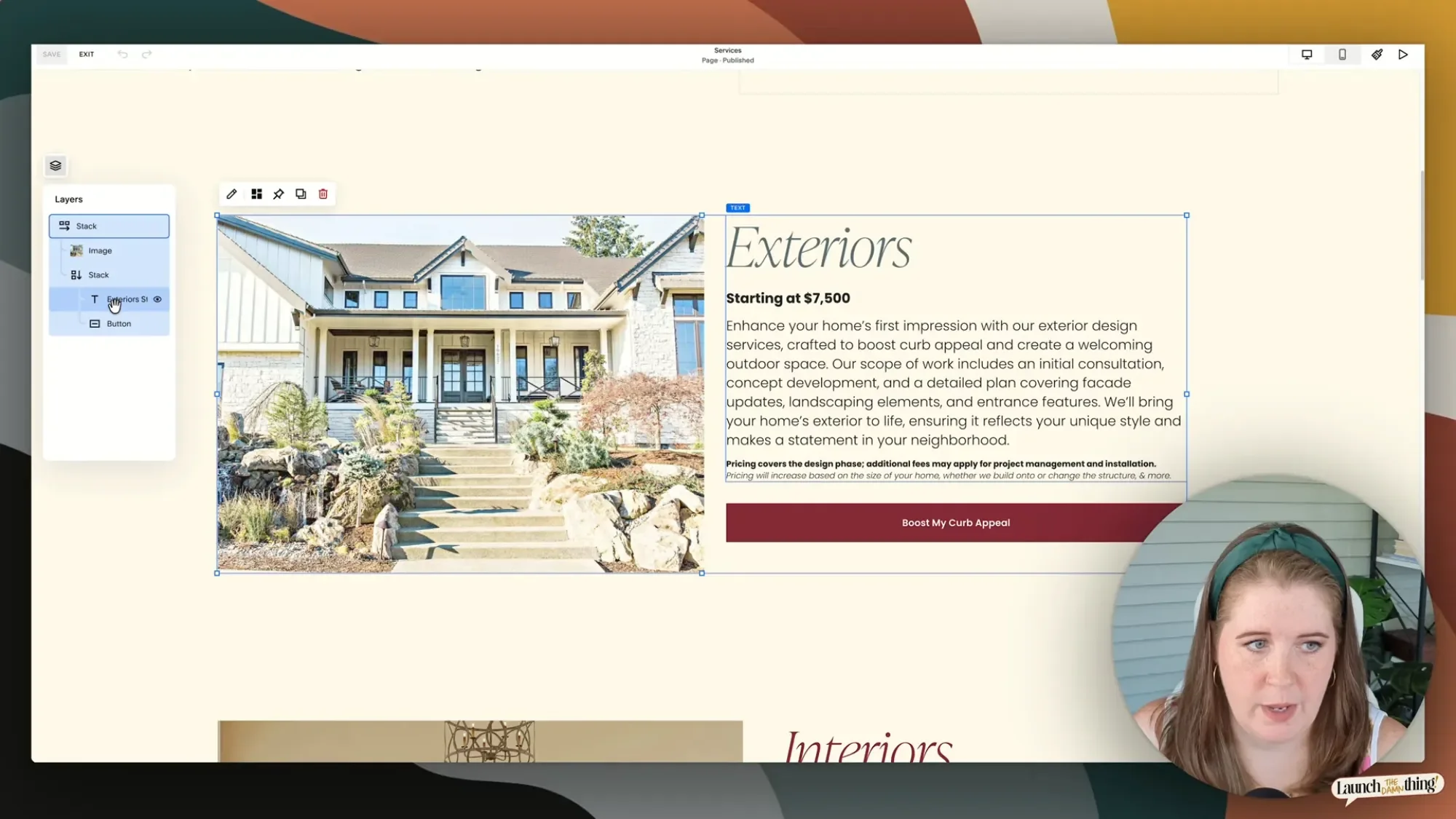
easy access from the Layers panel in Fluid Engine
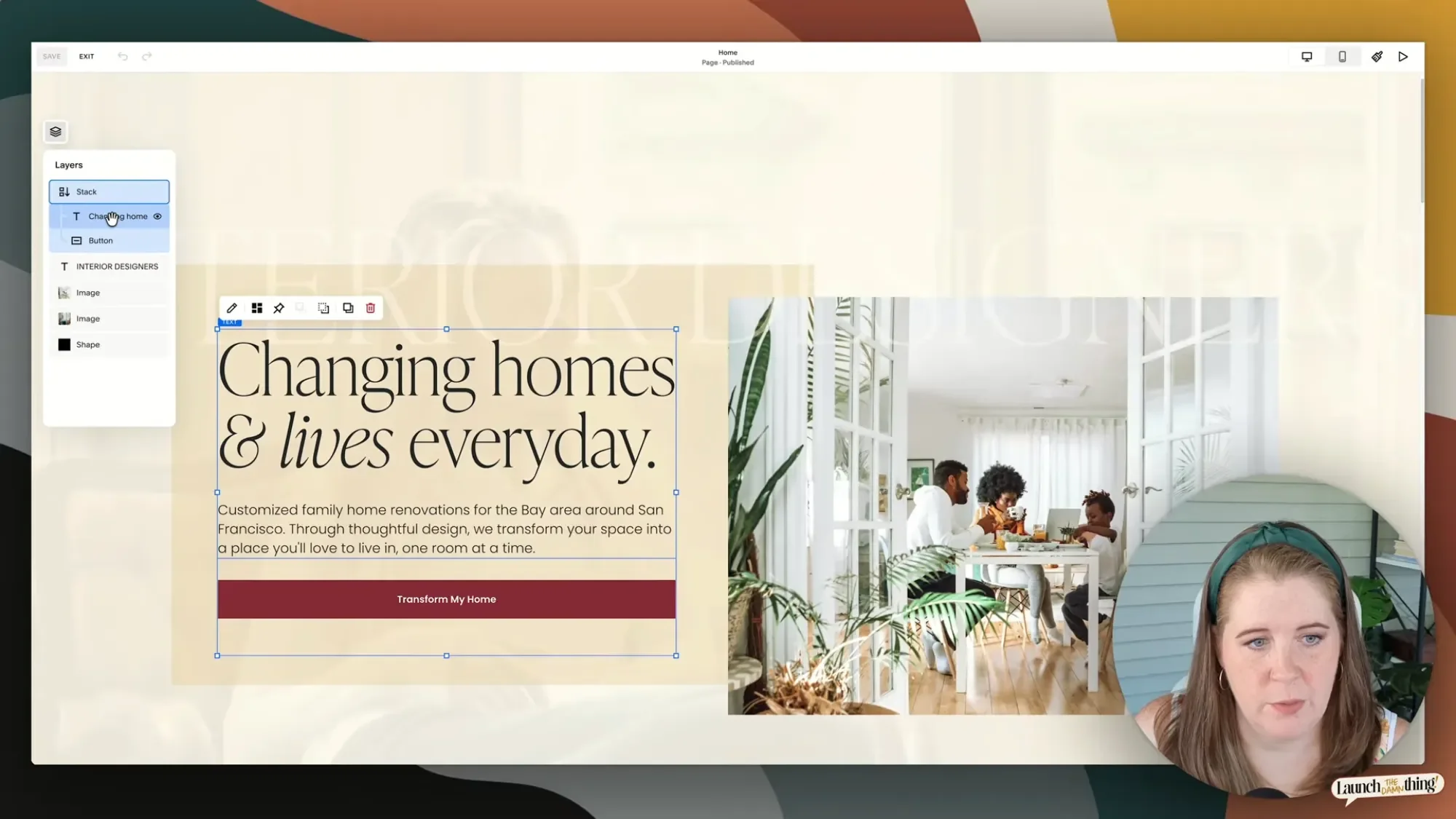
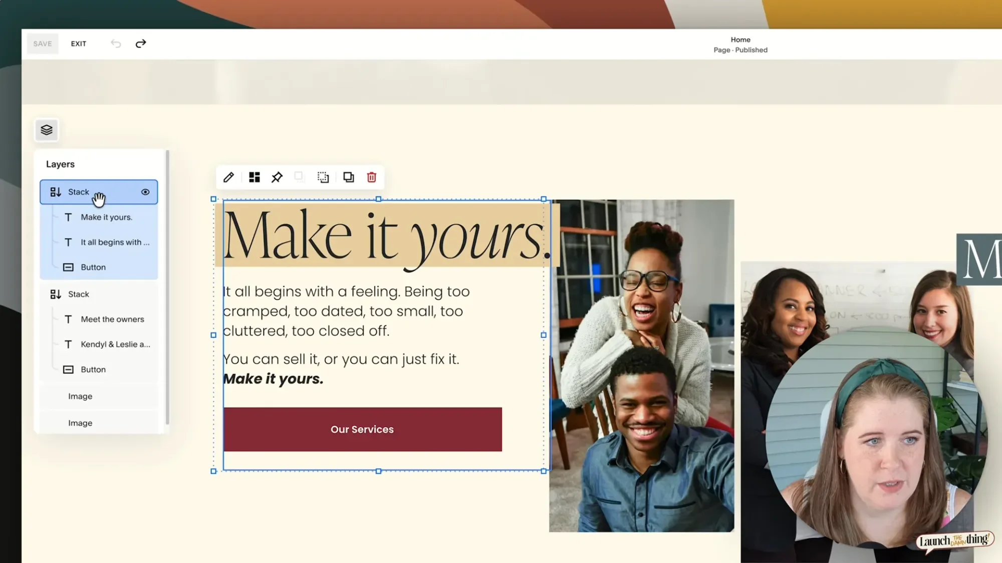
Once you've got Stacks nested inside other Stacks, or even just blocks within a single Stack, clicking on a block to edit it gets trickier, because your first click selects the whole outer Stack, not the specific block inside it. You can double-click repeatedly to drill down into nested groups until you land on the actual editable block you're trying to access, but depending on how many layers of stacking you've built, that can mean a lot of clicking around.
The faster route is to use the Layers panel. It lets you jump directly to any block, no matter how deeply it's nested or layered, without having to click through every parent stack first. It's also where you can drag items to reorder them. For example, if you decide your button should show up above your heading instead of below it, you can rearrange the layered position order from there instead of trying to drag things around on the section layout.
Pro tip:
If you click the Layer panel to open it, and select the block you're about to edit, then click the Layer panel icon again to close it & get it out of the way. Your selected block will remain selected and ready for editing!
Stacks Can Have Backgrounds, Borders, & Custom Spacing (Around the Edges)
Here's where Stacks start to feel genuinely powerful rather than just convenient or organizationally tidy: every Stack can have its own background color, border, blend mode, blur, padding (spacing) around the top/bottom and left/right edges, and transform settings, independent of every other Stack in the section.
That means if you've got text sitting over a busy image and it's hard to read, you can group the text into a Stack, give that Stack a background color, and then it will be legible without needing a separate shape block behind it the way we used to achieve this. You'll also want to add extra padding (space) around that background so the blocks inside the Stack aren't sitting flush against the edges, which you can adjust by hovering over the padding icon and dragging left-or-right and up-or-down, or by typing in exact pixel values (for this, pixel values are okay). You can round the corners of the background color on the Stack too.
Stacks background color options
Stacks background spacing options
Editing Stacks & Working With the Layers Panel
Once you've built out a few stacks, the Layers panel becomes less of a nice-to-have and more of an absolute necessity. It shows you the full hierarchy of what's nested inside what, and it's the fastest way to select a specific block inside that grouping of Stacks for editing without lots of double-clicking to get through the layers.
Let's say you've got a two-level Stack—an image and a button grouped together, and inside that, the button set to 50% width and a fixed pixel height of 70px. If you want to edit just the button, you can click straight to it in the Layers panel, and adjust its settings without disturbing the rest of the group.
This is also the moment to double-check that Fill vs. Fit setting again, in your button block, and that 50%-width setting won't behave the way you expect if the underlying sizing mode is wrong, because Fit is a very differently-sized button than Fill in most circumstances. 🤭 (insert size-matters joke here—LOL)
Mobile Overrides (the Feature We've Been Waiting For!!)
Stacks translates well to mobile, in Fluid Engine
This is genuinely one of the best things about Stacks: for the most part, it just works on mobile without you having to fix much of anything. But when it doesn't—when something needs independent tweaking on smaller screens—you finally have a way to do that without it affecting your desktop layout.
When you switch to Mobile view, you will notice a blue dot 🔵 on the mobile icon above the editor. That's telling you a desktop change is currently affecting mobile too, and it's worth double-checking before you hit Save or leave the editor.
If you click into a stack while in Mobile view, you'll see a toggle button that looks kinda like a computer screen with a curved arrow inside it. If it's black, you're currently able to override something for mobile specifically, meaning whatever change you make there (to settings or position) won't touch the desktop version too. You can also push a mobile-specific change back up to desktop if you want, or reset all your mobile overrides if you want to start fresh.
mobile override options in Fluid Engine
If you change a Stack's background color to something brighter on mobile just to see if it works better for the mobile layout—switching back to desktop, the Stack won't have the same background color change there. It only changed on mobile! That's the override system working correctly, and it means you can fine-tune spacing, sizing, and layout differences between devices without duplicating and hiding blocks on mobile vs. desktop layouts.
One important caveat: mobile overrides only affect position, spacing, background-related, and layout-level settings, not the actual content inside a block. If you change text alignment inside a text block itself (not the Stack it's sitting in), that change applies everywhere, desktop included, because you're editing the content, not the container the content is inside!
Advanced Stacking Techniques
Once you're comfortable with the basics, there's even more you can do!
Stacking Across Different Block Types
You're not limited to stacking text and buttons together. You can Stack an image with a text block, a text block with a button, or any combination of blocks that makes sense for your layout. As you resize the overall Stack, everything inside that Stack scales together as a unit, which is a huge part of what makes the Squarespace editor feel more like a design tool and less like fighting with a weird grid you don't understand. 🤭
Overlapping Stacked Elements Is Tricky
One limitation I've found is that Stacks doesn't handle overlapping elements gracefully yet. If you try to Stack two blocks that are positioned on top of each other in a collage-style layout, Squarespace typically converts that overlap into a side-by-side layout instead, which usually isn't what you wanted.
example of spacing issues caused by creating overlap effect within a Stack in Fluid Engine
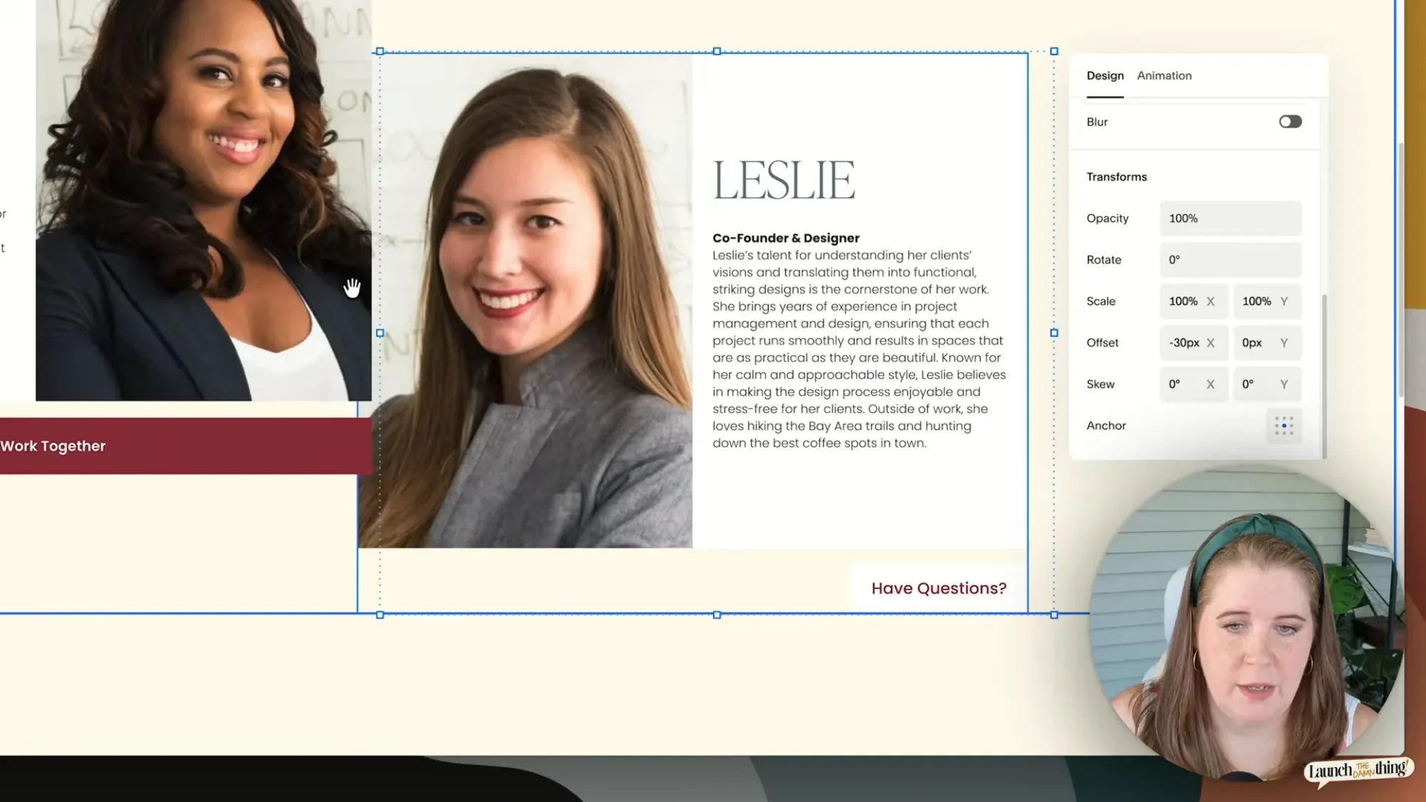
You can still create an overlap effect by adjusting the offset values (X is the horizontal offset value, Y is the vertical offset value) after stacking, but you'll likely run into layering issues, where the block you offset visually appears on top of, or underneath the other block, despite what you intended to be sitting in what layered order. That mismatch can also cause weird spacing gaps, especially on mobile, because the editor is trying to reconcile where the block looks like it is with where it visually is offset to and that extra space caused by the offset currently isn't reducible (as of posting).
My recommendation: use Stacks for layouts where things sit next to each other, not overlapping each other. If you need a genuinely overlapping, collage-style layout, you may be better off placing those elements individually on the Fluid Engine grid rather than fighting the stack system to do something it's not quite built for yet.
Stacks in Practice: Real Examples In My Website Template

ℹ my San Francisco template
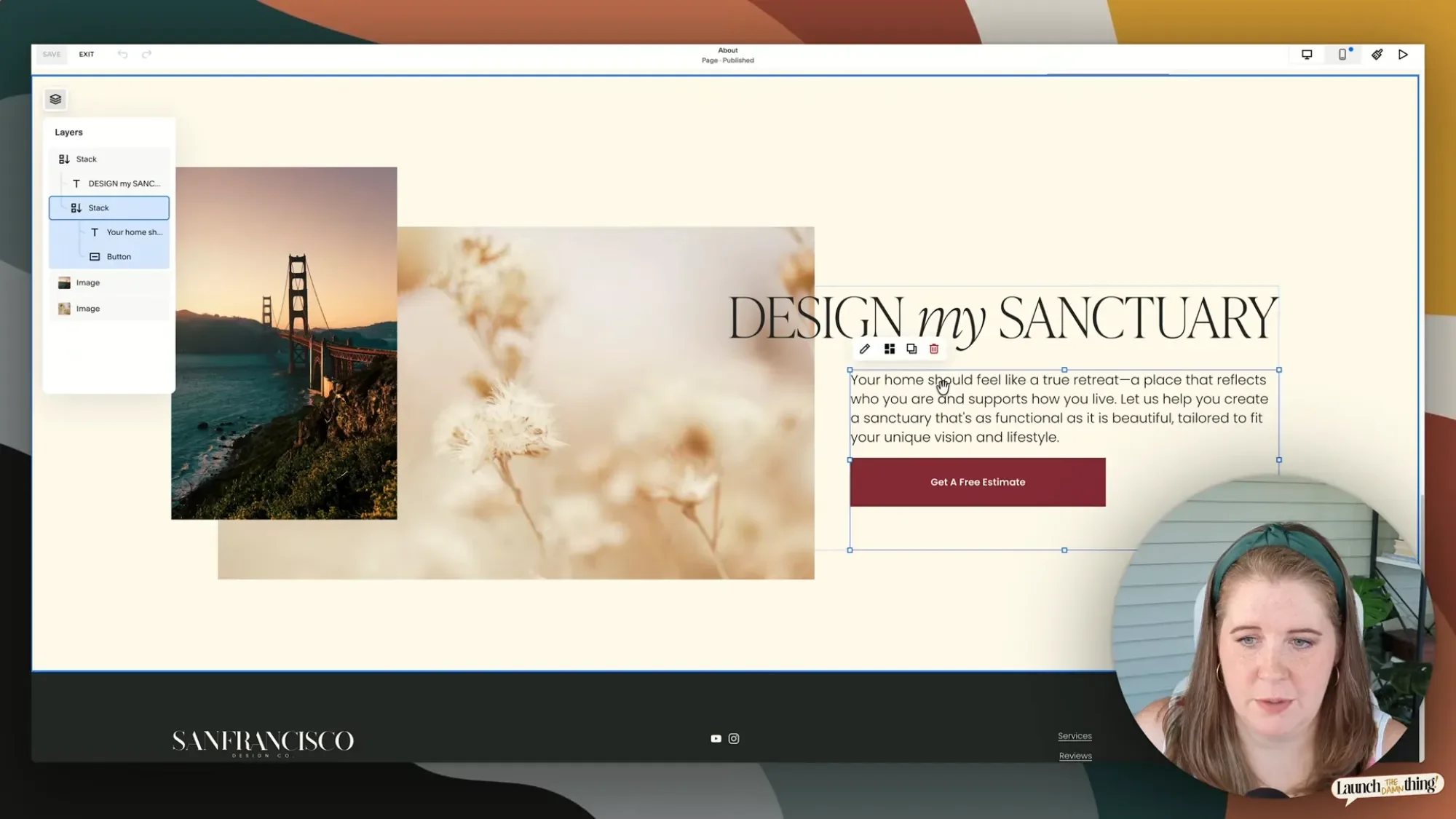
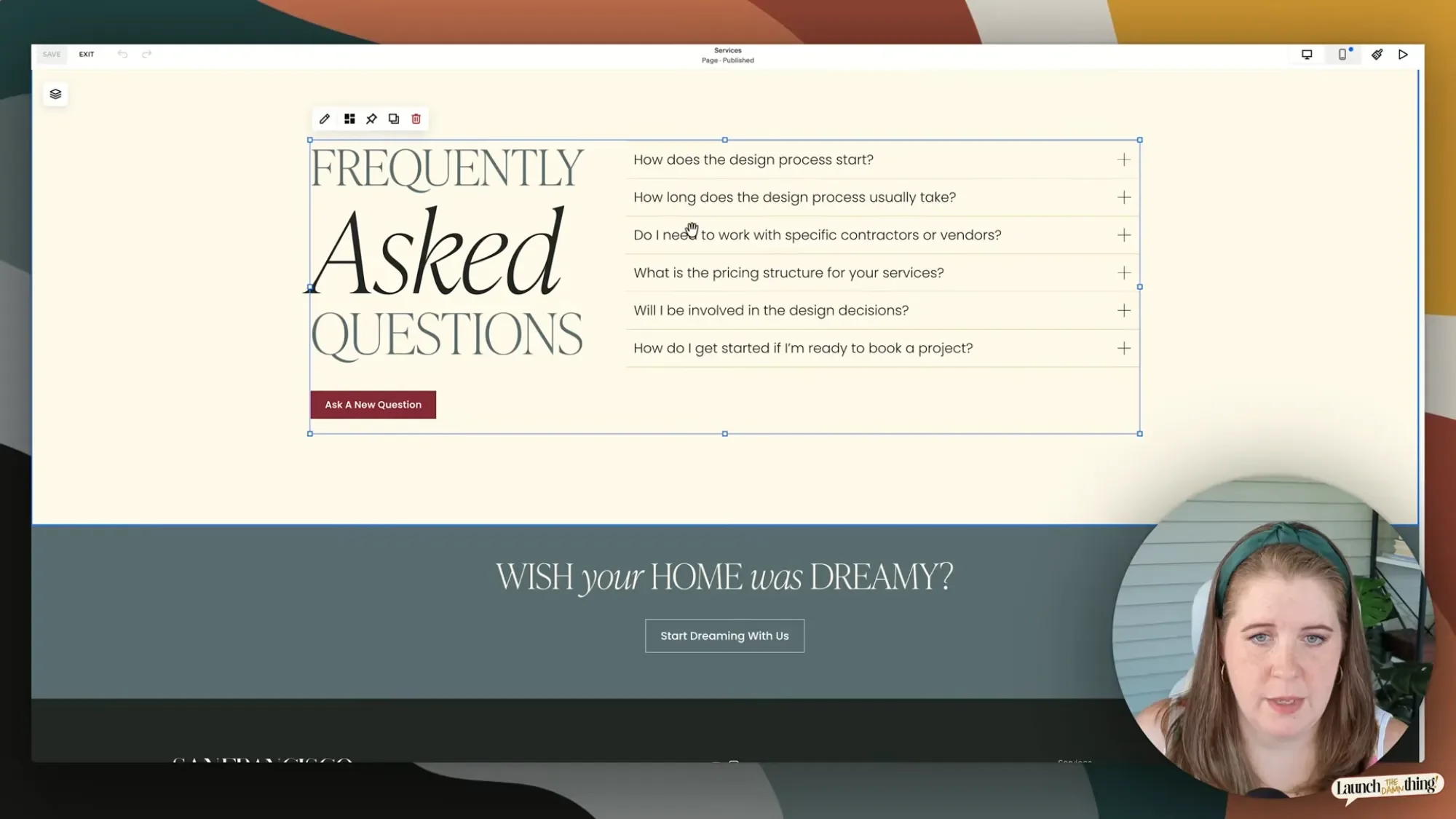
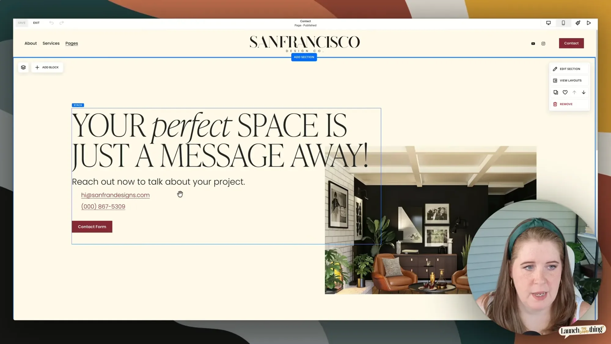
Theory only gets you so far, so let's look at how this shows up in an actual website design layout—specifically, the footer, one of the About & Home page sections, and the top section of the Contact page from my San Francisco Squarespace website template. (This template is currently only available through Design Days, where I can plug your content into it directly as a white-glove installation process, but it's coming to the shop on its own eventually.)
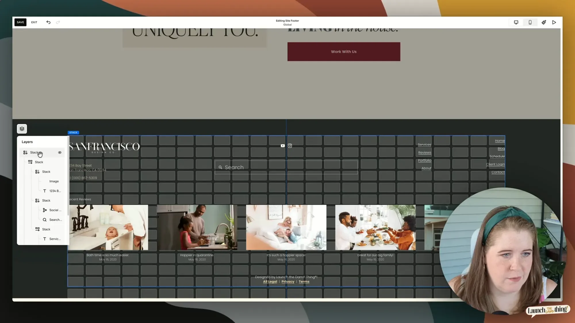
In the footer, I'm using six separate Stacks working together. Some are grouped vertically (like a paragraph and the image block above it), some horizontally (like a row of page links in 2 columns), and some are Stacks made of other Stacks (like a full column grouped with the row beneath it, so I can control the spacing between those two sections independently of everything else). The entire point of building it this way is that it's much harder for a client or customer to accidentally drag something out of place and break the whole footer layout, because everything that's meant to move together is locked into a group.
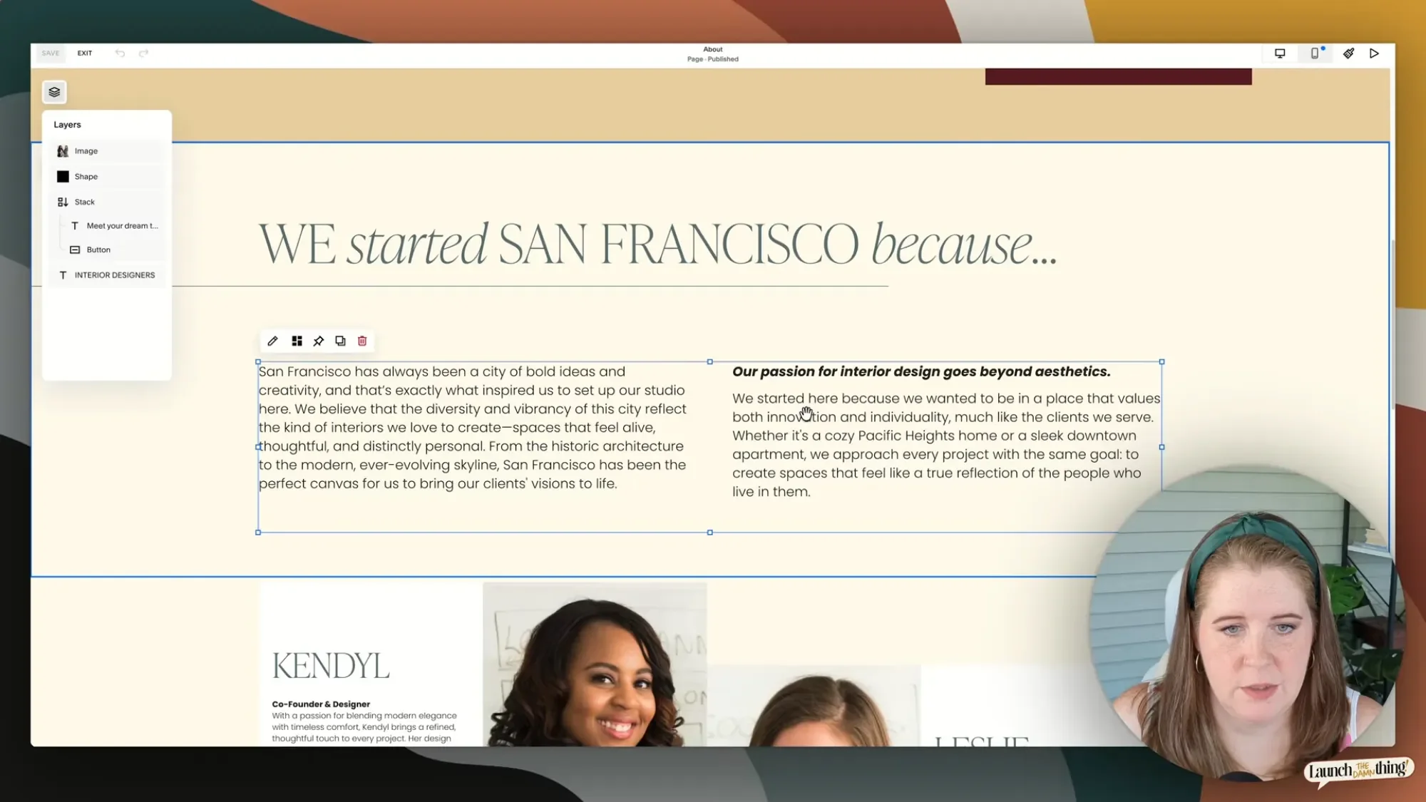
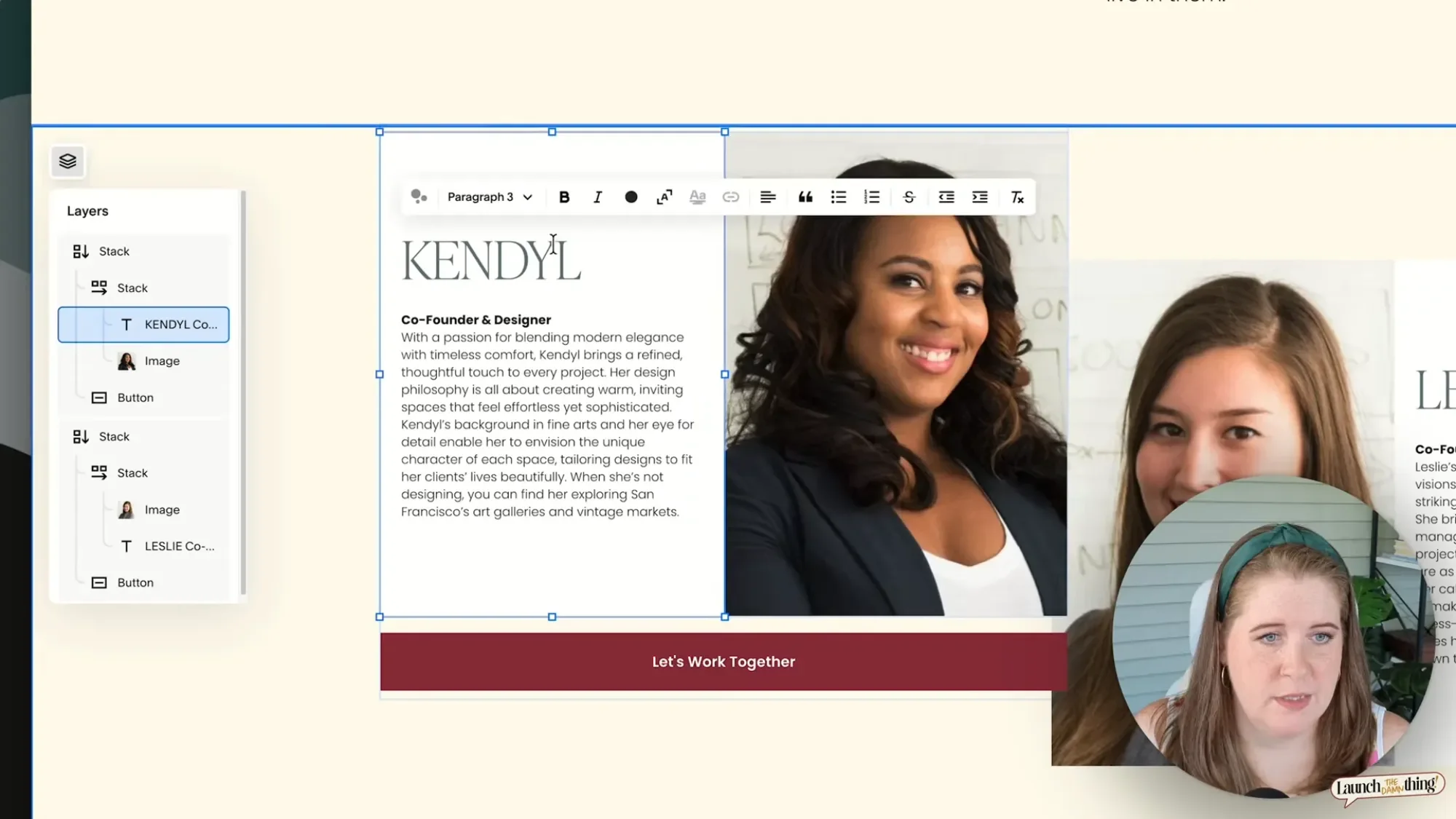
On the About page, there's a text-and-image stack where the text has a background color, hard corners, and centered alignment, stacked tightly against an image so the two touch with zero gap between them. Underneath that, a button is stacked with the whole group above it, giving it independent spacing from everything else in that section.
The Contact page uses a simpler version of the same idea: a text block stacked with the button below it, so I can control that specific gap without it being tied to spacing anywhere else on that section.
None of these are that complicated once you break them down into their respective parts, but stacked together (pun intended), they add up to a layout that holds its shape across every screen size without us having to babysit it or fuss over it (or frankly, pull our hair out in frustration about it). 😂

Common Mistakes to Watch For
The biggest mistake is accidental nesting. When you're dragging a block near an existing stack, Squarespace will show you a blue insert line if you're about to drop that block inside the stack (when you let go of the mouse/trackpad click) rather than next to it, as you may have intended. If you're not paying attention to that insert marker (blue line), you can end up with an element nested somewhere inside a Stack where you never intended to drop it, and then wonder why your spacing looks weird now.
The tell is in the highlighting. Example: for image blocks, if the image you're dragging becomes lighter or grayed out, that usually means you're about to place your image inside a Stack group. If it stays darker (its original color) and you don't see that blue insert line, you're placing it outside and around the Stack, as a separate element nearby, not inside. Get in the habit of watching for that insert marker line before you let go of the mouse, especially once you've got multiple nested stacks going on in your layout.
example of the insert marker that shows while drag-and-dropping a block into a Stack, in Fluid Engine
Before you go...
That's a wrap on Stacks! (I know, I know; that rhymed, my bad.) From someone who genuinely didn't get it at first and had to piece it together the same way you probably are trying to do right now.
Once the "stacks can stack on stacks" logic clicks, and once you get comfortable using the Layers panel instead of clicking blindly around on the grouped blocks in your sections, it stops feeling like a mystery and starts feeling like one of the most useful tools Squarespace has shipped in a while!
If you're still stuck after this, or you'd rather have someone look at your actual site for some troubleshooting, come hang out in Freeloaders in the Club, my free community for web designers. And if you want more direct access to me for questions & support—Insider members get monthly office hours where I answer questions live for at least a solid three hours per call (on average), plus eyes on your specific work in posted questions within the exclusive discussion space. Both live inside the Club.
And if you looked at that San Francisco template up above and thought "I just want that, plugged in with my own stuff," that's exactly what a template restyle in a Design Day is for. I'll take that template and swap out my content for your content in a single day—no fighting with Stacks or Squarespace is required. 😁