

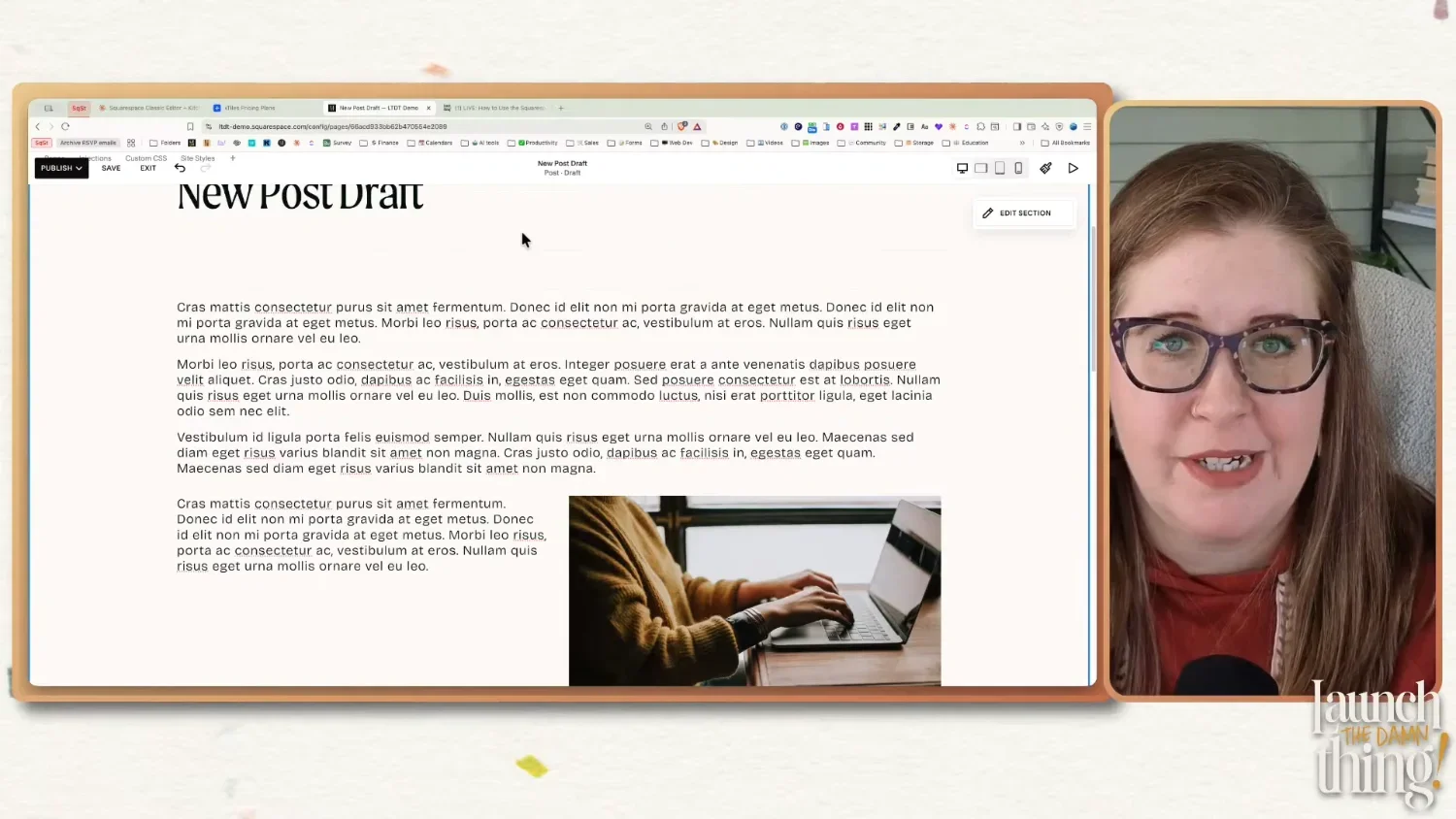
Blogging on Squarespace: A Guide for Using the Classic Editor
What's inside this post: Hide
If you've been building Squarespace websites for a while but you started after Fluid Engine dropped in 2022, there's a pretty good chance you've looked at the blog post editor and thought, "What the hell is this and why does it look like it's from 2017?"
I get it. Fluid Engine is the shiny, drag-and-drop-almost-wherever-you-want experience that Squarespace built to keep up with the times. So when you click into a blog post and suddenly you're in a totally different editing world, it probably feels like you accidentally took a wrong turn and ended up on the old version of the internet.
The Classic Editor is not a lesser experience. It's just a different one. And once it clicks, it's actually a lot more stable in ways that Fluid Engine isn't. I've been using Classic Editor for 10 years—started with it before Fluid Engine ever existed—and this whole live class was intended to help you get more comfortable with it too.
This post covers everything from that session: why Classic Editor still runs blog posts, how to set up your blog, my favorite template hack for never starting from scratch, how the editor works (including the stuff that trips people up), and all the blog post settings you should be filling out before you hit publish.
Why Squarespace Still Uses Classic Editor for Blog Posts
Squarespace hasn't said explicitly why they haven't migrated blog posts to Fluid Engine's editor yet, but after using both editors for years, I have my own strong opinion on it.
Fluid Engine becomes unpredictable the longer your content is, within in a single section. If you've been building sites lately (as of posting), you may have already noticed that the section editor has been kind of buggy. Now imagine trying to put a 2,000-word blog post—with images, video blocks, summary blocks, code blocks, all of it—into a Fluid Engine section. Holy shit, that would be an unstable nightmare. 😂🫣
Google likes long-form content though. High-value posts are considered to be at least 2,000 words, or longer; that's what you're shooting for if you want to show up in search results. Classic Editor handles that volume of content in a single section without losing its mind. It's more stable, and for blog posts specifically, stability matters more than design flexibility.
Classic Editor also shows up in a few other places on your site, not just inside blog posts:
Event pages (if you use the Events collection)
Product additional information sections (in Squarespace Commerce)
Any Classic Editor sections you add to regular pages on your site
So getting comfortable with it pays off in more places than just your blog.
And one thing Fluid Engine genuinely can't do that Classic Editor can, is text wrapping. More on that in a bit! 👇
Setting Up a Blog Page in Squarespace
How to create a new blog collection in Squarespace
This is pretty simple since you start with a default template layout, so I'm not going to spend much time on this part.
In your Pages panel, click the ➕ to add a new page and select Blog from list of page-type options. Pick a layout on the preview side of the module (single column, grid, list, masonry — it doesn't really matter because you can switch later), give it a name, and you're done.
A few things worth knowing about your blog page settings (click the gear icon next to the page name):
Page title and URL slug — fill these in intentionally. Don't just leave the auto-generated slug as-is.
RSS feed — Squarespace creates one automatically for your blog. You don't have to do anything to get it, it's just there. If you know what RSS feeds are useful for, great. If not, don't worry about it.
Navigation — you control whether this shows in your nav or stays hidden, by placing that page in either the Main Navigation section, or Not Linked section of your Pages menu.
You can have unlimited blog posts on one website. I also haven't found a limit for the number of blog collections you can add to a single website. You could use one collection for a regular blog, one for case studies, one for a client directory, one for a review series—whatever you want. There's no (known) limit on the number of collections, and there's no limit to how many blog posts each collection can have.
The catch is that all blog collections that share the same layout style, will share the same design settings for that style of page layout. So if you have two grid-layout blog collections and you want them to look different from each other, you'll need custom code to do that. It's not a built-in option, which is... a choice, Squarespace. 😂
the ‘Add new post’ button in Squarespace
Creating a New Blog Post
(& My Favorite Template Hack)
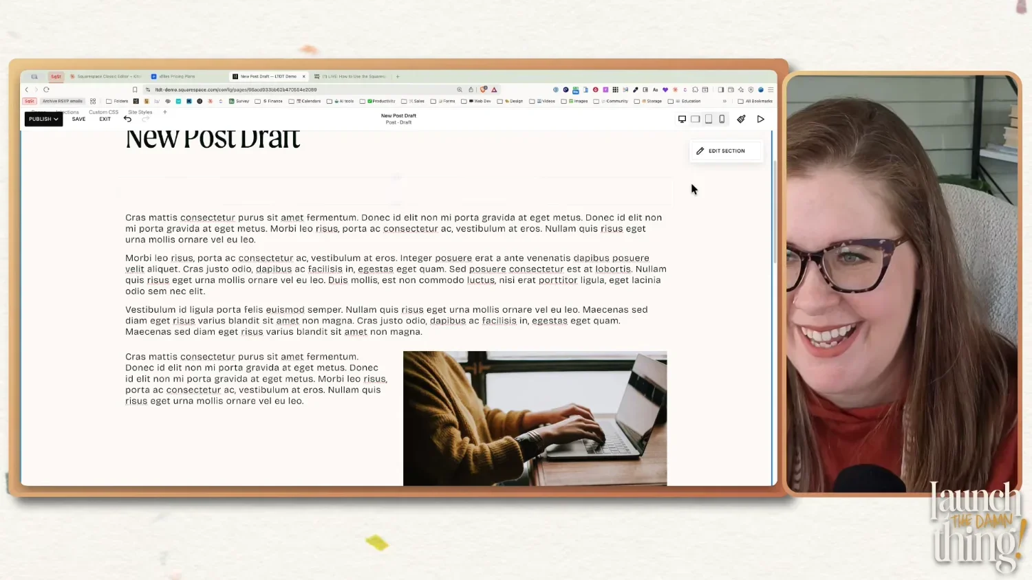
When you add a new blog post via the ➕ button in your blog's side panel, you get a blank page editor with one empty text block by default. If you start from scratch every single time you publish something new, you're wasting time doing the same setup over and over again, especially if you're repeatedly building the same layouts.
So here's what I do instead.
How to create a blog post template in Squarespace
I keep a dedicated "New Blog Post Template" draft that I duplicate every time I need a new post. Inside it, I have all my standard empty elements already in place:
A text block for the intro
A video block (for embedding my YouTube video)
A spacer block to separate sections
A summary block at the bottom for related content or resources
Any other elements I consistently use
Everything is blank; it's just the structure, ready to fill in for each new post so I can skip rebuilding the my go-to layouts each time. When I need to post something new, I duplicate that draft 'template', rename it, and start writing.
How to keep the template draft at the top of your blog post list in Squarespace
How to keep the template draft at the top of the list of blog posts
Normally, a draft post stays sorted by the date you created it, which means it'll get buried as you publish more posts over time. To keep it pinned at the top, go to Settings → Options, set the status to Scheduled, and pick a date faaaaaar in the future. I usually use January 1st, with the year being at least 5 years ahead of the current date. Then I save those changes. Once it's saved & scheduled to post 5+ years from now, then I go back and set the status back to Draft, which keeps the 'created' date but makes sure it won't be automatically published at any point.
Now Squarespace thinks that post was created on January 1st, 2030, so it will stay at the very top of your list until that date, no matter how many new posts are added in between. It never publishes because it's set to draft, it just lives there and is always easy to find from the top.
How to use the template blog post in Squarespace
How to use your blog post template in Squarespace
Click the three-dot ••• menu on the template post, hit Duplicate, and work from the copy. The duplicate opens automatically once a post has been duplicated, so just click Edit to begin making changes to the copy.
I've been doing it this way for years! I also create a template post for my clients during custom website projects, because it's so useful to speed up the initial process of writing posts.
Bonus tips
You can also pre-populate your template with settings you use on every post, like the Google Search Console sharing toggle (more on that below) and tags you always include. It's easier to delete something you don't need than to remember to add it every single time.
Create a template for different types of posts, if you have different types of content. For example, if some are just written blog posts with no video or audio component, create a template to use for those specifically. If some of your blog posts also contain a podcast episode or a YouTube video, create a different template for that type of post. If you also publish posts sharing your work as a portfolio item, or review from a client project, then create a post template for that too!
How Classic Editor Works in Squarespace
Classic Editor looks deceptively simple—it's just blocks, after all—but there are some specific behaviors that will make much more sense once you understand the underlying structure of this editing experience.
Starting at timestamp: (26:33) Using Classic Editor - Seeing & using the 12 column grid
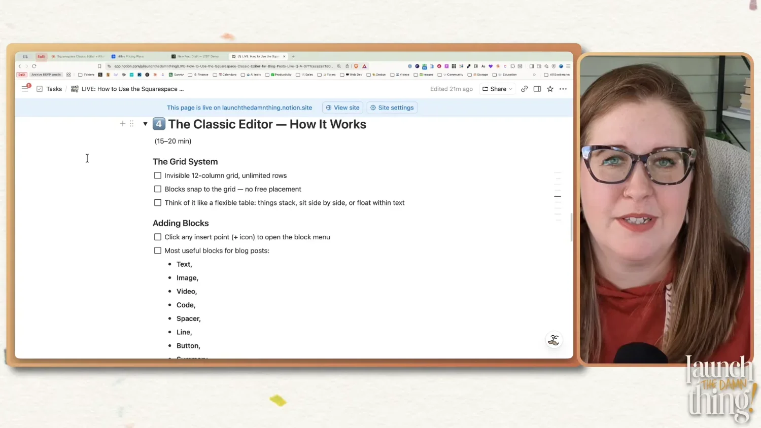
The Grid System
Classic Editor is built on an invisible 12-column grid. You can't see it (and unlike Fluid Engine, there's no keyboard shortcut to show it), but it's always there. All blocks snap to positions on that grid, and that's what controls your layout.
Think of it like a really flexible table or spreadsheet. Things can stack vertically, sit side by side, or float within a text block. You're not able to drag blocks more freely, the way you can in Fluid Engine, but once you know how the grid works, you can actually do a lot with it!
The maximum number of items you can add side-by-side is 12 columns across, which means the smallest a block can get is 1/12 of the width of your editable area. In practice, you rarely need to go that small, but good to know.
Starting at timestamp: (18:53) Using Classic Editor: Blocks & Layout
Adding Blocks
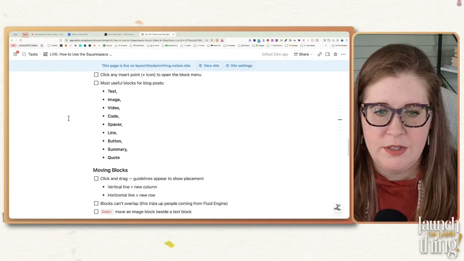
The only way to add content in Classic Editor is through the insert points, which are those little blue + icons that appear between or within, above, and below existing blocks. Click one and you'll see the block menu where you can pick a new element type to add to the page.
The insert point you click controls where the new block appears. So if you want something between two existing elements, find the insert point between them specifically, OR click one to add the block, then drag it to the right spot afterward. This is where people often get lost, because they click the wrong insert marker + and the block ends up somewhere unexpected so they struggle with moving it.
The most useful blocks for blog posts are typically elements like:
Text — your main content block. Also where you'll format headings, quotes, and lists.
Image — with some extra design options not available in Fluid Engine (more on this below)
Video — paste in a YouTube or Vimeo link
Code — for adding custom code, displaying a code snippet on the page, or embedding anything custom (forms, scripts, HTML, etc.)
Embed — for embedding anything custom (forms, videos, scripts, HTML, etc.)
Spacer — adjustable empty space (stop ignoring this one 👇)
Line — a horizontal divider line
Button — a standalone CTA button
Summary — pulls in posts from your blog collections in masonry, grid, carousel, or list layout
Quote — a styled pull quote block
Wrapping Text (around another block)
This is genuinely one of my favorite things about Classic Editor, and it's something Fluid Engine literally cannot do (still).
In Classic Editor, you can drag any block (an image, a button, a graphic) into one of the four corners of a text block, and the text will automatically wrap around it. Left side, right side, wherever you put it — the text flows around the block like you'd see in a magazine layout.
To do it: click and drag the block you want to wrap the text around, then slowly move it toward one of the corners of a text block. You'll see a blue box show up on top of the text in whatever corner you're dragging the block into; once you see that blue box, let go of your mouse to drop the block in that spot. The text wraps around it once you've let go of the click-drag motion with your mouse. If you messed up and need to move it, no worries! Just click the block you want to move, to select it, then drag it to the new spot & let go again.
This works in blog posts AND in any Classic Editor section on your regular site pages. So if you ever add a Classic Editor section to a layout page, you have access to text wrapping there too. It's one of the reasons I'll sometimes choose Classic Editor sections for regular pages too, not just in blog posts.
Starting at timestamp: (20:03) Using Classic Editor - Moving Blocks & Understanding Insert Markers
Moving Blocks
Click on a block to select it, then drag your mouse to move the selected block. When you're dragging, you'll see blue guidelines appear—those show you where the block will land when you let go.
A vertical blue line running the full height of the content area means the block will create a new column where that line is
A horizontal blue line running across the full width = the block will create a new row (go above or below something) where that line is
Quick reminder: blocks in Classic Editor cannot overlap. That's just not how this editor works without code (or a tool like SquareKicker*, which writes code like that for you). Everything stacks neatly next to or below/above each other. If you're coming from Fluid Engine where you can layer things, this takes some adjustment, for sure!
Also worth knowing: if you drag one text block on top of another text block that's directly above or below it, they are likely to merge into one block. Don't worry! Your content will stay there, but they won't be separate blocks anymore. This is expected behavior, not a glitch. If you want two separate text blocks stacked vertically, you need to put something between them (like a spacer block or a line block).

Starting at timestamp: (26:08) Using Classic Editor - Spacer Block & Building Columns
The Spacer Block
The spacer block confuses a lot of people, but it's just adjustable empty space. That's it. You drag it to wherever you need a gap, and then you drag the little grey dot on it to make it bigger or smaller than the default size.
3 main uses are:
Separating stacked text blocks so they don't merge (as mentioned above)
Resizing (controlling the width) and centering of other blocks
Creating columns for a multi-column layout
For that second use-case, say you have an image that's taking up the full width of the post and you want it smaller and centered. Add a spacer block on the left side of the image, then add another one on the right. Now drag the borders of the spacers, that touch the image block, to push the image to whatever width you want. It stays centered because the spacers on each side are balanced and pushing the image block toward the middle.
You can actually use any block to create that same effect (buttons, text blocks, etc.), but spacers are kind of invisible to visitors, which is why they're the easiest choice.
Resizing Blocks
Hover between two blocks that are sitting side by side and your cursor will change to a resize handle. Drag left or right to resize. Just know that resizing one block affects its neighbor; they share the available column space, so making one wider makes the other one narrower.
If this becomes a tug-of-war game, just add a second spacer block to the other side and adjust each incrementally until you get what you want. This way there's space on both sides working together to resize whatever block is in the middle.
Image Block Design Options (Classic Editor Only)
Images in Classic Editor have a Design tab inside the block editor that also give you layout options that you won't find in Fluid Engine's image blocks, because these layout options are specific to Classic Editor only. These layouts are: Inline, Poster, Card, Overlap, Collage, and Stack.
Here's a quick breakdown of what each one does:
Poster — adds a transparent color overlay over the image, with an optional title, paragraph text, and button sitting on top of it. Great for an image block that's also a CTA!
Card — puts the image on one side and text content (title, paragraph, button) on the other side. A side-by-side layout with no code required. These can be flipped with image on left, or on right, of the content beside it.
Overlap — text content that looks like a card, except the title text (if long enough) can literally overlap the edge of the image. The background color behind the text pulls from your color theme's settings for this image block layout type. These can be flipped with the image on left, or on right, of the content beside it.
Collage — similar overlap or card effect, just styled a bit differently, giving the entire content card a background color which overlaps the image, so the title, paragraph and button all share the same card background style. These can be flipped with image on left, or on right, of the content beside it.
Stack — places the image on top, with text content underneath it, all in one column. This layout doesn't allow you to choose where the content sits (above or below the image), but it works well in tight spaces where the column is more narrow and a side-by-side layout won't work as well.
From a Classic Editor Image Block’s Content tab, all of those layouts can either link the image itself as a button, link from a button, ––or not link to anything at all. Your choice! If using a button, styling options for color, etc are in Site Styles, and those options are unique to each Image layout, meaning Poster layouts can have a different button color than Card layouts, etc.
See the examples below! 👇🏼
Image Block: Poster
Adds a transparent color overlay over the image, with an optional title, paragraph text, and button sitting on top of it. Great for an image block that's also a CTA!
Image Block: Card
IMAGE ON RIGHT
Puts the image on one side and text content (title, paragraph, button) on the other side. A side-by-side layout with no code required. These can be flipped with image on left, or on right, of the content beside it.
Image Block: Card
IMAGE ON LEFT
Puts the image on one side and text content (title, paragraph, button) on the other side. A side-by-side layout with no code required. These can be flipped with image on left, or on right, of the content beside it.
Image Block: Overlap
IMAGE ON LEFT
Text content that looks like a card, except the title text (if long enough) can literally overlap the edge of the image. The background color behind the text pulls from your color theme's settings for this image block layout type. These can be flipped with the image on left, or on right, of the content beside it.
Image Block: Overlap
IMAGE ON RIGHT
Text content that looks like a card, except the title text (if long enough) can literally overlap the edge of the image. The background color behind the text pulls from your color theme's settings for this image block layout type. These can be flipped with the image on left, or on right, of the content beside it.
Image Block: Collage
IMAGE ON LEFT
Similar overlap or card effect, just styled a bit differently, giving the entire content card a background color which overlaps the image, so the title, paragraph and button all share the same card background style. These can be flipped with image on left, or on right, of the content beside it.
Image Block: Collage
IMAGE ON RIGHT
Similar overlap or card effect, just styled a bit differently, giving the entire content card a background color which overlaps the image, so the title, paragraph and button all share the same card background style. These can be flipped with image on left, or on right, of the content beside it.
Image Block: Stack
Places the image on top, with text content underneath it, all in one column. This layout doesn't allow you to choose where the content sits (above or below the image), but it works well in tight spaces where the column is more narrow and a side-by-side layout won't work as well.
👆🏼 These layout options can be really useful for things like end-of-post CTAs (linking to a freebie, a related post, or a paid offer, etc), and they can look a lot more polished than just dropping in a plain image, and a text block, and a button block below that, plus they make all 3 elements editable within 1 block, which makes it easier to rearrange the page if you want to move the CTA to a new section in your layout (because you don't have 3 different blocks to move around).
The styling for the colors (backgrounds, buttons, overlays, etc) are in these layouts is controlled in your site's color themes. So if the colors look off, that's where to go fix it.
The settings for spacing, image size, and more, are in your Site Styles, under Miscellaneous, then Image Blocks.
Where to adjust the colors in these Image Block layouts
Where to adjust the size, alignment and spacing in these Image Block layouts
Starting at timestamp: (26:33) Using Classic Editor - Building Columns
Multi-Column Layouts in Blog Posts
You can create side-by-side columns in Classic Editor — but you have to build them yourself. Blocks 'attach' to other blocks, based on where you saw the insert marker when you placed it there, which can affect how mobile rearranges the elements on the page to fit smaller screens.
👉🏼 OPTION 1
One way to do it is to use spacer blocks as column placeholders first, then insert (attach) your actual content (image block, text block, etc.) to each spacer that's in the column position you want it to be in. Once you're done adjusting, you can remove the spacer blocks. The reason this works well is that it makes sure the images are in the correct position on mobile.
👉🏼 OPTION 2
Another way to do it is to use the blocks themselves to form the columns, but while this might seem easier on the surface, it can sometimes result in unexpected shifts in layout order on mobile, because you may have accidentally 'attached' or inserted the block in 'the wrong' place.
Here's the workflow:
Add a spacer block
Add a second spacer block and drag it to the left or right of the first (so they're side by side)
Add a third spacer if you want three columns, drag it to the left or right of the second
Repeat for as many columns as you want, noting that even numbers will give you evenly spaced columns!
Now add your images or content using the insert block icon/button on each spacer, in each column position; repeat for each column
Once your content is placed, you can delete the spacers if you don't need the extra spacing and the column structure will remain
Why go through the spacer step at all? Because it helps you control the mobile order more effectively. Classic Editor stacks everything vertically on mobile from top to bottom, left to right; the same order as you'd read a page in English. By attaching your content to specific column positions, you control what order they appear in on mobile too.
Honestly, if you're comfortable with Classic Editor, using blocks to form the columns is the faster method, but if you're NOT confident with CE yet, I'd use spacer blocks to build your columns until you are, because it's much more straightforward & less likely to result in a unexpected re-ordering on mobile.
Which brings us to mobile...
Mobile Behavior in Classic Editor
Desktop changes affect mobile, and mobile changes affect desktop too. You don't have independent mobile or desktop control in Classic Editor sections, or pages, the way Fluid Engine allows. What you build on desktop is basically what shows up on mobile too, just stacked vertically; the only thing that may fluctuate based on how you've added the blocks to Desktop view, is the order they are displayed in on mobile.
The good news is that Classic Editor generally handles mobile pretty well without much intervention, so you rarely need to look at it, unlike Fluid Engine's editor which constantly needs checking. Basically, the blue dot indicator you're used to seeing on the mobile icon in Fluid Engine (the one alerting you that something needs attention) rarely shows up in Classic Editor because the editor's stacking behavior is usually fine as-is.
That said, it's still worth checking mobile before you publish anything—especially if you've done anything with multi-column layouts. If something looks off on mobile and you swap the order, just know that changing the order on mobile may also change it on desktop. There's no way around that without code, or a tool like SquareKicker*.
Tablet View in Classic Editor
This REALLY isn’t that big of a deal, even though I know it drives most designers crazy.
Why?
Stat Counter tells us that for the last several years, less than 2% of ALL internet users are browsing from a tablet, which is not enough for companies like Squarespace to create an editor that allows changes for that specific breakpoint (for those device size ranges specifically).
As long as your website looks good on Desktop, and on Mobile, you’re catering to literally 98.5% of website users, and Squarespace still handles the in-between sizes automatically anyway. Those tablet layouts may not be perfect, but literally almost no one is looking at those, if it makes ya feel any better. 😉
Squarespace Blog Post Settings
This part... 🤦🏻♀️ So many people skip a lot of these settings or half-fill them out and then wonder why their posts aren't performing. 🫠
One thing I want to mention before we get into it: while you're inside a post in edit mode, you can click the post title/status area in the top editor bar (above your website preview's main header navigation) to open the settings panel while you're editing a blog post in Squarespace. You don't have to exit the editor, hunt down the post in your blog list, click the three dots, and then click Settings. —just click the draft title/status area while you're editing.
It took me an embarrassingly long time to figure that out, so I hope that helps someone else!
Content
Featured Image
This is the thumbnail that shows on your blog list/feed page, and in summary blocks. It will not also get pulled into the Social Image, so you should set that separately (more on that in a bit)!
Don't upload this image multiple times though; if it's already in your asset library, search for it rather than re-uploading each time you use it, because duplicate assets add up and become a mess down the road.
Excerpt
These are just short descriptions of the post. but I rarely have a reason to use them.
A quick heads up on a quirk: if excerpt is turned OFF in a summary block's design settings and you have "Read More" enabled on the same summary block, the Read More link often won't show up. So if you're using summary blocks to pull related posts in various places, you may need to have the excerpt ON even if you don't want it displaying, just to be able to see the Read More link.
It's annoying, yes. Complain to Squarespace support—not to me. 😂 I personally skip excerpts 99% of the time, that way it's technically "on" but nothing will show in the summary block's excerpt, because nothing is thereto show.
URL Slug
Squarespace auto-generates this from new blog post titles, but it may need adjusting & you should almost always check it before publishing!
If you're duplicating & using a blog post template, the url slug will be the same as the original template's URL and a 5+ digit alphanumeric nonsense scramble of words & numbers, like: /blog/template-s73bvu
The recommended goal is to keep it between 4–6 words, keyword-rich, using dashes instead of spaces, and you don't need the little stop words (like "the," "a," "and," "of," etc.). Google prefers shorter URLs, and a cleaner slug is easier to share and remember anyway!
Author
Relevant if yours or your client's website has multiple contributors. Otherwise, it's probably just you & so the 'author' will be auto-selected to the website owner (you) by default.
Comments
You can enable or disable comments per post. The global comments toggle lives under Settings → Blogging. One cool thing people overlook: you can set comments to automatically close after a certain amount of time — like a year — so you're not dealing with spam on old posts forever.
Options
Status
This is where you can Schedule the post to publish automatically at a date/time you choose in the future, set a published post back to Draft or Needs Review, or Publish now after saving your final changes. You can change the status of any post, any time.
Categories vs. Tags
Categories are broad, meant for basic information, kinda like book genres: fiction vs non-fiction, fantasy, self-help, etc. Use a few of them, but limit the total list per collection to about 10, give or take a few. They show up on your blog post, in Archive blocks, summary blocks, etc. Examples for blogging might be: "Squarespace," "Business Tips," or "Client Projects."
Tags are more specific and granular. They display on the blog post page, at the bottom of the post, right above the comment section. Google sees them too and may use them to sort your post into relevant search results if the other on-page SEO elements aren't working hard enough. Think of them like hashtags but without the hashtag symbol & adding spaces to them. Examples for blogging might be — "Classic Editor," "Squarespace 7.1," "blogging tips," and "2026."
Use commas to separate tags when you're typing them in. The comma is also the separator so be careful where you use it.
Comments
I keep comments ON by default for new posts, so I almost never mess with these settings & just leave my comments on until I have a reason to close them, per post.
However, there is also a 'Disable Comments' option that allows you to turn off the comments at a specific date/time in the future if, for example, you want to disable comments 3 years after the blog post was initially published and it may no longer be as relevant.
Featured Posts
I rarely use this. The problem is that once you toggle it on, you have to go back and manually look at the blog post's settings to find any 'featured' posts later to turn it off, which is a major pain. There is no indicator in the main blog list, even while logged in, for which posts are featured vs. not.
In my humble opinion, there's no reason to use this unless you make a note yourself, outside of Squarespace in your task manager app (Asana, ClickUp, etc) so you know exactly which posts are marked as Featured.
Again, it's only worth using if you have a summary block specifically set to display only featured posts, and you keep a list of which ones are marked as featured.
SEO
SEO Title
Squarespace will usually pull your blog post title if you leave this blank, which is fine some of the time but it's usually more effective to write something specifically for Google to use on search result pages, versus for browsers on your website who already know you & want to read your content.
Target length is 50–60 characters — Google cuts it off after that (truncates it) for mobile devices, so I tend to keep it short enough to work on mobile first, which will also work well on desktop Google searches too. The character count Squarespace shows you in the field goes up to 100, but PLEASE ignore that. 100 is way too long and will get truncated in search results anyway.
SEO Description
Write this for every single blog post. Don't let it default to an excerpt (or worse, force Google to write one for you), especially if you're skipping the excerpt like I do.
Target length is 150–160 characters—enough to describe the post clearly and include your main keyword. This is what shows up under your title in Google search results, and it directly affects whether someone clicks on your website link from search results.
Social Share
Social Sharing Image
This controls the preview image that appears when someone shares your post link on LinkedIn, Facebook, in a text message, on WhatsApp, —wherever. If you don't set one, it defaults to whatever your site-wide share image is (usually your logo, if you haven't set one).
It's easiest to just set this to the same image as your featured image in most cases. You do have to set it separately though; changing the featured image does not automatically update the social image, and vice versa. Two different fields, two separate settings per blog post.
One thing to keep in mind: social platforms crop this image differently. Facebook crops it one way, LinkedIn another, text messages another. To avoid having important text or graphics get cut off, keep anything critical—especially post titles if showing in the image—as close to the dead center of the image as possible.
Share
🏆 Enable Google Search Console
This one is genuinely important for anyone blogging with any kind of regularity!
First, you need to connect Google Search Console to your Squarespace site if you haven't yet. Go to Home Menu → Analytics → Search Keywords, then click Connect (or Reconnect). Sign in with your Google account and authorize the connection. Once it's connected, you'll start seeing actual search data there within about 24-72 hours.
Now, in the Sharing tab of your blog post settings, you'll see Google Search Console listed as an option (it shows up under what Squarespace calls "Connected Accounts," which are different from the social links). Toggle it ON.
What this does:
Every time you publish a new post (when this is enabled, or turned ON), Squarespace automatically pings Google Search Console and tells it, "Hey, new content over here, please go index it." Without this, Google crawls your site on its own timeline—which could be tomorrow, could be two months from now, or two years! You have no control over the 'when' unless you request a crawl from Google on that specific page. With this toggle turned ON, you're basically raising your hand and saying "this post is new & ready to be found."
This is the reason I build this toggle into my blog post template. That way, each time I duplicate the template for a new post, the GSC toggle is already enabled on the duplicate. I never have to think about it again.
What's Next?
This was the first episode of a LIVE series on my YouTube channel, and I'm just getting started!
Future episodes could dig more into topics like blog page design, blog customizations, blog monetization, client portals, and anything else (Squarespace related or not) — I'm taking requests, so if there's something specific you want covered, drop a comment below or leave it in the chat on the next live!
If you want to catch these sessions live so you can ask questions in real time, subscribe to the YouTube channel and hit the bell icon to get notified of new episodes. I also try to announce them in my newsletter, and in the Club's Free Event calendar.
And if you want to go even deeper with me on a regular basis with more 1:1 time, come hang out in the Club with us — that's where I hang out most of the time with a smaller group of designers. 👇🏼
