

How to Pin blocks, Scale or Highlight text, & Hide Navigation in Squarespace
What's inside this post: Hide
I've been playing around with graphic design for what feels like forever, and have been creating websites since 2016. As a Squarespace Circle Member, I'm usually in the loop about their latest updates.
Recently, Squarespace rolled out some new features as part of their Fluid Engine updates (that’s their new editor). I've noticed that a couple of these are a bit tricky to figure out how to use and I've seen a lot of questions about them. A couple of these features are so fresh off the press that some people either don't even know they are there, or aren't quite sure how to use them if they’ve noticed.
So, I decided to take a moment to walk you through four of these new(er) features:
the scale text feature (and how to avoid messing it up),
the text highlight feature,
the pin block feature, and
the option to hide or show the header and/or footer on any page of your website.
Let's dive right in and explore these four features quickly together!
❶ Understanding the Scale Text Feature
Alright, first up - let's talk about the scale text feature. Now, this one isn't exactly intuitive to get the hang of. What it does is take your chosen text and resizes the font on each line so it fits the full width of whatever size your text box is.
Sounds simple, right? Well, here's the catch - if you're not careful with your line spacing, things can get a bit tricky!
Applying the Scale Text feature to 1 paragraph
In the above example, I have the Scale Text on for this whole block of text. Now, because there's only a single space between these two lines (a “soft return”), they're sizing together. They'll keep the same font size together, which is determined by what can fit full-width inside this text block’s container. If I resize this block, the scaled text will size up together at the same rate. So, each line will be at equal heights & sizes.
REMINDER:
a “soft return” is achieved by pressing
Shift + Enteron your keyboard, to start text on a new line without starting a new paragraph; the text often maintains the same styling of the text above it, as it’s technically still within the same paragraph.a “hard return” is achieved by pressing
Enteron your keyboard, to start a new paragraph & that text can often be styled independently of the text above it.
But what if I did a hard return instead? If I just press Enter and start a new paragraph, each paragraph is going to be sized differently because each line may need to be a different size to fit that text in the full-width of the text block’s container.
Applying the Scale Text feature to 2 different paragraphs &/or text in different blocks
In this case, the first paragraph could look smaller because it has more letters than the second, and both need to fit the full width of this text block, but the second paragraph might have fewer letters, so the letters inside that word will be much larger to fit the full width.
The key takeaway is this - if you want your lines of text to be sized at the same rate, to look like they're part of the same paragraph, you need to ensure the space between them is just a regular single space or “soft return.” Not a full break between paragraphs (”hard return”). That's the difference! If you’re not sure which one you used, Squarespace naturally puts more space between paragraphs (”hard return”) than it does between lines in the same paragraph (”soft return”). So, if you want your lines to stay together and size up at the same rate, they need to be in the same paragraph. To achieve this, you just hit Shift + Enter, then select your text and turn on the Scale text setting for all of the selected text at once.
For more control, you can duplicate the text box, delete the first half in one box and the second half in another, then turn on Scale Text for each text in each box. You can then drag them around or resize each line independently of one another. Just ensure the boxes themselves aren't overlapping, or else the text could run into each other & overlap too.
Don't forget to check how it looks on mobile. If the mobile icon has a blue dot, it means your recent change will affect the layout in the mobile editor. The Scale Text feature used on longer phrases will make the text small on mobile, so you will also want to check & make sure it stays legible there. As of posting, you can’t have the Scale Text setting ON for the desktop version, and OFF for mobile version of your website; if it’s on for one, it’s on for BOTH so use your best judgment!
❷ Exploring the Highlight Text Feature
Next, let's jump into the Highlight Text feature. Here is an example of some text highlights I've made in my demo site as an example. There’s an underlined highlight in column 1, a circular one in column 2, and a squiggly-underline highlight in column 3.
Example of 3 different text highlights applied to heading text
So, how do you get these cool effects? Simple!
Just select the text you want to “highlight,” then click on the text highlight icon in the rich formatting bar (it'll tell you it's the highlight function if you hover over it with your mouse). When you click on it, you'll see a dropdown with a bunch of options to choose from.
For example, if I wanted to change the underline to something like a background-color highlight, I could do that and choose squared or rounded corners for the background color’s shape. You can even add animation to your highlights - choose from draw, fade, or fade and scale. (I prefer the draw option; it just feels most realistic & interactive to me.)
There are more setting options as well, including adjusting the speed of the animation and even the direction it draws the animation. There's also an option to bring the highlight to the front (in front of the text), but I don't see much point in that unless your highlighted color is pretty transparent.
If you do want to add transparency to your highlight color, it's as easy as selecting the color and changing the opacity. Something to note though: when you adjust transparency this way, you may temporarily see a black non-transparent color in the preview while inside the editor, but if you save and exit the editor, it should show the color & transparency level you chose. That’s a super annoying (likely temporary) glitch, so instead, I've been using the custom color option to change the opacity.
If you're not familiar with RGB color code formatting and only know your color’s hex code, here's a little trick: enter your hex color first, then switch the format of that color to RGB in the color picker. It keeps the hex color but changes the format to RGB for you, allowing you to also adjust its opacity.
We can control the line thickness with the handy slider but the default value uses em for line weight, so if you need it to be super thin just manually enter px (pixels) instead (replacing em). Using 1px will make it a really thin & dainty line, much smaller than the smallest value on the slider using the default em value of 0.05.
Let’s look back at our examples now that we know what the available settings are, and see how we can recreate them.
Example of 3 different text highlight styles applied to heading text
In Column 1 - On the basic hand-drawn style underline highlight, it has rounded corners on the underline graphic making it look more like a pen or marker drew it.
In Column 2 - Next, let's look at the circle highlight example. The only difference between this example & the first is that we've changed the highlight color and the shape or style of the highlight. We've still set it to the draw animation, and we can slow it down to two seconds if we want.
In Column 3 - The last example is the squiggly or scribbled underline style, and it's the same deal. I've just changed the color and shape or style of the underline. We can thin it out, and tweak the duration of the squiggle animation, etc.
That's all there is to it! The text highlight feature has been around for well over a year as of posting, but I think a lot of people are still figuring out how they can customize & use it, so I hope this quick guide helps you get creative with your text highlights!
❸ Getting Creative with the Pin Block Feature
Next up, let's talk about the much newer Pin block feature. This one's a fresh new addition and it can be as “cool” as it is tricky to use or set up.
You've probably spotted the little pin icon 📌 now showing in the block settings menus, next to alignment and trash and the pencil icon, etc ––and wondered what it actually did.
Simply put, the Pin Block feature lets you literally 'pin' (stick) blocks to the screen in a very specific spot within a section, so even as your visitors scroll down the page, that pinned block stays where you placed it. At least until the section is ‘done’ and the user scrolls past it. It's a fun way to make certain elements stand out.
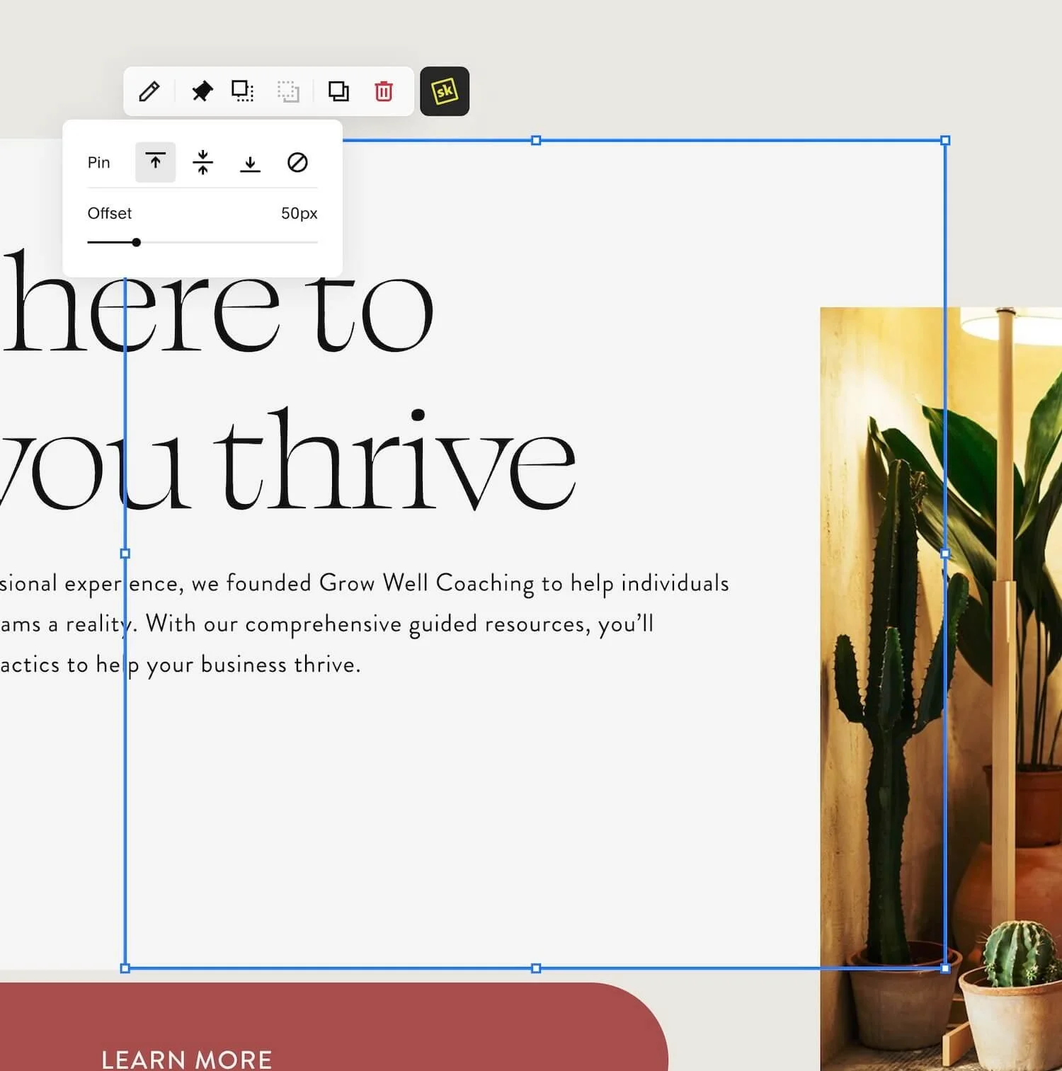
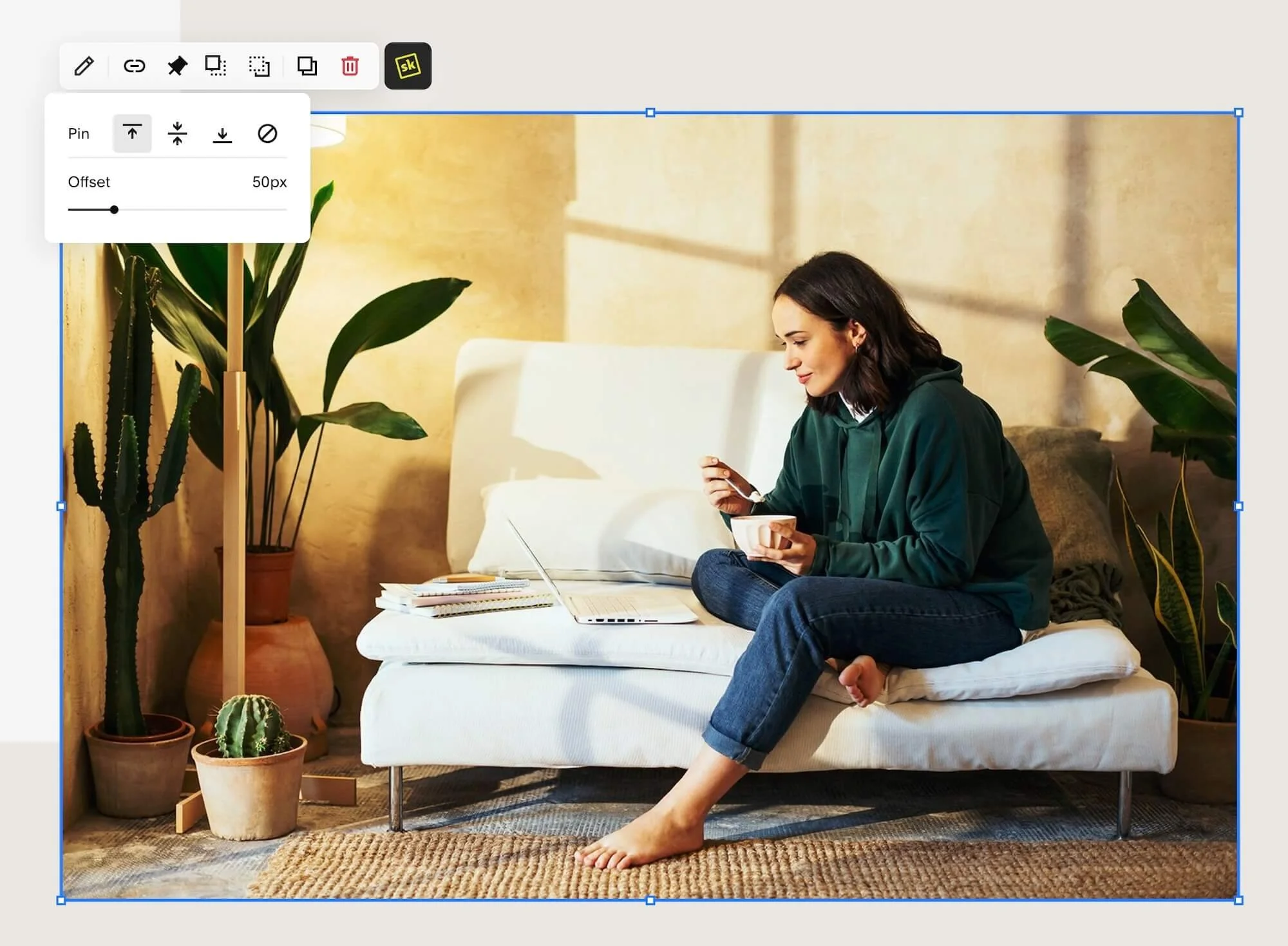
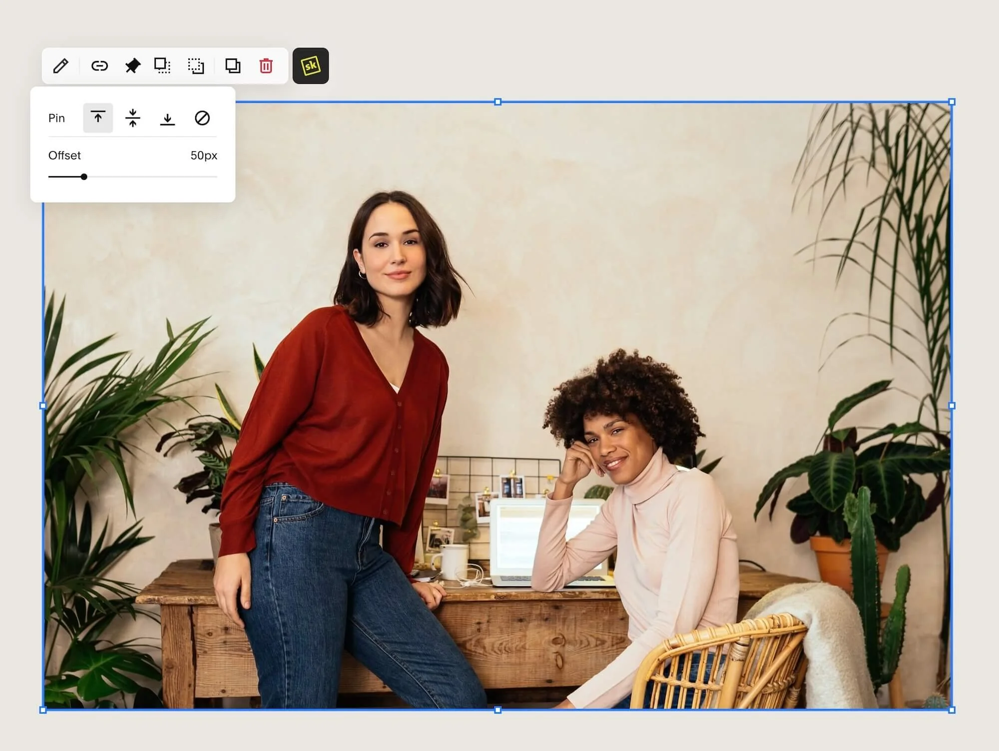
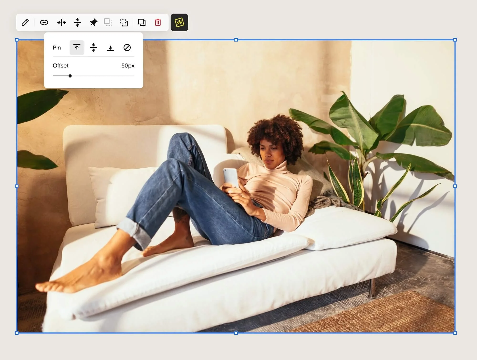
In my demo site, I've pinned a text block, a shape block, a button block, and three images, all in a single section of the page.
What’s happening, exactly? As I scroll through this section, because I’ve set all the images to stick to a specific area on the screen, they will appear to slide into the same exact place and sort of stack on top of each other, while the originals underneath will appear to vanish. At the same time, the 'Learn More' button slides up a little sticking in a new place too. Once you scroll past the section though, these elements are no longer sticking in place, but finally allow the user to scroll past them & see the content in the next section.
Let's look at an example & then break it down so you can see how to recreate an effect like this ––and when you shouldn’t.
Example of the pin feature being used on multiple blocks in the same section
First you’ll need to design your layout the way you want, because obviously you’ll need preexisting elements in order to pin them.
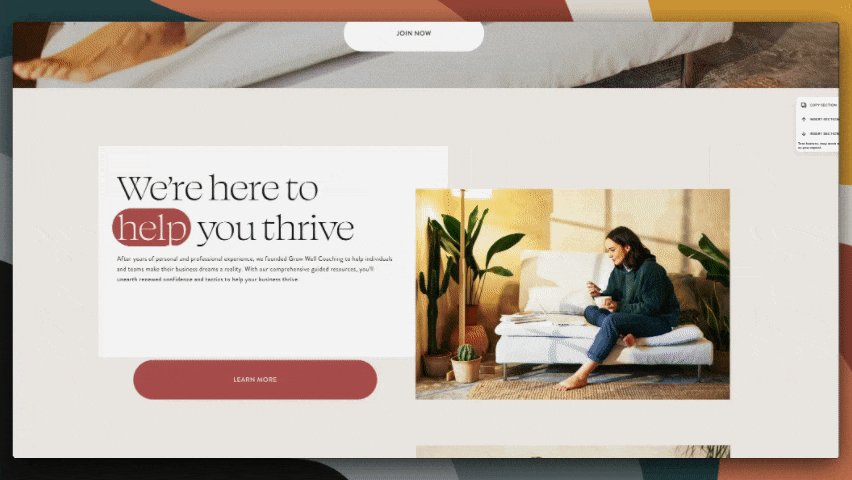
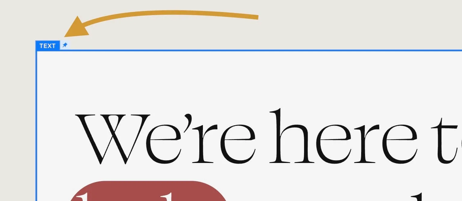
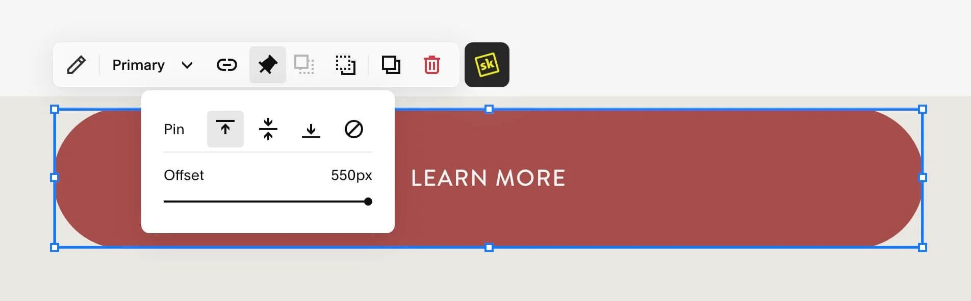
The next step is to click on the first element you want to pin, in order to see the block’s settings menu bar, then from that click the pin icon.
Where to look for the pin icon in the editor
When the Pin feature is active, the pin icon turns black. Also, when the block is not selected (just hovered over, in the editor), you can see a tiny light blue pin icon next to the block type’s name, indicating that the pin feature is turned on for that element.

When inactive, the pin icon is hollow or white with a black outline.
An INACTIVE pin feature displays a different icon
In my demo, the main elements are built with a text block that has a background color, and layered behind it there’s a shape block with the same color as the text block’s background. Both are pinned to the same place using the same settings so they will stay together. This layout gives the illusion of the image and text block interacting visually without the chance of the image overlapping any of the words.
To set the pin for those elements, I've aligned all elements to pin based on the top of the screen and set the ‘offset’ slider to 50 pixels, except the button which I’ve set the offset to 550px. That said, you can adjust the offset to be anything you like though; whatever works for your layout.
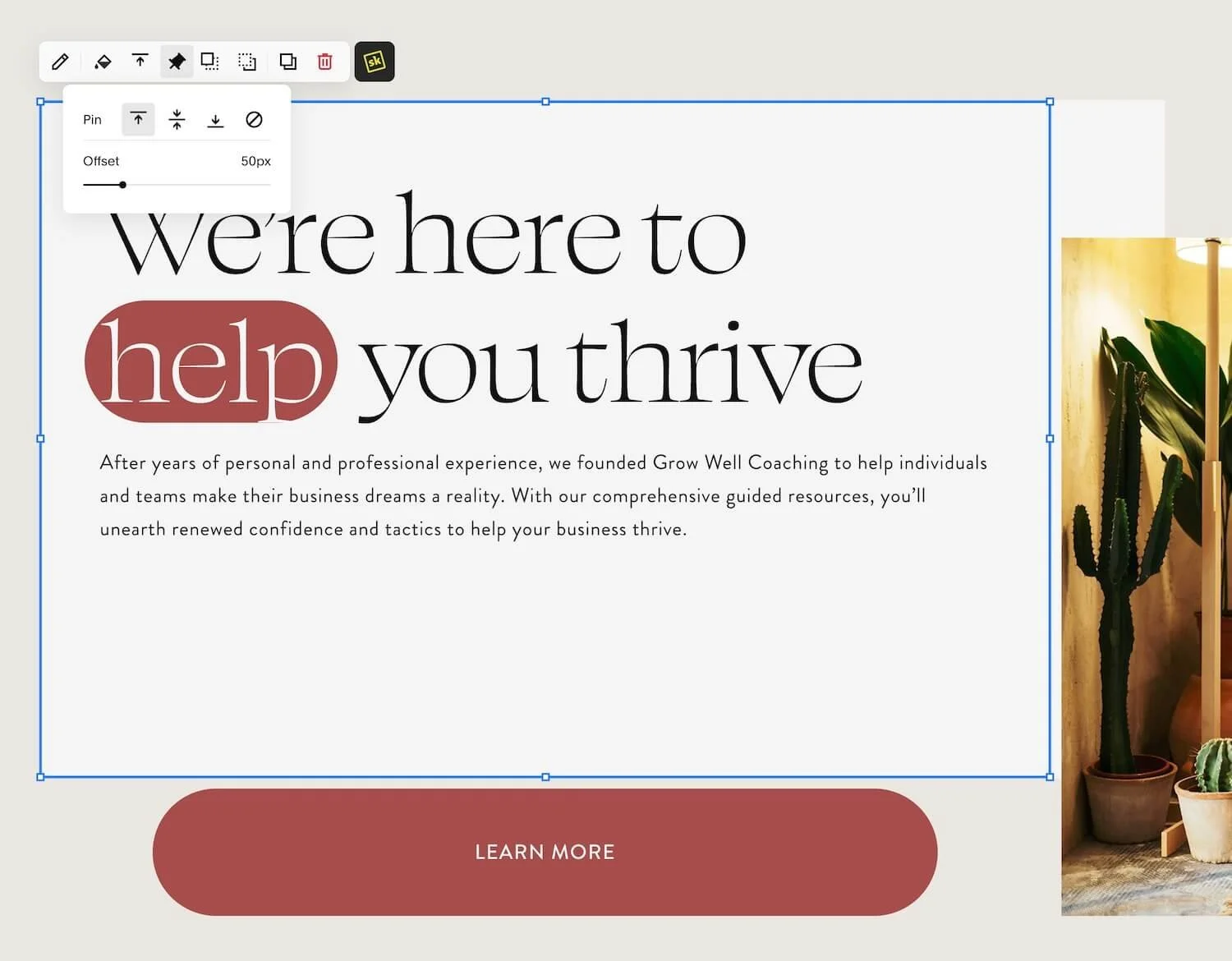
And then I’ve saved the changes. You can test how the pinning will work while still in edit mode.
If you ever need to remove the pin, it's as easy as clicking the pin icon and selecting the 🚫 icon, which if you hover over it, it will label it as “'Remove Pin.” That will unpin it and it'll scroll like normal again.
Since these settings are block-specific & section-specific, you can pin some elements while leaving others unpinned to create a floating effect where elements move around or stick at different speeds, adding a layer of engagement and interactivity to your design.
PLEASE NOTE: In this example, I’ve used
pxbut you CAN (& likely should) use other values such asem,vh,%, orremin the pinning feature’s settings to help with potential responsive sizing issues (instead of using the defaultpxvalue), which I’ll explain a little, next.
A word of caution
Be careful not to cover important text or buttons with your pinned elements, accidentally! Since different screens use different amounts of pixels in their display, getting this perfect on ALL screens is next to impossible, and you should be aware of this as a potential issue before you begin playing with this feature.
Since generally, Fluid Engine (Squarespace’s newest editor for 7.1 sites) is responsive, fluid & adaptively changing the element’s sizes on-screen based on the user’s viewing device, your design WILL fluctuate between people in your audience.
And since most of Fluid Engine does NOT use pixel values, in favor of percentages typically (or responsive size values such as vh or view-height, vw or view-width, em, or rem) this could mean that using a fixed pixel size when you stick an element in place, it could overlap with another element in your layout.
In general, when using this feature, just be careful & cognizant of your choices, and do a lot of testing to make sure the layout remains usable and readable for your viewers when you use this feature.
Always remember to check your design on mobile view when you make changes. Squarespace's default is to disable pinned settings on mobile, which is probably the best policy. It’s still a good idea to double-check this and adjust the mobile layout before you're good to go.
❹ How to Hide Headers & Footers (without custom code)
original transcript
The last feature we're going to cover is the hide header and footer feature.
And this is actually in the page settings. So if you click on the gear wheel to access the page settings, you now have an option under general called navigation. And if you turn the toggle on, Off for show header, it will not show the header. And the same thing for the footer. So, this would allow you to create your own sales pages that don't have a header or footer.
So, they look like standalone sales pages that you might have seen in something like lead pages, but you can create them on Squarespace. So that is a pretty handy feature to have, and you could actually hide the header but keep the footer and vice versa if you want to. They're independent of each other.
So if I did that, then I would be able to potentially add a logo up here at the top. Pretend that's a logo. So, If you had this as your sales page, you could have a logo at the top and you notice if you hover over that image, it actually changes to a pointer that indicates that it's clickable. And if you click that, it would take you to whatever page you linked it to.
So that could be essentially the way for them to get back to your homepage on your website if you want them to be able to, if they know that that's what it is. Otherwise, they could scroll down potentially and get to it from your footer if you kept that on but just turned the header off.
Now let's move on to the second brand new feature, as of posting: hiding the header and footer of any page on your Squarespace website WITHOUT needing custom code.
This is a pretty sweet addition to page settings that's tucked away and out of sight, so you may have missed it!
To access this setting, just click on the gear wheel icon for any page listed in your Pages menu and you'll find a new Navigation option under General in the sidebar of that settings window. Inside this Navigation option, there are two toggles: one for hiding or showing the header, and one for hiding or showing the footer. Pick which (or both) you want to turn on or off, and save you changes. It’s now THAT easy!
Where to access this setting for each page
How would someone use this feature?
This is super useful when you want to create unique sales, opt-in (or lead magnet), landing pages, etc. that can stand alone & do not need navigational areas. Typically, these types of pages are hiding headers &/or footers to allow the visitor to focus JUST on the content of that page without getting distracted by links to other areas of the website that are not related to whatever the main intention is for the page.
What's especially useful about how this feature was added, is that you can choose to hide just the header, just the footer, or both. They're not tied together, so this makes it very flexible.
For example, you could hide the header navigation and add your own logo at the top of the page, linking that image back to the home page if you wanted to make it easier for visitors to get back to the website even without seeing the navigation at the top. When you link an image, when someone hovers over it the cursor will change to a pointer, indicating it's clickable, and then it can lead visitors back to your homepage (or whatever you linked it to).
Alternatively, you could choose to only hide the header but keep the footer visible in order to allow visitors to scroll down to the bottom and use whatever links are in the footer, to navigate away from that landing page when they’ve finished looking through it.
Hiding the announcement bar (too)
Unfortunately, using the built-in feature to hide the header & footer does not also hide the announcement bar when it’s enabled, on any page these settings are activated. Hopefully it will in the future, but for now it does not.
Of course, I can’t just tell you it won’t also hide your announcement bar & then leave ya hanging so here are some resources that can help you hide the announcement bar on specific pages, if you need to:
How to customize your Announcement Bar with SquareKicker
Fun fact: SquareKicker does NOT require an ongoing subscription! You only pay for the month you make changes that you want to be shown on the live site. When you cancel your subscription, your changes stay put, you just can’t publish more changes until the next paid month, but you can choose when that is. Try SquareKicker any time* or learn more about it in this review post.
How to remove Announcement Bars in specific areas with code, from Circle member Tuan Phan
Hide navigation/header/footer in v7.0 of Squarespace, a Squarespace Forum post
Recap & final thoughts
I hope you found this walkthrough helpful! The Scale Text and Highlight features have been around for a year or so (as of publishing this post), but they still seem to trip people up. Not everyone knows what these buttons are actually doing, so I see a lot of frustration around using them; especially the Scale Text feature! That's why I wanted to make sure I covered it today, along with the two newest features—the Pin Block feature and the option to hide the header and footer in page settings.
I hope this information makes your editing experience in Squarespace a little smoother and more fun! If you're interested in more tips and tricks like these, stick around or keep searching through the blog because there’s tons more tips like these coming down the pipeline!
If there's a specific feature I talked about or mentioned today that you'd like to learn more about, drop a comment below. I’m always interested in what questions you’re asking about your website!
On that note, if you're mostly comfortable with these features but are struggling with what words to actually put on your pages, check out this post where I show you some templated guides available on my website. Those guides are designed to help you figure out what to put on every single page of your DIY website.
That's all I've got for you today!