

3 Reasons Why You're Not Booking the Clients You Want
What's inside this post: Hide
If you've ever asked a new client if they have brand assets ready to share: logo files, hex codes, brand fonts, maybe some photography, and they say things like: "I have a Pinterest board." Or, they send you some small, pixelated logo files with a white background behind it. Or sometimes worse, "Just pick whatever you think looks good — you're the designer! I trust you."
This is a real thing that happens all the time. But here's the thing — as frustrating as those moments can be, it's actually a symptom of a root problem, which starts a lot earlier than when a client shows up to a project empty-handed. A big chunk of that problem lives on your website, in your copy, and in how you're currently talking about what you do.
I know, I know. 🫠 Stay with me!
I've done a few website audits for Club members recently, and I keep seeing the same patterns come up over and over. So instead of just flagging it privately one-on-one, I wanted to lay it all out here — because this stuff affects every service you offer, not just your branding.
It's (Probably)Not Your Portfolio
The first place most designers go to fix when clients aren't converting is their portfolio. They usually think, "My work isn't good enough. I need more case studies. I need better mockups."
And while there's always room to improve your displayed work & the work that we produce, that's rarely the actual issue.
Clients don't say no —or ghost your proposals, or come back asking if you can "just do the logo"— because your design work isn't up to par. They do it because they can't feel the value of what you're offering before they've experienced it.
That's a totally different problem.
Think about it like this: you know exactly what 30+ hours of strategic brand and web work can do for a business. You've seen the before and after. You've watched clients go from looking like a Craigslist ad to looking like a company that proudly serves real (happy) clients! But your potential client hasn't seen that yet — and more importantly, they haven't felt what that result would mean for their business specifically.
Bridging that gap is on us. And most of us were never taught how to do it.
You're Already Doing Brand Work for free
How many times have you had a client show up to a web project without any real brand assets — and instead of stopping the project or upselling them into a proper brand package, you just... made it work? 🙋🏻♀️ Me too. I think we've ALL been there at least once, because we WANT to help!
If that's you too, you probably took one look at their existing logo (if they had one), pulled a few complementary colors, found some stock photography that "fit the vibe," chose fonts that actually looked good together — and quickly made a whole brand direction happen in the background while you built their site.
That is brand styling. That is a real, skilled, billable service.
You just called it "making it work" and gave it away for free, though.
And when you do it that way —unspoken, uncharged, not framed as the service it is— the client doesn't value it. Why would they? You didn't tell them it was a thing. You didn't present it as part of what they were getting. So from their perspective, the website just... came together. Like magic! No big deal. 🤷♀️
This is where undercharging starts. Not with bad pricing decisions necessarily, but with invisible work that never gets positioned as valuable in the first place.
What I Keep Seeing in Website Audits for Newer Web Designers
Getting more specific here, because I do see this most frequently on newer business owners' websites.
After looking at a bunch of newer designer's websites, I keep seeing the same issues. And none of them are about design quality. The work is good. The problem is everything around the work.
❶ Your positioning isn't clear, because YOU aren't clear yet either
Jumping right to this part of the video
This one is the hardest to hear, and the hardest to nail before you have figured out who you want to work with, ––but it also shows up everywhere on your website & in your general online presence, whether it's done well or badly...
If your niche is too broad, or you haven't committed to a specialty yet, that confusion doesn't stay in your head — it bleeds into your copy, your packages, your proposals, your client conversations. Everything! 😬
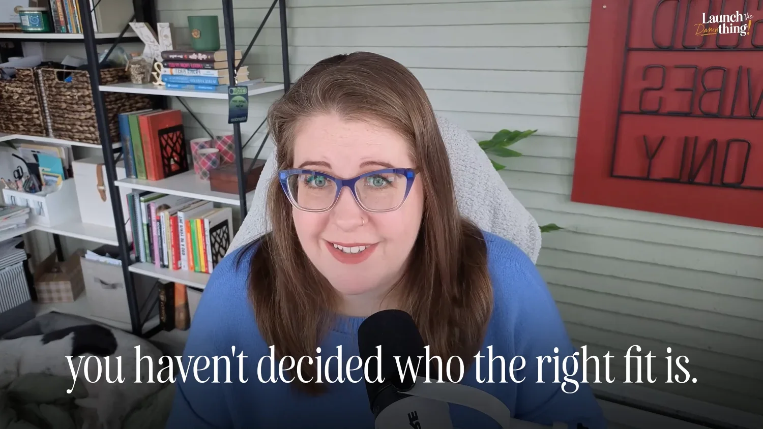
A potential client lands on your website and reads... something vague. Something that sounds like it could apply to literally anyone. And because nothing speaks specifically to them or their specific struggles, they may click away feeling like you're probably fine, but not the obvious right fit.
Here's the thing about niching down: your niche is not a cage. It's a magnet.
Choosing a direction —a type of client, an industry, a specific problem you solve better than anyone— doesn't mean you're blocking everyone else out. It means the right people feel like you're reading their mind. It means you stop competing on price alone, because you're not trying to be everything to everyone. It means the people who do reach out are already 80% sold before they even fill out your contact form because they KNOW they only want to work with you!
Staying broad because you're afraid to lose people is the thing that's actually pushing potential clients away.
Next, I'll give you an example to show ya what I mean.
❷ Your copy is talking about yourself, NOT your client
Jumping right to this part of the video
This is the second thing I see a lot, and it's such an easy trap to fall into because you know your services really well, but probably not your ideal clients yet.
A lot of designer websites talk about the processes —the discovery call, the mood board, the revision rounds, the deliverables, the approach, the methods, etc. And that stuff matters (to us)! But clients don't buy our processes. They buy outcomes.
There's a big difference between:
"I design custom Squarespace websites with a streamlined X-week process."
and
"I help wellness coaches stop losing clients to their competition and start booking out their calendars."
The first one describes what you do. The second one describes what changes for your client if they work with you.
Read your homepage right now and ask yourself honestly: is this copy about what I do, or about what happens for my client when they work with me? If it's about 'me' as the designer, that's a conversion problem — and no amount of fixing your branding pitch is going to solve it until the underlying copy is reframed to highlight the outcomes & benefits the client will receive instead.
Your client doesn't care that much about your processes. They care about whether you understand their problems & can fix them while you work. Show them you do!
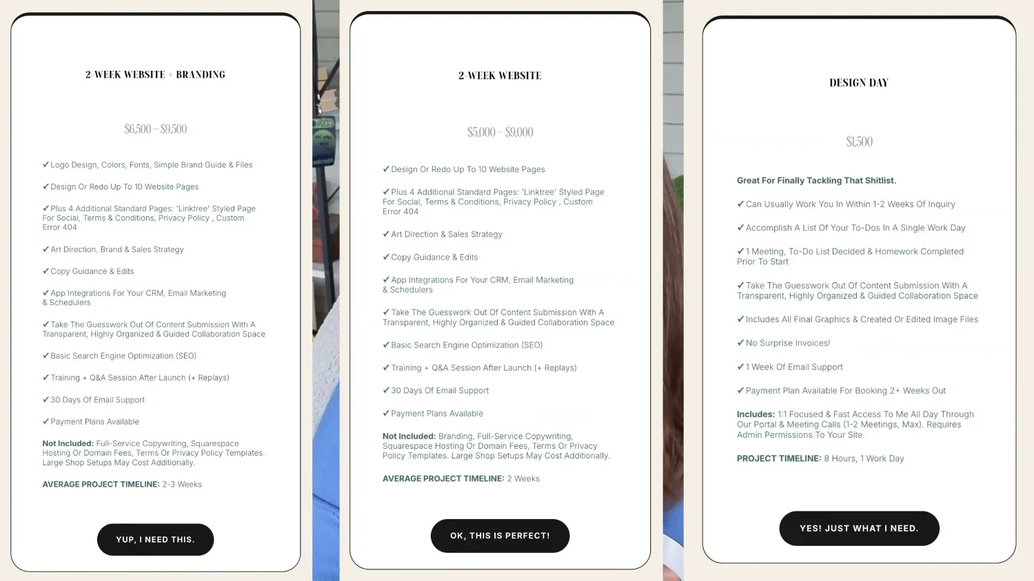
❸ Your pricing is anchored to the bottom & it's attracting price hagglers
Jumping right to this part of the video with visual examples
This one is straight-up pricing psychology, and once you understand it, you can't unsee it!
If your pricing page leads with your lowest package, you've just handed every visitor an anchor. They now have a number in their head —let's say it's $1,200 for your day-rate package— and every other price they see gets compared to that. So your $3,500 package doesn't read as "the full-service option with everything included." It reads as "almost three times the cheap one." 😬🫠
You've accidentally made your own premium offer sound too expensive.
Flip the order. Lead with your best, most complete offering. Let it set the standard! When someone sees that first, they're comparing everything down from there — which makes your mid-tier feel like a smart, reasonable choice instead of a big step up from the bottom, and your cheapest option becomes budget-friendly, not a negotiation tactic.
Here's a real-world example of price anchoring

Jumping right to this part of the video with visual examples
Say you walk onto a car lot with a $50,000 budget and you spot a car you love — the price tag is $30,000. Amazing! It's under budget! You test drive it, you're sold, it's got everything you want. Then the salesman comes back and says, "Okay, with all fees, we're looking at $45,000 out the door." Suddenly you're bummed. Even though $45k is still well within your original budget, you're anchoring to that $30k sticker you saw first. It feels too expensive now — even though it's not out of your prepared budget.
Flip it: Now let's pretend you walk onto the lot with a $50k budget and found the $45k car, test drove it, loved it, and the salesman said, "That'll cost ya $47,000 driving out the door, fees & all." You're excited because it's pretty much what you expected, and it's still under your original budget by $3k.
Flip it again: If you'd walked on that lot, seen a $45,000 car first, fallen in love, and the salesman came back and said "actually this one's $30,000" — you'd be elated because it's $20k under budget! Same car. Same price. Completely different emotional experience.
That's basically what's happening on your pricing page every single time someone lands on it and sees your lowest package first. They anchor (compare) what comes next to that lowest number, and everything else above it feels expensive by comparison —even if your rates are completely reasonable for what you deliver!
A few more quick fixes while we're here:
Don't set your price in the biggest font size on the pricing section. The value should be the most prominent thing, not the number.
If one of your packages says "includes everything in Package B" — make that line visually more distinct than everything else that's in the included list. It shouldn't look like a shorter bullet list than the cheaper packages around it on the same page. People skim. They do not read details anymore, so make it impossible to miss!
Call out your most popular package, or the best value, if known. That helps draw attention to the right one that will work well for most people.
Make sure your calls to action start with a verb. "Book now." "Inquire here." "Get started." And please, for the love of all things holy — stop using "Learn More" in 90% of the places you're using it. Always. Forever. Clients don't want to learn more, they want to do something more (& for us to do it for them). That's how we run businesses, when they take action & pay us for our services. 🤭
These are small, but mighty, tweaks. The order alone can shift the type of inquiries you get — because anchoring to the bottom consistently attracts clients who anchor their expectations there too.

Should You List Prices on Your Website?
Why You Can't See These Problems On Your Own Website
We can spot all of these problems on a client's website in about ten minutes. We can read their copy and go, "oh, this isn't speaking to the right person." We can look at their pricing page and immediately see that it's backwards. We can feel when a niche is too fuzzy.
But on our own sites? Total blind spot. 🤦🏻♀️ 😂
It's like trying to read the label from inside the jar. You're too close to it. You wrote that copy, you made those package decisions, you've been staring at that homepage for so long you can't even see it anymore. You just see what you intended it to say — not what it's actually communicating to someone landing on it cold, and with no context or trust built with you yet.
This is not a skill problem, it's is a proximity problem.
Forest? Trees.
Can't see 'em if you're standing in the forest.
The point is: getting outside eyes on your own stuff is not a luxury or something you do when you're struggling. It's a regular part of running a healthy business. A mentor, a coach, a community of peers who'll tell you the truth — these things are really helpful! They're how you stop flying blind on your own positioning while you're helping everyone else nail theirs. 🤭
What Changes When You Fix This Stuff
When you get your positioning clear —when your copy speaks to the right person, when your pricing is anchored correctly, when you know exactly who you're helping and you're saying it confidently & clearly— everything else shifts.
Better clients reach out. Not because you got lucky, but because your website is now doing the appropriate filtering for you. The people who reach out already understand what you do and why it costs what it costs. The "can you just do a logo?" inquiries drop off. The people who are serious about investing in their business find you and think, 'finally, someone who gets it!'
Your proposals land differently too. When the value is clear before the proposal ever arrives, you're not in a battle to justify your rates, to negotiate, or convince anyone of the value. You're really just confirming what they already expected.
And for those of you who want to add branding to your services —or who are already offering it but struggling to get clients to bite— fixing this upstream stuff is what makes that possible. You can't successfully pitch a premium service if the foundation it's sitting on is secretly working against you. 🫣
Nobody Likes to Admit This
A lot of the time, the "clients don't want to pay my rates" problem isn't really about that client or the prices.
There's just a fear underneath it that doesn't get named, which is, "What if I position myself more confidently, they say yes, and then I have to actually deliver something that matches what I just promised?"
That fear makes sense. Totally valid. Especially if you've been doing this solo, figuring it out as you go, without anyone looking at your work and giving you honest, specific feedback.
Most designers are further along than they give themselves credit for. But without someone who can actually look at your situation and tell you where you're killing it and where there's room to grow —that gap just kind of ...sits there. Actively keeping you from pricing where you belong, and preventing you from helping the people you'd love working with most.

You missed the live, but you can watch the recording!
Get A Second Opinion
I'm hosting a free live session with Kadie Smith of Drop Cap Design® on April 14, 2026, and I'd love for you to come join us!
Kadie has built and launched 200+ brands since 2014. She works with designers on exactly this stuff —the pricing, the positioning, the client conversations, the confidence gaps, and more.
She runs monthly group coaching calls for her Brand Business® students, and she's offering us a live coaching session as a direct follow-up to her previous event on adding $1k to Web Projects with Brand Styling (watch the replay here to catch up)!
This is not a webinar, not really a 'workshop' in the normal sense either.
It's more like an actual group coaching call!
So bring your real situations —a client scenario you're stuck on, a pricing question, whatever you're currently trying to figure out on your own— and get real input from Kadie & I, who've been doing this for over a decade & have probably been in your shoes before.
It's free. It's live.
And yes there's a replay; if you're reading this afterward, you can still watch it.
One hour of specific feedback on real attendee’s businesses is worth more than three months of consuming content about generalities.
If you've been battling with some version of "I know I need to fix my copy, but I haven't gotten around to it yet" — this is your sign. Come hang out with us in the Club!
Why does branding cost so much?
A live coaching experience on positioning the value of brand design for our clients.
