

Brand Strategy for Web Designers: What You Should Know
What's inside this post: Hide
Web design is my thing. It's what I love most in the design world, it's what I chose, and it's the creative work I find the most joy in doing.
I'm not a brand designer, and I don't want to be.
I think it's important to note that, as web designers, we don't also have to be brand designers. We don't also have to be copywriters. We don't also have to be graphic designers, etc.
We can be, if those things genuinely light us up. But if they don't, there are other ways to handle those pieces without forcing yourself into a lane that was never mandatory for you.
That said, brand strategy still shows up in my work every single time I build a website. Not because I'm running full brand discovery sessions or sending clients deep-dive questionnaires (more on that in a minute), but because the design principles behind brand strategy are woven into every decision I make for a website. The colors, the fonts, the logo, the imagery — none of that is arbitrary when you know what you're doing.
Here's what that actually looks like in practice: what I think about, why it matters, and where my lane ends, and someone else's can begin!
How my web design background shapes my brand strategy approach
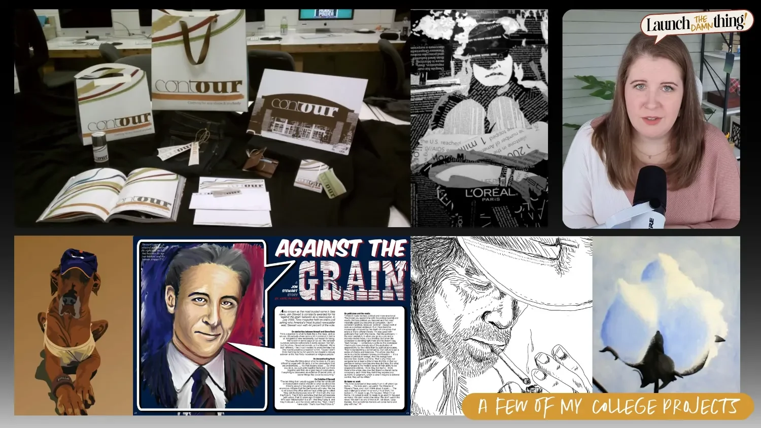
A few of my college projects
(📸 Video Screenshot)
I studied art & design in college. In my graphics classes, we learned brand strategy, conceptual design, design elements and principles... That was all part of the curriculum, so I do have the real foundation.
But capable of something ≠ wanting to build a business around it. 🤭 I pivoted into web design in 2017, went full-time freelance in 2020, and that's where I've been ever since. Brand strategy has always been a supporting skill for the web design work in my business, but not the main event.
What I actually offer clients is brand styling — and I didn't even really have a useful name for it until Kadie Smith, of Drop Cap Design used that phrase to describe it during one of her workshops in my membership. 😂
Brand styling is essentially a curation of the visual assets a brand needs: sourcing fonts, building out a color palette, curating stock photography, and creating a typeset logo (usually in Canva, Affinity, Adobe, Figma, or even directly in the web builder while setting up the header navigation). It's not a full branding identity package. But it's also not nothing — because even within that scope, I'm applying real strategy to every decision and it takes a MINIMUM of 10 hours to gather & curate all the pieces.
Brand colors: a real client example
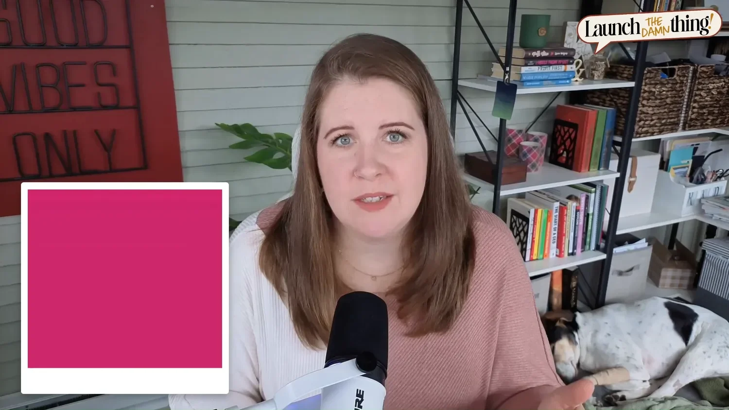
Example Fuchsia color
(📸 Video Screenshot)
I'll give you a real example, you can get an idea of how this comes together in real world projects.
A client came to me with a color palette she already had & felt established with. It was a vibrant, monochromatic set of fuchsia with various tints and shades of the same hot pink. She even had brand photography where she appeared in clothing that matched those colors!
But the problem was that the palette was loud. Too loud. Too high-energy. And too monochromatic. For the type of service-based business she was running, that energy wasn't doing her any favors, and it felt misaligned for the subject-matter.
Here's one of the thought-provoking questions I asked her: if you built a physical lobby for your clients to walk into, and it was painted mostly that color — how would they feel in that room while getting ready to work with you?
Then she got it. That's not the feeling she wanted her clients to have.
So we made some changes:
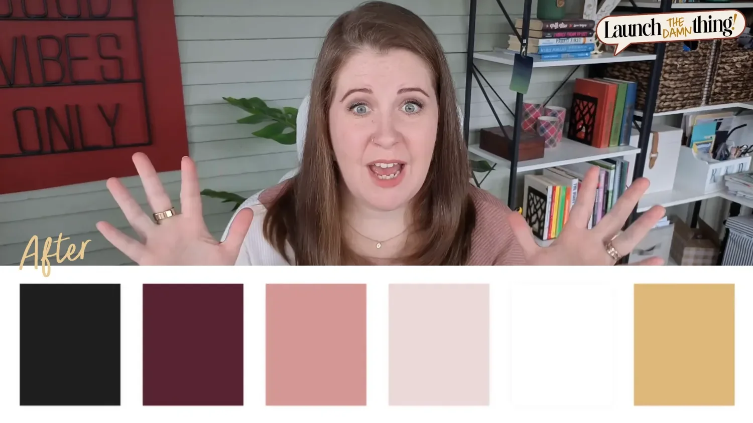
Example Color Palette – End Result
(📸 Video Screenshot)
Softened the fuchsia — we kept the pink-and-purple direction but pulled it into dustier, more neutral territory. Still her, and feminine, just way less intense & aggressive, pulling the energy level way down.
Added a soft black — we needed dark text on the site, and pure black felt harsh. A soft black (basically a dark warm grey) grounded the palette without overpowering it.
Brought in gold — warm, slightly luxurious, and it opened up a whole world of stock photography with gold accents that matched the vibe of client she wanted to attract.
The result was a brand that felt much more approachable, elevated, and aligned with what her business was actually trying to communicate —but without erasing the color theme she loved.
If I hadn't had that brand strategy foundation, I probably would've just built the site in fuchsia, and neither of us would've been able to put our finger on why it felt off the whole time. That kind of misalignment between intention & appearance is almost always a brand or foundational strategy issue. The web design can be technically flawless and still feel like something's not right if the brand foundation & strategy underneath it is shaky.
How brand strategy helps in web design work
So what does brand strategy look like when used in web design work? Here are the three things I think about most.
❶ Color psychology in web design
Color communicates whether you want it to or not. This isn't woo-woo or assumptions, it's actually studied and documented, and it affects how people feel when they land on a page in the first few seconds before they've read a single word. It also affects our buying decisions, and even our trust with companies, products & service providers.
For example:
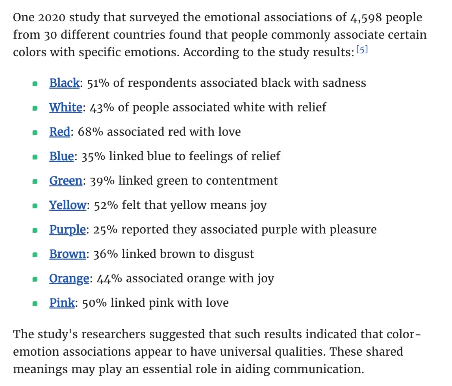
One study in 2020 surveyed nearly 4,600 people across 30 different countries, finding commonly associated feelings with certain colors & specific emotions, suggesting that color-emotion has universally recognizable qualities. The results found the following:
Black: 51% of respondents associated black with sadness
White: 43% of people associated white with relief
Red: 68% associated red with love
Blue: 35% linked blue to feelings of relief
Green: 39% linked green to contentment
Yellow: 52% felt that yellow means joy
Purple: 25% reported they associated purple with pleasure
Brown: 36% linked brown to disgust
Orange: 44% associated orange with joy
Pink: 50% linked pink with love
So, fuchsia basically says LOOK AT ME!! — which is great for some businesses, but completely wrong for others. 🫣🤭
The question I'm always asking: what does this site need to make someone feel in the first three seconds? Not "what colors does the client like" (though that matters too), but what emotion needs to be triggered immediately for this site to work & build trust with its audience?
To dive deeper into how this ties into web design, check out these blog posts (with videos) next:
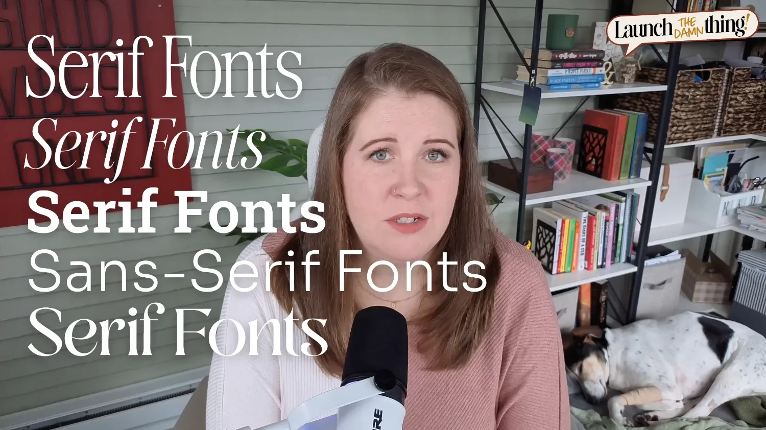
❷ Typography and brand personality: choosing the right fonts
Example Font Personalities & Character Traits
(📸 Video Screenshot)
Fonts have a vibe. Full stop. A high-contrast serif reads as editorial, or even elegant. A chunky, slab-serif reads as athletic and bold, while a rounded sans-serif font reads as friendly & approachable. A thin geometric sans-serif font reads as modern and minimalistic, sometimes casual & happy or simple. Those vibes either support what the brand is trying to say, or they can work against it.
I think about font selection the way a casting director thinks about filling a role for a movie or a tv show. It's not just "is this a good font?" It's "does this font fit this story?" That's a different question, and it usually takes longer to find the right 'actor' among the tens of thousands of available fonts in places like Canva, Adobe, Google, Affinity, Creative Market, or even built into Squarespace.
Your heading font sets the personality tone because it's the biggest, most prominent text on the page, so it does the heavy lifting. Your body font's job (for paragraphs) is to support the heading's personality and stay out of the way. You want one of them to have personality. Not both, and preferably not the body font or it'll be harder to read in smaller letters.
Remember & think of it like this: two strong personalities in the same room creates tension, and tension is not a vibe you're going for on a service provider's website.
To learn more about how to use headings properly on websites, check out this post next:
❸ Logo design for web designers: why context matters
A logo doesn't exist in a vacuum. It lives in the header navigation area, it shows up on an Instagram profile, in an email signature, or even potentially on printed materials or embroidered on merchandise someday. Designing for the whole brand ecosystem —not just the single asset— is something I'm always thinking about as I create & curate the brand assets & styles for my clients.
This is where my print production background actually comes in handy, because it informs one of the most common mistakes I see newer brand designers make: using way too many colors in a logo.
The general rule is 2 to 3 colors max, and here's the real reason why. In digital, color is free and made with light on the screen. You can use 47 colors in a logo and it costs you nothing to display it on a screen. But the second that logo needs to be printed, embroidered, screen printed, or produced in any physical medium —in many cases, every color costs money. Some print production processes charge by ink color in addition to the quantity ordered & the product's base rate before your design is added to it. Embroidery charges by thread color, instead of ink colors. So, a logo with 8 colors could be significantly more expensive to produce than one with 1 or 2, and some production methods literally can't replicate certain color combinations accurately.
So when a brand designer loads up a logo with a bunch of colors because it looks cool on screen, they've unknowingly made their client's life harder and more expensive every time that logo shows up in the physical world. It's one of those things you only really learn if you've worked in production, I know, —but it's a pet peeve of mine for good reason. 🥴
Even if a client swears they'll never print anything: keep it simple anyway. Businesses evolve. Merch happens. Plans change. And a logo that looks great in isolation can still fall apart & look terrible in certain circumstances. Context is everything.
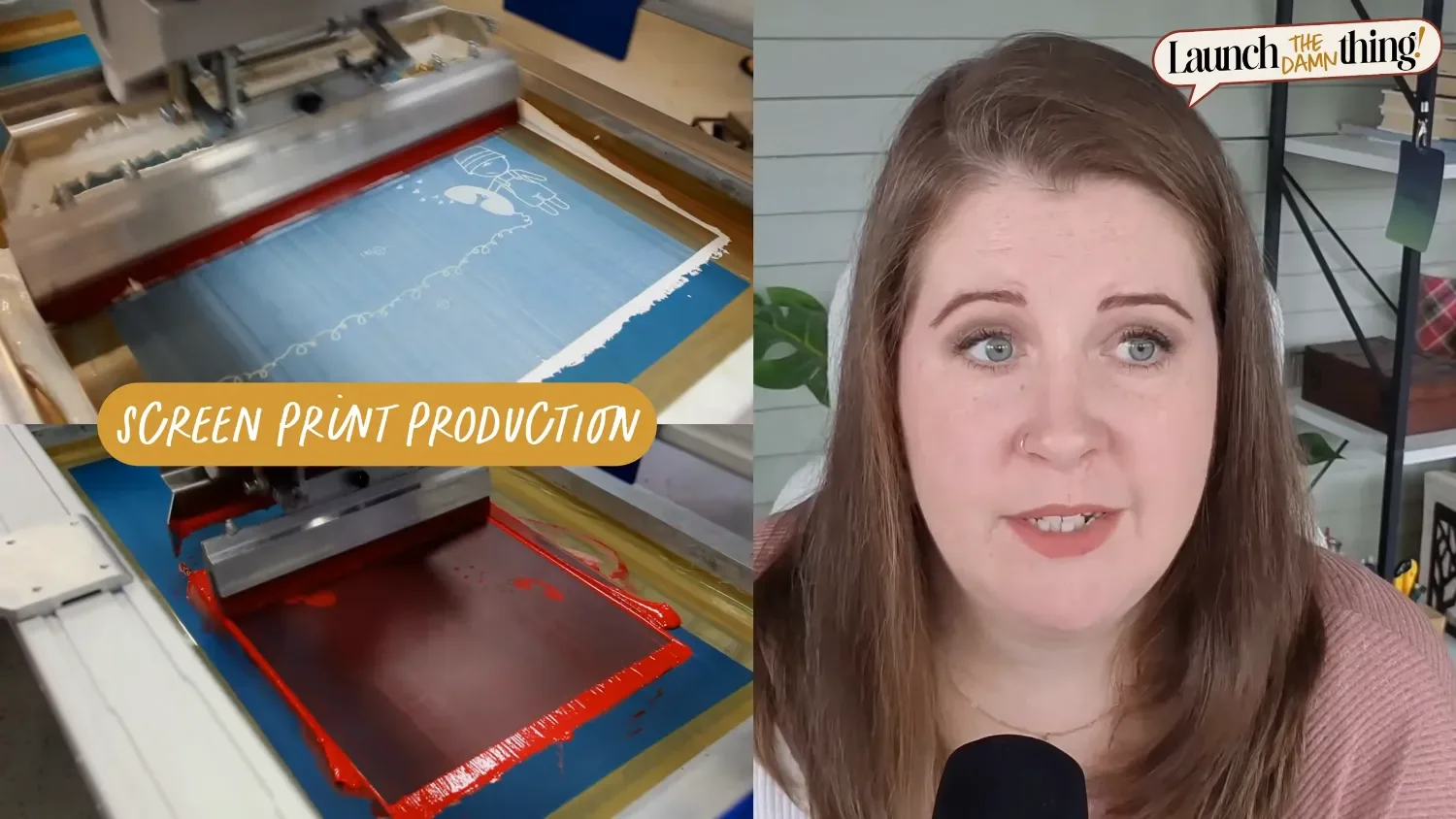
Screen-print production: print press in action
(📸 Video Screenshot)
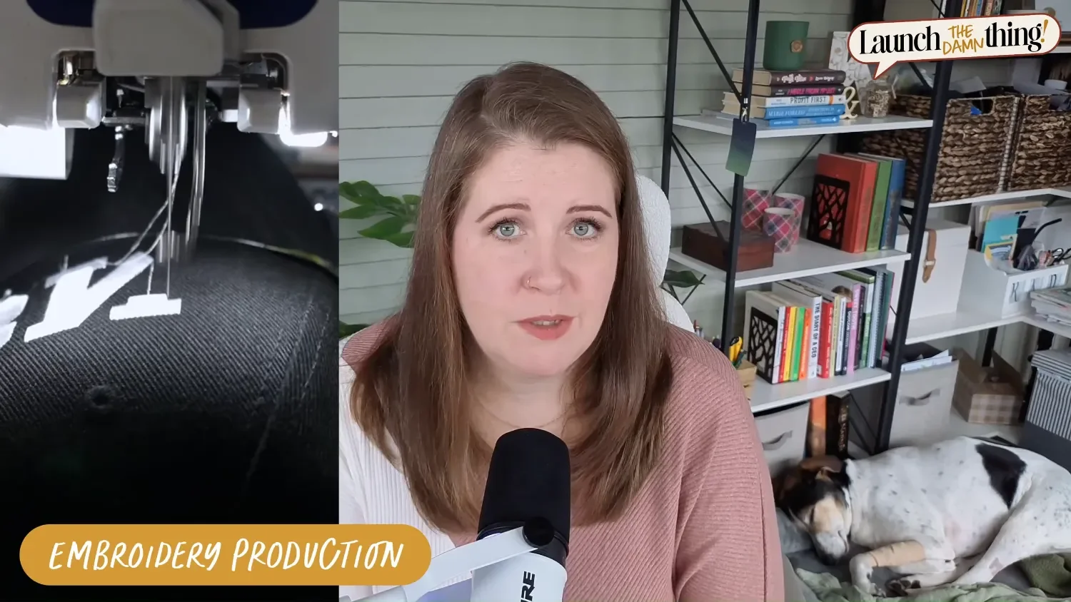
Embroidery production: embroidering caps & designs in action
(📸 Video Screenshot)
Brand Styling vs. Brand Strategy (knowing the differencE)
Here's the distinction you need to know: what I just described is brand styling with intention. It is not the same thing as a deep brand strategy process and it has much fewer assets and pieces to deliver.
Deep brand strategy involves figuring out the brand story, establishing the positioning, identifying archetypes, creating brand systems —basically, the research and methodology behind figuring out not just what the brand looks like, but what it means and how it communicates across every single touchpoint with the audience & ideal clients/customers. That work has real, significant value beyond just styles & aesthetics. Offering Brand Identity services is a specific skill set of its own, and one I have the foundation for, but zero desire to specialize in. 😂
And I say all of this not to undersell what I do, but because I think it's actually really important for web designers to know the difference — and to know when a project needs more than what you're currently offering. Because some projects do. I've worked on websites where the brand was the whole problem. No amount of beautiful web design was going to fix it. And knowing enough to identify that, pause, and course correct, saying "we need to deal with this first" is genuinely valuable — even if doing the brand work yourself isn't your thing.
Where to learn Branding for Web Designers
The person I recommend wholeheartedly is Kadie Smith of Drop Cap Design® —whether you're a designer who wants to learn how to offer branding as a service, or you're a business owner who just needs to finally nail your own brand without paying agency rates.
Kadie has been doing this for 12+ years (as of posting) and has worked on 200+ brands through her agency, to date. More importantly, she's a genuinely excellent teacher. She even has students who are not designers —completely different industries, zero design background — who have gone through her program(s) and come out with brands they're actually proud of that they did on their own. Teaching creatives & non-creatives alike, to make good visual identity decisions is legitimately harder, and the fact that she pulls it off consistently with successful students is exactly why I trust her. Not to mention, she's a super likable gal and I think you'll like her too!
She has two options worth knowing about:
*Yes, I'm an affiliate for Kadie’s programs, but I also have The Brand Edit® myself, and I've even brought Kadie into my community to teach because I trust her expertise that much. — She is an incredible educator, and I'd be happy to share her with you regardless of my affiliation!
STEP 1
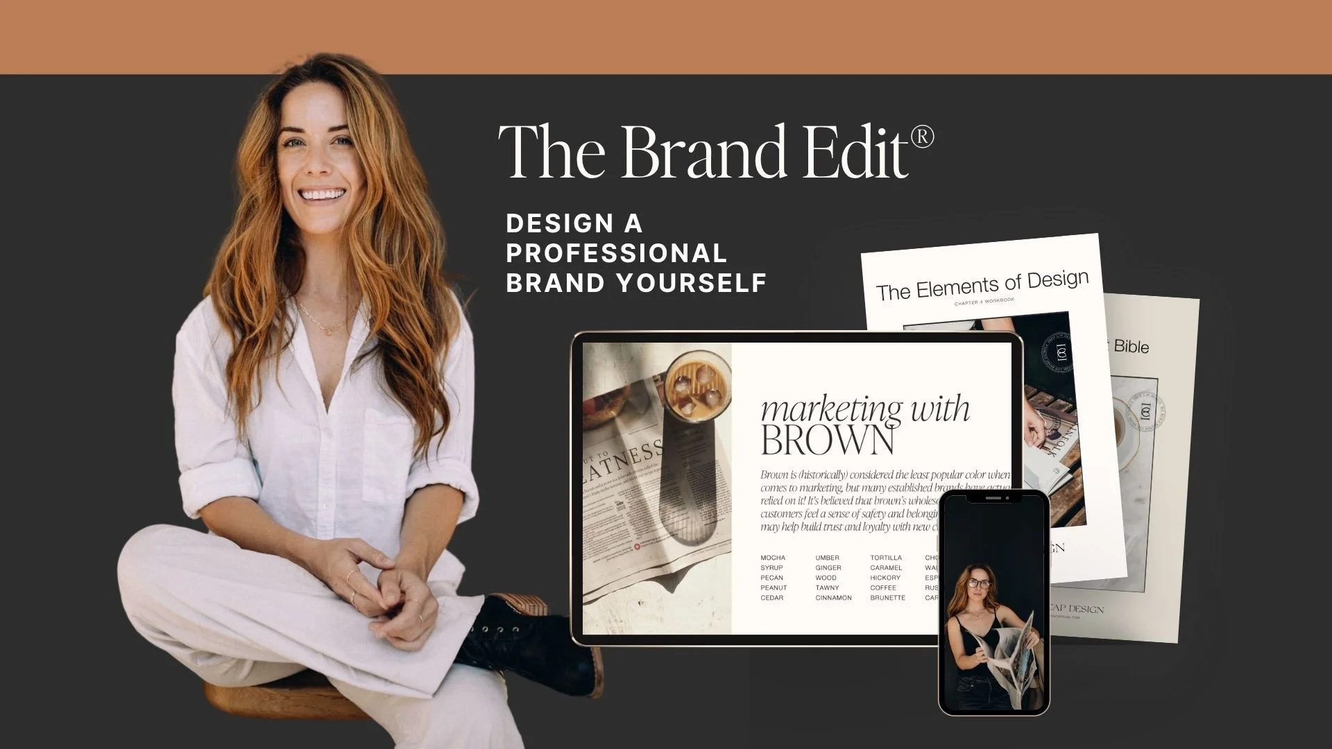
THE BRAND EDIT®
The Brand Edit® is a self-paced course for anyone who wants to build or refine their own brand identity — designers, non-designers, business owners who want a properly done brand without hiring an agency. If your brand has always felt a little DIY in a bad way, this is the fix.

STEP 2
THE BRAND BUSINESS
The Brand Business* is a self-paced course for designers who want to offer branding as a service to clients. It covers the full methodology, client process, pricing strategy, and the creative direction conversations that are honestly the hardest part. If you're already doing brand styling decisions and you want real strategy behind them —and to charge accordingly— this is where I'd start. This one is only available with the bundle, or to past/current Brand Edit® students!
Brand Strategy: basics web designers should know
You don't have to become a brand strategist to be a great web designer. But you do need enough of the foundation to make smart decisions — and to recognize when a project needs more than you're able to provide, whether that means learning a new skill from someone like Kadie, or finding someone else to refer your client to for that part of the service.
My fuchsia-client didn't need a full brand strategist. She needed a web designer who knew enough to course-correct before we started building the site with her old branding. But I've definitely had projects where the brand was the whole problem, and the website would have been a mess no matter what I built on top of it or with it.
Know your lane. Know who to call when something's outside of it. And if you want to expand that lane — Kadie's your brand-guru.
If you want to dig further into the brand personality side of things first, check out the free workshops from Kadie in my community's free events (linked below). And when you're ready to go deeper with someone who actually teaches this for a living, that's where Kadie comes in.
Meet Kadie!
Free Workshops Available in the Club:
Why does branding cost so much? (see the screenshot)