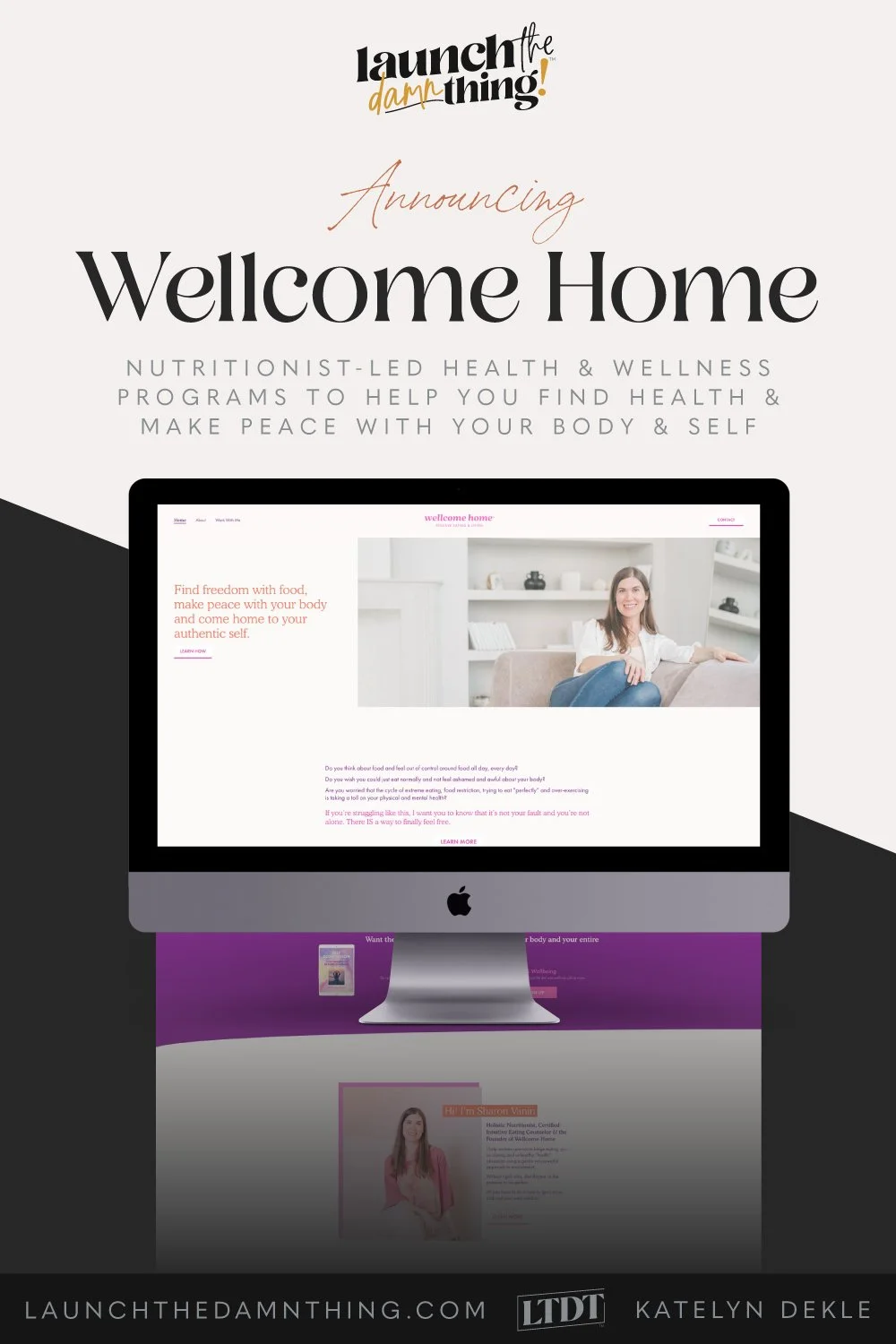
Wellcome Home launched the damn thing!
What's inside this post: Hide
📌 Pin it!
Some people are like legit heroes, am I right? How they can make the time every day to do all these things, I'll never know. 😂
Sharon is one of those people, and if you caught her previous 2 website launch celebrations with me (yes, you read that right––I said TWO), then her face and her name is familiar to you by now.
Aside from her long (15-year) career as a lawyer in Canada, founding her own legal practice, and creating a contract template shop specifically for health & wellness professionals, ––she is ALSO a Holistic Nutritionist, Certified Intuitive Eating Counselor, and the Founder of Wellcome Home.
🤯
Not only does she have an impressive list of credentials & education, but she also has the personal experience of what it feels like to have (& overcome) her own struggle with eating to numb her feelings.
She's not just another healthy know-it-all poser because it's just a trendy topic. She's actually been IN the trenches herself, as someone who didn't have the knowledge to pull herself out... until she bottomed out, decided to go back to school and changed careers to literally follow her heart. 💜
It’s always refreshing to see a professional helping people overcome something they have experienced themselves; when they aren’t just blindly teaching what you “should do” because you just “should do it,” they know what it feels like to sit & struggle in that student’s seat too.
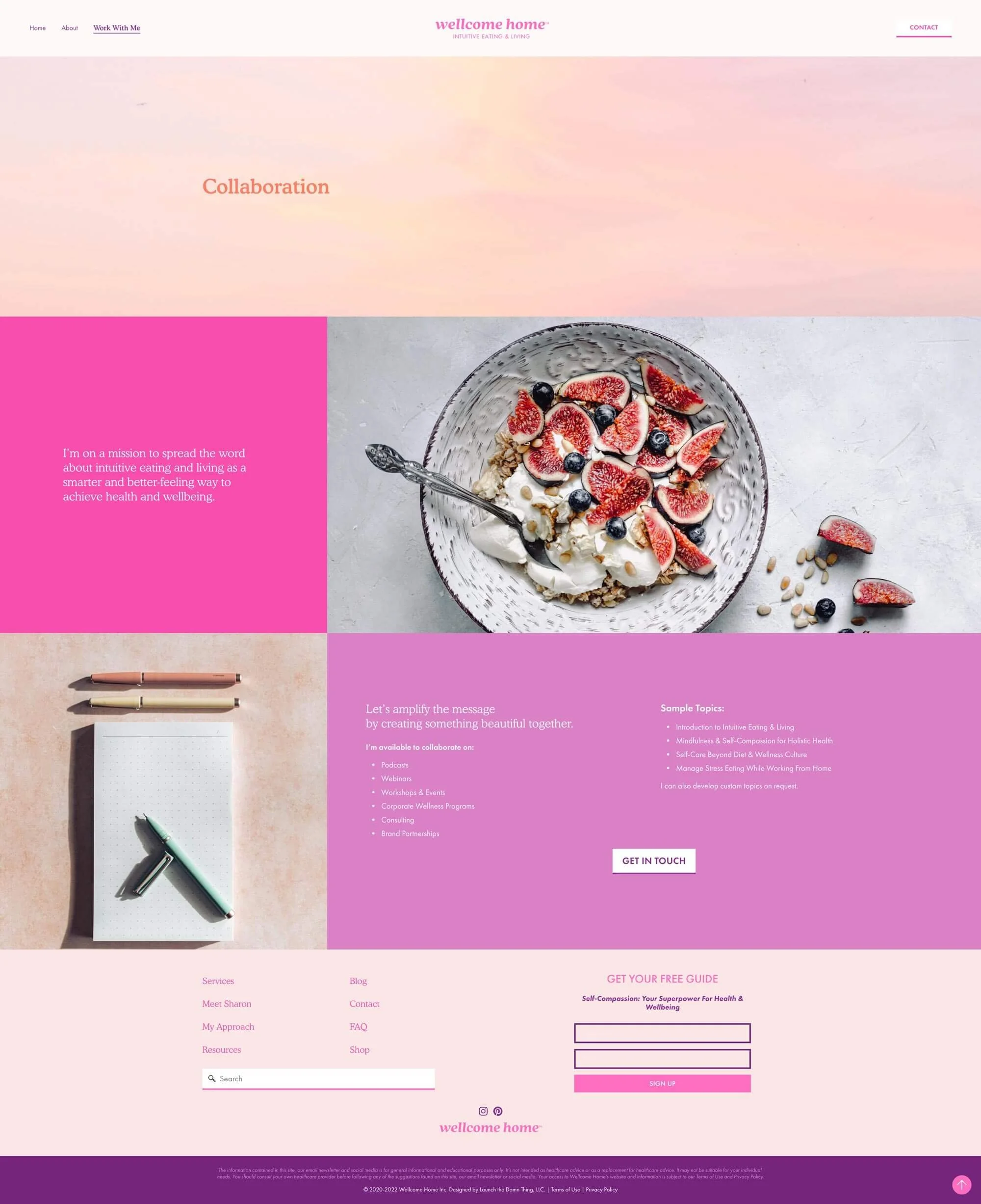
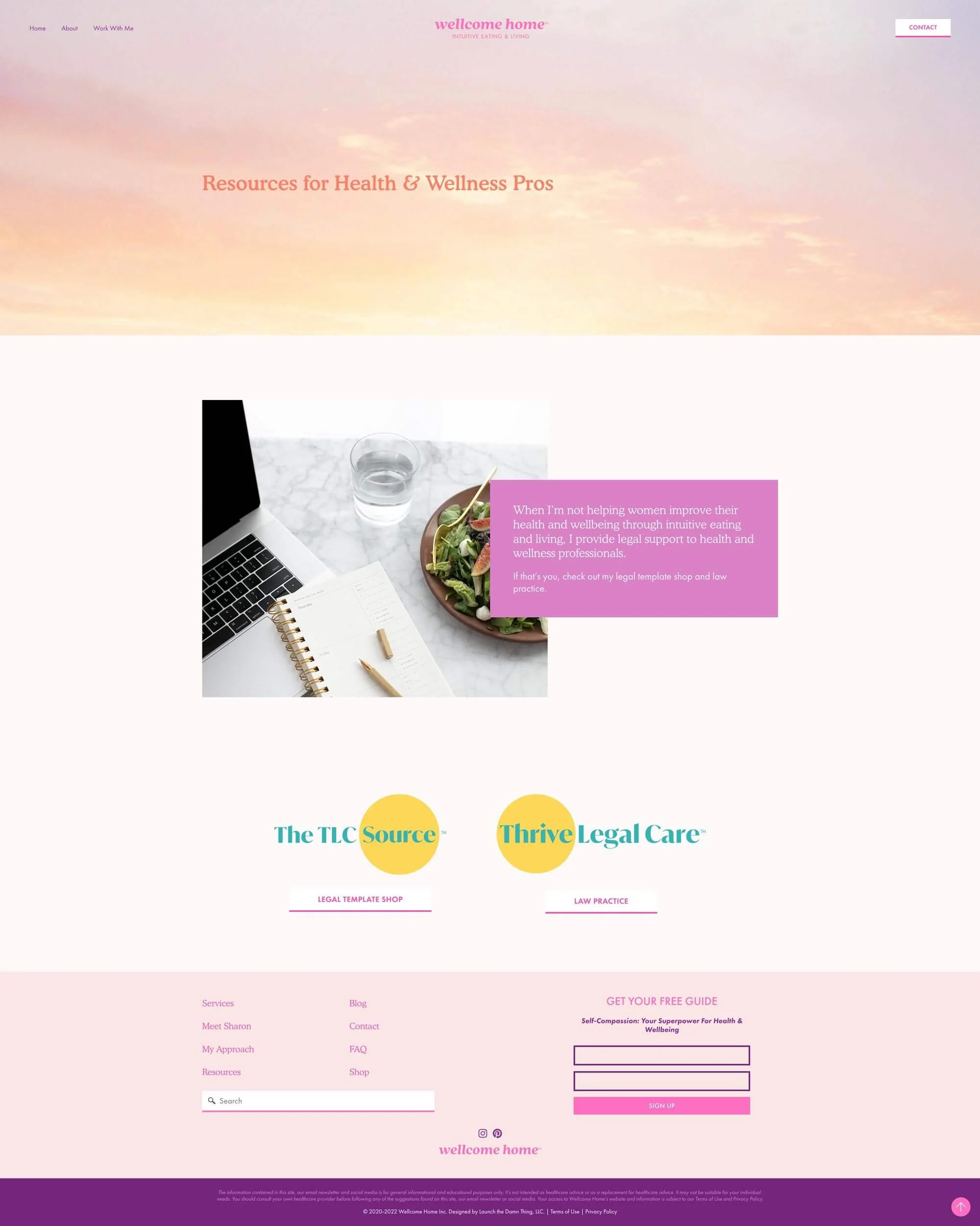
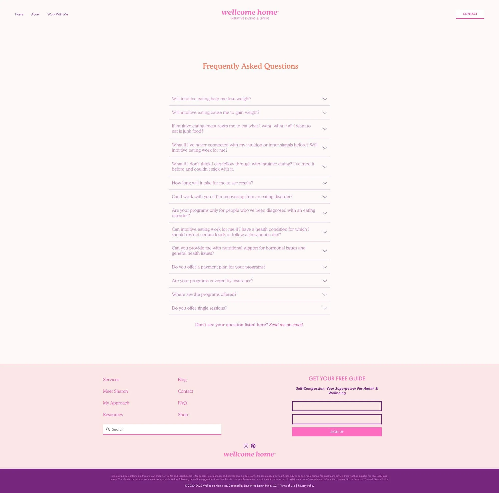
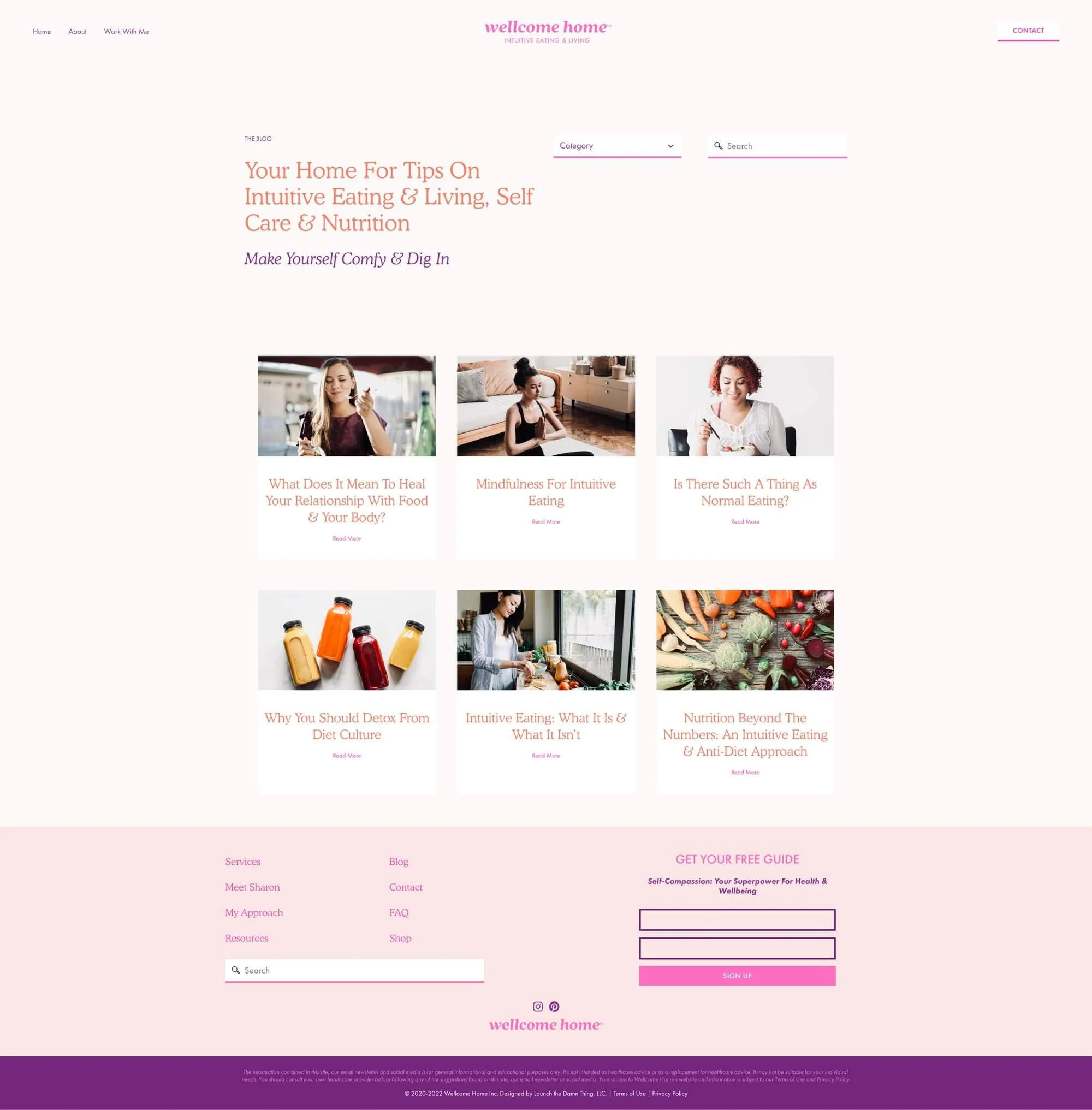
As with Thrive Legal Care and The TLC Source, Sharon came to me with Wellcome Home’s branding done, colors chosen, and fonts selected. With that work done, we were able to quickly create a fun, vibrant, and uplifting design for her website which has been one of my favorite projects to date!
I feel like I’m starting to say this after every project, but I can’t help myself! 😂
About the project
I don’t often get to work on projects that have so many vibrant feminine colors, and I really enjoyed finding fun ways to add more pops of color throughout, while also trying to keep things feeling fresh, light, and airy.
We wanted to make sure it would feel very approachable, easy, and totally free of any references to the types of sunken, heavy, or ashamed feelings one of her clients might feel when coming to her for help in the first place.
Out with the super serious ‘doctoral’ vibe, and in with the kindness that comes naturally packaged in a wonderful human being like Sharon. 💛
Honestly, this design was so incredibly easy; it just flowed! Aside from some minor changes, it’s basically the same as the initial draft, and Sharon and I had a blast with it!
Sharon says,
“I approached Katelyn with a big challenge and she nailed it. I was looking to build three websites for three different businesses in two very distinct industries — law and nutrition/wellness. Since I'm the founder and face of each business/brand, it was essential that my personality, style, and essence shine through on each site. At the same time, I wanted my legal clients to trust me as a lawyer and I wanted my wellness clients to trust me as a nutritionist.
At first, I wasn't sure how this could be pulled off, but thanks to Katelyn's ability to really get to know my preferences and quirks on a deep level, she was able to give me exactly what I was hoping for. Each site feels so aligned with ME — whether I'm wearing my lawyer hat or my nutritionist hat.
Katelyn is so much more than a website designer. She's taught me so many efficiencies and systems for maintaining my websites and all the back-end integrations of running an online business. I never would've been able to figure out these things on my own. She's also been an amazing source of support and advice for the challenges of entrepreneur life in general. I couldn't run my business without her!
She made the whole process flow really well. I couldn't be happier with the final result!”
You can work with Sharon at:
Website Features
In this site, there are a ton of customized features worth noting!
installed custom fonts
automatic Related Posts show at the bottom of each blog post
added a sidebar to the blog posts layout
created a template for her to use in new posts
customized on-brand built-in forms, in case she ever needs to use them
customized the search block & the search icon
integrated her CRM for her client application process
integrated FloDesk for her freebies
some split page layouts
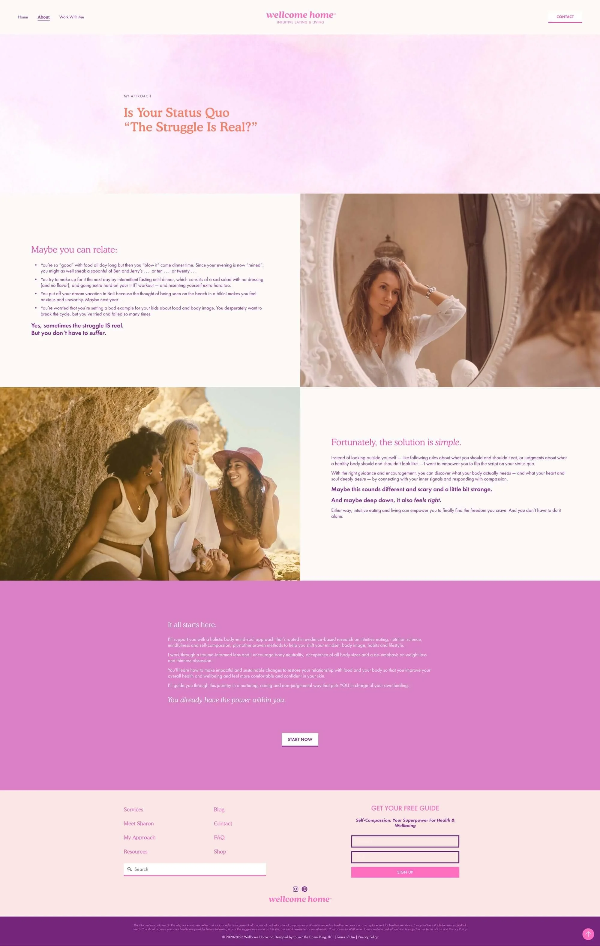
nostalgic graphics for her About page photos,
custom link hover animations
custom header navigation styles for active pages
a page listing all of Sharon’s favorite products (available soon!)
page layout for sharing client testimonials (available soon!)
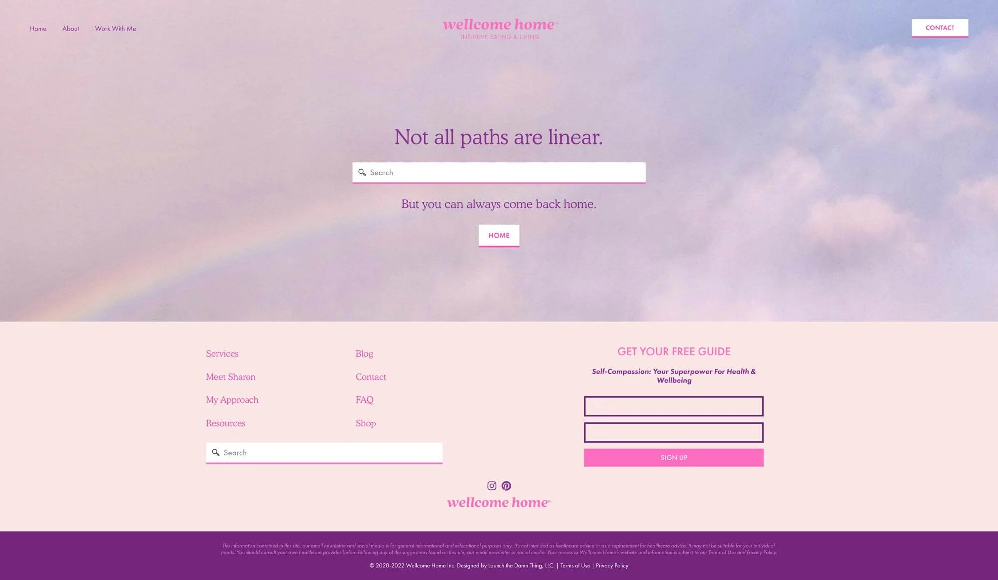
page layouts for additional pages you might not see, like:
Error 404 (broken link page)
the Thank You page forms redirect to, after submission
a layout for her Privacy Policy, and Terms & Conditions
a Linktree-style social media landing page
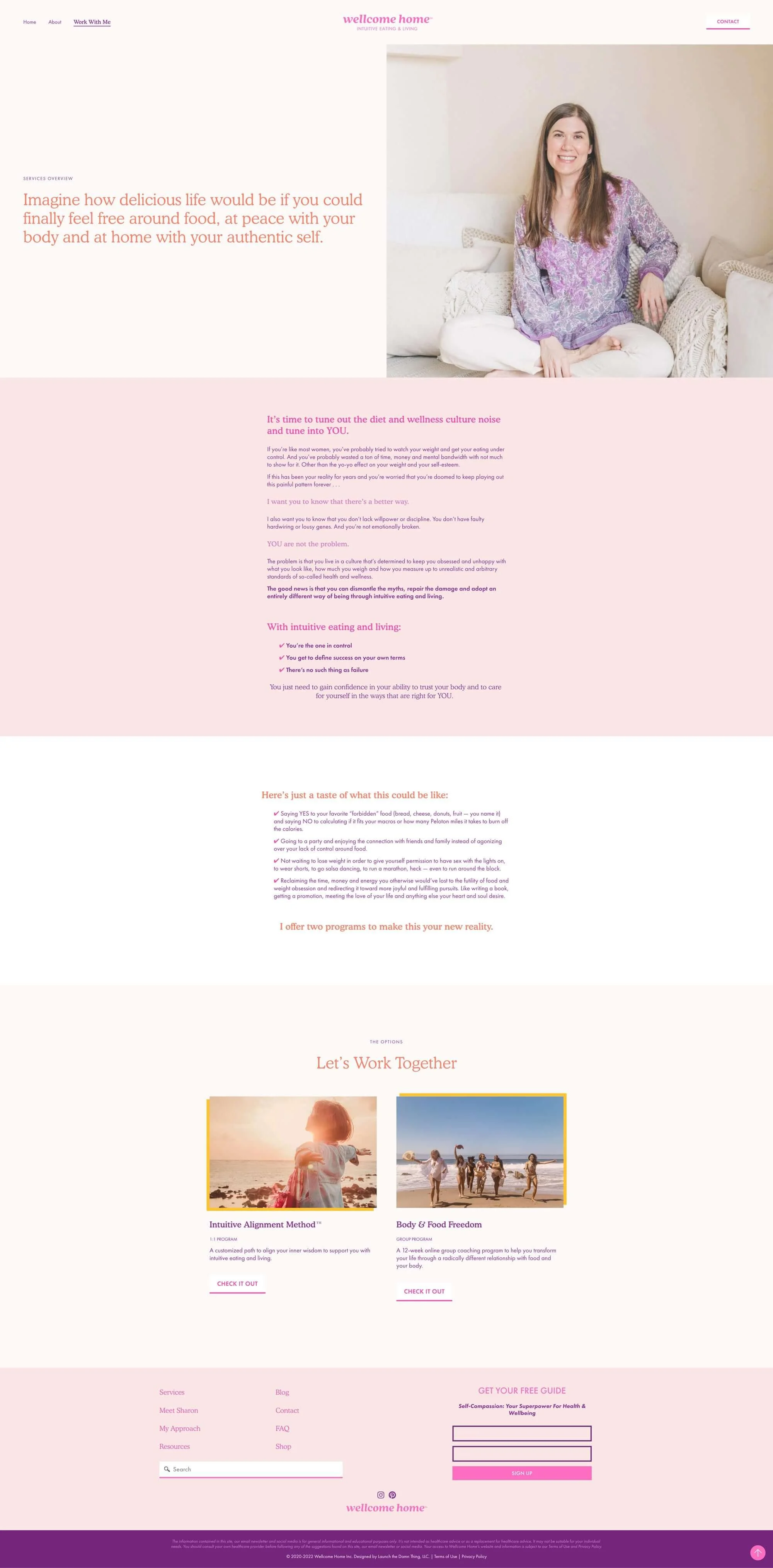
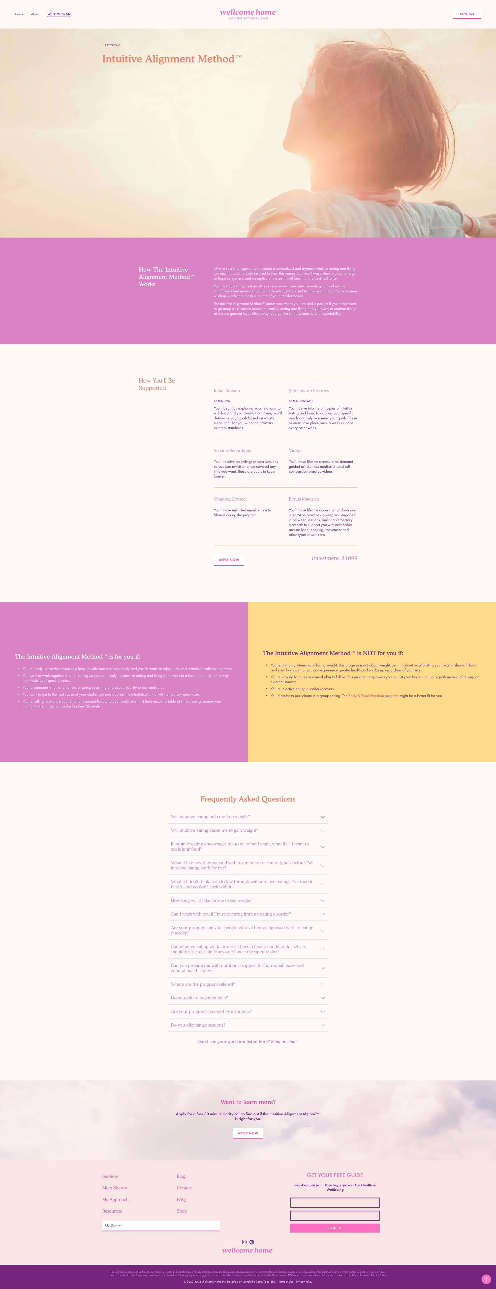
But now it’s time to stop talking about it and do a show & tell!
Gallery
CLICK TO OPEN EACH IMAGE & SEE THE WHOLE PAGE!


