A brand strategy is a MUST for strategic websites that sell
What's inside this post: Hide
There are a lot of things that contribute to the functionality & efficiency of your website, beyond just the platform and how “pretty” the site itself looks, –all of which I’ll be covering in this series.
But since I’m already talking about the pretty factor, let’s dive into the first and arguably the most important bit that needs to be established before ANYthing else: your brand strategy.
I know, as a website designer you weren’t expecting me to start here, were ya?!
But it’s true! Your foundation has to be “right” so the house doesn’t eventually crumble, and this is where I start with my clients when building a new website –even if they already have a brand or a website in place.
I do that for a few reasons, but the main reasons are that it helps me to:
get to know their business better so that I can design a strategy that fits their specific situation
form a strategy when I know what their goals are & who their audience is supposed to be
learn what they’re currently doing (or thinking about doing) within their business processes,
and within that, what’s not working (or what their hesitations are if they haven’t implemented yet)
figure out how these processes might need to scale with their business growth,
So you can see just from those points, this is a really important step that can’t be skipped IF your goal is to not only have a badass website, but also one that speaks most directly to the type of customer you want to attract & help them transition from a visitor to a buyer while keeping administrative work (on your end) to a minimum, even as the business grows. Whew! That was quite the sentence, wasn’t it!
📌 Pin it!
6 basic strategies to get more sales & eyes on your website (Part 1)
Things to consider when branding or rebranding your business
A Strategic Brand Will Help Represent the Business as A Whole
One question I typically ask all of my website clients –especially if they already have branding in place– is simply, Do you like your current branding and how is it serving you right now?
It’s not because I’m trying to upsell them; it’s actually because a lot of times a “logo” is something that’s sort of arbitrarily designed at the start of the company, or maybe it’s been through several iterations and I can tell from the way it has evolved that “the” perfect solution hasn’t been discovered yet & the client is obviously struggling to find it.
Another reason might be that since the launch of the business, maybe the business has changed, maybe the audience has changed, or maybe you feel like that logo isn’t portraying the right unknown-something that you just can’t put your finger on?!
Not always, but I’m often surprised by the answers I get to this question, and sometimes it can even change the trajectory of the project!
For example, when working with past client Stephanie on building a website that could host the online version of her printed magazine, I asked her that question during our Kickoff call because she had told me in her homework materials that she DIDN’T like it, which surprised me!
From there we talked about how she’d gotten to the current iteration, how she felt about it, and quickly realized she didn’t love it and it wasn’t working for her BECAUSE there was no strategy behind it. It was just a design and it didn’t mean anything to her.
So we switched gears a bit and we rebranded her online presence to present the brand to her audience in a way that portrayed the look, feel and feeling that she wanted while also accomplishing some other goals.
Here’s what Stephanie said about the end result:
”If you have a product or service that you believe in but, it's falling short of its potential, I would highly recommend Katelyn to help you take your idea to the next level. She takes the time, has the professional rigor and the technical acumen to elevate your efforts, improve your narrative and Launch the Damn Thing!
This updated look has already proven to reenergize our followers. As a designer, it is nearly impossible to find an agency that commits the time and resources to really understand YOUR business challenges and opportunities and holds you accountable to collectively create a winning solution. It's a lot of homework (no exaggeration), but you are better for it and the results are extraordinary. Katelyn, you have exceeded the design goals and really expanded our bandwidth and capacity to remain relevant in this new marketplace.”
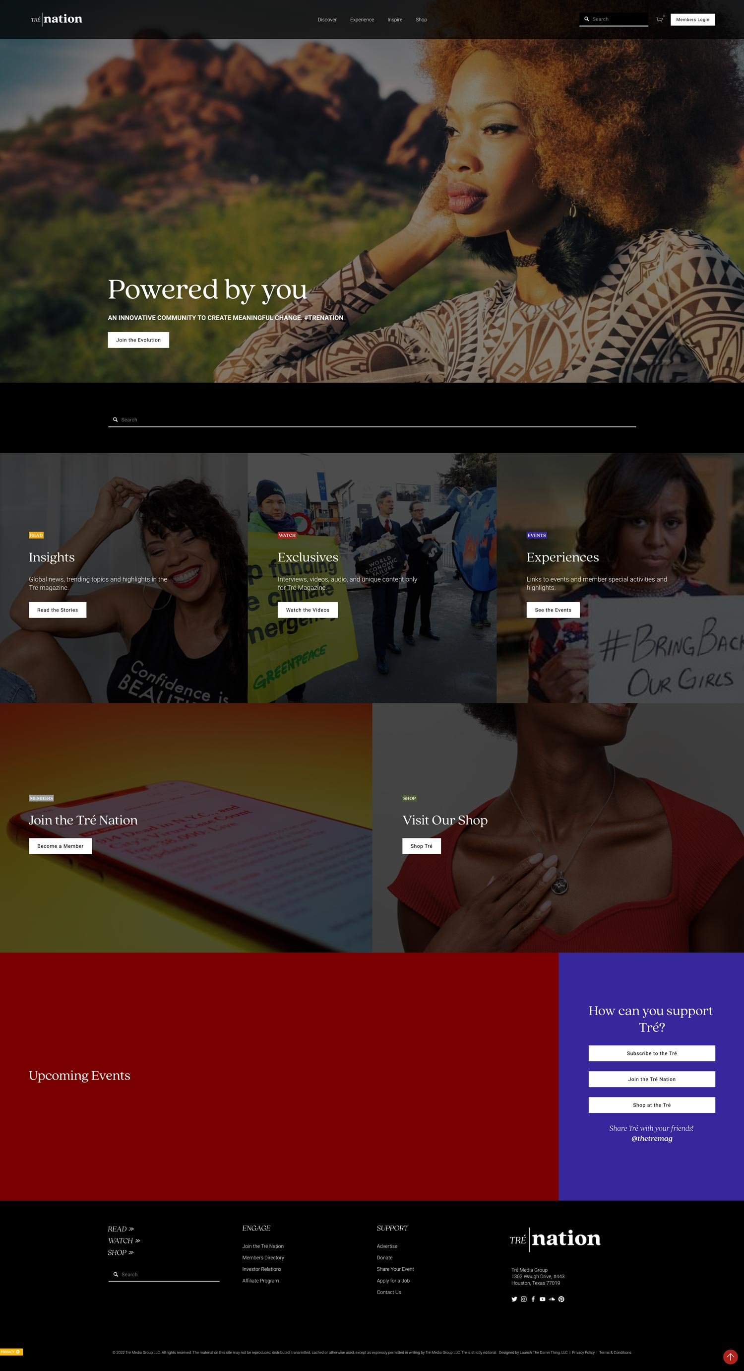
What we did for her project was scrap the old design and start with something new that could help contribute to the goals of her business, which were focused on building & fostering engagement in her local community online and in person.
Here’s the before & after, so you can see the difference as an example:
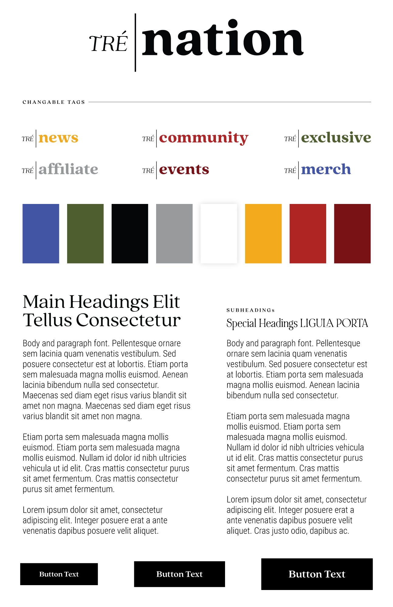
The brand Stephanie had in place before didn’t mean anything in particular to her, it just looked cool. The colors were chosen for a reason, but everything else was somewhat arbitrary. So when I redesigned it, every piece had a purpose and specific use. It was simplified a lot in order to allow for the kind of versatility I knew she’d want to have as her company continues to grow.
So let’s break that down a bit further:
the name change implies community
the font style “feels” more narrative and editorial; it’s also quite flexible with many different weights & styles to choose from depending on the use-case
the color palette was reduced down to black/white, which again is very editorial, with pops of color to bring in her community-based colors that her audience would recognize
she also got an idea of how the new name could grow & adapt to various other pieces of her expanding business
and of course, the logo can stand by itself in its own right
Thinking along that last line of thought, I just want to remind you that your logo is NOT necessarily a visual description of what you do. In fact, that’s usually not the case. But what it should be, is a visual representation of the way you make your customer FEEL. We as consumers often make buying decisions based on our feelings & our problems, but more on that point later.
So if you feel like your branding is “off,” ask yourself (and be honest) these questions:
Do you like your current branding?
How well do you think it is serving your business right now?
What do you think it does for your business?
Does it represent a certain feeling or “vibe?”
Does it feel messy to you, or lack cohesion across all of the places it shows up? (email signatures, printed materials, your website &/or social media pages, etc.)
Does that accurately portray how you want your customers to feel when they interact with your business?
Is the logo misleading? Too detailed?
Is it possibly hard to read, or is any part of it confusing to understand?
Where might someone get hung up while they interpret/decipher your logo?
If it has icons or graphics, why are they there and what purpose do they serve?
What emotion do you think it evokes and do you think that’s affected by the colors being used?
How to Evaluate Your Current Strategy
If you’re not sure how to answer something like, ‘how the current brand is serving your business’ –look, I totally get it. That sentence is full of design & business industry lingo, so let’s break down how to evaluate and answer these questions when you don’t have someone like me to give you more context!
These answers often show up in the way your audience interacts and engages with you, especially online. So let’s look at a few things in your business.
Find actual data to answer these questions:
Do your customers go out of their way to send you positive (or negative) feedback? Yes or No?
Do people tell you things like,
“I LOVE your brand; it’s so [insert appropriate description here]!”
or for service providers, something like “I connected with you right away; I knew you’re who I want to work with.”
Do people engage with your content elsewhere online? Yes or No?
What kind of customer do you typically get, on a scale from 1 to 5? (1 being 😬 and 5 being 🤩)
Are they typically the perfect fit? Yes or No?
Are they typically throwin’ off all kinds of “red flags?” Yes or No?
In other words, are they qualifying themselves before they reach out to you or buy from you? Yes or No?
Do you feel like you have no direction on how to generally talk to your audience? Yes or No?
Do you know how to market to your audience? Yes or No?
Do you think your logo portrays the right feeling to your audience? Yes or No?
How do you think someone might react if they saw your logo by itself with no other context?
How well do you think someone might be able to guess what industry you’re in? Or what you do/offer/sell/provide?
Why & how Do People Actually Make Buying Decisions?
Earlier, I mentioned that people often buy based on feelings –especially women 🙋🏼♀️ and if that emotional vibe is OFF, ya ain’t gettin’ as many purchases or inquiries.
Granted, the emotional vibes of your business come from more than JUST the logo, it’s also in the way you talk to your audience throughout your online business’ content, whether that’s your website or your social media posts, or your videos, etc.
But if you don’t know who your audience IS or what you think they WANT, then you also don’t have a clue how to talk to them about what you do/offer/sell/provide.
And if you don’t know what they want, or what problem they need solved, then how on earth can you provide a solution? And if you don’t know what solution they’re looking for then you are going to have a very hard time figuring out how to talk to them about whatever you sell, product or service –doesn’t matter.
So ask yourself:
Why would someone want what I’m selling?
What kind of person is most likely to buy from me?
What problem does it solve for them?
What are the symptoms of that problem?
How does my [product or service] ease those symptoms?
How can my [product or service] make their life better?
A pretty sweet bonus to having this kind of strategy built into the branding is that it helps keep your salesmanship from becoming sleazy. You don’t have to feel like a slimeball to sell your thing, because NOW you know exactly why people might want it, and who to sell it to.
So again, we’re coming back to strategy here because it underlines EVERYTHING in your “foundation” (brand) and helps you figure out how to structure the “house” (content) on top of it.
Mistakes people often make
❶ Your Logo Is Not “Just a Design” so Don’t Let Just Anyone Design It
Going back to the strategy piece here, and I hate to say it, but I’m just gonna say it, –just because you have a friend/family member who knows HOW to do a thing, doesn’t mean they can/will do it WELL.
Let me rephrase that for the people in the back: just because you’re granddaughter (or whomever) has Photoshop, does not mean she can design a successful logo.
A logo has to be more than just a decent design, or ya might as well not even have one because a BAD logo can hurt your business more than help it.
I know you can look at mega-popular brands like Starbucks who don’t even have words in their logo anymore, or Google who (very likely) have a totally made-up word for theirs, or Apple using a fruit as the icon for their tech company –and think, well… if they can do that, then why can’t I?
But what you might not know is that each of those brands went through their own transitional phases and without discussing those phases (because that could be a whole other post entirely) let’s just say that they already had brand recognition when they removed those seemingly important pieces.
While Apple used to say Macintosh along with that apple icon, it doesn’t now, but only have YEARS of having both the text & the icon, for example. Most likely, you don’t have that kind of recognition, so you need to be more strategic.
Everything in your logo MATTERS, from the font choices to the icon or graphics to the colors. How do those things work together and how do they work apart? Again, we’re coming back to those questions from before.
❷ Designing Your Logo for The Wrong Audience
It’s all too easy to design a logo these days. Just find yourself a designer on Fiver, or sign up for Canva and just set up something you call a logo. Right?
Well, you’re not wrong, in that yes those methods are possible and will provide A solution… just not THE solution.
It’s so easy for the “wrong” person to design a logo that doesn’t work for your audience. If they don’t understand your business or your “target market” (sorry, another marketing term there! –read: intended customer or ideal customer) then they aren’t going to be designing it for that audience.
Say for example that you’re looking to book a photographer for an outside, somewhat casual wedding…
Are you going to book from the website with branding & content that looks and feels like the wedding of your dreams? (ie: as you’re lurking their site, you’re thinking “wow that’s basically the same colors I’m using in my wedding! That font is really similar to the one on our invitations! I love the timeless quality in those black and white photos…”)
Or are you going to book from the website with branding & content that looks and feels like they only ever do frilly, super elegant, indoor, Cinderella-style weddings and charges several more figures than is in your budget?
Both are valid solutions for photography, but both are catering their brand to a specific type of audience and hoping to attract like-minded customers looking for that version of the same service.
So you have to be very mindful of the visual decisions you make throughout the branding, the user’s experience, and the design of it all, so that it fits the bill for the audience you’re intending to attract, –and not everyone else.
Myth: focusing your marketing efforts on one audience does not & will not exclude all others on a very permanent basis, but it will help the right audience find you more easily and feel better about inquiring or purchasing from you. If anyone else (outside of that intended audience) inquires or buys, you will have the option to say yes or no.
❸ Nothing About Your Logo Helps You Stand Out
And THAT is the ultimate goal for your branding and how you talk to your customers because there are a bazillion people out there and a ton of them already do/provide something similar, so HOW WILL YOU STAND OUT?
What makes your product/service different? Why should someone buy from you, instead of your competition?
Look, the people who shop at Wal-Mart versus Target are a great example. You go to Wal-Mart if you want access to a lot of things for basically the cheapest price. You go to Target for the same reason but know you’ll have an overall better experience and access to (generally) a higher quality of products. Straight up.
You can’t literally be everything to everyone; it’s just too hard. Especially if you’re a new, smaller business.
So if you can find a way to stand out to a certain “crowd” so that you rise above your competition in an area they don’t do well themselves, then by default (basically) you will stand out.
People will find and work with you for that very reason, and the feeling they get while they interact with you/r business when they’re ready to make that buying decision.
So make it easy for them. Use every piece of your branding (your fonts, your colors, your content, your photos, your marketing materials, your strategy) to help your ideal customer understand you, your business, and your offering.


