What's inside this post: Hide
At the end of 2024, I was DONE managing things the hard way.
I was done with Google Forms for collecting client content, and I was even done with my Notion portal (as much as I still love Notion).
So did a crap-ton of research, looking for a “real” portal tool that would do everything I wanted and almost got Notion to do. Then I remembered Kitchen.co*, and found Tally.so*. I promptly moved my whole client content collection process over to a Tally form, and embedded that in my portal. (I made a video about that switch in 2025.)
Since then, my content guide form has slowly evolved and become more streamlined while adding a few new updates that help simplify complicated sections for our clients.
So today I want to walk you through what my client content guide looks like now, both from my view as the person who built it and from the client's view filling it out.
If you're still emailing clients a fillable Google Doc at this point, or using Google Forms, this is your sign to build something smarter, branded, and more efficient for everyone.
Why I Ditched Google Docs & Notion for Managing Client Projects
using Google Docs as forms
For some quick context if you're new here: I've been doing client work for 20 years as of 2026 (which is wiiiild and doesn’t feel real sometimes), so I've got a lot of one-on-one client experience, both as an employee and as a freelancer, and I’ve put much of I've learned over the years into this content collection form.
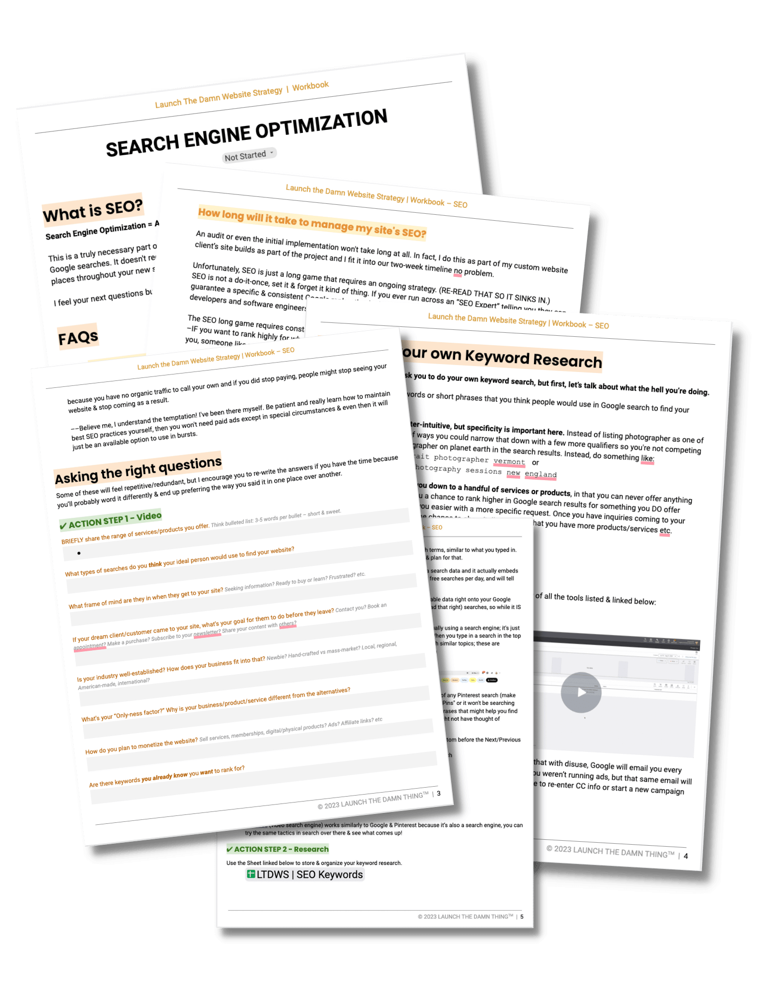
Using Google Docs as forms
Google Docs worked fairly well, butcopying content out of it was a slower-than-necessary process, plus those docs lived in a silo, there was no centralized communication area (that I wanted to use), and files lived in Google Drive while I personally used Dropbox and there were always permission issues with everything. I often had to request access to the completed ‘form’ docs, which got annoying when having to wait to also be allowed to see something I already had the link to.
old Notion Portal tasks section screenshot
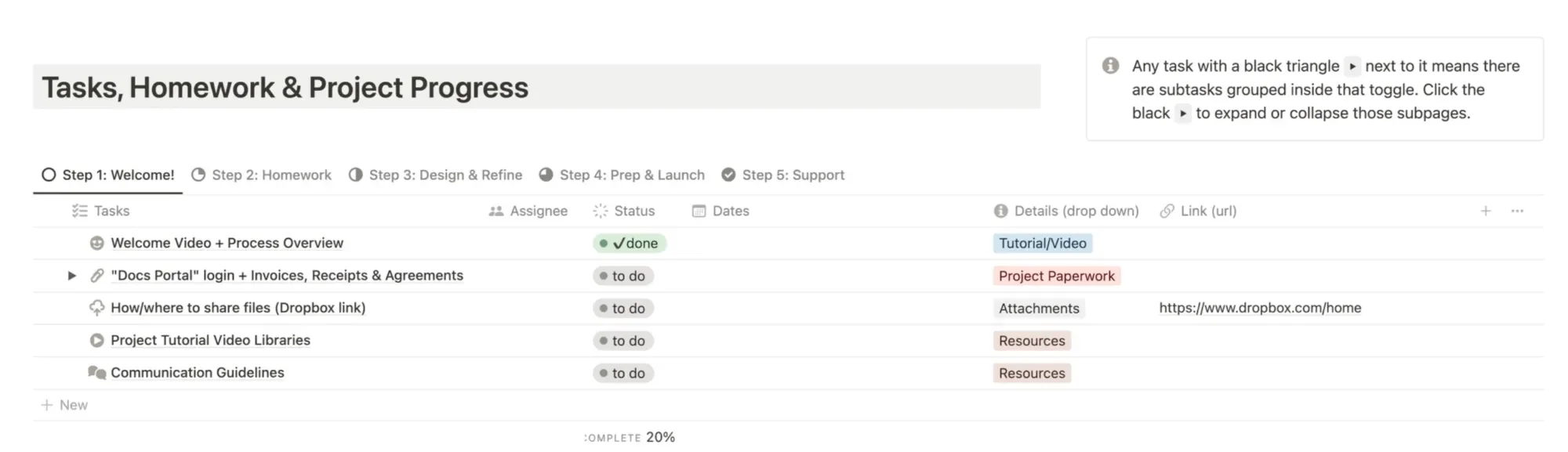
Using Custom Notion pages as forms
Notion worked really well for me, but I always wondered how easy it was to use for my clients; though none of them complained, a couple mentioned they couldn’t remember where things were and I went through several iterations of the Notion portal trying to make it easier & simpler. The problem ultimately was that there was still a lack of easy communication there, sharing individual files there was easy but not whole folders of files, and notifications were sometimes missed by both myself and my clients.
With both of those, there were essentially no limitations on how much content could be added to either ‘form’ in the Google Doc, or Notion ‘form’ pages, so guiding and enforcing certain strategies while they filled out the content guides wasn’t really possible beyond offering simple instructions that may/may not be ignored.
How I use the Tally form template in my Kitchen portal
Page 1, screenshot
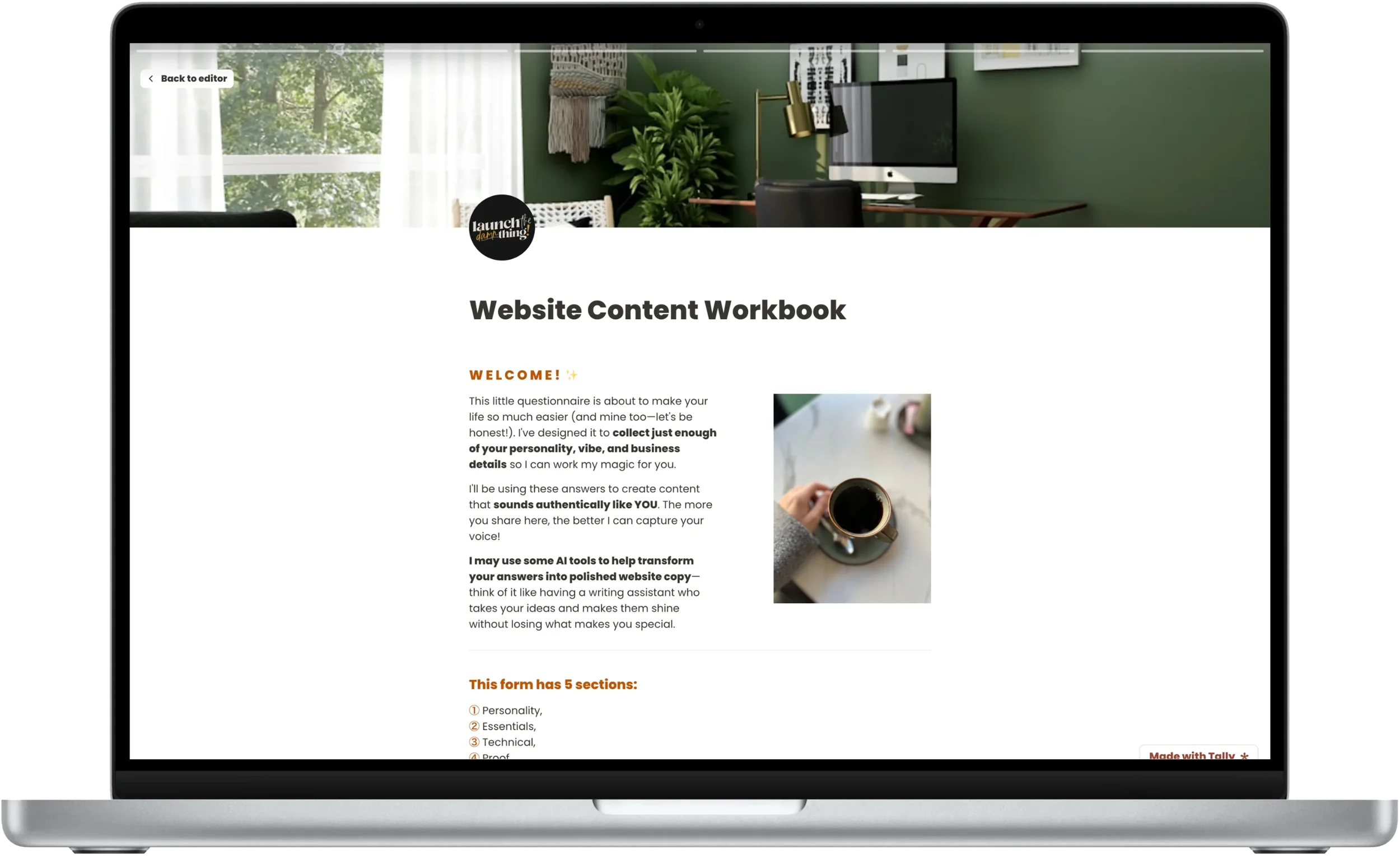
I use Kitchen* for my portal software, and I use Tally’s* free plan for the form itself, but I embed the Tally form directly into the Kitchen portal so it feels seamless for my clients. They don't necessarily realize I'm running two different pieces of software behind the scenes, because from where they're sitting, they can access it all from the portal and it doesn’t matter to them.
The Tally form saves their progress as they fill it out, as long as they access the form from the same device. Breaking up the form into sections helps reduce the overwhelm and keep their eyes from glazing over while they fill it out, so each section of the form has its own page to break up the process of filling it out & help them focus on each section, one at a time.
From my side, as the admin & editor of the form, it feels a lot like editing in Notion which makes it feel easy, simple, and familiar. It’s also very customizable, even on the free plan, and practically embeddable anywhere you want to place it. I can even send the form with my client’s name & email pre-populated so it feels like it’s setup just for them.
Using a templated and repeatable content collection guide form template that’s specific to your industry can become a living breathing document that can grow, evolve, and fluctuate with your expertise over time, without needing to edit duplications of it for each client. Why? Because every client uses the SAME exact form; I don’t customize the form for each client because I almost always work with service-based businesses and those kinds of changes aren’t necessary.
Plus, every client project teaches me something, whether it’s an added clarification, an extra field someone requested, or adding a whole new section I hadn't thought to include before.
Inside the Form Template
Page 2, screenshot
Client Gift Questions
These questions weren't in the version I shared before, but I like sending a gift to clients before starting their custom projects.
I added a set of questions specifically designed to help me pick something they'd actually enjoy. I leaned toward asking questions that could sound personality-based like, like whether they prefer coffee or tea, chocolate or vanilla, or would they rather read or watch their favorite story, etc.
If you want to build something similar for your own clients, think of their human, everyday routines, and/or ask questions that fit the type of people you actually want to work with. There's no one-size-fits-all gift-picking formula, so just tailor the questions to your specific niche and/or industry.
stylistic preferences
Visual Vibe & Style Preferences
The next section is about stylistic preferences so I can try to pin down the visual style and strategies for the project.
In the form, I provide descriptions alongside everyday visuals so that, depending on how the client processes information (visual or not), the client can choose options they understand and ultimately help me figure out the vibe they want their website to have.
I also ask a few multiple choice questions, asking things like naming the three words that MUST describe and must NEVER describe every interaction with their business online. I also include a few follow-up questions to help me narrow down the vibe and style even further.
In this section, the form auto-populates a recap of everything they’d just told me, for their own reference, and then offers them the option to create a Pinterest board based on that information so they can find example images that fit their preferences or represent the styles they’ve said they prefer. I ask them to use the out-of-the-box questions to look for that inspiration, which helps me spot patterns in what they are gravitating toward. Clients aren’t always able to articulate what they’re looking for, whether they don’t have the terminology, or whatever other reasons, so this Pinterest board process is also particularly helpful for those people.
Next I present some specific style options and ask whether they prefer a more feminine, masculine, or neutral design style. When they’e set the overall stylistic category, then we dive further into style patterns where I ask if the client prefers flashy and blingy styles, vs warm or natural styles, whether they prefer gold or silver, etc. and each of these subcategories are paired with a visual to reference so the words are matched with a stock photo which represents that style. This way, the client can decide based on either the wording or the visuals, or both, and they can select multiple options if they are drawn to more than one.
With all of that, I start to get a sense of what they are drawn to, without needing them to describe it themselves in their own words.
Font style preferences
Colors, Fonts, & Conditional Logic
This part is where Tally begins to earn its keep, even on their free plan, because I start using what’s called conditional logic.
Essentially, this feature allows you to conditionally show follow-up questions based on previous answers, which can either shorten or elongate the form based on how the client fills it out. I love this about Tally, because it means the form can be as simple or complex as the client’s business may be, and they won’t see questions that aren’t relevant to how they’re filling out the form and submitting their content, making the content collection process more efficient for everyone.
Beforehand, requesting fonts and colors just had straightforward questions asking them to tell me the font names, color codes, and/or submit the font files.
In this version of the content guide using Tally, I wanted to get more strategic than that. When I used to just ask for the information outright, I’d sometimes end up needing to adjust the font or colors they’d submitted to fit the client’s strategy. So in the new form, I thought it’d be more helpful to instead get a more general sense of what style they preferred for fonts and tell them how to submit their color palette in a way that’d work on a website.
Since both of these sections use Tally's conditional logic, which only shows follow-up questions based on how someone answers, if a client doesn't have existing colors or fonts, they never see those extra clarifying fields and can move on to the next group of questions.
Essential Content (Bio, Services, & Contact Info)
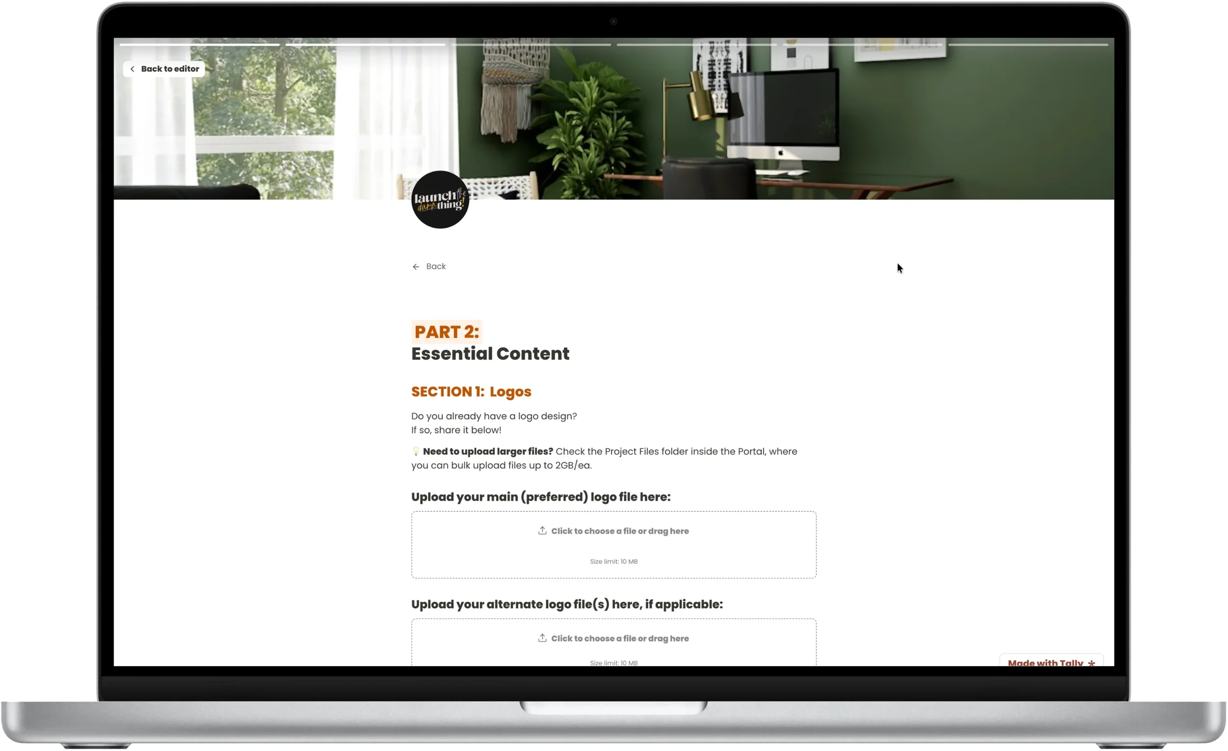

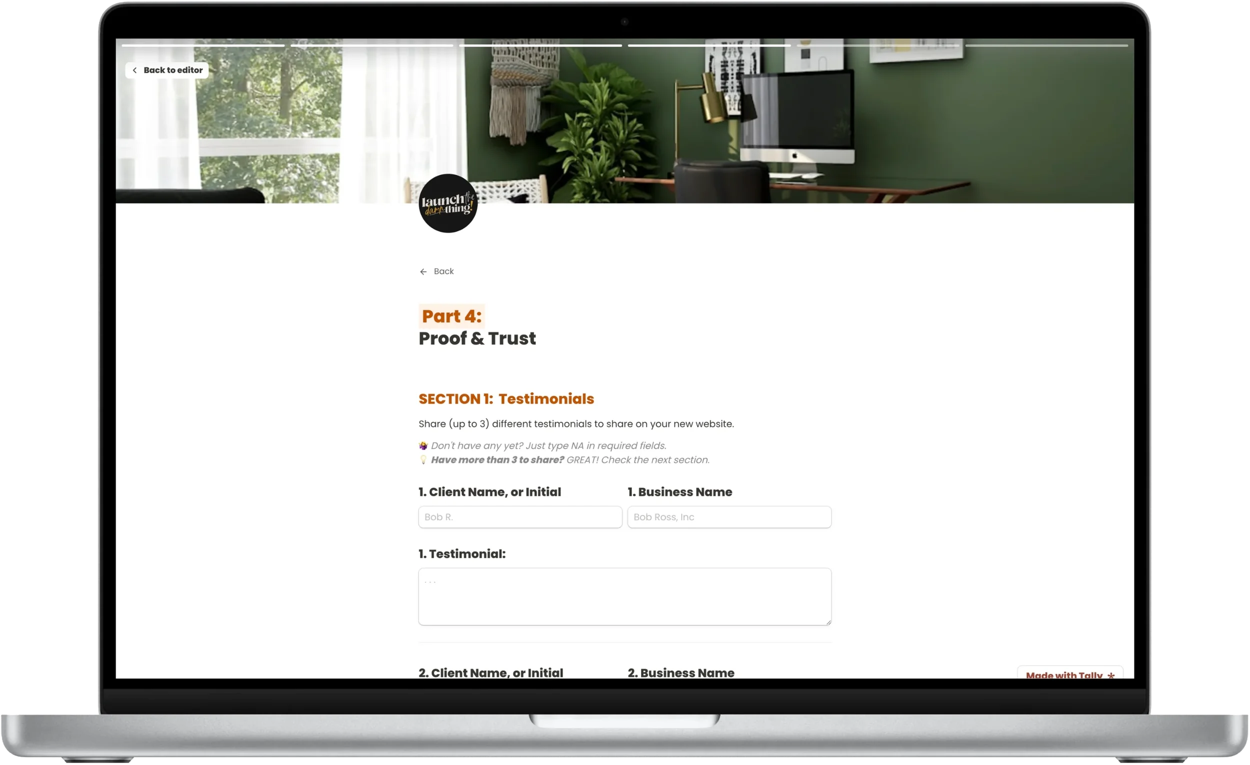
Part two of the form collects their essential content, including their bio, business basics, and how many services they offer along with details about each service.
This section got a big update since the last version I shared! I addedfive more options, and a lot of conditional logic to make sure they only saw the relevant fields for the number of services they said they offered.
That means, if a client says they have just one service, they only see the follow-up detailed fields for that one service. If they have four services, they see four sets of fields, one set per service offered. But what I’m really proud of, is that if they say they have more than six services, the form tells them (gently) that I don't recommend advertising more than six services on a website (IMHO, you shouldn't have more than 3 listed on your website), because more than 3 can easily become confusing for visitors to choose between and could cause decision fatigue that may result in the visitor deciding not to decide (or reach out) at all.
Once their services are decided on and details have been shared, the next questions ask them to share their process, competitive advantage, contact info, and social platform links. This is really helpful for us both, and keeps me from forgetting to ask which social platforms they wanted linked, or whether they had a Facebook, TikTok, Apple Podcasts, Bandcamp profile, or whatever else that they wanted linked on the website.
In the contact form section, clients tell me what their publicly listed email address is, what their office hours are, and what kind of response time is expected for anyone that sends an email.
Then I follow with what type of inquiry form questions they want their own inquirers to use, what their thank-you message copy will say after a form is submitted, share some general FAQs, and even figure out who their competitors are. There's also a proof-and-trust section for collecting testimonials, expertise credentials, and clarifying what their main call-to-action goal actually is (a button to contact, book, subscribe, etc).
Page 6, screenshot
Legal Setup & the Thank-You Page
I’ve significantly simplified the educational area in last major section of the form since the last time I shared this template, and I think it's a much better version now.
This section is all about educating my client on the legal requirements for websites, as I understand them, which includes a Privacy Policy, a Cookie pop-up, and some other recommended (but not required, to my knowledge) policies that are helpful for the business owner. I break these up into what’s required, what’s not but is still recommended, and provide some resources for the client to look into before deciding how to handle this part of their website build.
In this section, I also tell my client to consult an attorney for anything specific to their industry or location because I'm not a legal expert in this area, and if they need further information and advice, they should seek legal counsel to make those decisions with the appropriate help.
After that, my clients can choose between using Termageddon* (which I’m partnered with, so Termageddon provides my clients with more hands-on onboarding & setup support), or policy templates from Creative Law Foundry®*—both of which I’m an affiliate for, and will get commission from if my client decides to use them.
Of course, my client also has the option to source their own legal policies and either link to or upload those documents so I can put those policies on the website for them. They are NOT required to use either of my recommended options (Termageddon or Creative Law Shop®/Creative Law Foundry™️).
If they decide to use Termageddon, the second option to upload or link to their own documents disappears to simplify the remaining options now that they’ve chosen what they want, but they will still have the ability to upload additional legal documents if needed (which is great for industry-specific disclaimers provided by their governing bodies, for example).
No matter what they choose to do, the form requires them to make a decision about how to handle the legal website stuff, and there's also a brief website accessibility notice reminding them that some compromises might be necessary to meet general best practices so that the website is usable by the most amount of people.
After those sections, there’s a spot for the client to sign & date their agreement of their choices in that section.
Last but not least, there's a new checkbox asking if they would like a copy of their form responses because Tally's free plan doesn't automatically send that to them, only to me.
Page 7, screenshot
After they’ve submitted the form, the customized thank-you page is somewhat personalized! It will display their name using a mapped field which pulls their name from the Name field on page one, tells them they’re awesome, shows a fun GIF to congratulate them on completing the form, and it also lets them know I'll review their answers and follow up with questions if needed. If they checked that box before submitting, to get a copy of their submission, it reminds them that I'll send it through the portal. If they didn't check it, that reminder simply doesn't show up at all (again, using conditional logic).
Copy This Client Content Form
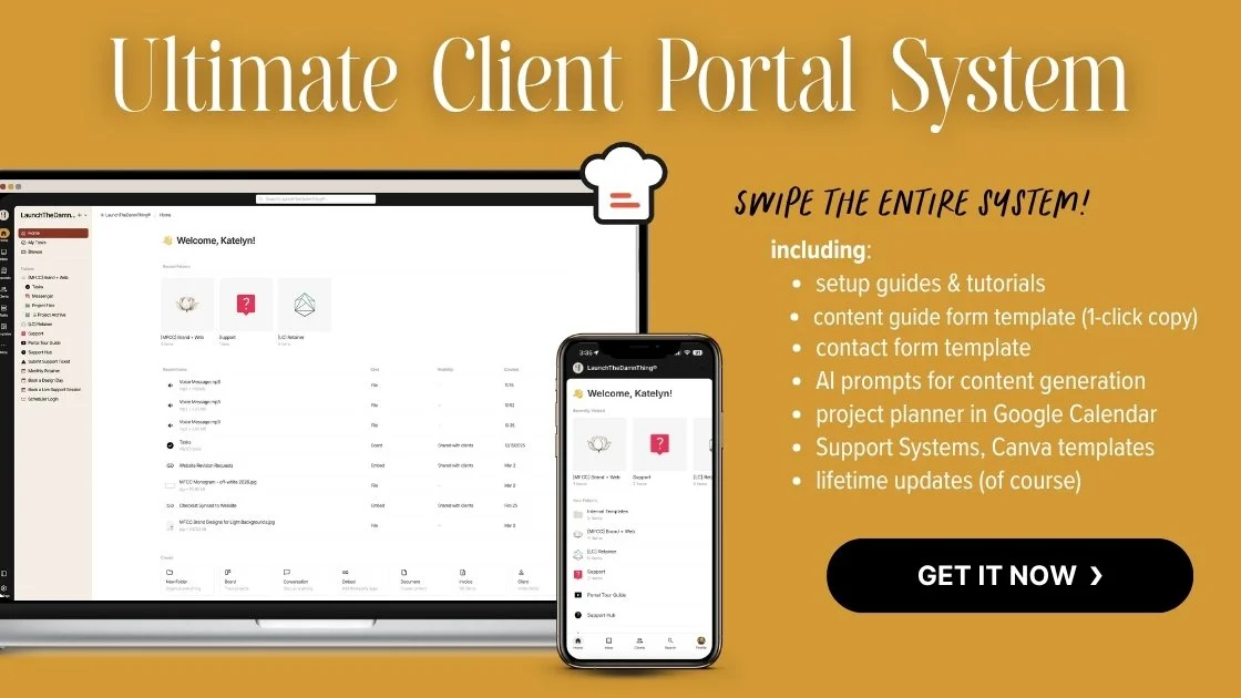
If you're already a student in my Ultimate Client Portal System, you already have access to this template here.
Plus, every time I update my version of the template, the linked template is updated too. So current students don't need a new link every time I tweak something in the form template!
Current students can log into the course anytime to check the most updated version of the template. There's a course login link in the header and footer of my website in the links labeled "for designers".
Once you’re inside the course, head to Module 6, and look about halfway down for the ‘content guide form template’ lesson. That link always points to the current version, so you can check back anytime, make a new copy, then in edit mode, select whatever's changed, then copy & paste the updated content into your existing form template to add the updates to your version of the form without starting over from scratch.
If you're not in the Ultimate Client Portal System yet, that's the only place I share this template. I don't sell it on its own, because it works better if paired with the other systems and context I teach alongside it in the course. On its own it's good, but it's intended to work as part of a larger system to be most efficient for both you and your clients.
Today’s Takeaway
Your systems aren't supposed to be perfect on day one.
They're supposed to continually get better with each project, as you actually put them to work.
The version of this form you got to see today is the result of two years of small, consistent tweaks, miscellaneous client feedback, my own feedback while reading client submissions, 20 years of client service experience, and my own design expertise.
If you want the full form template, along with the rest of the client portal system it’s designed to work with, you can get it by joining a few hundred other students in the Ultimate Client Portal System course.
P. S. - Kitchen's lifetime plan is retiring!
One more quick heads up! Kitchen has announced they're retiring their lifetime plan.
If you missed that announcement, now's the time to test the free plan and see if the lifetime plan would work for your service-based business, and lock in the lifetime deal before it disappears and they switch to a traditional subscription model.
I don't have an exact date for when it will disappear yet. Kitchen’s support team has told me they'll announce it though, and they've also confirmed the change won't affect anyone already on the lifetime plan, only future customers going forward.
So if you never want to pay for Kitchen again, grab that lifetime plan before it’s gone! I'll announce the exact date everywhere I can once I know what it is, including in the Club, but I wanted you to have as much time as possible so you don’t miss your window of opportunity! 🥴