

Why I switched to Flodesk from MailerLite
What's inside this post: Hide
FULL DISCLOSURE: I no longer use Flodesk myself, BUT this post is still full of helpful insights for those who are interested.

I’m a solopreneur which means it’s just me around here. I don’t have a VA or any other team members, so it’s a do-it-all-myself kind of routine around here, which I actually don’t mind, for now.
That being the case, I write the blogs, I schedule the emails, I write & schedule social posts, I update the website, I do all my own graphics, I do all of my client work, etc. etc. etc.
For my newsletter, I started (back in 2016) with ConvertKit. While I could plainly see how robust it is, it was WAY more juice than I needed with just 14 people on my list. –Okay, 10 or 12, because a few of those were immediate family. 😂
So I switched to MailerLite, which I used for free until early 2019 when they changed their pricing structure. I built my list with MailerLite, and I do still like & regularly recommend their platform when it seems like the best fit, …but both ConvertKit & MailerLite lacked some design-y features I’d really wanted.
Then Flodesk* entered the stage, and it is f*cking gorgeous!
Easy to use. Simple, clean UI, and the site is mobile-friendly too! I tried it out with the free trial and liked it. Even though it’s missing a few things both ConvertKit & MailerLite do, Flodesk (was still in Beta at the time so it) is new & is still evolving, which I actually like.
Then I found a coupon for 25% OFF* and I decided to jump in, head first. Why? Let’s dive in!
Why I switched from MailerLite to Flodesk*
Pricing structure
Flodesk's pricing is transparent and subscriber-based — you only pay for what you use, and there are no hidden fees or surprise charges as you grow. (Check their current pricing for the latest details.)
That in itself made the switch worth it, for me!
Design-friendly
Feeling ‘meh’ about your email marketing app? Me too.
MailerLite could look attractive, but not anything close to the ‘pretty factor’ that Flodesk has. As a designer by trade, that was more important to me than to, a freelance accountant or bookkeeper, for example.
I wanted my emails to look interesting to those who take the time to open them & read what I have to say. Convertkit does NOT do this at all, MailerLite & Mailchimp are better at this, but Flodesk far surpasses them in this category.
Here’s just a glimpse of some of them below. Right away you can see that overall (even with the gif moving that fast!) they’re a LOT different than most other email platforms.

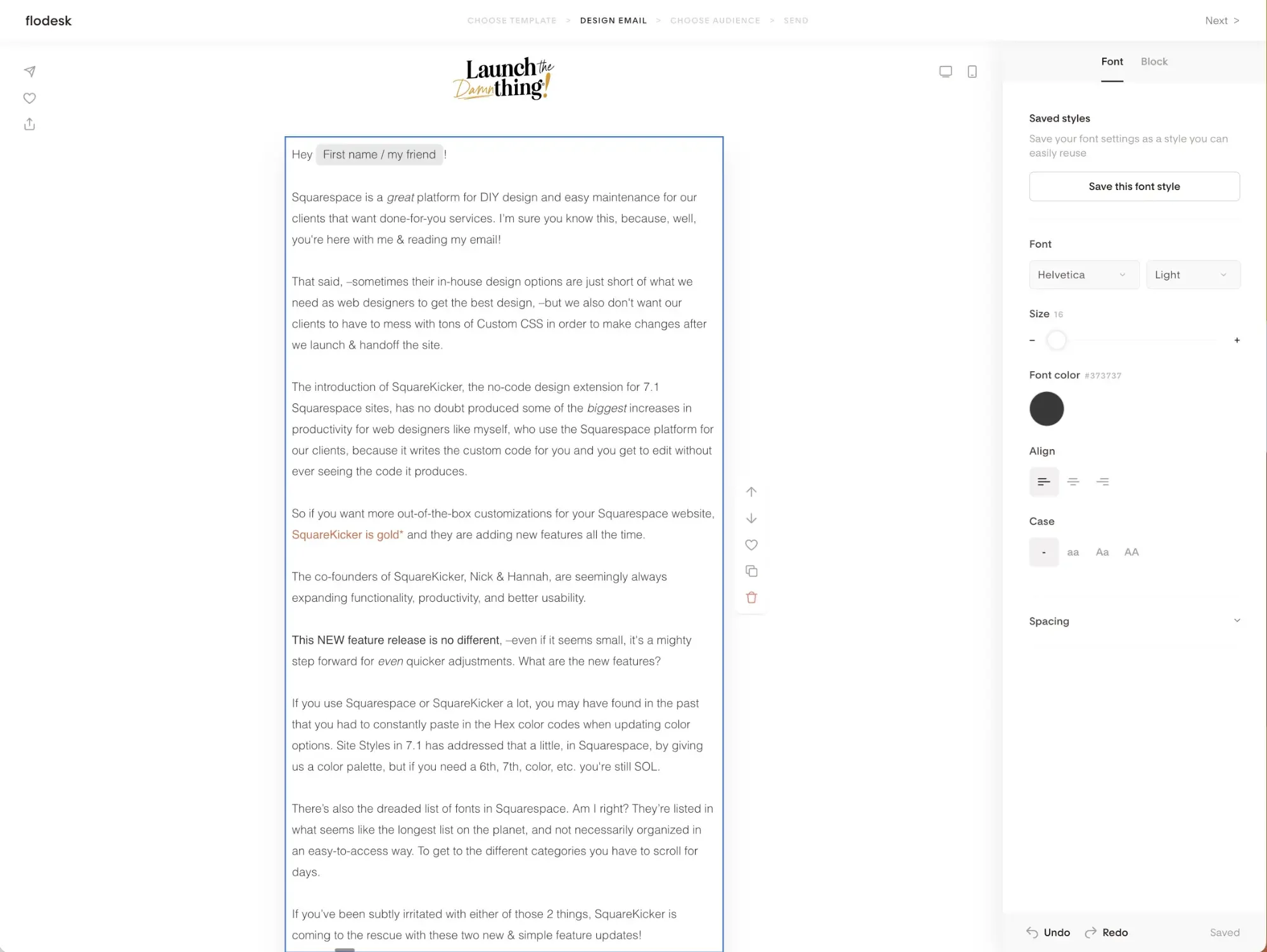
So many different design options for email layouts!
Designing, simplified
With MailerLite, I was adding a blog post image and pasting the website link so that the image is clickable to get to the blog post. I was doing the same thing for the title, and the actual button that says, go read this here, or whatever.
With Flodesk*, you choose the layout you want, and add the link once. It applies to to the image, the title & the button if your layout has one. MUCH simpler, and less room for error, frankly.
Did I mention that you can dictate your brand colors & logo within the settings so it doesn’t have to be just saved into a template (though it can) that you have to always start with?
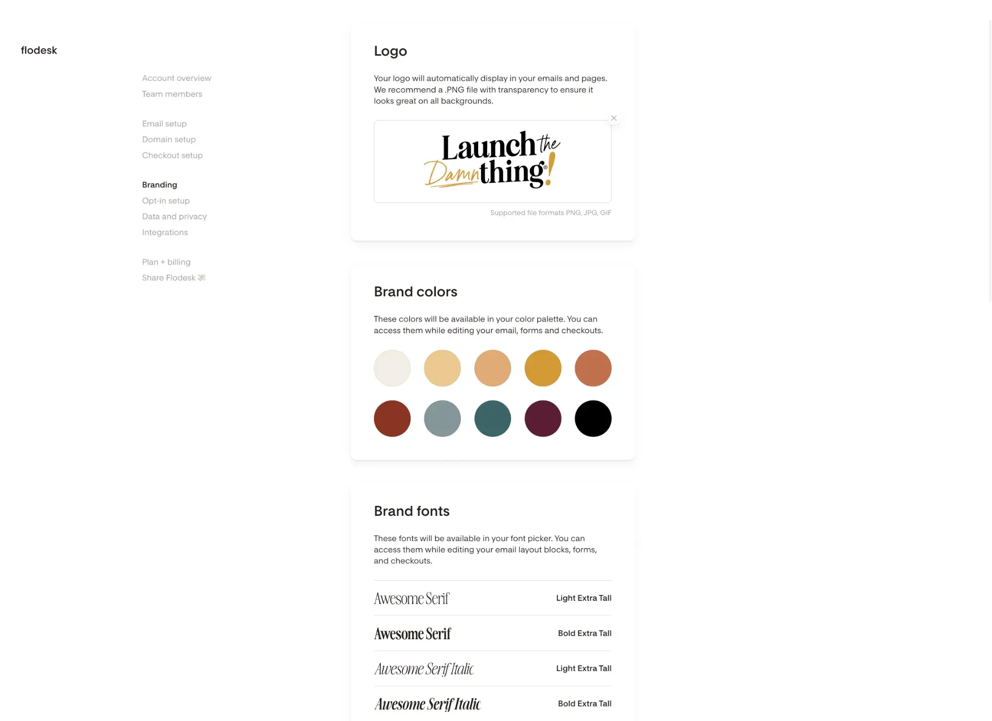
Account Brand & Style Settings, 2026
Account Brand & Style Settings, 2026
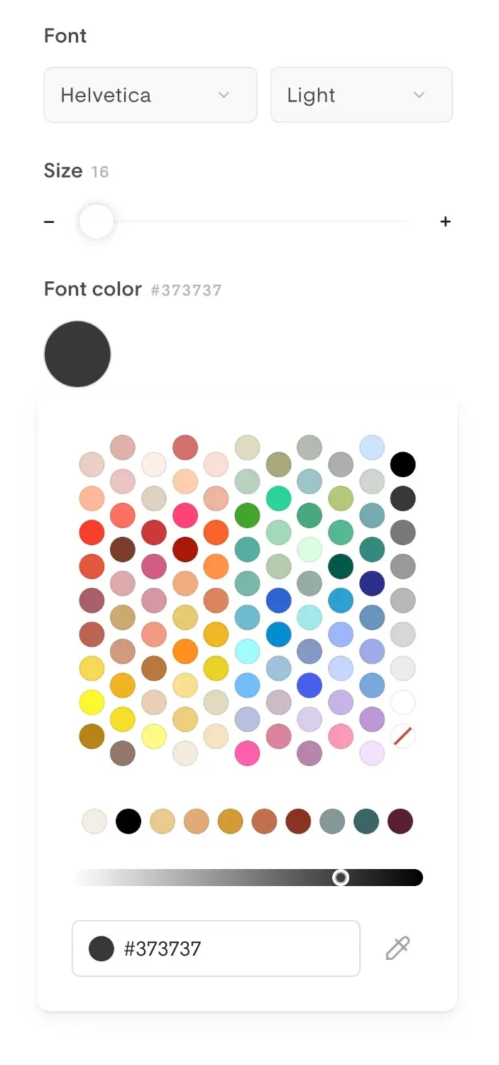
in-email color picker (with brand colors always available), 2026
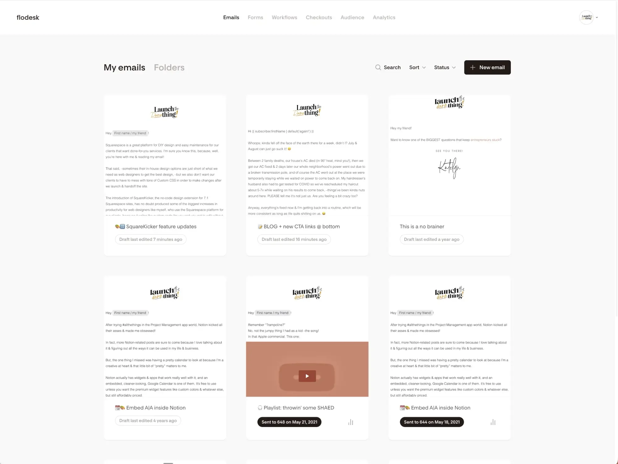
UI feels familiar & easy to use
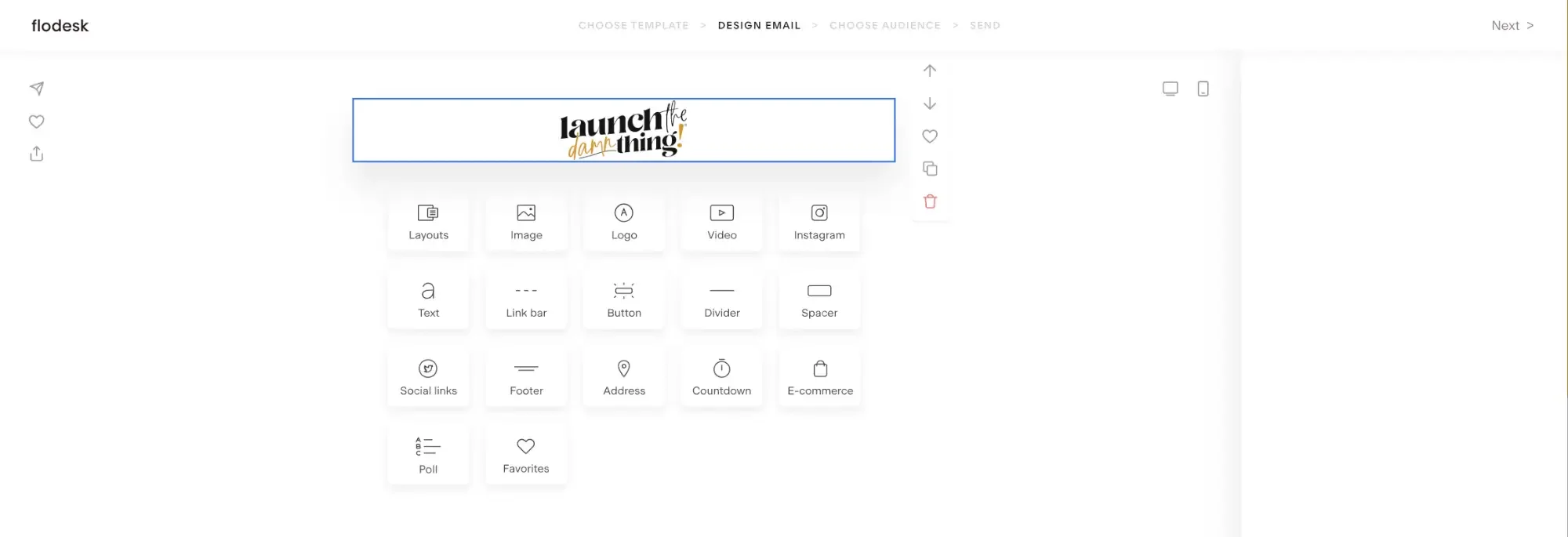
Honestly, the interface reminds me of Squarespace as you can see in the image below. With only a few main navigation elements, every area is clean and clear, including your dashboard upon login (shown below).
And as you’ll be able to see in the Header/Footer section further down, it even has a ‘block’ drag-and-drop design system you’ll be comfortable with, coming from any drag-and-drop website builder.
screenshot of Flodesk's simplistic & user friendly user interface, 2026
screenshot of Flodesk's email editor UI, from 2026

screenshot of font options in Flodesk's email editor, 2021
Fonts galore
Before I rebranded, one of my brand’s fonts was Brandon Grotesque, which I still love (those capital letters, man…). MailerLite doesn’t offer that font as an option, but Flodesk* does!
While they don’t offer tons of font choices, they have many, many more than MailerLite. So it’s a lot easier to maintain your brand identity by keeping your font choices a bit more consistent.
I should note here, that the regular ‘text block’ has fewer font options than the layout options, and the call-out, heading style block which has way more. Still, I love the options there.
Header & footer
I like the options it gives you for adding navigational links in the header or footer. You can choose what they are and what they link to, with the ability to have up to 6 different links. For me, I use it like the navigation on my site, so you can an easily get to those pages right from the email.
It also gives you templated options for the legally required bit at the bottom so readers know how they got this email in their inbox. There are 9 options though, so you can pick the one that matches your voice best.
While the footer is more regimented in what’s required to be there, the header is easy & simple. Pick from any of the ‘blocks’ they allow & that’s all there is to it.
Screenshot of the header options in Flodesk’s email editor, 2026
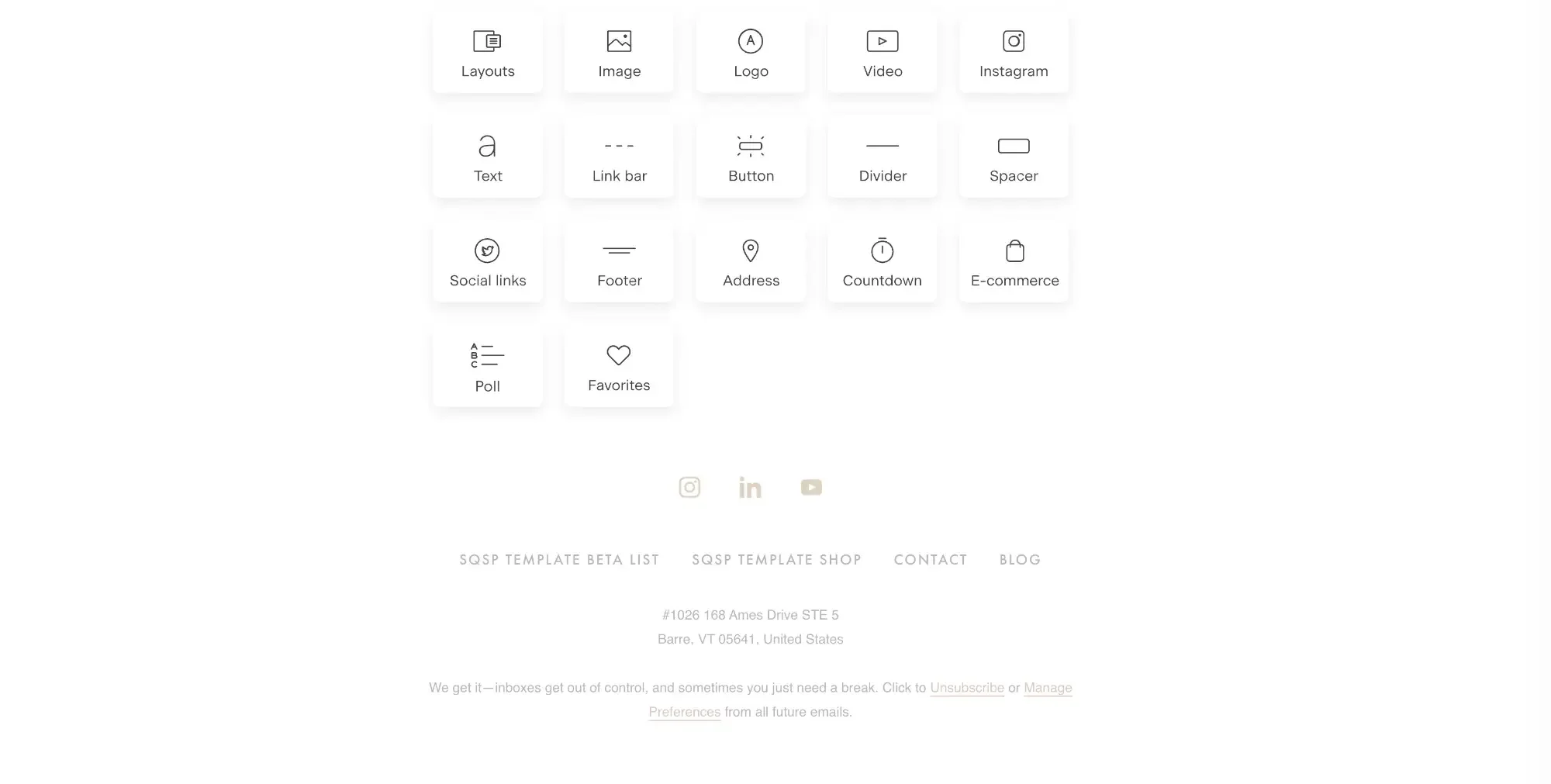
Screenshot of the footer options in Flodesk’s email editor, 2026
Embedded Instagram feed
You read that correctly! If Instagram is important to you, then you’ll want to you that you can literally embed your IG feed into your email. In your footer, as the header or even in the body of your email. It grabs the latest set of posts for you, automatically.
Great for designers, photographers, and other people where pretty visuals are part of your brand.
Organizing your list
While it’s not super robust yet, it does allow one level of segmenting (organization). It also allows you to choose who TO send your emails to, while also being able to exclude segments.
So, for example, I can send my emails to All Subscribers, excluding those who haven’t given me ‘marketing permissions’ per the GDPR laws, with a simple click at the end of setting up a new campaign.
On this note, I am not a privacy law expert (or a law expert of any kind) but I can say that Flodesk has made strides toward compliance since 2019. I have no idea if they officially & completely meet compliance to the current (ever-changing) standards, though.
Forms & popups
Like most other email marketing apps, Flodesk* has this capability also. From embedded in-line forms to popups and full page forms (think Cover Pages in Squarespace v7.0), you can easily set these up!
Flodesk now also has Checkout, which includes full sales pages, funnels, and payment processing —this has come a long way since 2019! I never used Checkout with Flodesk, since that wasn’t available when I was using their platform, but it looks like a great feature for standalone sales pages. Of course, you can also probably build your sales page in Squarespace and link the buy buttons to a simple Flodesk Checkout page if you want more customizability for the design of the page. Options are never a bad thing!
Workflows / automations
Flodesk now has a much larger library of workflow templates than they did in 2019 —welcome series, nurture sequences, freebie delivery, abandoned cart, post-purchase, re-engagement, and more. (The workflow builder itself has also had a major overhaul in late 2025, after this original post was written.)
Those 4 types are: Nurture, Welcome, Lead Magnet, and Sales Sequence. Each one has it kind of pre-set up for you, then you go in & design everything, choose the functions of each, …and it’s just so easy to set up!
Of course you can start from scratch too, which is always an option.
Get 25% OFF your first year!
For all those reasons (& more), I switched to Flodesk* in 2019 and used it for a couple years, moving back to ConvertKit in mid-2021. For what I needed at that time, it was a perfect fit! Of course, everything has pros & cons, but I loved using it during that season of my business!
If any of this sounds good, you can test it out for yourself totally FREE for 30 days! See if you like it, then use my link to get 25% off your first year, or use code DAAAMN for the same discount.*
Or if you’re feeling like maybe Flodesk isn’t the right fit, then maybe you’re… 👇🏻