8 NEW features in Squarespace: a roundup of changes in fall 2021
What's inside this post: Hide
📌 Pin it!
A LOT has been changing on the backend of Squarespace v7.1 lately, and not all of the changes were widely announced so you may have missed them.
If you’re feeling stuck on v7.0 and don’t have access to new features like this, then please know this is likely not going to get better. Version 7.1 is the new version and Squarespace is devoting their time & effort to innovating for it specifically.
If you want features like these on your site, then it’s finally time to upgrade & make the switch. Don’t worry, it won’t cost you anything but time to switch over.
But shit. Who has plenty of that these days? 😂
I’m always happy to do a site migration for you, even if your branding & content stay the same. It can be a beast of a task depending on how large your site actually is.
The difference between your DIY method & mine is that I have paid tools that help me do the migration, then it’s just a matter of restyling everything to look however it needs to, based on what you want.
If you want to try your hand at it, check out these posts to learn & get the Squarespace migration tool, and to learn how to migrate from 7.0 to 7.1 (whether or not you also rebrand). It’ll save ya money, but not your time!
Okay, now let’s cover what’s changed recently over in the land of 7.1 so you’ll be good and green with envy at the end of this post! 😆
NOTE: since I rarely use v7.0 anymore, for clients or myself, I don’t know yet how many of these features are not available in v7.0, but at least half of these are specific to 7.1 only.
What’s changed in Squarespace v7.1?
First things first:
❶ A brand new block: Accordion
For v7.0 + v7.1!
For YEARS any time you wanted to have FAQs or to generally condense content on your site, you’d have to buy a third-party plugin.
I always use either Squarespace Themes’ AccoTabs plugin (because it works great, support is awesome, and I never have a problem with it), or the simpler accordion version from SquareStylist (which doesn’t require any code snippets for the client, making it super easy to set up, edit & maintain for them).
Those are both great, –and still have their place, as the new Accordion Block in Squarespace still doesn’t all you to have robust text formatting inside or additional blocks like the above plugins do.
That said, if all you need is a simple way for clients to have Q&As on their site, this block will save your ass. No code needed, and it still has a LOT of built-in style edits.
Not to mention, GhostPlugins offers several totally free styling options with CSS to further customize the way these blocks look, and I’m sure more are coming:
As for the built-in, no-code version from Squarespace? Here’s one way of many you can style it with the built-in settings:
-
Description text goes here
-
Description text goes here
-
Description text goes here
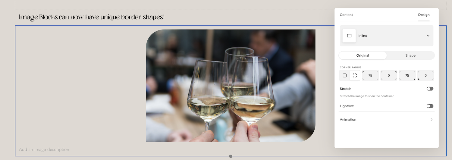
❷ Image Blocks can have unique border shapes!
Image border shape, example
For v7.0 + v7.1!
Not only can images have easily editable rounded corners (released earlier this fall), but now they can now also be cropped to one of many unique shape options!
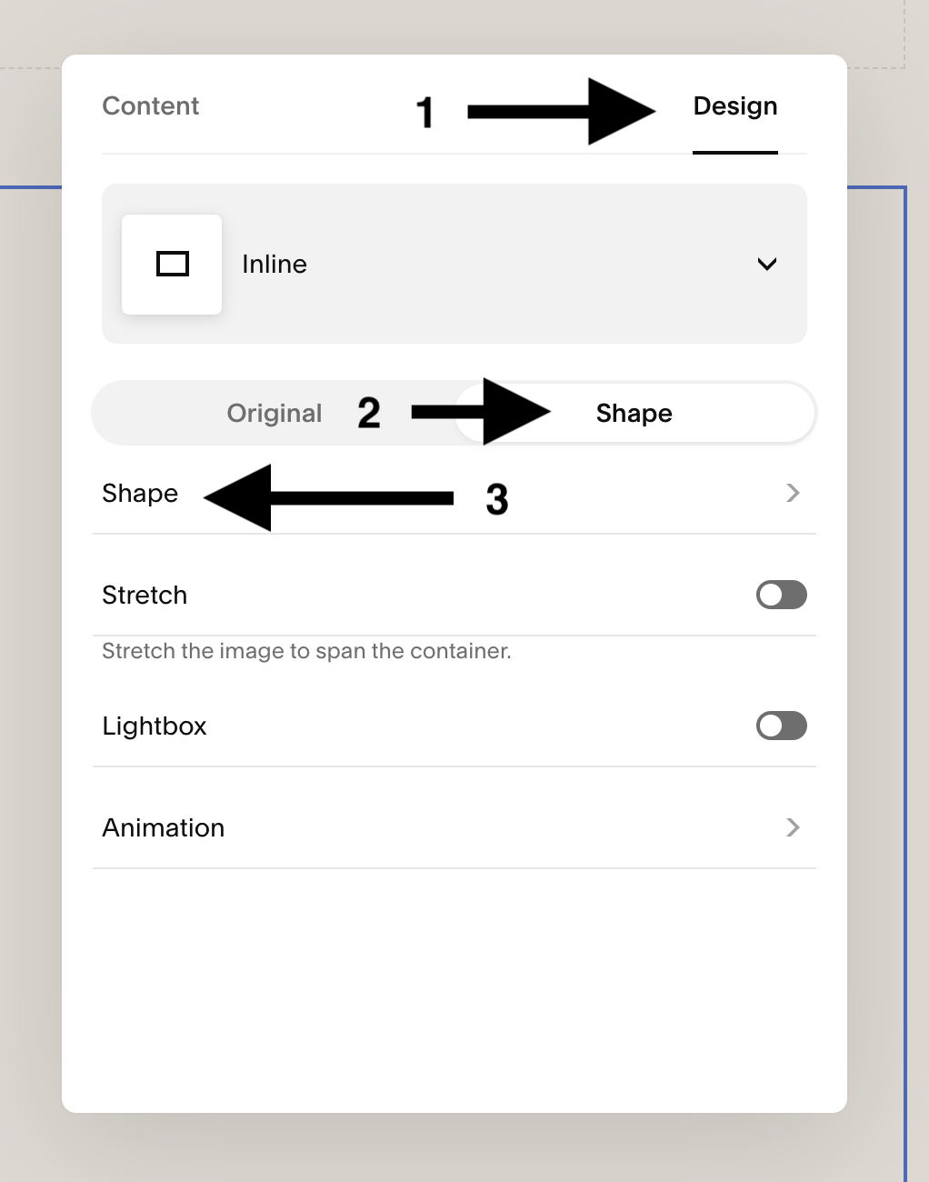
Just upload your image to any Image Block, then click on the Design tab in that block’s settings. From there you have lots of fun options!
Of course all the original Image Block Layouts are there too (Poster, Card, Overlap, Stack, Collage).
You can adjust the corner radius, which basically just means the higher the number, the more rounded your corners will be & you can also choose which corners to round.
Rounding corners on images
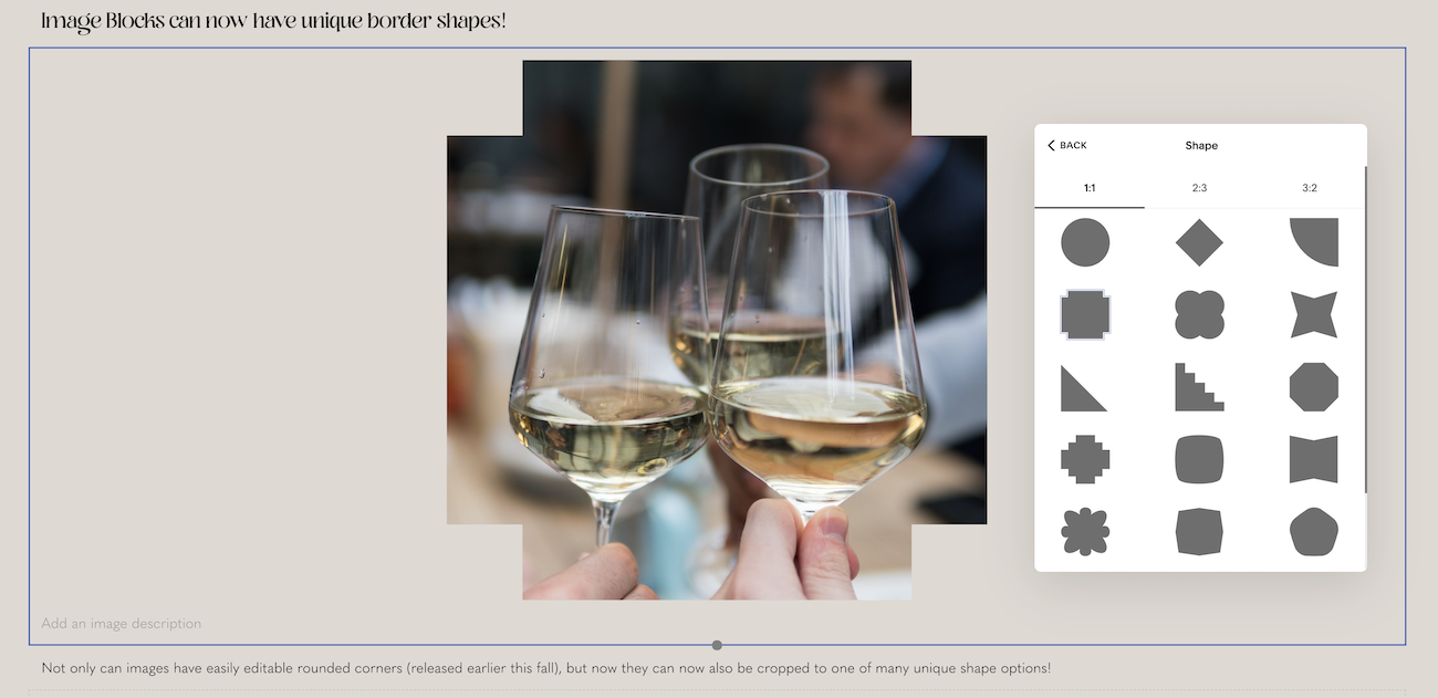
Or you can choose a shape to crop your image! There are 16 options inside the 1:1 (square) ratio, 12 options inside the 2:3 (portrait) ratio, and 7 options inside the 3:2 (landscape) ratio.
Crop images with Shapes
Choosing a Shape to crop your image
Add Image Alt Text
And speaking of images…
❸ Add/edit “Alt text” for images!
We used to do this in captions, and then turn off the caption so it wasn’t visible but the information was still there.
Now we can do this from a built-in Alt Text field, AND have a caption as a separate field to display if we want.
❹ Delete Media Library assets
Released to Circle Members only, but coming soon to the public!
Squarespace introduced the media library a couple years ago, but for all that time, we haven’t been able to remove content from it if we needed to. Accidentally duplicate a page or upload a copy of a thing with an error in it? You couldn’t remove it.
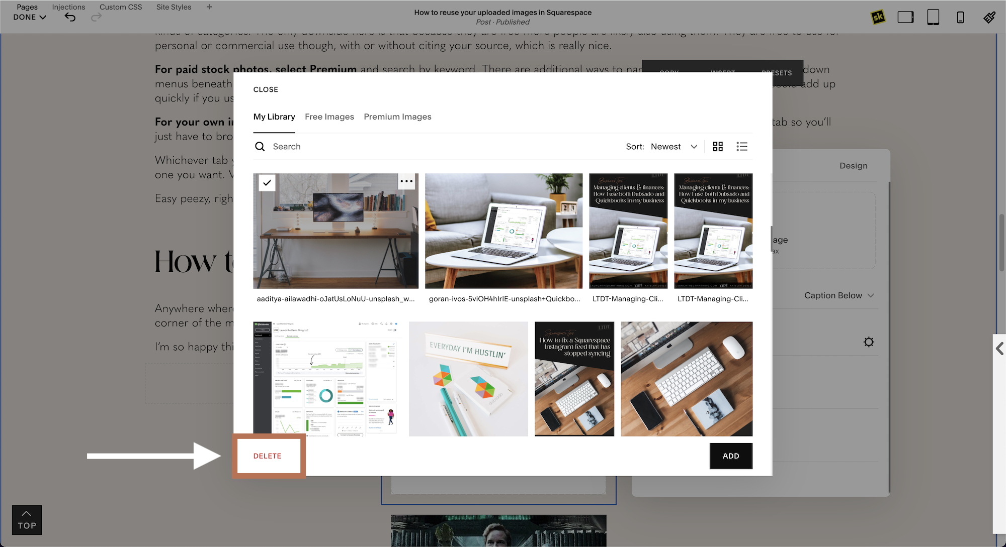
BUT, now you can! And it’s super easy to do: simply select the image you’d like to delete & click the Delete button in the lower lefthand corner.
The only caveat I’ve found, is that Squarespace doesn’t (at time of posting) tell you if that particular image is actively being used anywhere on your site, which would be a good thing to know. Until then, be careful about deleting things, but know you can if you need to!
Deleting an asset from your Media Library
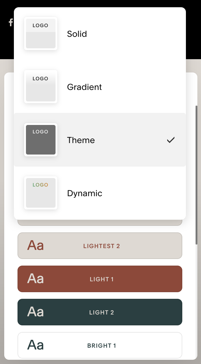
new Header nav options
❺ New header navigation styles
It’s quirky, but there are lots of new options, including a transparent gradient background, a blurred transparent background, solid & bordered backgrounds, and more!
Don’t confuse this with layout options though; we’re still stuck with the same 5 or so layouts for now, but at least you can style them a bit better now. If you’re missing all the layout options from v7.0, you’re not in luck quite yet, but we (designers) are screaming for more flexibility here, so we’ll see how things change in the future.
❻ Upload videos to section backgrounds
As of late October 2021, Squarespace says you can “host your videos on your site. Right now, this is only available for section backgrounds in version 7.1 sites.”
This is a really exciting update! If you’ve been waiting for this feature for a long time & want to know all the details, take a peek at their support info for the nitty-gritty details on how to add background videos, whether uploaded or linked. And check here for video upload limitations and requirements on Squarespace.
Here’s how to use it:
open the Section Editor
select the Background Tab
select the Video Tab
click the “+” or drag & drop to add a video (for best performance)
Videos can be up to 60 seconds long, up to 500 MB (file size), and uploaded in MP4, M4V, or MOV file formats
Or use a video hosted elsewhere by choosing “Add from Link” after clicking the “+” to add a YouTube or Vimeo video. The background video options are below, as before, including playback speed, filter, background width, and choosing a mobile fallback image.
❼ Animated banner art
This one is probably not on everyone’s most-wanted feature list, however, it is still a brand new feature and one that’s an unusual & fun addition to the section backgrounds.
You can choose animations that act sort of like the old screen savers; they float & move around on the screen, some even follow your cursor. You can dictate their colors, animation speed, and other styling options inside the settings for each of these, per section. They also come with a Play/Pause button when live, so visitors can choose to stop the animation or play if they want.
It does come with a downside, of course.
Because these files are likely larger than standard banner images, having too many on any given page will slow the page down …and it could become tacky fairly easily. So I’d definitely encourage the use of these in a limited capacity or using colors & animations that don’t scream for attention from your site visitors, over the content, which is obviously more important.
To learn more about this feature right from Squarespace, check out their support info on animations and image effects.
how to get to the Background Art in section settings
Choose a style you want, then click the settings icon to adjust styles
style options for one of the Art options
❽ New blank template!
…And Squarespace designers everywhere REJOICE. 😂
We’ve been doing this manually for YEARS, like the whole of Squarespace’s existence. We would start with any template and then get rid of all the demo pages, and start from scratch in Site Styles.
But the new Blank Template does that for you!
So if you know you want to use Squarespace for your website, but you don’t want to be distracted by the demo styles, this is a great way to get crack-a-lackin’ on your new site by using your own creativity.
Or if you’re a Squarespace designer like me, and you don’t have the SquareWebsites Tools Pro extension* yet (another subscription!) that deletes demo content for you, then this new Blank Template feature will save you LOADS of time when starting a new client site.
Speaking of client sites…


