MK Family Law
PROJECT CASE STUDY
WEBSITE MIGRATION & REDESIGN ✦ LITE BRAND REFRESH ✦ v7.1 FLUID ENGINE

Website Migration &
Lite Brand Refresh
We decided to do a light refresh of her brand’s fonts & color palette to match her new logo a bit better. Even though the logo was done by her designer, we were able to freshen up the supporting elements & form something consistent she could use to market her business more effectively.
Melissa had not one, but TWO websites, on WordPress when she came to me, both of which she wasn’t happy with stylistically, and felt they were hard to manage & update herself.
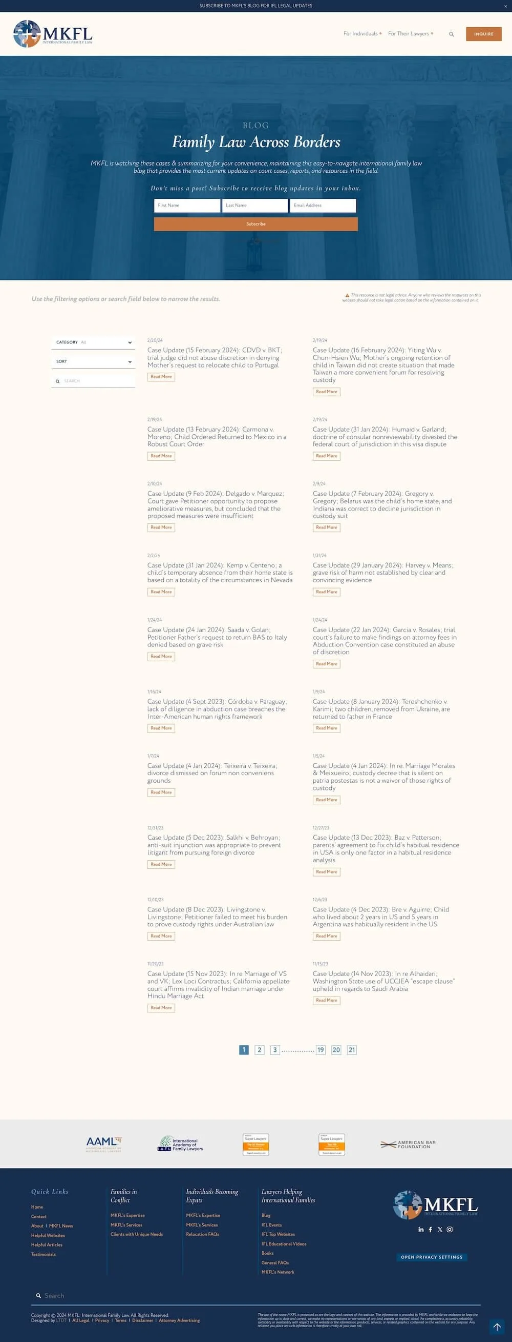
one site was large blog where she published insights on international cases she was watching,
and the other a website for her legal consulting services
She was really struggling with how to merge the two sites, and how to explain what she did clearly for her different audiences, because each website was catering to a drastically different type of client she worked with.
One site was geared toward the attorneys she may work with in a consulting capacity.
The other site was focused more on consulting directly with the client.
In just three weeks her new website was LIVE!
Sales Strategy & Modern Design +
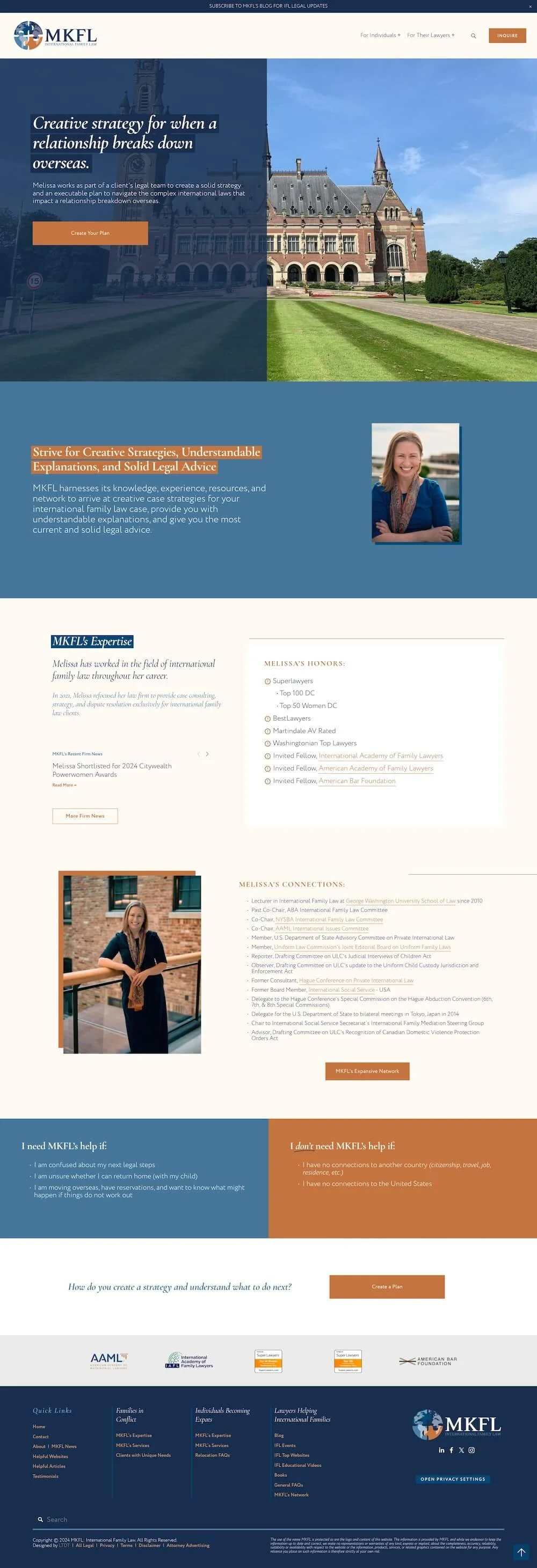
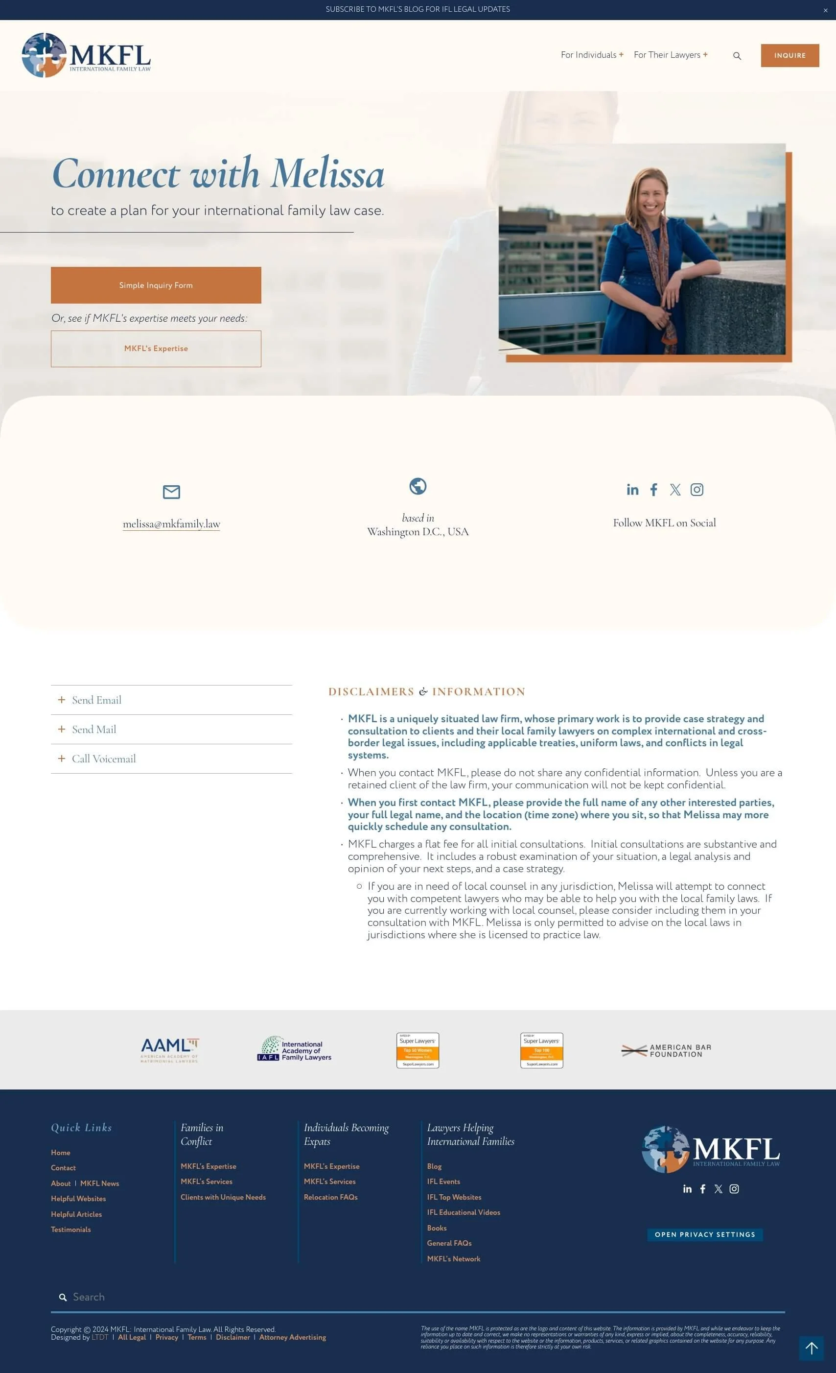
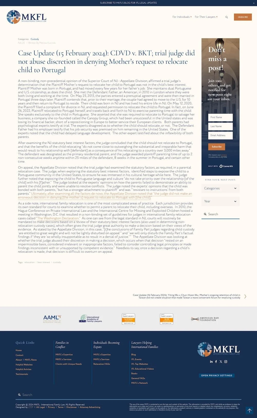
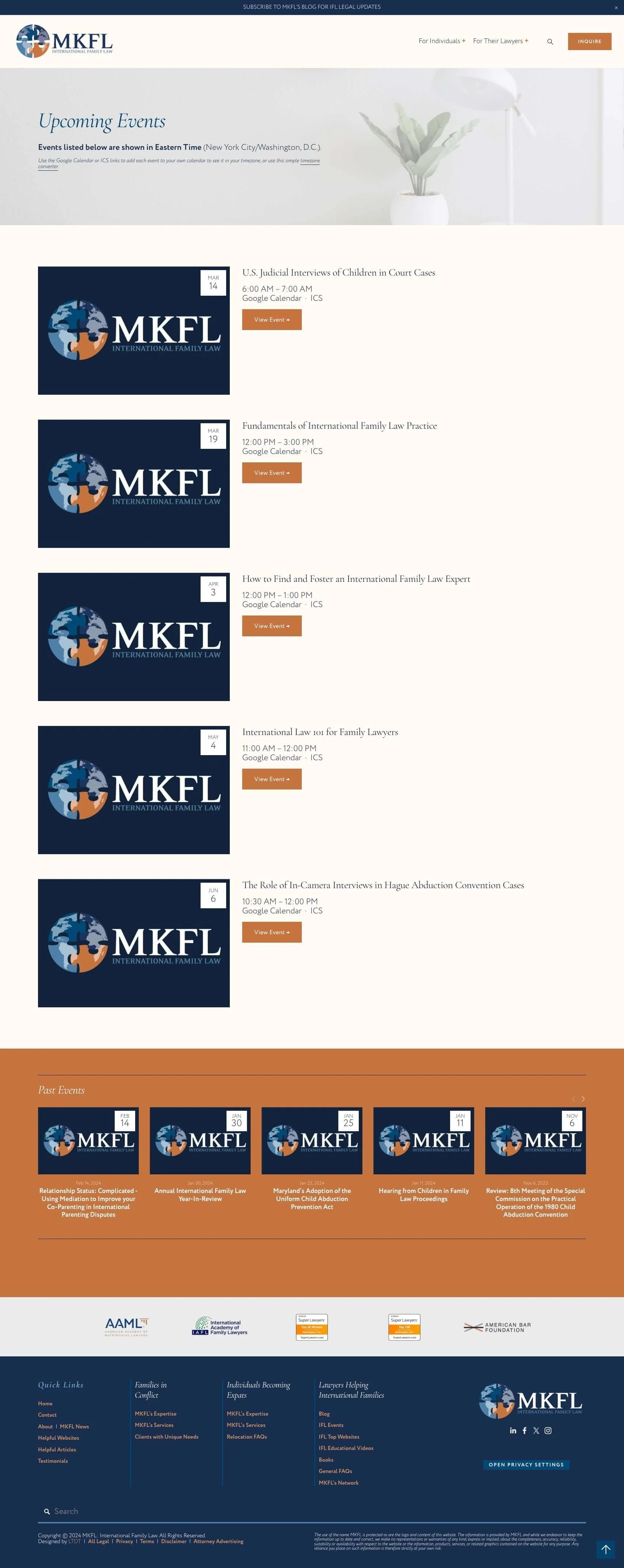
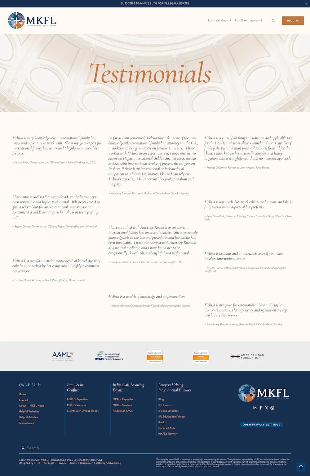
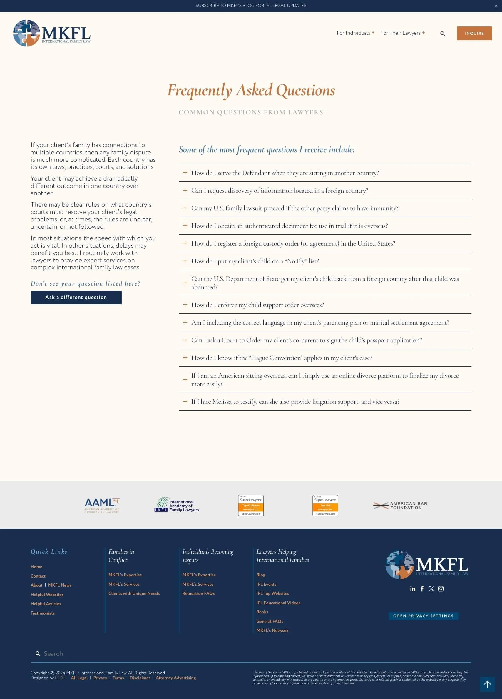
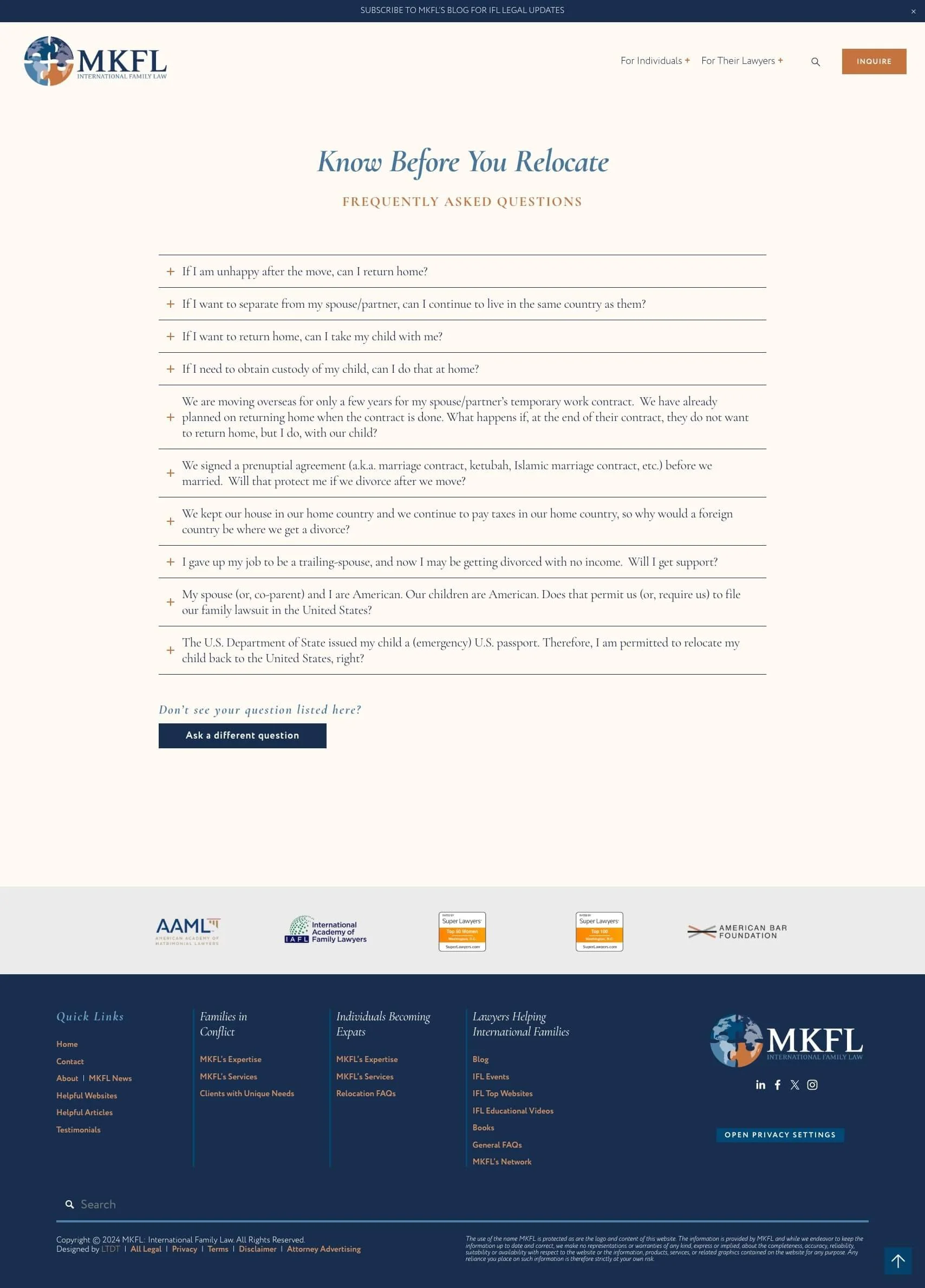
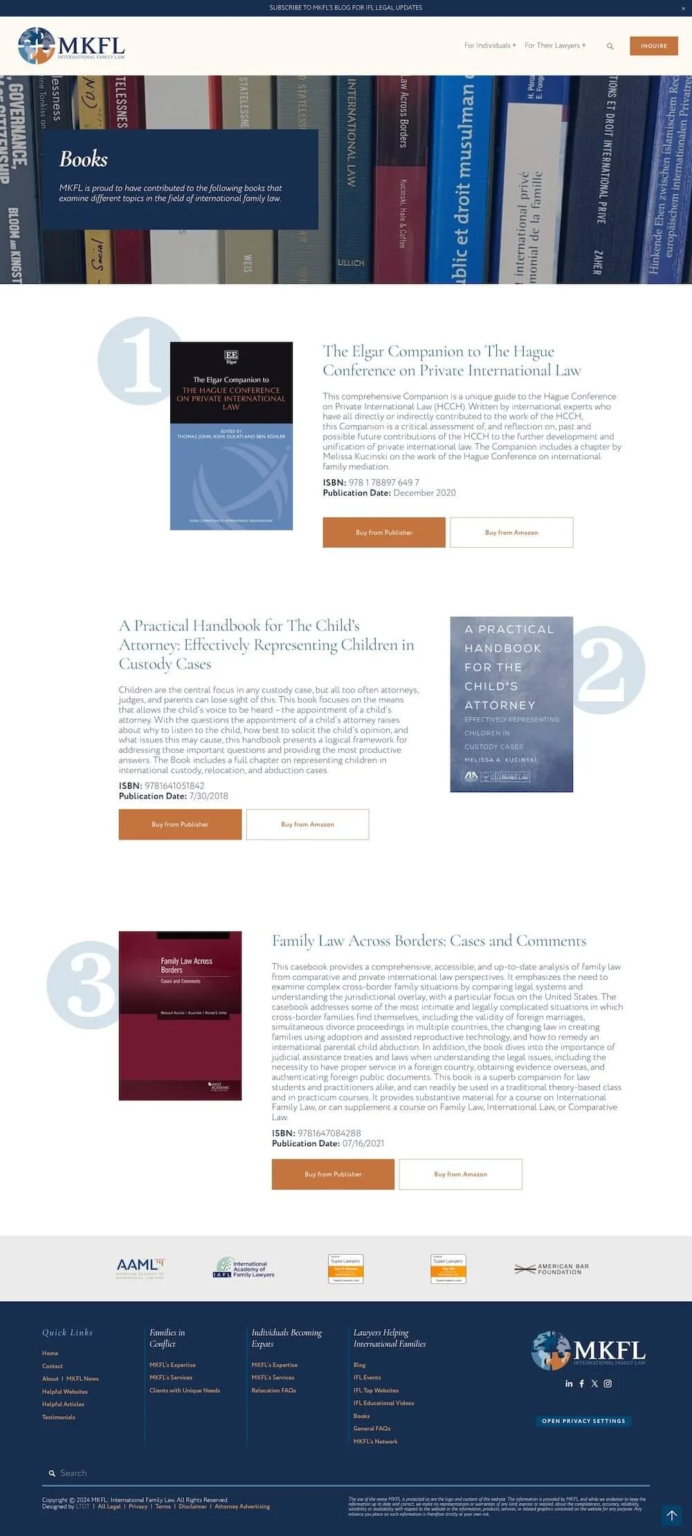
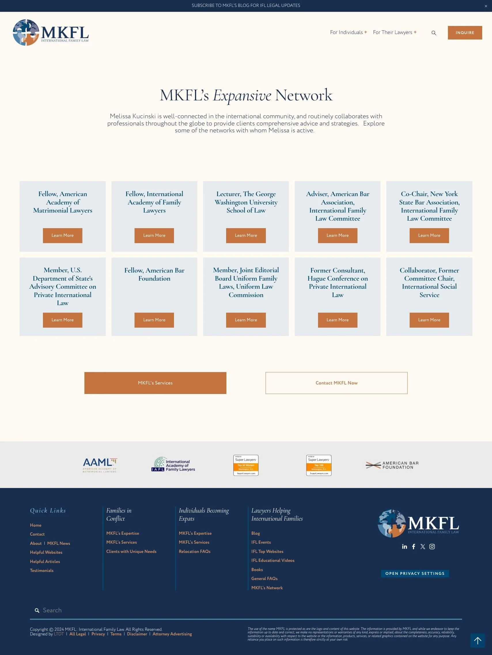
designed 22 pages & 1 form
customized brand colors & fonts
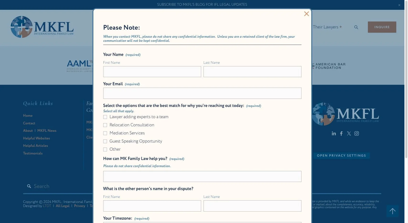
custom popups for easy access to inquiry form
basic SEO applied to all images, pages, blogs, & alt text,
multiple collection pages to organize information,
Blog
Events
News
Testimonials
Resources
Videos
custom banner slideshows,
custom header menu for more organizational control
custom hover animation features throughout
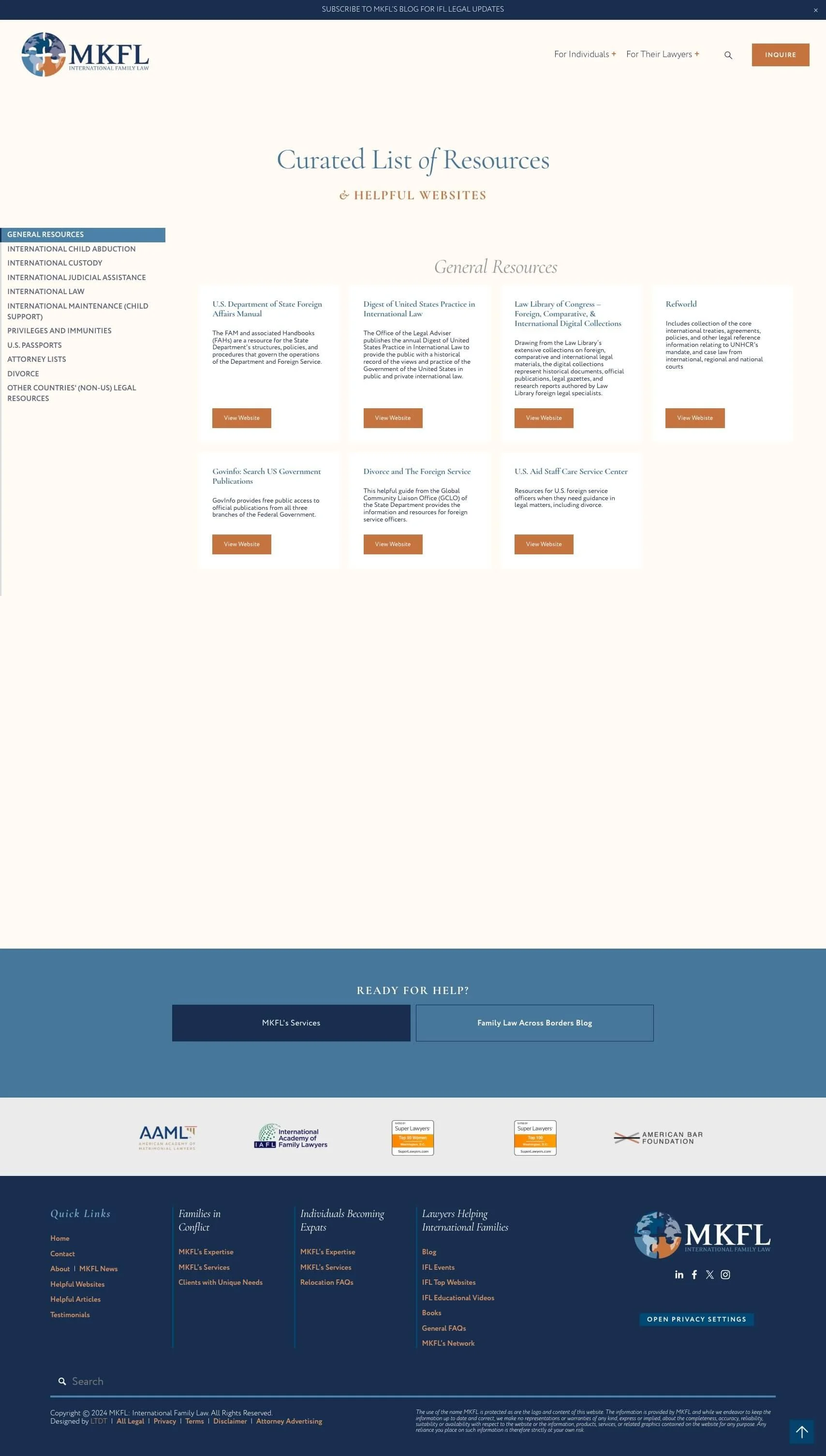
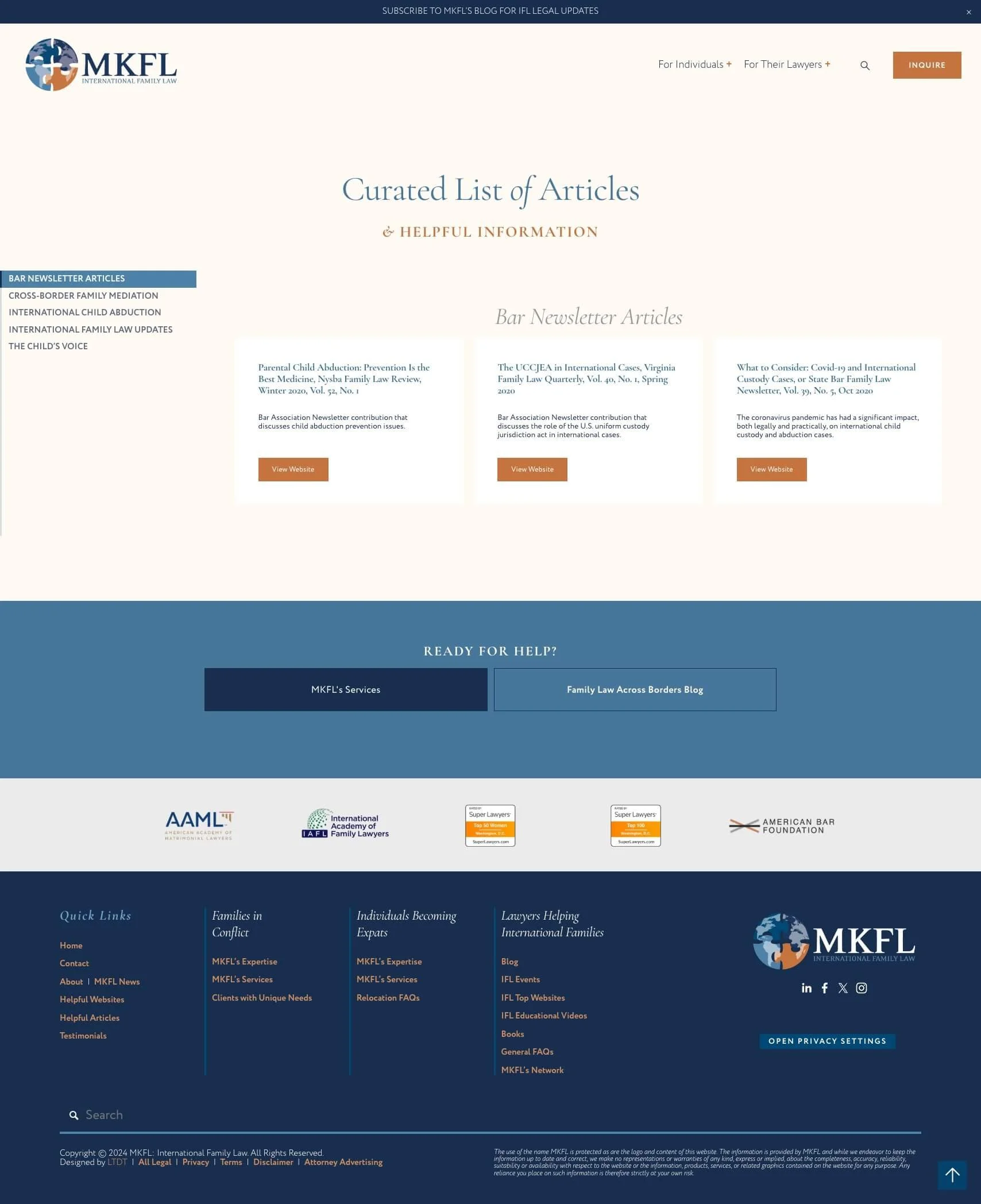
organized resources with categories, sorting & search
migrated 400+ blog posts,
streamlined tags & categories
added custom sidebar for collecting email subscribers
event calendar
imported & organized all past, current & upcoming events
URL redirects to prevent broken links from the migration,
basic ConvertKit setup
Canva templates for all new/redesigned graphics
❶ What are your favorite parts of the new website & branding?
How you captured things about my business that I hadn't even focused on.
❷ How do you think this updated look will impact your business?
I am positive it will help others understand the unique nature of my business that I have been struggling to sell.
❸ Did we successfully accomplish your design goals?
Yes, thank you!
❹ What was your favorite part about working together?
Your organization, your cheery and positive attitude
❺ In your own words, review your experience:
I struggled for almost two years to articulate what is special about my business to others. Katelyn was able to visualize things about my law practice that I hadn't even thought to focus on. She was not dissuaded by my disorganized thoughts, and constant comments and questions. When I had trouble letting go of ideas that were counter to my goals, instead of nudging me away from those ideas, she took them on and re-crafted them into a website that is uniquely me. For a solo law firm, she truly captured my spirit and what makes me so passionate about what I do.
Designs
Home
About
Services
Contact
Blog
Blog Post
Events
Firm News
Testimonials
General FAQs
Relocation FAQs
Melissa's Books
Helpful Website Resources
Helpful Articles
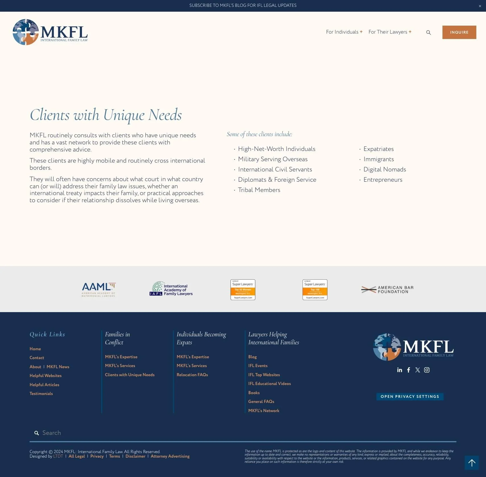
Unique Needs
MKFL's Network
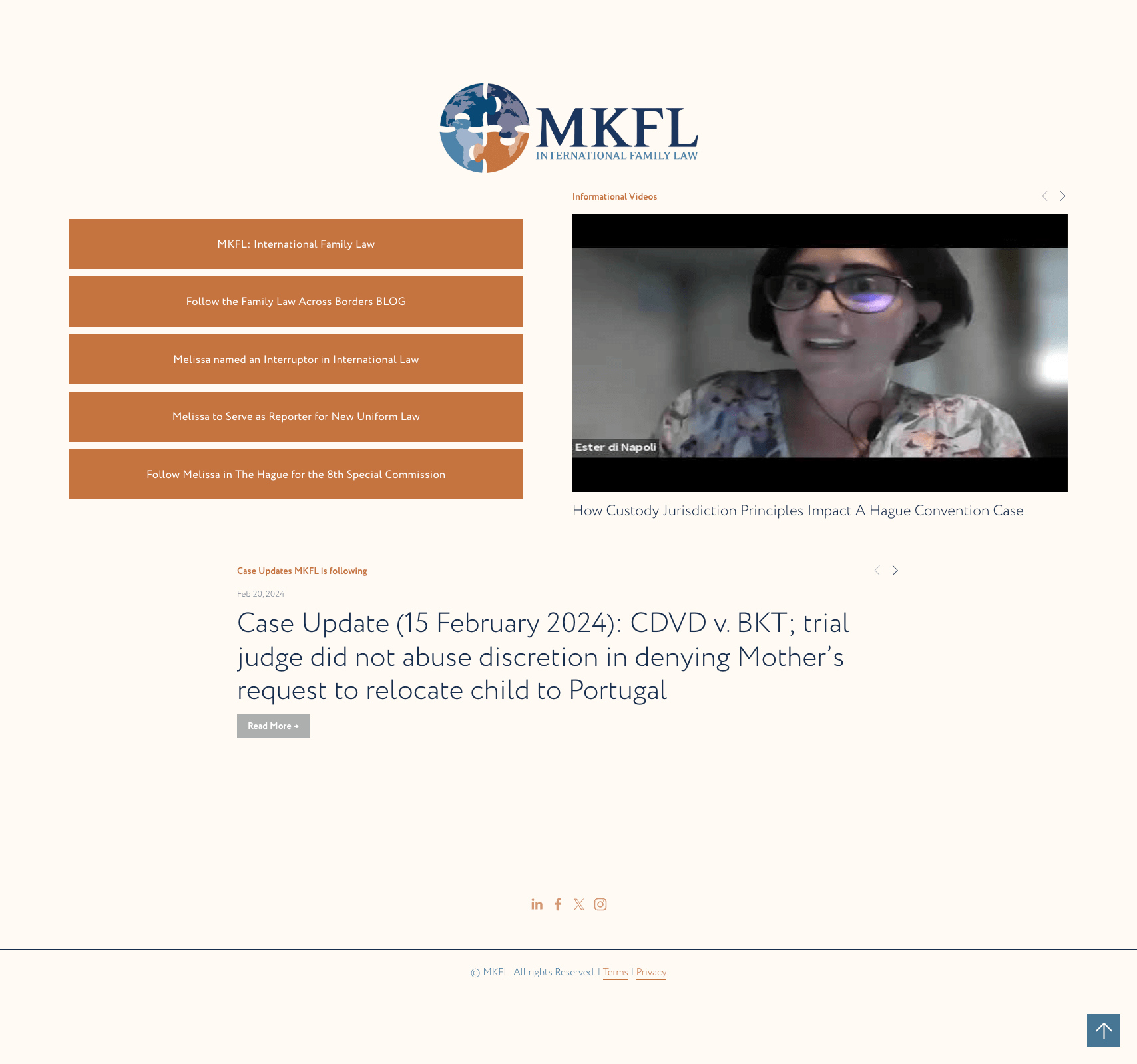
Educational Videos
Global Inquiry Form Pop-up
Media Kit
Social Media Link in Bio
Thank You
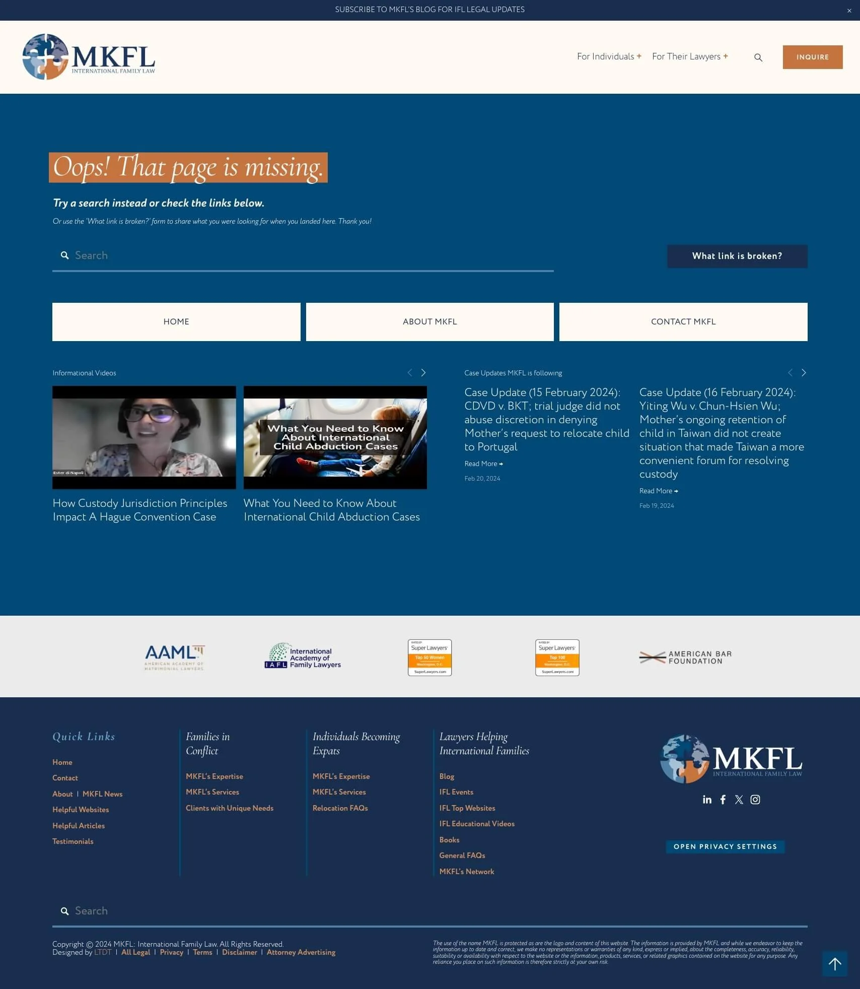
Error 404
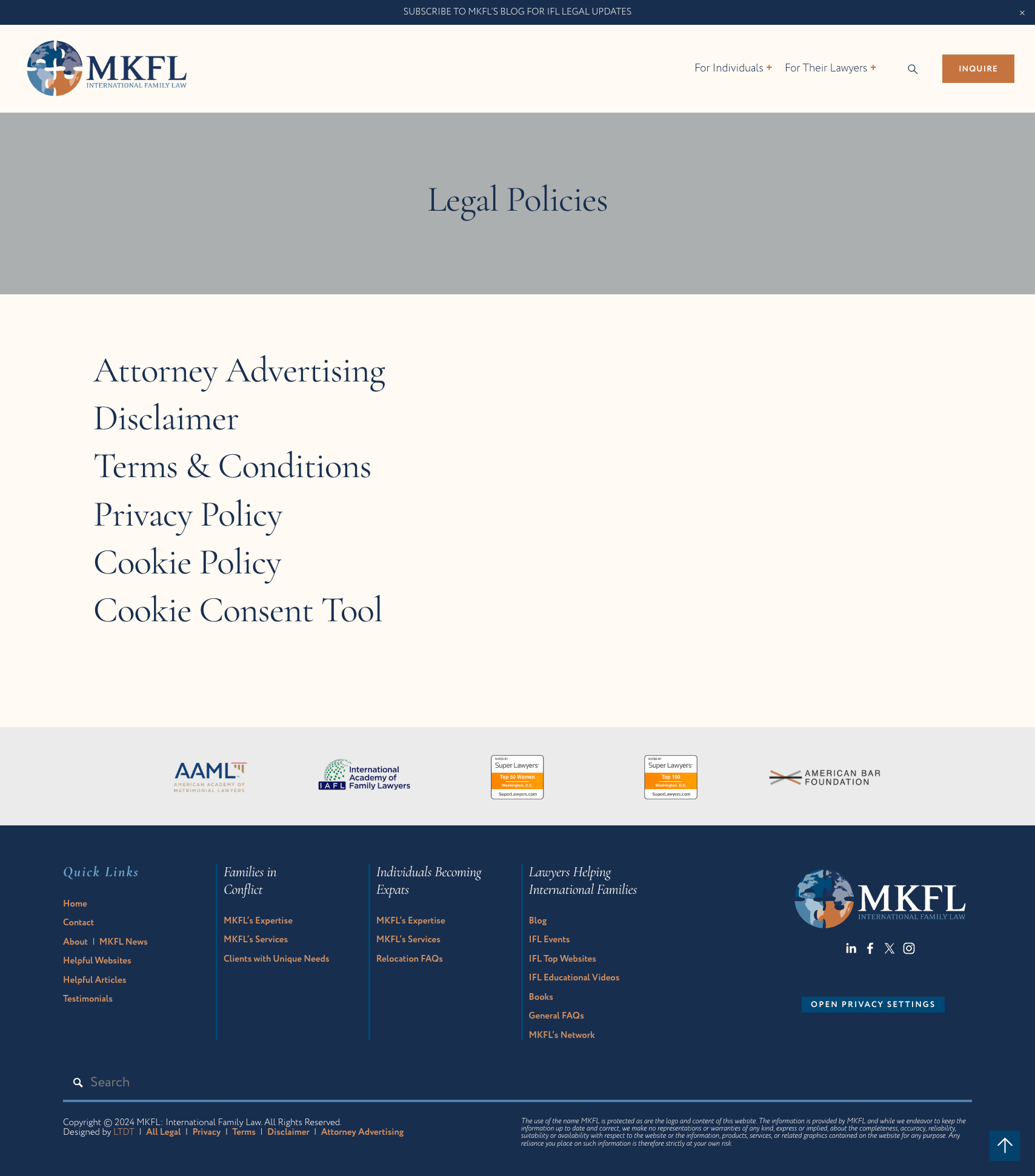
Legal Policies

The proof is in the digital pudding...
You’re unique. Your website should be one-of-a-kind too!










★★★★★
I struggled for almost two years to articulate what is special about my business to others. Katelyn was able to visualize things about my law practice that I hadn't even thought to focus on.
For a solo law firm, she truly captured my spirit and what makes me so passionate about what I do and I am positive it will help others understand the unique nature of my business that I have been struggling to sell.
I enjoyed the process, her organization, and her cheery and positive attitude. It was evident that she spent so much time and effort working on each project. Thank you.