Missing parallax in Squarespace 7.1? Try this instead!
One thing 7.0 had going for it was the parallax scrolling feature, where the background image and the content on top of it move at different speeds creating kind of a 3D effect as you scroll.
When Squarespace released 7.1, they left out parallax and all of us (designers) were going, ‘–Wait… –What? WHY! 😭’
So over the last year, you can image how much we’ve been pelting them with requests to bring it back, at least in some form.
And guess what?! They have! –And you may not have noticed it yet.
X marks the spot, and I’m sharing that (unintentional) secret with you!
Can I use parallax on 7.1? Yes! Kind of.
HERE’S WHERE IT “MAGICALLY” APPEARED…
So, anytime you add a background image in 7.1, you go to a section, click the pencil icon to edit that section’s settings. Right?
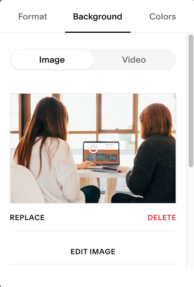
Okay, so while you’re in that popup menu, click Background, then add your image the way you normally do.
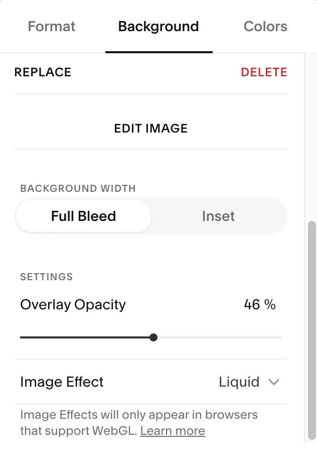
Next, scroll down until you see the new part! Here’s what it looks like:
At the very bottom, now there’s a dropdown where you can choose 1 of several animation options. The bottom two (pan & zoom) work the most LIKE parallax, but you’ll see a little bit of a difference in the way it moves.
PRO TIP: This is change-able per section! So you can have different animations throughout your site if ya want, as opposed to the standard parallax on everything.
It may not be exactly the same, but at least it’s not stagnant/fixed anymore.
I’m callin’ this a win! 🙌🏻
Launch your site, fast!
My templates with plug-and-play layouts can help ya launch in a weekend!


