Why you should start your shop on Squarespace 7.1
If your business will primarily make money from product sales, Squarespace probably isn’t the best e-commerce platform for you. I’d recommend using Shopify, because it just works better for that level of product sales.
If your business primarily makes money from services, but you have a shop on the side for passive income, then Squarespace should work just fine & will help you keep things organized, since you won’t need 2 platforms: 1 to sell products & 1 to sell your services. Yay!
That being the case, let’s get into the nitty gritty of why I’m now recommending 7.1 over 7.0 shops.
Why I recommend using Squarespace 7.1 instead of 7.0 for online shops
7.0 shop limits
Shops in 7.0 are limited to a total of 200 items. Betcha didn’t realize that!
The product limit on 7.0 may not be a big deal if you only ever plan to have a handful of items in your shop, but it’s still good to know, because it means there are limitations on how your shop can grow.
You could, for example, have multiple product pages, –which if you set them up right, could be like a system of categories with a limit of 200/each.
Sound confusing? That’s because it could be.
If you had a shop page for Coffee Mugs, you could add up to 200 listings for it & you could organize it into mugs that have swear words, and mugs that are for Dads, and mugs that are business-inspired, or mugs with safe-for-work-place quotes on them, and mugs with your own designs.
You could also have a shop page for prints with the same designs & quotes that those coffee mugs have, and also have up to 200 listings. But you now have 2 different pages, needing you to create the same exact set of categories & tags.
You could also have a shop page for digital products only, and have up to 200 items in that. This might be the digital design for anything that’s on your printed/physical products in the other shop pages, and this one would be a 3rd instance of creating the same set of categories & tags.
Now you’d have 3 different store pages to keep track of, with potentially up to 600 items to track down separately when you needed to change information, and you’d have 3 of the same organizational tags & categories, since each of them have the same design.
And what if you wanted to have a single Summary Block displaying all the items with a particular design or quote on it? And that quote was a digital file, a print, and on a coffee mug? That’d be 1 item from EACH shop.
And now, –you’re stuck.
You couldn’t do that without adding 3 product blocks or 3 image block layouts with a button, side by side, because Summary Blocks only pull information from 1 collection, –not from 3 different ones.
Yes, I realize that you could have 1 product with different variations like a mug or a print inside, but things also get hairy, there, because you can’t have digital AND physical products in the SAME listing.
So you couldn’t have all 3 available in 1 drop-down option on the same product listing, IF one of them is digital-only.
So you’re back to square one, now. Right?
Not if you’re using 7.1’s Store Pages!
7.1 shop limits
Shops in 7.1 are limited to 10,000 products. 😱 That’s an enormous difference.
It also means you can have all of those 600 products from the store ideas above, in the same shop.
Which means you can also only have 1 set of categories & tags to create & manage.
And you could use those Summary Blocks to display all items with the same category or tag, because they’re all in the same collection now!
BUT, you say, 10,000 items is A LOT to manage in one place! You’re right, it is. That being said, here’s where this ‘hidden gem’ comes in handy in 7.1 shops: a new system of nested categories!
Organization: nested categories
+ video
So here’s where 7.1’s organization is both MASSIVELY different and more effective.
7.1 stores now have the ability (available starting in Aug. 2020) to create & organize your products with nested categories!
That means your categories could look like those on Target’s website, where you select a series of options to funnel down the products & ultimately find what you’re looking for easier.
Can’t visualize that? It’d look something like this:
Digital Design Downloads
Printed Designs
Coffee Mugs
Quotes
Funny
Family-Friendly
Safe For Workplace
Inspirational
Family-Friendly
Business
Life / Personal Growth
Sweary
Things Most People Want To Say, But Can’t
Dry Humor
Work Related
NSFW
Motivation
Fitness
Business
Life
Personal Growth
Feminine
Boss Babe
Masculine
Coffee mugs
Design Prints
Digital Designs
Unisex
Each word in that bulleted list, could be a clickable category that could narrow down your list of products that fit into each group.
That would be really helpful in larger stores where it’d be easy for customers to get lost in the list of products, especially if you’re only limited to single categories (like we’re used to in 7.0).
Think about all the possibilities! Even if you only had 50 products, if you could organize them this way, it’d be so much easier for your potential customers to go RIGHT TO the exact item(s) they want to see first, rather than fish through a long vertical list and abandon your shop because they got tired of scrolling.
Right? The possibilities for this are wide open!
Example:
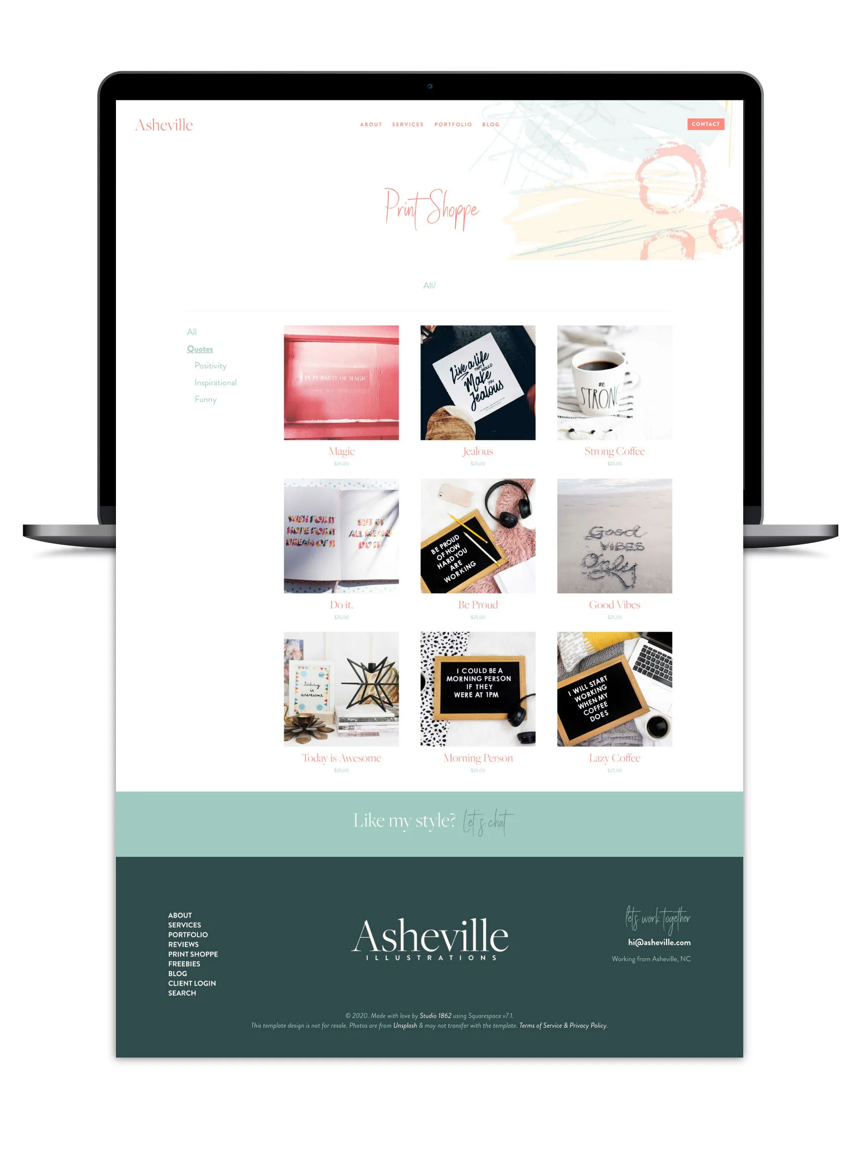
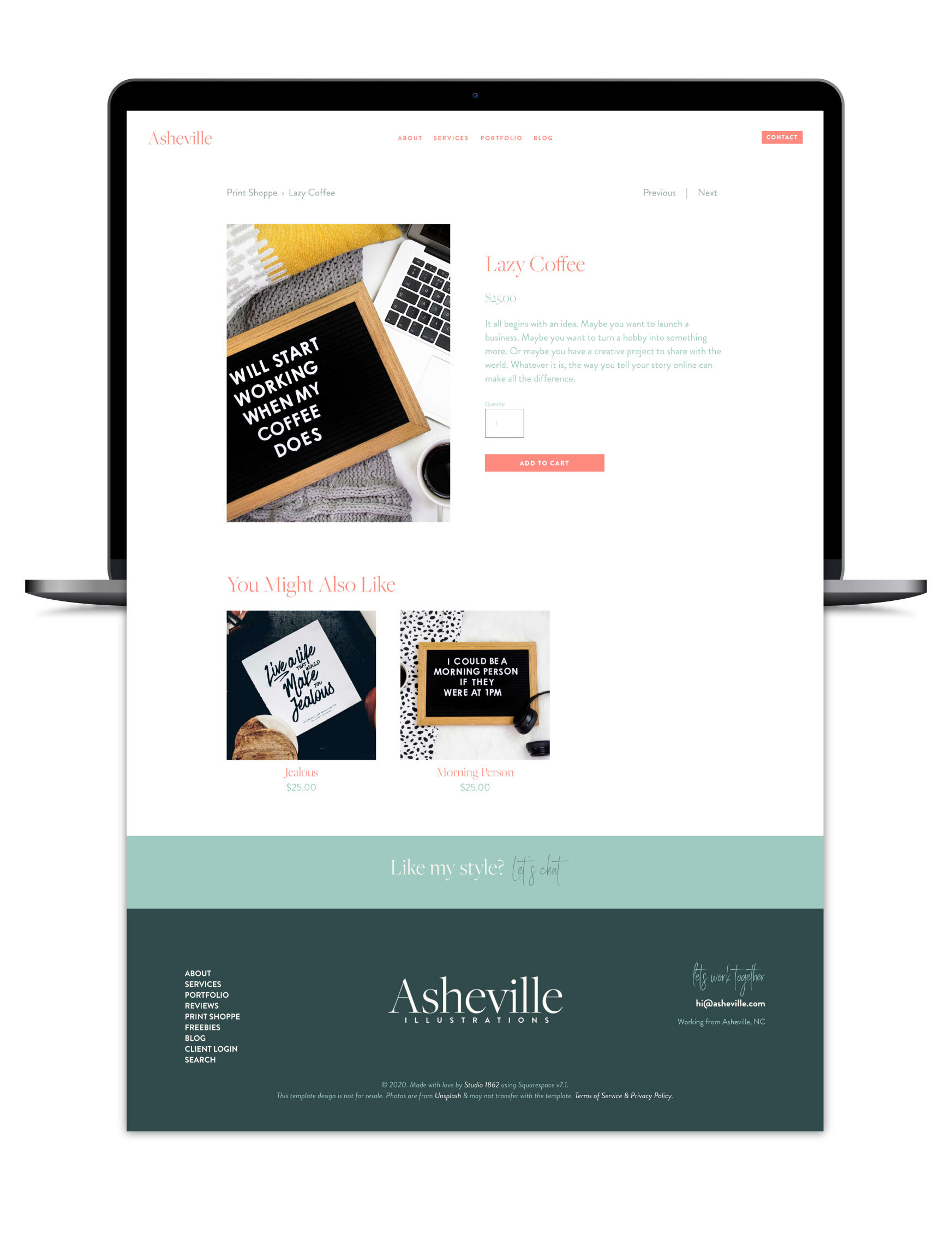
A very simple example is in my Asheville Template! 👇🏻
Nested categories shown on the main shop collection page
breadcrumb categories shown on the product page
(password is: demo)
I think you can see how useful this new feature can be for commerce on Squarespace!
Adding categories in 7.1 is as simple as navigating to your store page, then clicking the gear wheel ⚙️ then choosing Categories. You can add a category, then click the ellipsis (…) next to it, to add another underneath, and so on.
You can also add categories & then click & drag them around to create subcategories or re-order what you have already added.
To learn more, check out Squarespace’s help article on categories & organizing products here, or adding products to your shop here.


