'Boudoir by Sarah Chatham' Launched the Damn Thing!
What's inside this post: Hide
A word of caution: today's video is going to have a little bit of nudity in it.
Not mine (or my client, Sarah’s). I promise. Scout's honor! 🍑
I’m sharing a recent client's website launch and her photography business specializes in boudoir photoshoots. So…
If I haven't gotten your attention with THAT, stick around because I'm going to walk you through the website, show you some of the custom features, what we did versus what she had, and what she had to say about it so we can celebrate with her!
First and foremost, before I dive in, my name is Katelyn. I run Launch the Damn Thing®. I'm a Squarespace educator and designer, and I've been a graphic designer in some capacity since 2006. So I've got a lot of thoughts to share on the topic. And that is why I am here to share them with you.
On that note, let's hop in and I will show you what we did for Sarah's business.

Sarah's feedback in the final Design Presentation
-
Sarah: Katelyn, I'm just so like, I, I'm so thrilled. Like you're amazing.
Katelyn: I had an absolute blast.
Sarah: Well, you're the, yeah. Like absolutely perfect. You're the perfect person for this. And I'm just, I can't even, I'm just so thrilled.
Katelyn: I'm thrilled too. I'm thrilled that you love it, but I'm thrilled that I got to work on it and I was so stoked that when you reached out too, cuz I've always wanted to do a specific boudoir.
Sarah: Oh, it was the universe! Like I was explaining to my mom like, you were working on it. She's like, I can't wait to see it. And I'm like, literally, she's like the perfect person. I don't know how I came across her, but like the universe just brought us together because it's exactly what I wanted without being able to describe what I wanted.
Katelyn: That's what everybody says. It's exactly what I didn't know I wanted.
Sarah: Yes. And I couldn't put words to it, but somehow she like ran into my soul and figured it out.
Katelyn: Good. I'm so glad you love it.
Sarah: Thank you. I'm so, I'm excited to kind of dig in a little bit more too, so that'll be fun.
Katelyn: Yeah. Yeah.

‘Boudoir by Sarah Chatham’
the client & experience
Fun fact, when Sarah reached out to me, I was not shy in telling her that I had actually always wanted to do a website for a boudoir photographer, because I thought it would be fun and entertaining and interesting. And definitely outside of the box. And she of course loved that. So we clicked early on. Sarah is an awesome human being, who I was really excited to work with. And I was not let down!
The whole project from start to finish was the easiest project maybe that I've ever done from start to finish. And I know that I say this every time, but I'm gonna say it anyway. Maybe also one of my absolute favorites to date.
So now that you're curious, I'm gonna show you where Sarah was to start with before, when she reached out to me. And show you the progress, what we decided to do and why. And then dive into the website so that you have that for context.
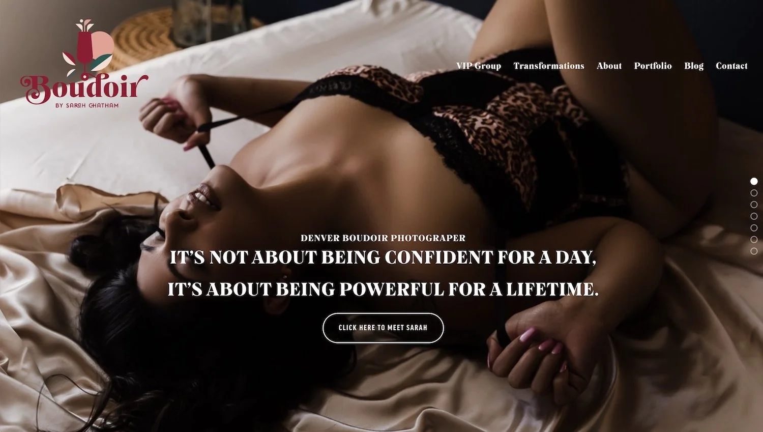
original website design’s Home page
Where she started
This is Sarah's original website, and I'm not gonna go through the whole thing because that's not really the point here. But I did want to show you where she was starting from and point out that it wasn't actually a bad design, it just wasn't a good match for her where she wanted it to be.
So I was surprised when she reached out to me. There were a few things that I would tweak, but like I said, that just wasn't a fit for the personality she wanted her brand to have, and that's one of the things that I do really well.
So as you can see, this is her original logo and it is very large and it has to be very large because there is a graphic in it, which is one of the reasons why I never designed brands that have graphics or some sort of illustration in it as the main option, because they tend to take up too much space. Like here in the header where a third of the screen is the header itself, because the logo has to be that tall in order for the text to be that visible.
Upon talking to her, when I book a new client, the first step after the spot is booked they fill out a 30 question brand personality workbook and in that workbook she told me she loves the logo, but she also doesn't love the logo.
So of course on our kickoff call, I had to dive into that, like figure out what were the hangups. What did she love about it? What did she not really like about it? Could she pinpoint any of the things that she felt like derailed the vision she had for her business?
Because it wasn't quite on the right track, she wanted to take a different approach.
This was her original color palette and the only color that she was really attached to was the burgundy.
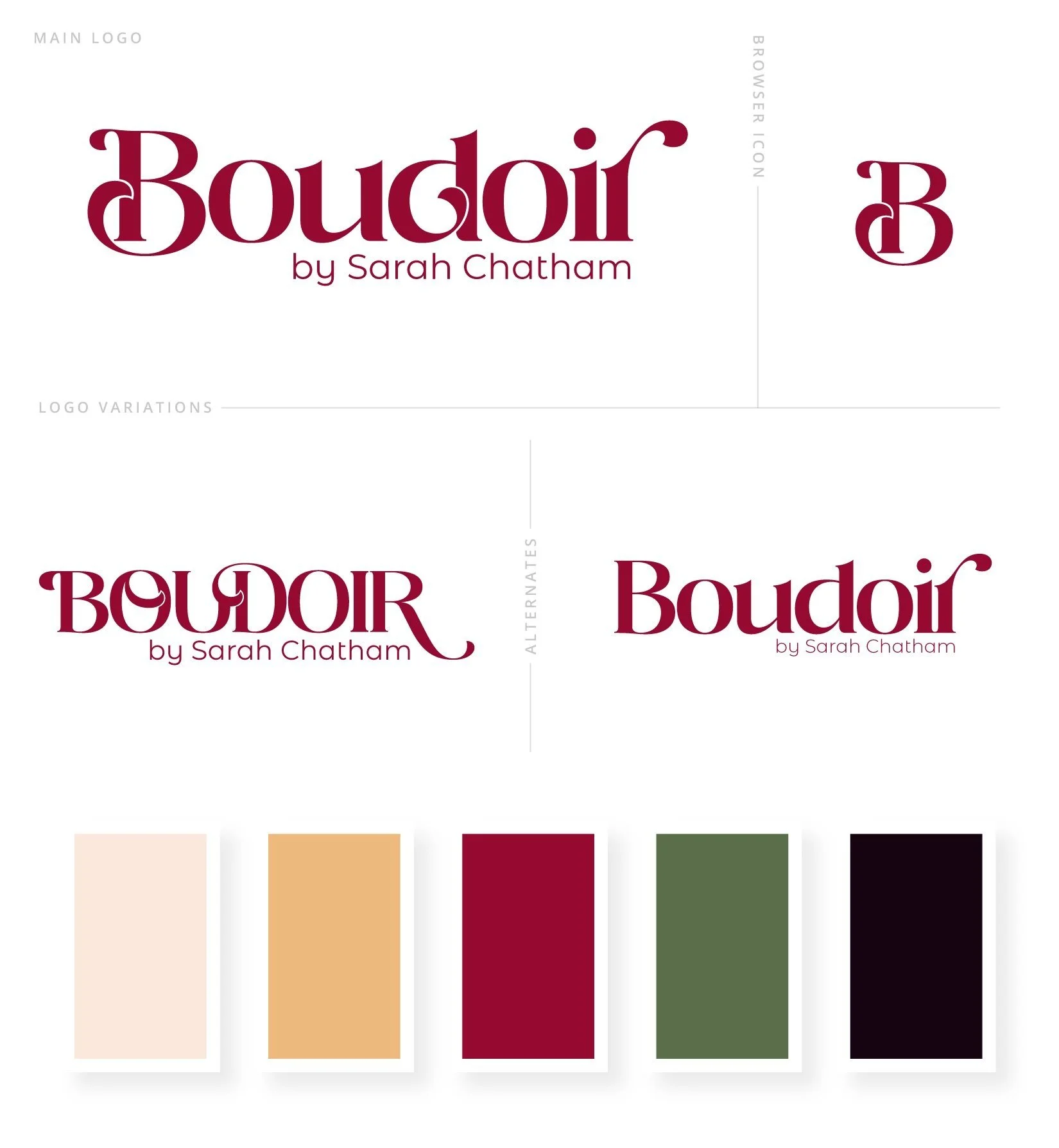
Refreshed brand design
Brand Refresh
So we started with that burgundy color and built off of that.
I used one of her photos and pulled color inspiration directly from that, and that is what we ended up using on the actual website. It required extremely minimal edits. Literally. She was like, love it. So that's what we did.
We took this piece where we were reestablishing what her brand needed to be refreshed into and went from that to. This.
You can see it's not too far off. Very similar font, but it is different actually. Both of them are. The regular text down here and the boudoir font itself. Both of them are actually different than the original, but slightly more modern.
And I'm also giving her a couple of options so she can be as fancy as she wants to be with all caps definitely more on the bold side, kind of in the middle, which is the main one, and then simplified, which is the other alternate version. And then of course, just the favicon by itself or the browser icon, whichever you wanna call it.
We also picked a few fonts so we can get the playful, fun, classy, sexy vibe that she was going for, and from this we were able to build the website.
Sarah's initial reaction to the Home page draft
-
Sarah: I'm so excited!
Katelyn: I know. Me too. So, on that note, I guess I'll jump right in.
Sarah: Okay. Yeah.
Katelyn: I'll try to move as much of this off the screen as possible without changing screens.
Sarah: Katelyn! Oh my gosh.
Katelyn: I did tweak your logo, a little bit.
Sarah: I love it!!
Katelyn: Good. I love that face!
Sarah: It’s beautiful!! … Ahh!
Katelyn: I'm so glad. I just. Picking the heading font ended up leading me in that direction. So,
Sarah: –into a wormhole?
Katelyn: Yeah; it did. And I'll give you all the files for that. It was really an easy change, so it's–
Sarah: okay. It's, it's a totally new font?
Katelyn: Yep, totally new font.
Sarah: so pretty…!
Katelyn: I felt like it had the same vibe.I really liked all of the curves and the soft edges, but just kind of more in the,
Sarah: it's elevated.
Katelyn: Yeah. Just in a different way.
Sarah: Yeah. I love it.
Katelyn: So then I am trying to incorporate some like soft edges that are like hinting at curves.
Sarah: Yeah. I love that! Yeah.
Katelyn: And, um, we can swap out images anywhere that you see them.
Sarah: Yeah. Cuz I'm gonna be having that, um, that shoot. Ooh!
Katelyn: Yeah. Then we have your services and there's a nice little hover effect on the images there so they can like, feel like they're interacting with it. And then of course the button would go over to the services page and then this one would go over to the portfolio page.
Sarah: Yes… I love it?!
Katelyn: and here's your recent shoots. So just a summary block.
Sarah: This is so cool!!
Katelyn: I just wanted to pop it, like jazz it up a little bit, for lack of better.
Sarah: Yeah. It doesn't look like anything I've seen before, which I love!
Katelyn: Good. I really wanted it to feel different.
Sarah: Yeah.
Katelyn: And then your recent reviews.
Sarah: Oh. Oh, that's so cool!
Katelyn: There is a slight Ken Burns effect on it.
Sarah: Yeah.
Katelyn: That's really, so it's just zooming in a little bit.And then at the bottom, the button that goes to the rest of them would be like all the way across the page that's whole is a button.
Sarah: Yeah. Oh, this is so great. –OOoo!!
Katelyn: This little blurb about you.
Sarah: I love the green.
Katelyn: I do too. And then your bottom footer.
Sarah: It's so beautiful. I'm gonna cry. I love it so much.
Katelyn: Good. I'm so glad you like it.
Sarah: I, I love the color good –and everything like is readable. Um, yeah. Oh!! I love it.
Katelyn: Good, good.
Sarah: So great. Sorry, I'm just, yeah,
Katelyn: that's the perfect response.
Sarah: Well, you, yeah.

The Gallery




-
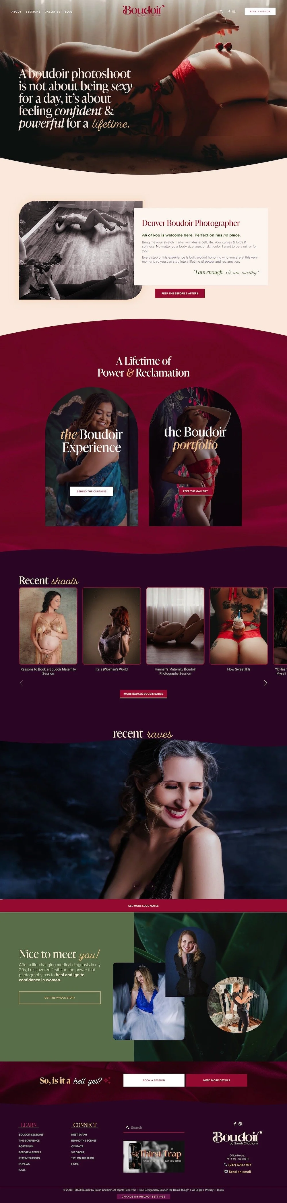
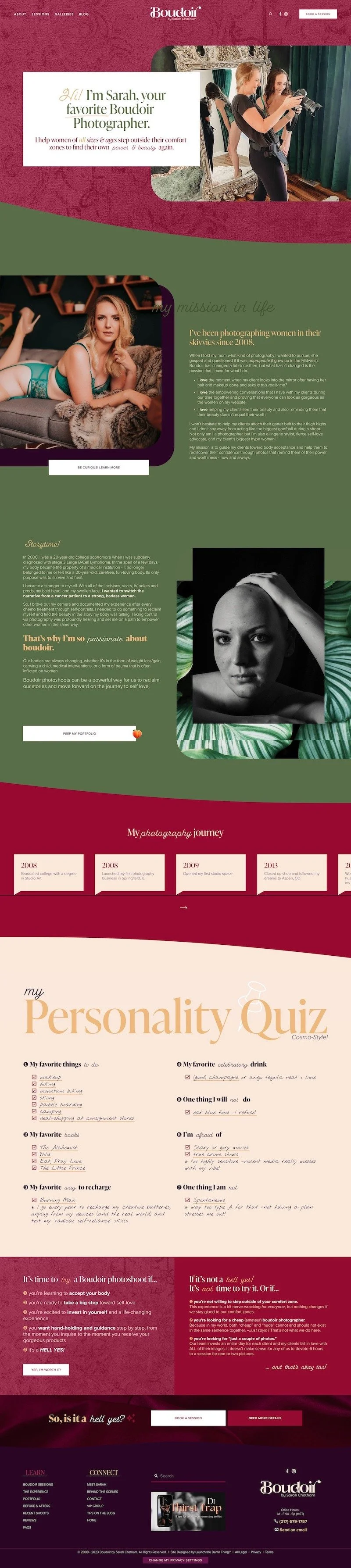
Home page
This is Sarah's homepage. It's somewhat similar to the one that she had before. We're keeping it very simple and very clear. Her logo is still mostly in the red color. The links are mostly still in the white. She's got a different font, more emphasis on some words than others. And overall a gorgeous, intriguing photo. That's slightly edgy, but not so much that it might turn people off right away.
Probably not the best idea to put the most nude picture right here. Because this is kind of a scary thing for a lot of people to do. And you don't wanna scare them off right away. That's an option per client. They get to choose how much nudity they show in their own photo shoot. So not everybody has to do that and we don't wanna present them with the boldest option.
As you start to scroll down, we are starting to incorporate rounded edges, curved, pointed edges. All the things,
because I wanted to really play with the idea of curves and different edges, different styles, because the whole point of Sarah's service is to give someone empowerment and self-love. Help them understand and love their body and see it in a different way. All colors. All shapes. All sizes. So it didn't make sense for everything to be quite so uniform here. So I did get to play a lot with those.
As we scroll down, we have a hover effect on the two main options here. Because the first thing people dive into is probably not necessarily, 'I wanna do this!' It's 'I wanna learn more cuz I think I wanna do it.'
So we're diving into the experience and we're also taking a look at the portfolio to show that these people don't just wake up like this. I would imagine that almost no woman in the world does. This is really the place where they can go to see what their photos could look like and imagine themselves in a photo shoot like this.
As we scroll down, we have a custom summary block. With the arrows in a slightly different place than normal, and also stylistic changes to the actual posts themselves. It's pulling from her blog, so It includes tips, tricks, recent photo shoots, all the things right.
And there's a lot of it. I forgot to mention her previous website had been in existence for some years. So the blog has upwards of 300 posts in it. That was a large migration.
And then as you scroll down, we have an auto list layout section for her testimonials, her featured testimonials. I put a custom CSS bit in here for a Ken burns effect. So that we really draw attention to how beautiful these photos came out. And these are before and afters, so you can actually see the transition that was made between when they walked into their appointment and when they left.
Beneath that there is a little intro area, getting to know Sarah, the photographer. And then below that we have a pre footer and the footer, and we've broken the footer down into strategic sections. Where we have ways to learn more about her services, ways to connect with her an opt-in, that is by the way, fantastic. And a search bar in case you wanna search the whole website and also all of her contact information.
About Sarah page
On Sarah's about page, she's introducing herself. She's showing you a candid shot of what she looks like in action during a shoot, which I love.
She also specifies who she helps. That's basically helping people, self-qualify. Am I in the right place? Scrolling further down, she's showing herself in the same environment that you would be if you booked her services. So you can see that she's been through the experience herself.
She's also giving people the reason why she started doing this, being curious to learn more about the experience itself, what she offers in her service, and also a little bit of background about why she got into this in the first place, because as she said up here, she's been doing this since 2008. That's a long time!
So you learn a little bit about Sarah and you can peep the portfolio again. We have another auto list layout that I've customized with CSS. So you can see the timeline of her photography journey.
This is one of my favorite parts about this page. I decided to do a personality quiz style, cheat sheet, as if she were literally writing in her answers.
So you can see her favorite things to do her favorite books, her favorite way to recharge, one thing that she's afraid of, one thing she won't do. Then there is a little section to try to help people self-qualify even further. So this is for you. If you're in this space, it's not for you. If you're in this space and that's okay, too. Um, so if they click through yep. I'm worth it. They go to the contact page where they would submit a form. And if they're ready to book a session, they can go hop right to the form from here. If they need more details, this goes to the actual service sales page.
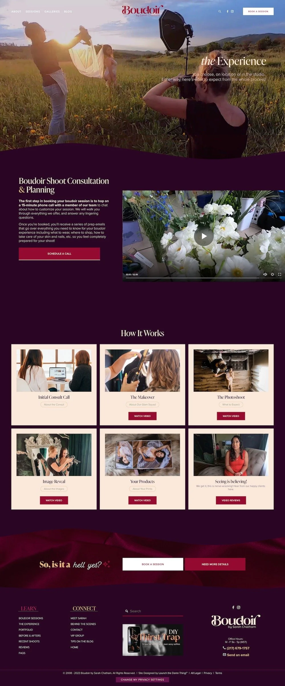
About the Experience page
Next we'll go to the experience page, which is basically a quick and easy dive into what the experience itself is like. Then all the steps that make this process work from the initial consult call to the make-over itself on your appointment day, the photo shoot itself, and then the following image reveal that is on the same day. And then the products that are available for you to purchase with your newfound images.
And then also some video reviews, because seeing is always believing. And all of these women had fabulous photo shoots. This is a custom feature that I installed into an auto list layout, which is what this section is. I put in these collapsible descriptions so that they all had the same shape.
Also the 'watch video' pops up in a light box So anybody can watch the video from any of those sections and consume the content that way, rather than reading it themselves.
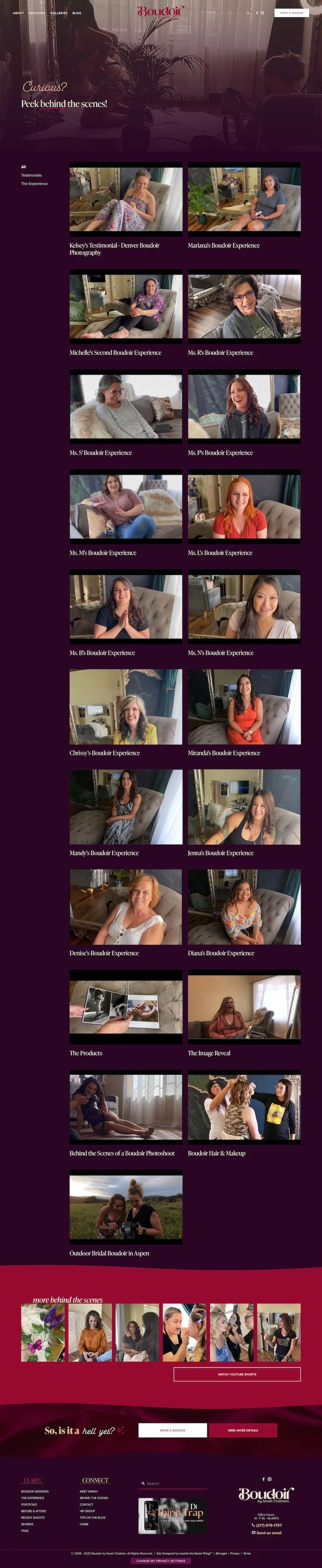
Behind The Scenes page
The behind the scenes is just a place for her to put in all her videos. If she didn't want them to only exist on YouTube.
This is using Squarespace's video collection and YouTube. So if you click on this, you get a full screen, video experience and description. If there is one, and then we customized the, you might also like section of this, that shows related videos based on similar categories. This was a really fun thing to set up for her because she has so many video testimonials, which is incredible.
Services sales page
From the behind the scenes page, we can go over two sessions and check out the services sales page. One of my favorite pages.
This is another gorgeous photo. There are maybe two stock photos on the entire website and there are a lot of photos trust me, I went through them in the asset library.
So this is another client of hers. We are talking about what this service is supposed to do. And basically in the most beautiful way we have a custom count up. So we are really trying to draw attention to the fact that she has photographed over 200 clients in this way.
As we scroll down, we have a little blurb about what the service itself is going to do for all the people. The reason why she offers this, because of the empowerment that she can offer people. Because females as a gender, internationally I'm sure, we all struggle with our own physical appearance on some level. There's something that we don't like. And eventually over time that can easily turn into the opposite of self-love.
As we scroll down, we've got some beautiful textures here. Some curves, some lines, some soft edges, juxtaposed with lots of sharp points and hard lines. All to point out that she understands she's been there in a similar situation, most likely, and can easily relate to whatever struggle you're currently feeling right now.
As we slide down, we start to address the butts. I mean, that felt like it was appropriate. And definitely that pun was intended.
This video is from a past client Miranda; it's her testimonial. It's a fantastic interview. And it's also talking about the reasons why the viewer is feeling like they can't do this.
Underneath that we're going into the rest of that sentence, "I can't, because" ...lie number one, lie number two, lie number three. These are the most popular objections.
"I am going to be so awkward during the photo shoot."
"I'm not as pretty as those other women. I can't pull this off."
And "I'm too fat, old, skinny, pale, et cetera."
None of this matters, because it's not about what you think you look like. It's about how we can transform you into something that you never even thought was possible. So that you can find a way to love yourself as you actually are. And she has a link to her transformational photos in here.
Below that we go into the actual session fee and the details. So this is a simple text box. We didn't wanna make the table, the pricing table too difficult to maintain. So we kept things really simple. The call to action at the bottom. And that fades into the next section, which is the flip side of this coin.
You have to get products if you're gonna have a session, because the whole point is to look at yourself. You can't do that if you have nothing to look at yourself with. And details about that, then what to expect on the actual shoot day, the consultation, the photo shoot itself and the products, and then how to get started.
And then we have yet another slider. This is another custom summary block. So they can go through the actual testimonials. This one is pulling from the blog, recent shoots and their testimonials.
So you can slide through that and see, 'does anybody look like me' , or 'maybe they're doing something that I'm interested in doing.'
sliding down even further, we have a beautiful frequently asked questions section with a little bit of a hover effect on the actual questions. And when they open, the hover effect is no longer transparent because they do actually need to read the questions. Then more in the FAQ page, which is a dedicated page, and looks very similar to this.
And then scrolling down, reminding them again. 'Is it a hell yes,' because that's what we want. Right? We want a 'hell yes!' Not a, 'hmm... maybe. I don't know,' like there needs to be a commitment here.
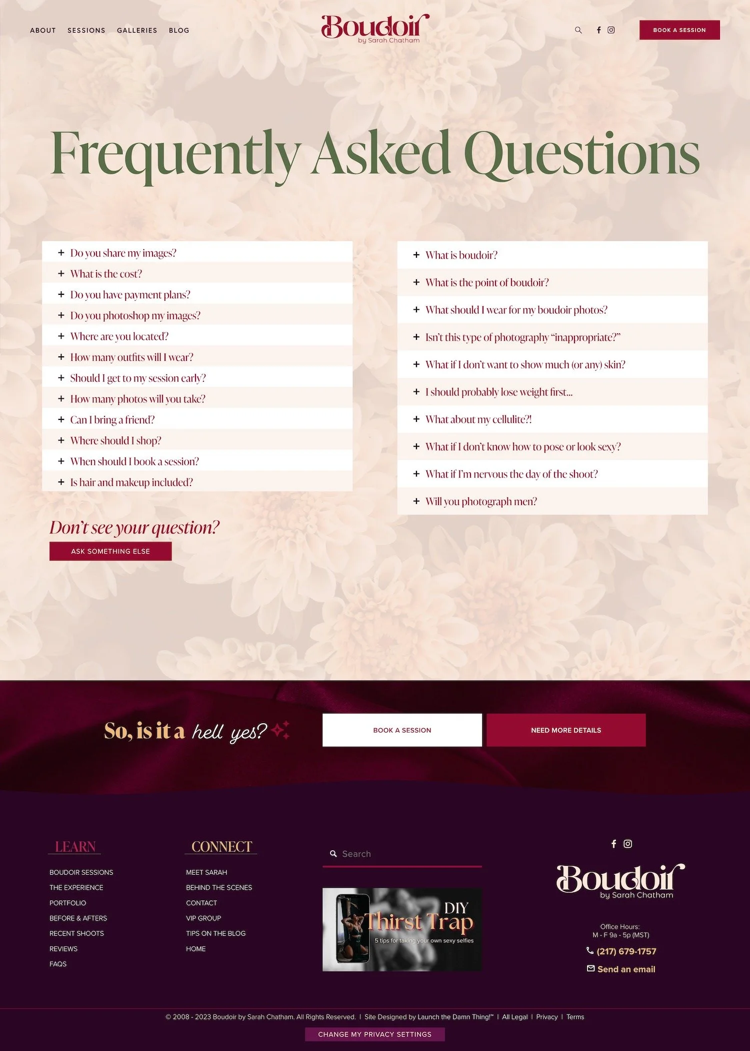
Frequently Asked Questions page
The boudoir FAQs has the rest of the questions. Uh, two columns of them and all of the things that are probably on people's minds. I should lose weight first. What about my cellulite? What about my stretch marks? What if I don't want to show any skin?
So all of those things are addressed here. And if you don't see your question, there's actually a form you can fill out where you can ask your own question.
Rave Reviews page
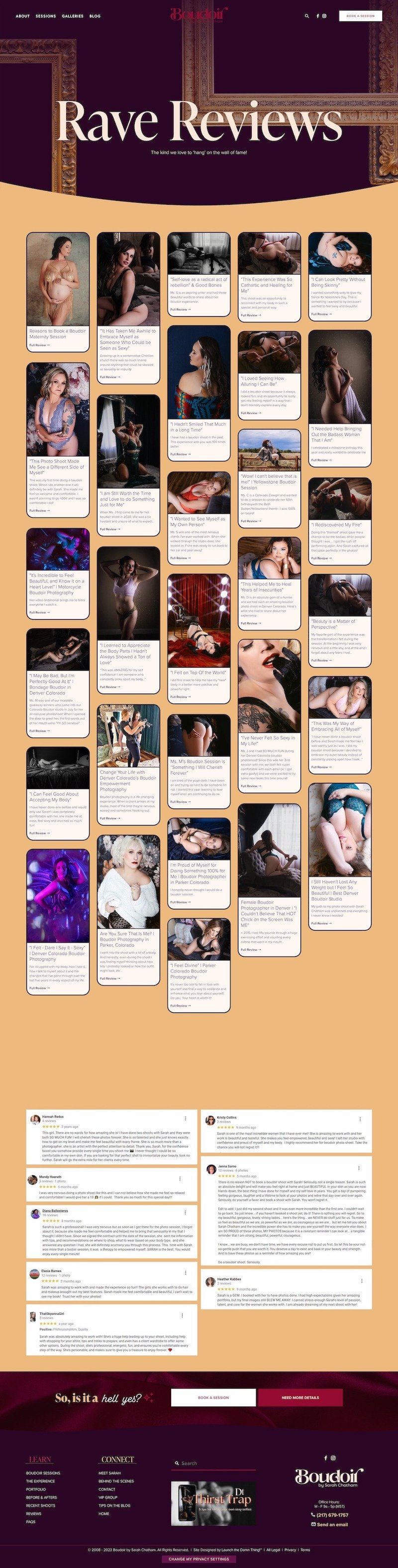
Next we go to the rave reviews or the reviews page. This is literally a wall of fame and we made this really easy, but really pretty.
The summary block under here is in a masonry grid, so it's pulling from her blog but only the testimonials category. This means that she doesn't have to do anything in here.
She's already posting very frequently on the blog and quotes when she gets testimonials from clients; they're going to automatically show up in this list. So people can look through and see one picture from that person's photo shoot, their main takeaway in the title and a brief description and to click through and see the whole review and some more photos from that shoot.
It does have a limit on how many it will show and one that passes that limit on one page, there will be a load more button. So that the person can keep scrolling through the list.
There are also snapshots of Google reviews and those are actually linked to the actual Google review.
Yes, I did take the time to go do that because I think it's a good policy to show that they are legitimate.
VIP Group page
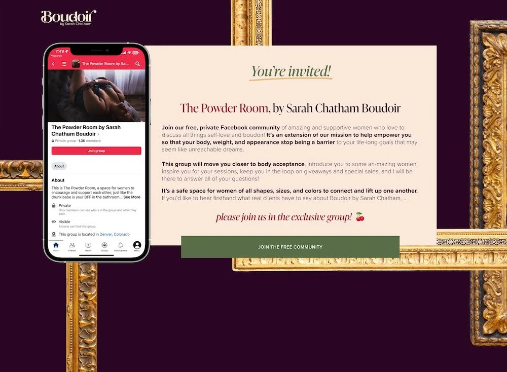
Next we're gonna go to the boudoir VIP group, which is a landing page where we have hidden the header and the footer, because this is something that she can use in advertisements, but also it's a way to focus and get people to look at their invite for the Facebook group, which you can see here in the mock-up on the left.
And you can join the free community at the button below. And the logo at the top is a back to home page button in case they wanna get out of this without actually hitting the back button.
Blog page
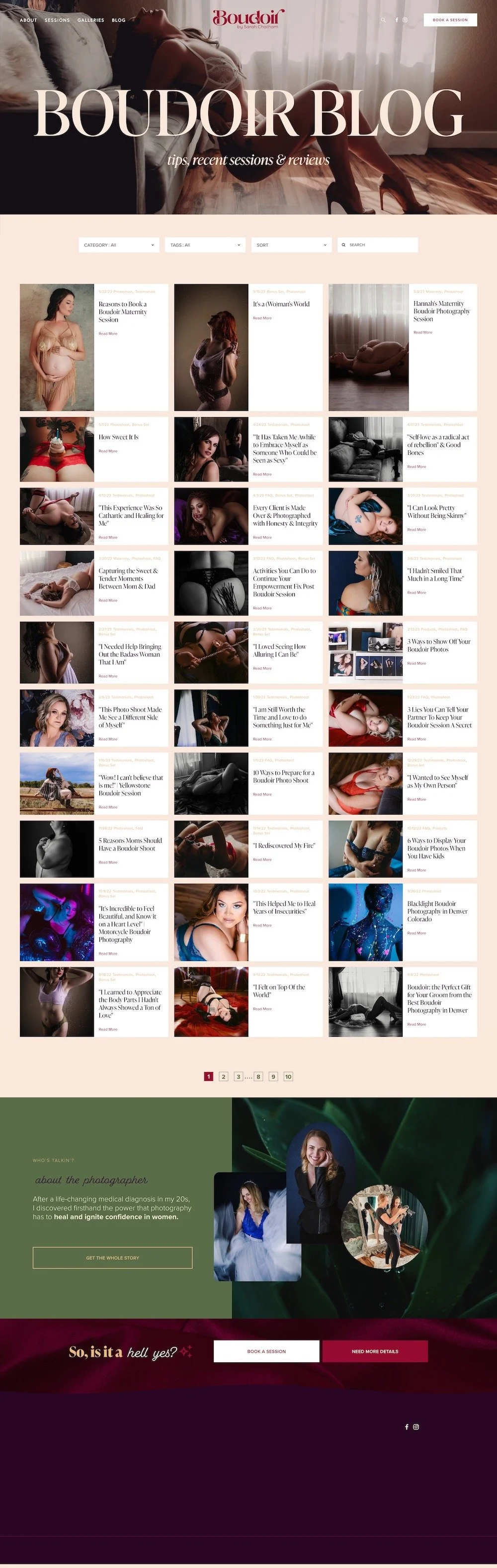
From here, let's go over to the blog next. We decided to do a Vogue esque approach to the top half of this page, and then talk about what this page actually has on it. So these are both in the header font for SEO purposes. One is obviously more emphasized than the other.
I have installed the Universal Filter on this blog because her original blog came into this new website with 299 posts and she's had more posts since then. So there was a lot to move over and the Universal Filter allows users to be able to sort through the content based on what they're looking for.
The thing that I love about the Universal Filter is the drop-downs can be used together to narrow down content very easily and it does not force the page to refresh in order to see the content.
So for example, if I were to click on photo shoot, this is recent shoots. And then a tag set to maternity, for example.
That would filter down all of her content to just the photo shoots that she posted about maternity sessions. If I get rid of that tag, it's just the posts that are photo shoots so that you can see how this actually works. You can also sort the posts from a to Z or Z to a, in alphabetical order or older to newer and vice versa.
You can also search through the entire post collection, which I love. So this is a must have for any blog collection that is going to be extensive.
As you noticed, we've also customized this blog basic grid so that the image is on the left and all the info is on the right. And that allows some pictures to be taller or take more precedence; that is dependent on the post itself.
At the bottom, Universal Filter has pagination, so you get a sense of how large this blog collection actually is. Default Squarespace blog collections only have pagination for forward and backward, like older or newer, and that does not give you a sense of, 'are there 50,000 blog posts? Or are there five?'
Right? So this shows that there's 10 pages of content. That's a lot of content. I think this allows up to 20 posts per page. Maybe. I can't remember. You'll also notice that the universal filter stays sticky at the top as long as you're scrolling down. So you can always change your mind and add filters or search through the content whenever.
At whatever time you feel like is necessary as you're scrolling through the post. At the bottom, we have another intro to Sarah so they get a preview of her personality what it's like to be in an actual photo shoot, and where to go learn more about her in case they only come to the blog first, instead of coming through the homepage or the about page or some other page of the website.
Inside the post, there are a few custom features as well. If we look at, for example, this one. She's sharing images from that client, talking about what to do, giving you tips on how to have a good boudoir photo shoot.
And at the bottom, we have a more like this section. This is a summary block, but it's not a summary block that she has to manually put at the end of her post. This will automatically show up on all posts and it will filter the content shown in that summary block to only the posts that have the same set of categories or tags. That means that when they get to the bottom, they can keep scrolling through stuff that's interesting to them specifically, based on whatever they're looking at, which is fantastic.
So this is a custom plugin. Not part of Squarespace, but you could do a workaround and manually put it in yourself or create a template draft in your blog collection and just duplicate that every time and then you would manually have that. The difference with this is because it's automatic, it continually updates.
So if you change the tags later on the post itself, the summary block could potentially update too. Whereas if you're manually putting these in, you also have to update tags and categories and filters. On the summary block itself and the post. So it's just more legwork to do it manually.
Below that we have a blog footer, which is also an automatic thing that gets appended to the bottom of the post. This is another custom plugin that is showing a GIF, Which is an ad we created in Canva to draw their attention and the click through on this image goes to the VIP group on Facebook, where they can request to join.
Below that we've also installed some share buttons.
We've also of course customized the comment box, the filter option that lets people sort comments, the preview comment button, which is the button you click when you've typed in a comment and you wanna see it first before you hit publish, and then the post comment button. And also we've applied a divider on top of the page, nation. So we can really differentiate that from the post content above it.
So there's a lot of customization around her blog because she had a lot of posts and we really needed to make sure that this was going to be very useful for people when they were coming to our website so that they could search through all of this content and find exactly what they were looking for.
Extra user-friendly features
I should also note that we put in the top of the navigation, a search icon, which automatically goes to the built-in search function in all Squarespace websites and we've customized this page just slightly.
So if one does a search for, recent shoots, for example, let's see what that pulls up.
This text right here. That is something that I have put into the customization of this page so that they have some sort of explanation when their search doesn't pull up any results.
If we search for testimonials, for example, it pulls up actual results, we've also customized in the results that pull up, what the highlight looks like. So this is pulling this post testimonial was a tag or a category or something like that in the blog post, and it's highlighting that so whoever's doing the search can see how relevant what they search for is in the results that come up.
Before & Afters (Transformations) page
Next we'll go to the transformations because that's what everybody wants to know. We have a fun. Animation effect on the before and the after. So you can see how that kind of plays as you start to scroll down.
All of these images are light boxed, and they have a little animation when they come in, they load in.
This page is really designed to give the full attention to the photos themselves so that people can really appreciate the value behind the transformation that took place for these women.
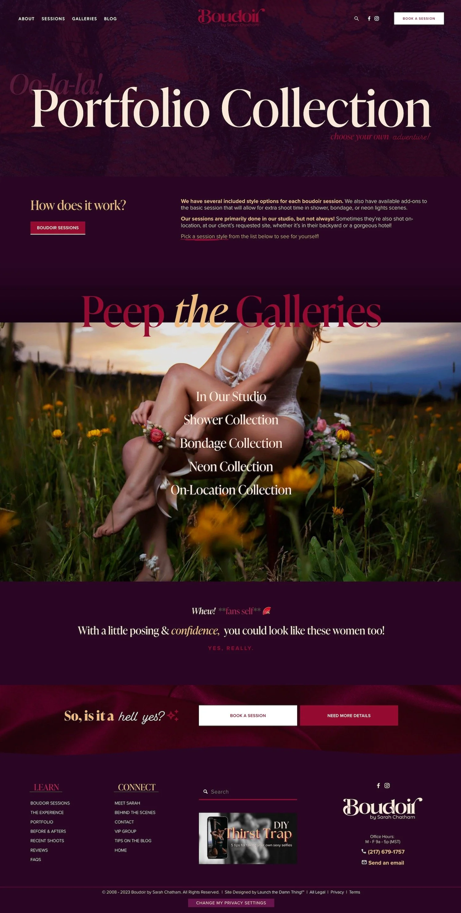
Portfolio Collection page
Next, we're gonna jump over to the portfolio. So this is again, one of my favorite areas.
We have a little bit of red and black lace happening in the background here, but it's very subtle because the purple overlaps that.
We also have a 'oo-la-la' in the background. But as you start to scroll down, that kind of expands and blurs out. So it's not part of the main title.
And we also have 'choose your own adventure' down here because we're really drawing to draw attention to the fact that there are several different types of photo shoots you can book with Sarah, with different add-on packages. So this is how it works.
A quick link back to the sessions or the services sales page. And to pick a session style from the list below. So you can start to look through the photos that are specific to that session type. Below that we have peep the galleries. And as you continue to scroll that title disappears again so that we can focus on the images themselves.
As you hover over the type of session, you see an example of that session photo. So here we have in the studio, in the shower collection, in the bondage collection in the neon collection and the on location collection. And each of these have their own set of photos.
As you scroll down. There's one final little 'whew! Fans self.' This is just a reminder that with a little posing and some guidance, you can actually look like this yourself. And this reminder is here for a reason because we want people to scroll back up and take another look at those photos. And actually look inside the galleries.
In Studio Collection (sub-page)
Let's start with in studio. This is about 30 to 50 or so pictures that are done in her actual studio.
And you can see how absolutely gorgeous these are. These are also light boxed. So they can be clicked on in, seen individually on their own or together in a group.
Now, because this is built into a portfolio collection, which is one of the different collection page types, Squarespace offers, it has built-in pagination at the bottom, which will allow me to go right into the next collection without having to go backwards.
Shower Collection (sub-page)
So if we click, we are now in the shower collection session add-on.
She has a regular studio session and the clients can pick, which add-ons they want, if they want any at all. And this is an add-on. And at the bottom, we can go backwards. We can go back to in our studio or we can go forward to the next, add-on session type, which is the bondage collection.
Bondage Collection (sub-page)
So let's hop into that one. A little bit of that leathery effect to really point out that this is a different session type. And The neon collection is really fun,
On-Location Collection (sub-page)
And then the on location collection. This is a session add-on that is dependent on where the client wants to do the session. So, this is not necessarily outside. And we wanted to start with inside pictures because we don't want people to freak out that like Sarah's gonna put them in a park in downtown Denver or something. Like, not going to happen.
This is at a site where the client chose. And then we can go into some of the outside ones where people are doing them in their backyard or something like that.
So that's the end of the portfolio collection.
I'll let you go check it out more individually.
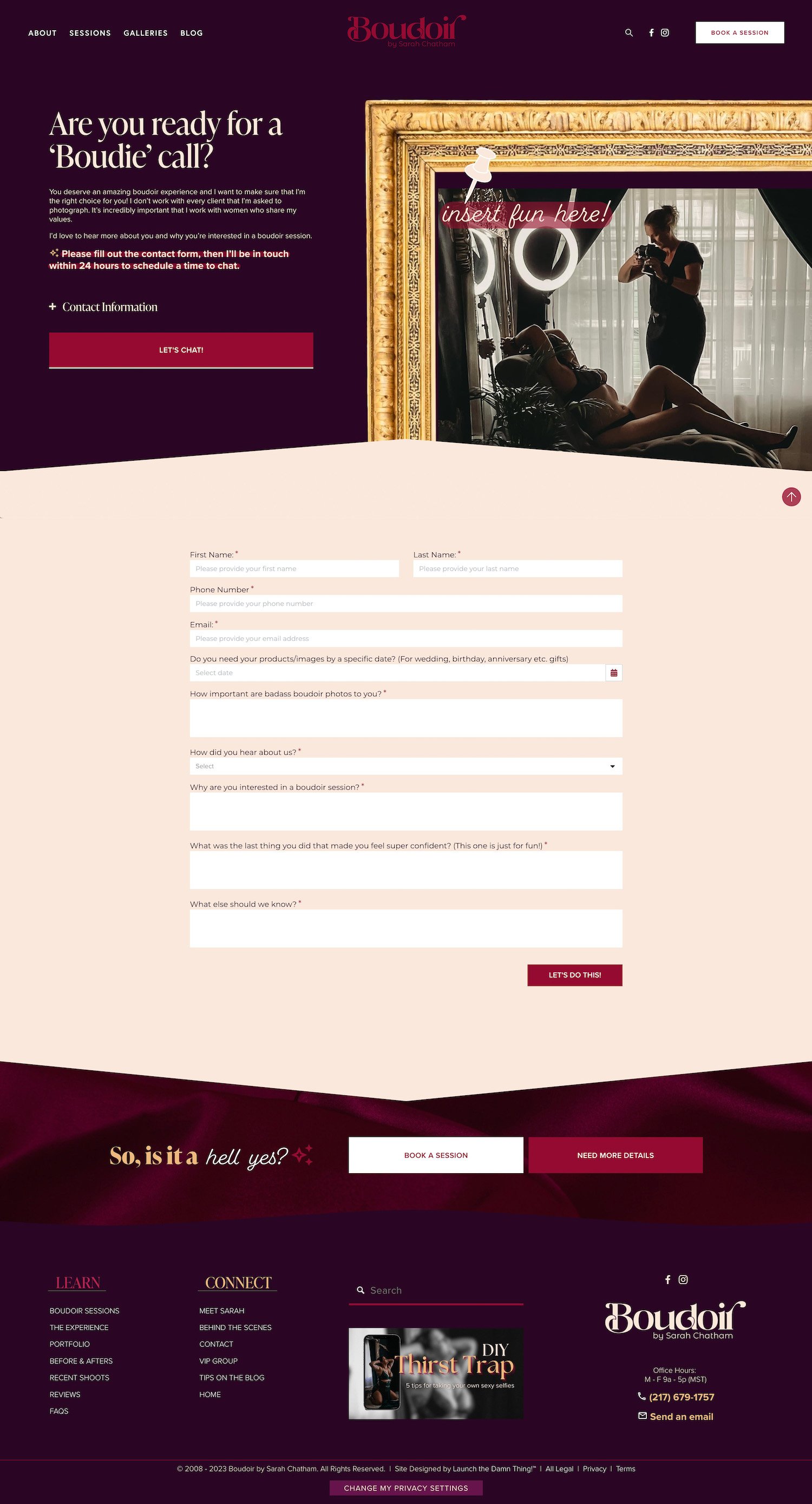
Contact page + embedded inquiry form
At the bottom in the footer, let's go down to the contact page. Notice we did not put this in the top. There are so many ways for them to reach this page, that it really wasn't necessary to put it in the top and also the book of session does technically take them to the inquiry form. So they can still reach out in that way, if they want to.
We've done that very strategically so that we can help people self-qualify for this service in particular, without having to go to the contact page and ask a generic question. Like, most of their questions can be answered on the website itself.
We are using that wall of fame frame again. But we are actually overlaying that with an image which will kind of slide into place.
And we're doing that in kind of a fun way to say like, 'Hey, this could be, you insert your own fun right here.' We also have a brief description of what the timeline is, where you can hear, expect to hear back from Sarah.
And then the contact information is strategically hidden in an accordion. And we have some custom icons in here so that people can gravitate quickly towards the thing that they're looking for . Then the let's chat button scrolls down to the actual service, uh, inquiry form, where they can fill that out and submit, and that is built into her CRM. So that is an easy solution for her.
Legal policies hub page
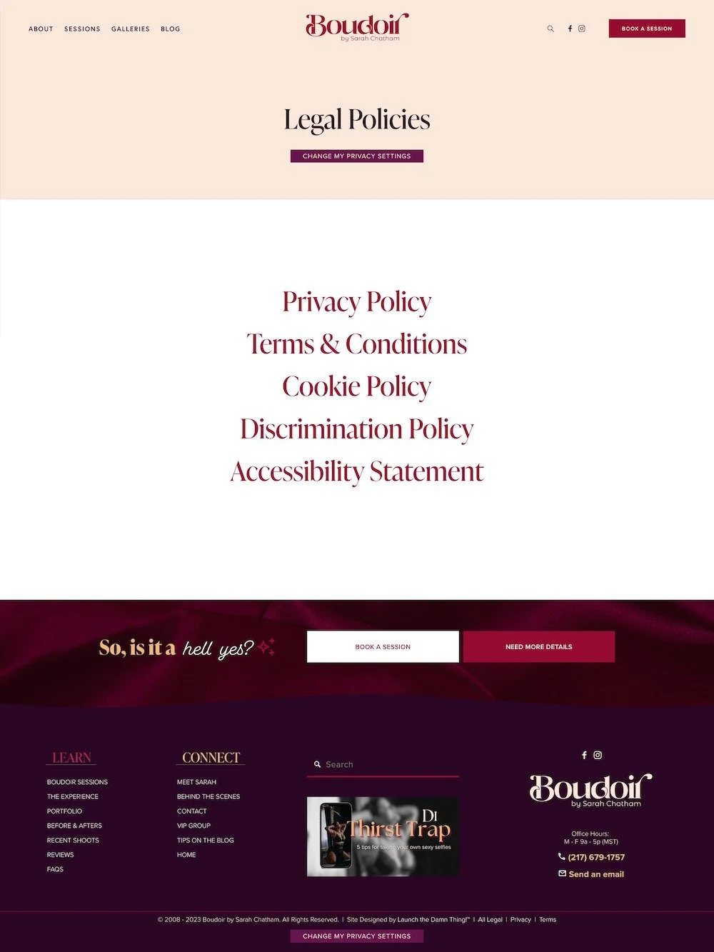
The extra pieces of her website that are not public facing necessarily are, for example, the 'change privacy settings,' which is through Termageddon.
We also have all legal pages. So you can look through the legal policies. We also have the 'change privacy settings' here, so that can be accessed from multiple areas of the website.
Social links page
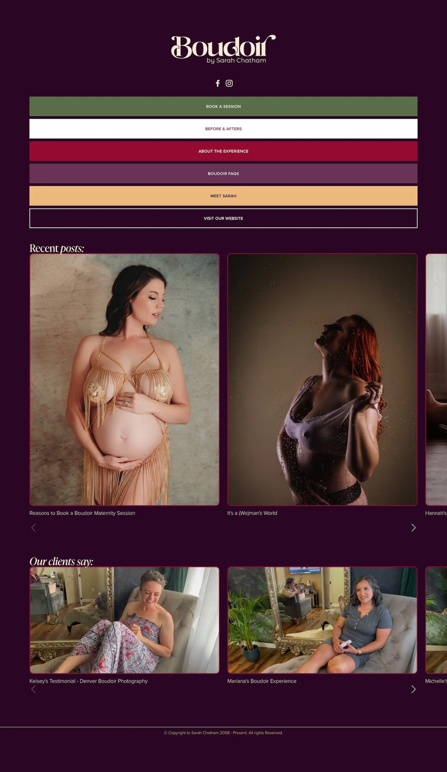
We also have a Instagram specific page, which can actually be used on any social media platform, with the right link. The logo goes back to the homepage, and she also has her social links in here automatically. And below that it will automatically pull in all recent posts in a summary block. Below that it will automatically pull in any videos that she puts into the video collection. So this is going to automatically stay up to date for her. And it is mobile responsive.
This is what it would look like on mobile.
Which is really nice, right? You don't have to pay for something like Linktree that won't stay up to date with the content you're putting on your website automatically, when you can create something really easy and custom for yourself this way instead.
Error 404 page
She also has a fabulous 404 page.
Sarah's reaction
Katelyn: on your error, 404 page…
Sarah: Oh! …(laughter) oh my God! …You’re the best!
(laughter)
Katelyn: I was trying to, I always try to make this humorous because if they land here, it's because they can't find something that they were looking for.
Sarah: Oh shit. Oh my gosh. I love it. Oh, oh.
Katelyn: There's a little form here that just has like a broken link report.
Sarah: That's great. Oh my god, I love you! Oh my goodness. That's perfect. That's awesome. (laughter) I love the humor.
Katelyn: Yeah, me too.
Talk about a sense of humor, right? That's my kind of girl. 'Well shit. looks like we had a bit of a nip slip' –– that's for all you Seinfeld fans out there. Just had to slip that in!
So this is to let people find the thing they were looking for if they land on a broken link, because that happens on older websites that have been around for a while, mine included, and this page needs to be there.
And it needs to be custom so that it can help people actually find the things that they were looking for when they found the broken link.
So there is a built-in search block so people can search the whole website if they happen to not have noticed that there's a search block in the header and in the footer. There's also a light box form where people can tell her what's actually broken so she can submit a support ticket to me.
And this can be filled out anonymously. There are also buttons to the most important areas of the site.
And underneath that another summary block that's pulling in recent content. So if they were looking for something in particular, hopefully they'll see recent posts down here and grab their attention. They can also click book a session from anywhere in the website.
And it'll take them to the full page inquiry form in Dubsado, Sarah's chosen CRM.
Extra back-end pages
On the back end of Sarah's website, it's always really important for me to try to help organize all this loose stuff that tends to happen here. Because in 7.1 of Squarespace it doesn't have the separated main navigation, secondary navigation, footer, top, middle, bottom, and not linked sections. It just has two. One for the top navigation, one for everything else, which I like better. But sometimes that can get overwhelming if you have a lot of pages and she has a lot of pages.
We've got some things grouped for quick and easy access, groups of things like the backend website settings, which includes a sandbox area.
So if she wants to practice with a particular element because she was coming from version 7.0, Fluid Engine is a completely different thing. And I wanted to give her space where there's not a published page for her to screw up, so to speak, so she can feel safe, trying out something new she wants to put in another page, et cetera. So that's what the sandbox is.
Legal, I just showed you.
Error 404 and social. I just showed you.
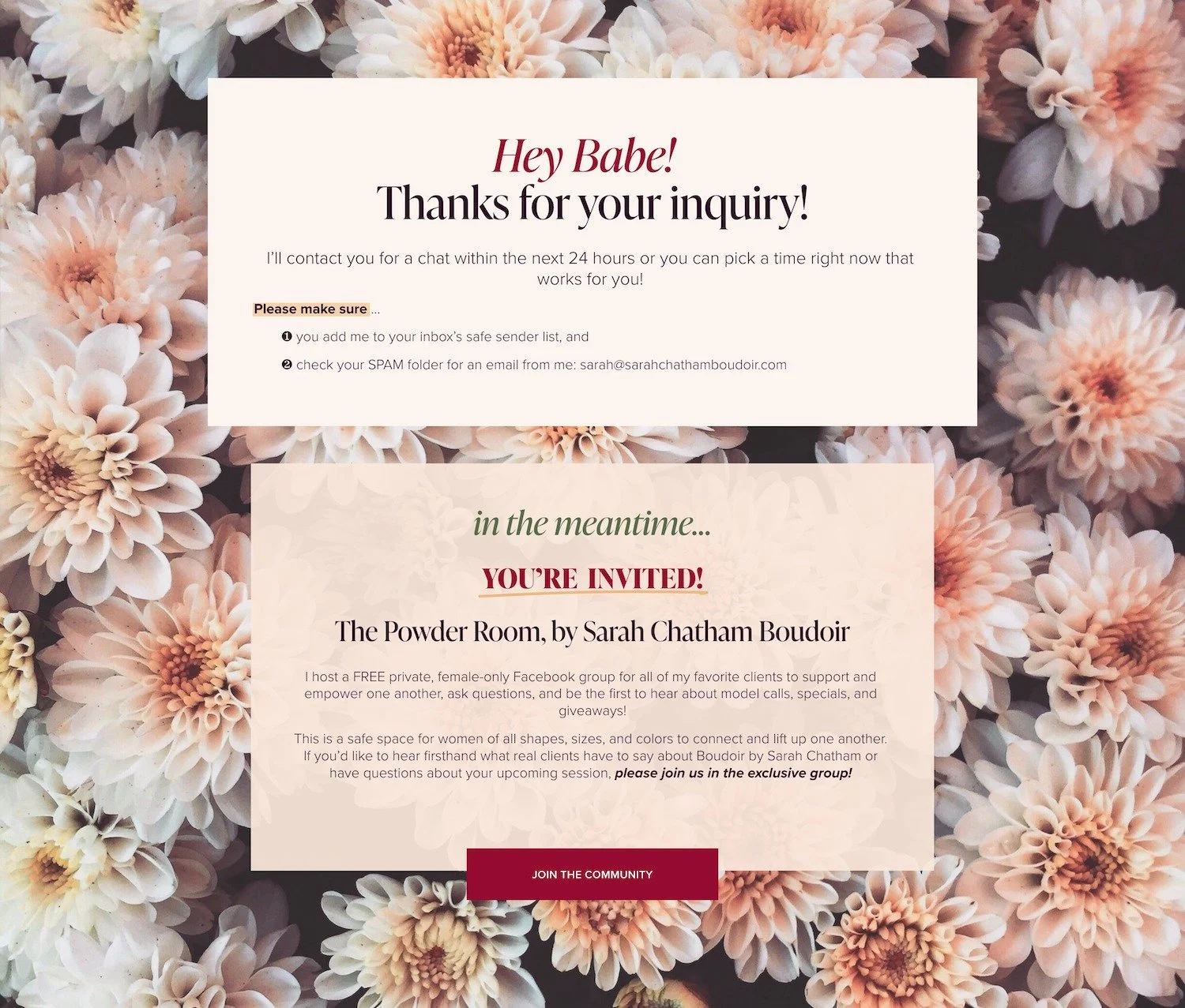
She also has several thank you pages, which she can use as the redirect to several of her forms, including this very generic thank you page, which doesn't go anywhere. There's also a thank you page related to her inquiries; this one's a little bit more specific telling them what to do and what happens next. There's a separate thank you page for newsletter signups.
Of course, We also have the template style guide here.
That's the thing that I always start every website build with.
There is also the private resources, which I've shared in a separate video on what is included in there. I have included tutorials in her private resource library that will walk her through every step of how to light box everything, how to create input, anchor links into her website and also how to use Google icons in the instructions, those that we had in the accordion on the contact page. That's what we're doing here. And then also the animated count up text feature, how to do that. So this is like all built into the back end of her website so that she understands how to use some of these upper level or higher level custom features that we've put into her website.
We also have an ads library. So she can create ads like this one down here in her footer for her opt-in, which goes to the form link.
And the blog footer so she can decide to change that out if she wants to and she only has one place to change that out, which will affect all blog posts. Again for striving for efficiency here.
Then we have, let's see the DIY thirst trap guide. This is the delivery of the actual document that you get, which again is awesome. Sarah herself is on it, teaching you how to pose and. Getting the right lighting and all the things.
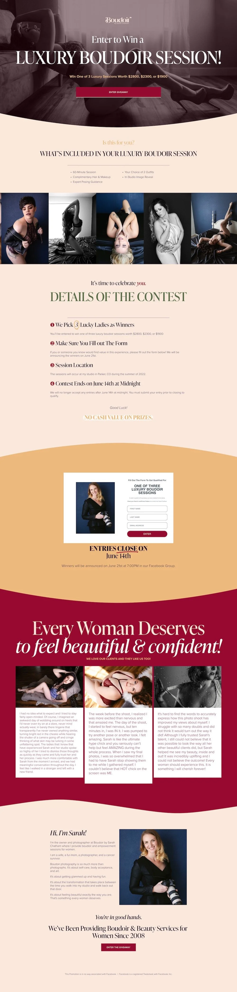
We also have a bunch of disabled pages, including giveaway pages that were styled. So we have this beautiful one enter to win. This is for her giveaways that she runs periodically. And basically it's a sales page, right? But we wanted it to be a beautiful sales page.
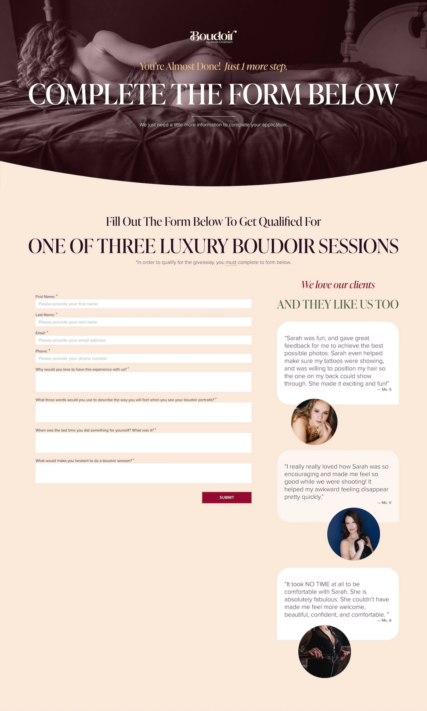
We have the application page. This is what she sometimes uses as part of her onboarding process. And this is also a form with some testimonials here.
We also designed her confirmation page. So details on next steps and what to do next.
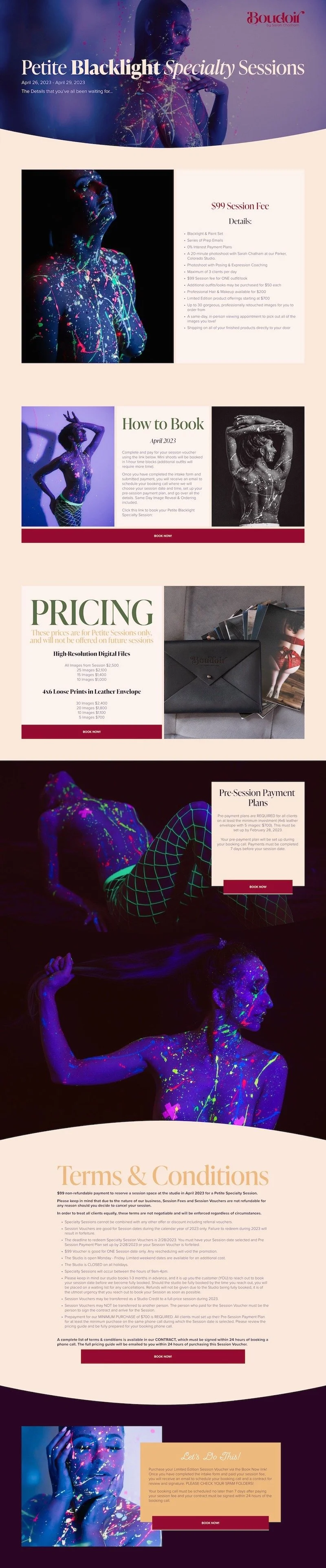
And of course her flash sale. So we also wanted this one to be a very pretty page. And this one we're also hiding actually all of these we're hiding the header and the footer sections in because this is a standalone, like Lead Page, style page where we want them to focus on one call to action for this particular thing and not get distracted by other stuff. However, we do have the logo on the, on these pages for a reason, and it does link to the homepage.
So this is a sales page, where we're pulling in saved sections that we have used in other pages so that she doesn't have to recreate them. It's another fun feature of version 7.1. And what happens when you sign up and the photographer?
And all the things.
How to work with Sarah
That is an overview of all things Boudoir by Sarah Chatham. I hope that you've enjoyed this peep into what her website was like and I really encourage you to go to the website, check it out for yourself. If you're in the Denver area or don't mind traveling to the Denver area to be photographed by Sarah, definitely make sure you reach out to her. And find out what it's all about.